Lost Opportunities
Not every opportunity results in a successful sale. To keep the pipeline up-to-date, lost opportunities need to be identified. Specifying why an opportunity was lost helps identify recurring issues, reveal coaching opportunities, and can assist with improving overall sales strategy.
Mark an opportunity as lost
To mark an opportunity as lost, first open the CRM app, and then select an opportunity from the pipeline by clicking on its corresponding Kanban card. Doing so reveals that opportunity detail form.
Then, click Lost, located at the top of the opportunity detail form.
This opens the Mark Lost pop-up window. From the Lost Reason drop-down menu, choose an existing lost reason. If no applicable reason is available, then create a new one by entering it into the Lost Reason field, and then clicking Create.
Additional notes and comments can be added below the lost reason in the designated Closing Note field.
After clicking Mark as Lost, a red Lost banner is added to the upper-right corner of the opportunity.
Create/edit lost reasons
To create a new lost reason, or edit an existing one, navigate to CRM app ‣ Configuration ‣ Lost Reasons.
To edit an existing lost reason, click the reason to be edited to highlight it. From here, change the selected lost reason by editing the Description field.
To create a new lost reason, click New in the upper-left corner of the Lost Reasons page. Then, type the new lost reason in the Description field.
View lost opportunities
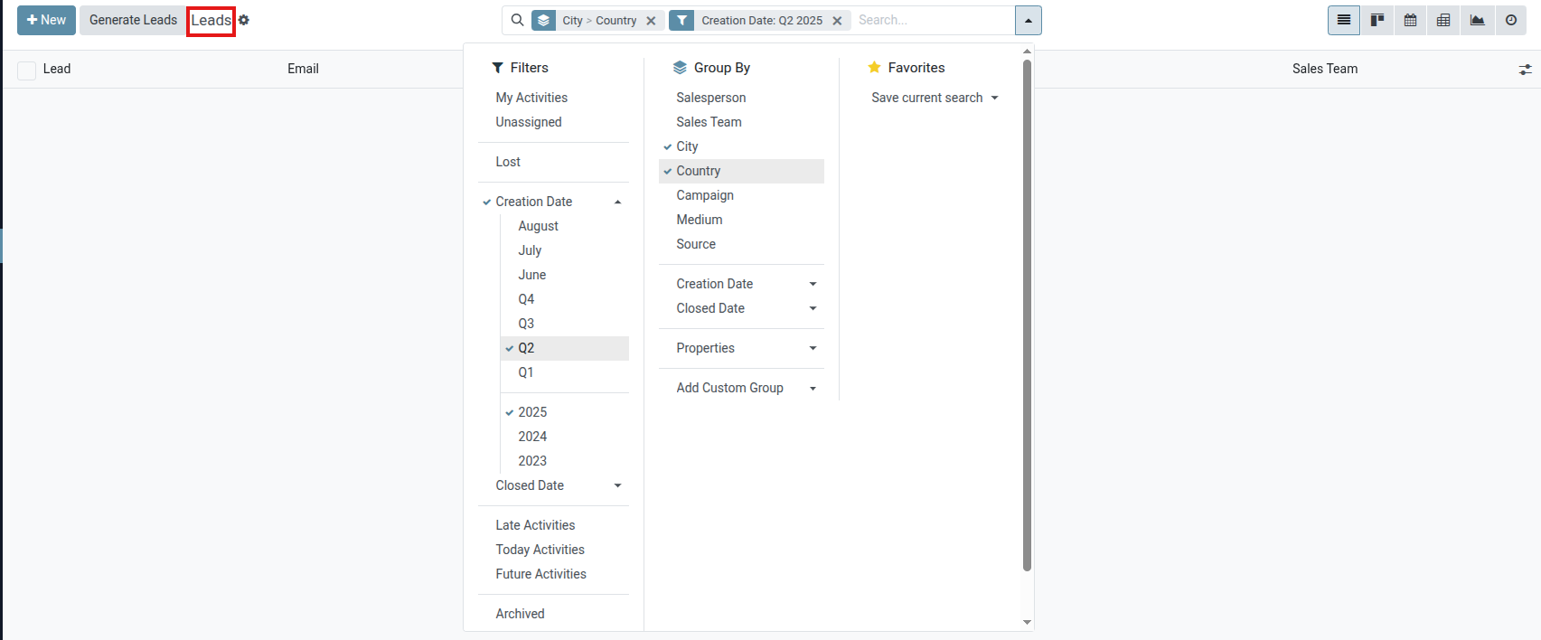
To retrieve lost opportunities, go CRM app ‣ Sales ‣ My Pipeline, then click on the search bar at the top of the page, and then remove all of the default filters.
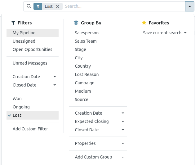
Open the Filters drop-down menu by clicking the (dropdown) icon to the right of the search bar to open the drop-down menu containing Filters, Group By, and Favorites options, designated into respective columns.
Select the Lost option from the Filters section. Upon selecting Lost, only the opportunities marked as Lost appear on the Pipeline page.
Sort opportunities by lost reason
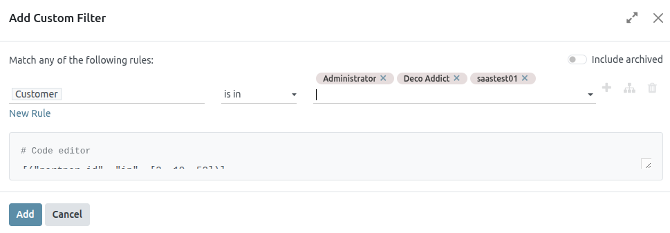
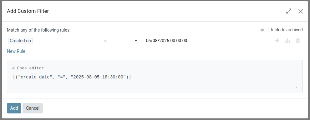
To filter opportunities by a specific lost reason, click the (dropdown) icon to the right of the search bar again to open the drop-down menu. In addition to the Lost filter, under the Filters column, click Add Custom Filter, which opens an Add Custom Filter pop-up window.
On the Add Custom Filter pop-up window, click in the first field and type Lost Reason in the search bar, or scroll to search through the list to locate it. Then, click into the next field, and select = from the drop-down menu. Click into the third field, and then select a lost reason from the drop-down menu. Finally, click Add.
Restore lost opportunities
To restore a lost opportunity, open the CRM app to reveal the Pipeline dashboard. Or, navigate to CRM app ‣ Sales ‣ My Pipeline. From here, click the (dropdown) icon to the right of the search bar to open the drop-down menu that contains Filters, Group By, and Favorites columns.
Under the Filters column, select Lost. Doing so reveals all the lost opportunities on the Pipeline page.
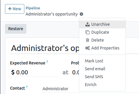
From the lost opportunity’s detail form, click Restore in the upper-left corner. Doing so removes the red Lost banner from the opportunity form, signifying the opportunity has been restored.
Restore multiple opportunities at once
To restore multiple opportunities at once, open the dashboard mega menu by clicking the (dropdown) icon (to the right of the search bar) and select the default Lost option located under the left-side Filters column.
Next, select the list view option, represented by the (list) icon in the upper-right corner. Doing so places all the opportunities from the Pipeline page in a list view. With the list view chosen, select the checkbox to the left of each opportunity to be restored.
Once the desired opportunities have been selected, click the Actions drop-down menu at the top of the Pipeline page. From the (Actions) drop-down menu, select Unarchive.
Doing so removes those selected opportunities from the Pipeline page because they no longer fit the Lost filter criteria. Delete the Lost filter from the search bar to reveal these newly-restored opportunities.
Manage lost leads
If Leads are enabled on a database, then they can be marked as lost in the same manner as opportunities. Leads use the same lost reasons as opportunities.
Mark a lead as lost
To mark a lead as lost, navigate to CRM app ‣ Leads, and select a lead from the list. Doing so reveals that lead’s detail form. Then, click Lost, located at the top of the lead’s detail form.
This opens the Mark Lost pop-up window. From the Lost Reason drop-down menu, choose an existing lost reason. If no applicable reason is available, then create a new one by entering it into the Lost Reason field, and selecting Create.
Additional notes and comments can be added below the lost reason designated in the Closing Note field.
When all the desired information has been entered in the Mark Lost pop-up window, click Mark as Lost.
Restore lost leads
To restore a lost lead, navigate to CRM app ‣ Leads, and then click the (dropdown) icon to the right of the search bar to open the drop-down menu that contains the Filters, Group By, and Favorites columns.
Under the Filters column, select Lost. Doing so reveals all the lost leads on the Leads page.
Then, click on the desired lost lead to restore, which opens that lead’s detail form.
From the lost lead’s detail form, click Restore in the upper-left corner. Doing so removes the red Lost banner from the lead form, signifying the lead has been restored.
Restore multiple leads at once
To restore multiple leads at once, navigate to CRM app ‣ Leads, open the Filters drop-down menu, and select the Lost option. Select the checkbox to the left of each lead to be restored.
Once the desired leads have been selected, click the (Actions) drop-down menu at the top of the Leads page. From the (Actions) drop-down menu, select Unarchive.
Doing so removes those selected leads from the Leads page because they no longer fit the Lost filter criteria. Delete the Lost filter from the search bar to reveal these newly-restored leads.
Merge Similar Leads and Opportunities
Saasmate automatically detects similar leads and opportunities within the CRM app. Identifying these duplicated records allows them to be merged without losing any information in the process. Not only does this help keep the pipeline organized, but it also prevents customers from being contacted by more than one salesperson.
Identify similar leads and opportunities
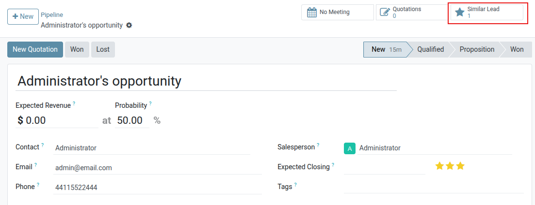
Similar leads and opportunities are identified by comparing the email address and phone number of the associated contact. If a similar lead/opportunity is found, a Similar Leads smart button appears at the top of the lead (or opportunity) record.
Comparing similar leads and opportunities
To compare the details of similar leads/opportunities, navigate to CRM app ‣ Pipeline or CRM app ‣ Leads. Open a lead or opportunity, and click the Similar Leads smart button. Doing so opens a Kanban view that only displays similar leads/opportunities. Click on a card to view the details for the lead/opportunity, and confirm if they should be merged.
Merging similar leads and opportunities
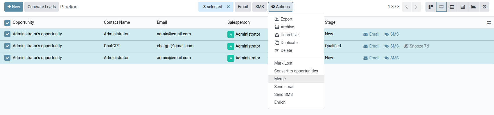
After confirming that the leads/opportunities should be merged, return to the Kanban view using the breadcrumb link, or by clicking the Similar Leads smart button. Click the (list) icon to change to list view.
Check the box on the left of the page for the leads/opportunities to be merged. Then, click the Actions icon at the top of the page, to reveal a drop-down menu. From that drop-down menu, select the Merge option to merge the selected opportunities or leads.
When Merge is selected from the Actions drop-down menu, a Merge pop-up modal appears. In that pop-up modal, under the Assign opportunities to heading, select a Salesperson and Sales Team from the appropriate drop-down menus.
Below those fields, the leads/opportunities to merge are listed, along with their related information. To merge those selected leads/opportunities, click Merge.
When leads/opportunities should not be merged
There may be instances where a similar lead or opportunity is identified, but should not be merged. These circumstances vary, based on the processes of the sales team and organization. Some potential scenarios are listed below.
Lost leads
If a lead/opportunity has been marked as lost, it can still be merged with an active lead or opportunity. The resulting lead/opportunity is marked active, and added to the pipeline.
Different contact within an organization
Leads/opportunities from the same organization, but with different points of contact, may not have the same needs. In this case, it is beneficial to not merge these records, though assigning the same salesperson, or sales team, can prevent duplicated work and miscommunication.
Existing duplicates with more than one salesperson
If more than one lead/opportunity exists in the database, there may be multiple salespeople assigned to them, who are actively working on them independently. While these leads/opportunities may need to be managed separately, it is recommended that any affected salespeople be tagged in an internal note for visibility.
Contact information is similar but not exact
Similar leads and opportunities are identified by comparing the email addresses and phone numbers of the associated contacts. However, if the email address is similar, but not exact, they may need to remain independent.
Manage Sales Teams
The Sales Teams feature within Saasmate’s CRM app allows for the creation and management of multiple sales teams, each with their own assignment rules, invoicing targets, and roster of salespeople.
Create a sales team
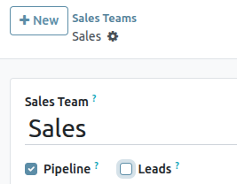
To create a new sales team, go to CRM app ‣ Configuration ‣ Sales Teams, then click New.
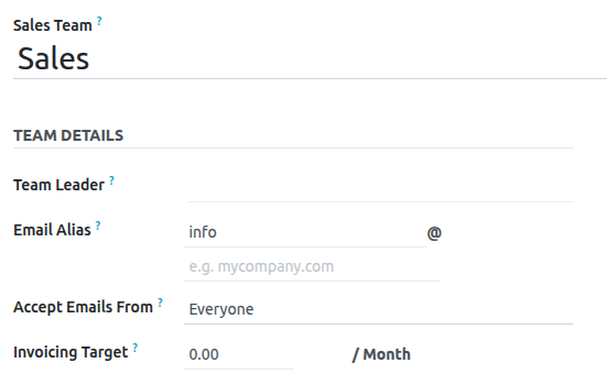
On the blank sales team form, enter a name in the Sales Team field.
Next, select a Team Leader from the drop-down list.
Set an Email Alias to automatically generate a lead/opportunity for this sales team whenever a message is sent to that unique email address. Choose whether to accept emails from Everyone, Authenticated Partners, Followers Only, or Authenticated Employees.
Select a Company from the drop-down menu to assign this team to.
Add sales team members
To add team members, click Add under the Members tab when editing the sales team’s configuration page. This opens a Create Sales Team Members pop-up window.
Select a user from the Salesperson drop-down list to add them to the team. To prevent this salesperson from being automatically assigned leads, tick the Skip auto assignment checkbox. If this feature is activated, the salesperson can still be assigned leads manually.
The Leads (30 days) field tracks how many leads the salesperson has been assigned in the past thirty days for this team, and the maximum number of leads they should be assigned. To edit the maximum number of leads this salesperson can be assigned, enter that amount in the Leads (30 days) field.
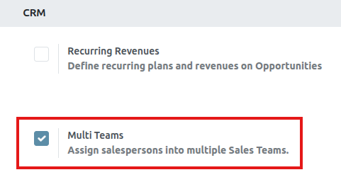
Enable multi teams
To allow salespeople to be assigned to more than one sales team, the Multi Teams setting needs to be enabled. First, navigate to CRM app ‣ Configuration ‣ Settings. Under the CRM section, tick the checkbox labeled Multi Teams. Then, click Save at the top-left of the page.
Sales team dashboard
To view the sales team dashboard, go to CRM app ‣ Sales ‣ Teams. Any team the user is a member of appears in the dashboard.
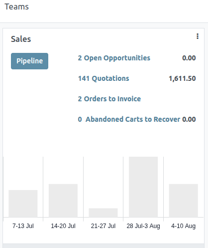
Each Kanban card gives an overview of the sales team’s open opportunities, quotations, sales orders, and expected revenue, as well as a bar graph of new opportunities per week, and an invoicing progress bar.
Click the Pipeline button to go directly to that team’s CRM pipeline.
Click on the (vertical ellipsis) icon in the top-right corner of the Kanban card to open a drop-down menu. Then, to view or edit the team’s settings, click Configuration.
Convert leads into opportunities
Leads act as a qualifying step before an opportunity is created. This provides additional time to review its potential, and gauge its viability, before the opportunity is assigned to a salesperson.
Configuration
To activate the Leads setting, navigate to CRM app ‣ Configuration ‣ Settings and check the box labeled, Leads. Then, click Save.
Activating this feature adds a new menu option, Leads, to the header bar, located along the top of the screen.

Once the Leads setting has been activated, it applies to all sales teams by default. To turn off leads for a specific team, navigate to CRM app ‣ Configuration ‣ Sales Teams. Then, select a team from the list to open that team’s configuration page. Clear the Leads checkbox, located beneath the Sales Team field, then click Save.
Convert a lead into an opportunity
To convert a lead into an opportunity, navigate to CRM app ‣ Leads, and click on a lead from the list to open it.
Click the Convert to Opportunity button, located at the top-left of the page.
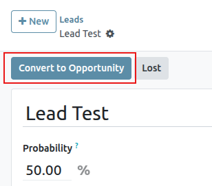
This opens a Convert to opportunity pop-up modal. Here, in the Conversion Action field, select the Convert to opportunity option.
Then, select a Salesperson and a Sales Team to which the opportunity should be assigned. Neither field is required, though if a selection is made in the Salesperson field, the Sales Team field is populated automatically, based on the salesperson’s team assignments.
If the lead has already been assigned to a salesperson or a team, these fields automatically populate with that information.
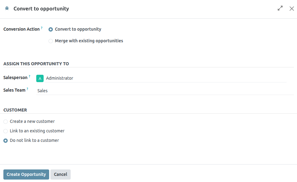
Under the Customer heading, choose from the following options:
- Create a new customer: choose this option to use the information in the lead to create a new customer record.
- Link to an existing customer: choose this option, then select a customer from the resulting drop-down menu, to link this opportunity to an existing customer record.
- Do not link to a customer: choose this option to convert the lead, but not link it to a new or existing customer.
Lastly, when all configurations are complete, click Create Opportunity.
To view the newly created opportunity, navigate to CRM app ▸ My Pipeline.
Create opportunities from web contact forms
Adding a contact form to a website makes it easy to convert visitors into leads and opportunities. After a visitor submits their information, an opportunity can be created automatically, and assigned to a designated sales team and salesperson.
Customize contact forms
By default, the Contact Us page on an Saasmate website displays a preconfigured contact form. This form can be customized, as needed, to suit the needs of a specific sales team.
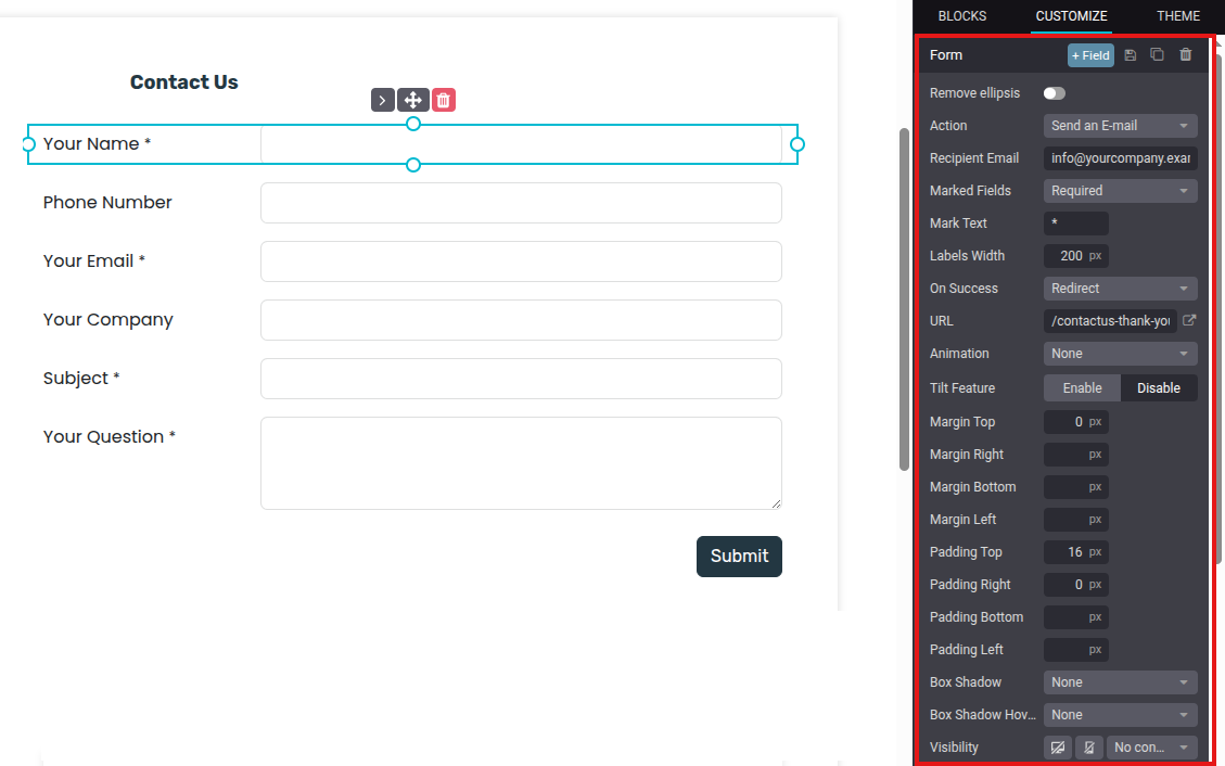
Navigate to Website app ‣ Contact Us, then click Edit in the top-right of the screen to open the web editor. Click on the form building block in the body of the webpage to open the form configuration settings on the right sidebar. The following options are available to customize the contact form from the From section of the right sidebar:
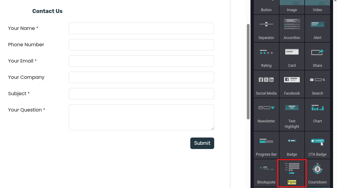
- Action: the default action for a contact form is Send an Email. Select Create an Opportunity from the drop-down list to capture the information in the CRM app.
- Sales Team: choose a sales team from the drop-down menu that the opportunities from this form should be assigned to. This field only appears if the Action field is set to Create an Opportunity.
- Salesperson: if the opportunities should be assigned to a specific salesperson, select them from the drop-down menu. If no selection is made in this field, the opportunities are assigned based on the team’s existing rules.
- Marked Fields: use this field to alter how the form handles marked fields. The default option is to treat marked fields as Required, which is the recommended setting.
- Mark Text: choose how Marked Fields should be identified. The default character is an asterisk (*).
- Labels Width: use this field to alter the pixel width of the labels, if desired.
- On Success: select how the webpage reacts after a customer successfully submits a form. Nothing keeps the customer on the same screen, with the addition of a confirmation message that the form was submitted successfully. Redirect sends the customer to a new webpage, based on the address provided in the URL field below. Show Message replaces the form with a preconfigured message that informs the customer someone should respond to them as soon as possible.
- URL: if Redirect is selected in the On Success field, enter the URL for the webpage, where customers should be directed after successfully submitting a form.
- Visibility: use the drop-down menu to add any visibility conditions for this field, if desired.
Customize contact form fields
In addition to the settings for the form, the settings for each field can be customized, as well. With the web editor menu still open, click into a field to open the Field configuration settings section on the sidebar. The following options are available to customize a field:
- Type: choose a custom field option or an existing field type.
- Input Type: determine the type of information customers should input. Available options are Text, Email, Telephone, or URL. The selection made in this field limits the format that customers can use when entering information.
- Label: enter the name for the field.
- Position: choose the way the label is aligned with the rest of the form. The label can be hidden, above the field, to the left of the field, or right adjusted and closer to the field.
- Description: slide the toggle to add a description for the field, which can provide additional instructions to customers. Click under the field on the form to add the description.
- Placeholder: enter an example to help users know how to input information where formatting is important, such as a phone number or email address.
- Default Value: enter a value to include in the form, by default, if the customer does not provide information in the field. It is not recommended to include a default value for required fields.
- Required: slide the toggle to mark this field as required if it must be filled in for every submission.
- Visibility: select when this field should be visible. Use the button on the left to choose whether to show or hide this field on a desktop. Use the button on the right to choose whether to show or hide this field to mobile users.
- Animation: select if this field should have any animation.
View opportunities
After a customer submits a contact form, and an opportunity is created, it is assigned based on the form setting. To view opportunities, navigate to CRM app ‣ Sales ‣ My Pipeline.
On the My Pipeline dashboard, click on an opportunity card in the Kanban view to open the opportunity record. The information submitted by the customer is visible on the opportunity record.
Create Leads (from email or manually)
Leads can be added to the CRM app from custom email aliases, and by manually creating new records. This is in addition to the leads and opportunities created in the app through the website contact form.
First, ensure the Leads feature is enabled in the database by navigating to CRM app ‣ Configuration ‣ Settings. Tick the Leads checkbox, then click Save.
Configure email aliases
Each sales team has the option to create and utilize their own unique email alias. When messages are sent to this address, a lead (or opportunity), is created with the information from the message.
To create or update a sales teams’ email alias, navigate to CRM app ‣ Configuration ‣ Sales Teams. Click on a team from the list to open the team’s details page.
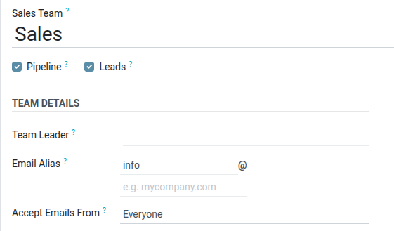
In the Email Alias field, enter a name for the email alias, or edit the existing name. In the Accept Emails From field, use the drop-down menu to choose who is allowed to send messages to this email alias:
- Everyone:messages are accepted from any email address.
- Authenticated Partners:only accepts messages from email addresses associated with a a partner (contact or customer) record.
- Followers only:only accepts messages from those who are following a record related to the team, such as a lead or opportunity. Messages are also accepted from team members.
- Authenticated Employees:only accepts messages from email addresses that are connected to a record in the Employees app.
Leads created from email
Leads created from email alias messages can be viewed by navigating to CRM app ‣ Leads. Click a lead from the list to open it, and view the details.
The email received by the alias is added to the chatter thread for the lead. The subject line of the message is added to the title field, and the Email field is updated with the contact’s email address.
Manually create leads
Leads can be added directly to the CRM app by manually creating a new record. Navigate to CRM app ‣ Leads to view a list of existing leads.
At the top-left of the list, click New to open a blank Leads form.
In the first field of the new form, enter a title for the new lead. Next, enter a Contact Name, and a Company Name.
Manually create opportunities
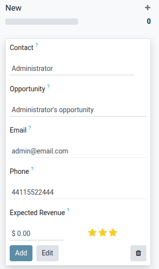
To manually create an opportunity, navigate to CRM app ‣ Sales ‣ My Pipeline. At the top-left of the page, click New to create a new opportunity Kanban card. In the Organization/Contact field, enter the name of the company the opportunity is for.
Choose a name, and enter it in the Opportunity field. This is a required field. When manually creating an opportunity, it is helpful to add a name that relates to the details of the opportunity.
Enter the contact information for the opportunity in the Email and Phone fields.
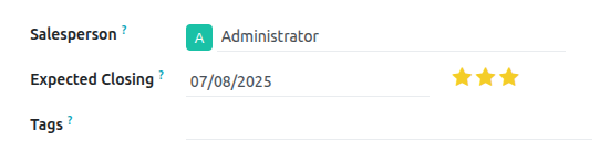
In the Expected Revenue field, enter an estimated value for the opportunity.
Then, use the ★ (star)icons to assign a priority.
- ☆ ☆ ☆: low priority
- ★ ☆ ☆: medium priority
- ★ ★ ☆: high priority
- ★ ★ ★: very high priority
Once all the necessary information has been entered, click Add.
Create and send quotations
Once a qualified lead has been converted into an opportunity, the next step is to create and deliver a quotation. This process can be easily handled through Saasmate’s CRM application.
Create a new quotation
To create a new quotation, open the CRM app, revealing the Pipeline page on the main CRM dashboard.
From here, click on any opportunity to open it. Review the existing information and update any fields, if necessary.
At the top-left of the form, click the New Quotation button.
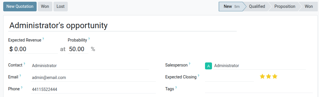
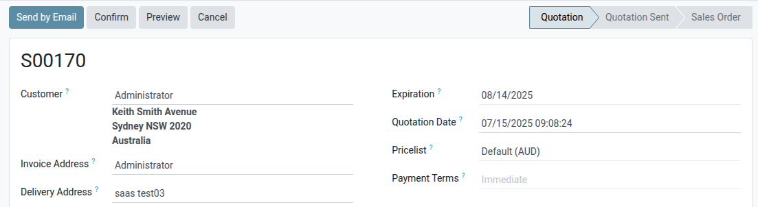
Once this button is clicked, a new quotation form appears. Confirm the information in the top half of the form, and update any missing or incorrect field
- Customer: the company or contact for whom this quotation was created.
- Referrer: if this customer was referred by another customer or contact, select it from the drop-down menu in this field.
- Invoice Address: physical address where the invoice should be sent.
- Delivery Address: physical address where any products should be delivered.
- Quotation Template: if applicable, select a pre-configured quotation template from this field.
- Expiration: date when this quotation is no longer valid.
- Quotation Date: creation date of draft/sent orders, confirmation date of confirmed orders. Note: this field is only visible if Developer mode (debug mode) is active.
- Recurring Plan: if this quotation is for a recurring product or subscription, select the recurring plan configuration to be used.
- Pricelist: select a pricelist to be applied to this order.
- Payment Terms: select any applicable payment terms for this quotation.
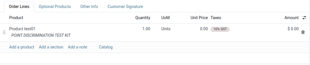
Order lines
After updating the customer, payment, and deadline information on the new quotation, the Order Lines tab can be updated with the appropriate product information.
To do that, click Add a product in the Order Lines tab.
Next, type the name of an item into the Product field to search through the product catalog. Then, select a product from the drop-down menu, or create a new one by selecting Create or Create and Edit.
After selecting a product, update the Quantity, if necessary. Confirm the information in the remaining fields.
To remove a line from the quotation, click the (trash can) icon.
To organize products into sections click Add a section and type a name for the section. Then, click the (drag) icon to the left of the name and drag to move the section to the appropriate location. Move each product using the same method to finish organizing the quotation order lines.
Product catalog
To quickly add numerous products to the quotation, click the Catalog button to open the product catalog.
All products in the database are listed as cards and can be sorted in the left panel by Product Category and Attributes.
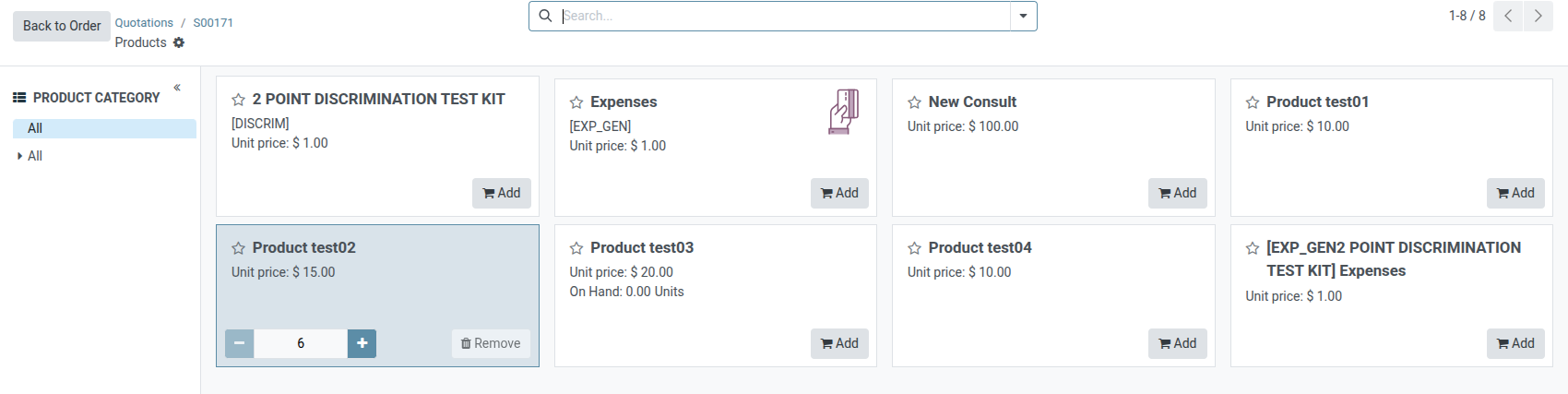
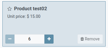
To add a product, click the Add button on the product card. Set the quantity of the item using the (add) or (subtract) buttons, or type the quantity in the number field between the two buttons. To remove an item, click the Remove button on the product card.
Once all product quantities are set, click the Back to Quotation button to return to the quotation. The items selected in the product catalog now appear in the Order Lines tab.
Preview and send quotation
To see a preview of the quotation as the customer will see it, click the Preview button. Doing so opens a preview in the Customer Portal.
After reviewing the customer preview, click Return to edit mode to return to the quotation form in the backend.
When the quotation is ready to deliver to the customer, click the Send by Email button.
Doing so opens a pop-up window with a pre-configured email message. Information from the quotation, including the contact information, total cost, and quotation title are be imported from the quotation.
A PDF of the quotation is added as an attachment to the email.
Proceed to make any necessary changes to the email, then click Send. A copy of the message is added to the Chatter of the of the record.
After a quotation is sent, the originating opportunity’s Quotations smart button updates with a new count. This quotation, and all other quotations can be accessed through this smart button at the top of the opportunity in the CRM app.
Any quotations attached to the opportunity that are confirmed, and have therefore been converted to sales orders, will be deducted from the number listed on the Quotations smart button. Instead, the value of the sales order will appear in the Orders smart button located in the same control panel.
Mark an opportunity won or lost
In order to keep the pipeline up to date and accurate, opportunities need to be identified as won or lost once a customer has responded to a quotation.
To mark an opportunity as won or lost, return to the opportunity using the breadcrumbs at the top-left of the quotation form. Or navigate to CRM app ‣ Sales ‣ My Pipeline and click on the correct opportunity to open it.
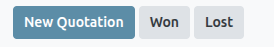
At the top-left of the form, click on either the Won or Lost button.
If the opportunity is marked won, a green Won banner is added to the record, and it is moved to the Won stage.
Marking an opportunity as lost, via the Lost button opens a Mark Lost pop-up window, where a Lost Reason can be entered.
From the Lost Reason drop-down field, choose an existing lost reason. If no applicable reason is available, create a new one by entering it into the Lost Reason field, and clicking Create.
Additional notes and comments can be added in the Closing Note field.
When all the desired information has been entered in the Mark Lost pop-up window, click Mark as Lost.
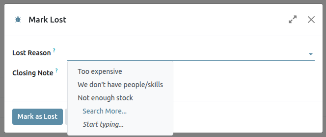
Upon clicking Mark as Lost, the pop-up window disappears, and Saasmate returns to the opportunity form, where a new red Lost banner is now present in the upper-right corner of the opportunity.
Once an opportunity is marked as lost, it is no longer considered active, and it is removed from the pipeline.
In order to view a lost opportunity from the pipeline, click the down arrow icon to the right of the search bar, and select either Lost or Archived from the drop-down menu that appears.
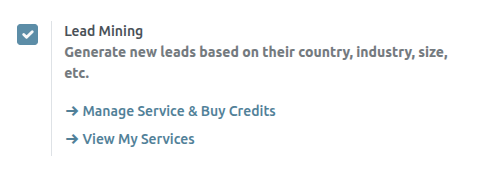
Lead Mining
Lead mining is a feature that allows CRM users to generate new leads directly into their Odoo database. To ensure lead qualification, lead mining output is determined by a variety of filtering criteria, such as the country, the company size, and the industry.
Configuration
To get started, go to CRM app ‣ Configuration ‣ Settings, and tick the Lead Mining checkbox to activate the feature. Then, click Save.
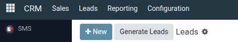
Generate leads
After the Lead Mining setting is activated, a new button called Generate Leads is available to use in the upper-left corner of the CRM Pipeline (CRM app ‣ Sales ‣ My Pipeline).
Lead mining requests are also available through CRM app ‣ Configuration ‣ Lead Mining Requests, or through CRM app ‣ Leads ‣ Leads, where the Generate Leads button is also available.
Click the Generate Leads button, and a pop-up window appears, offering a variety of criteria by which to generate leads.
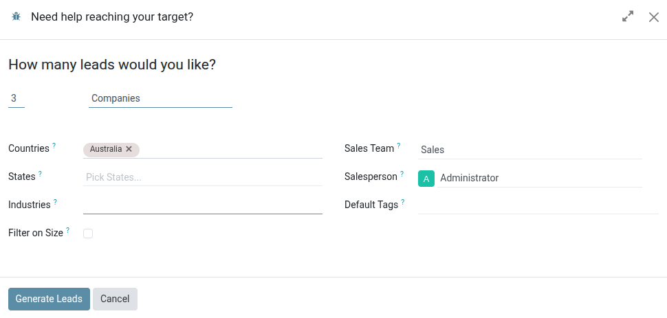
Choose to generate leads for Companies to get company information only, or choose Companies and their Contacts to get company information and individual employee contact information.
Additional filtering options include the following:
- Countries: filter leads based on the country (or countries) they are located in.
- States: further filter leads based on the state in which they are located, if applicable.
- Industries: filter leads based on the specific industry they work in.
- Filter on Size: tick this checkbox to specify the number of employees at the company. This generates a field labeled Size. Fill in the blanks to create a range for the desired company size.
- Sales Team: choose which Sales Team the leads will be assigned to.
- Salesperson: choose which member of the Sales Team the leads will be assigned to.
- Default Tags: choose which tags are applied directly to the leads once found.
View leads
After leads are generated, they are assigned to the designated salesperson and team. To view additional information regarding the lead, select one from the list, and click to open it.
In the chatter thread for the lead, additional information is provided. This can include the number of employees, the technology used by the company, the timezone, and direct contact information.
Pricing
To buy credits, navigate to CRM app ‣ Configuration ‣ Settings. In the Lead Generation section, under the Lead Mining feature, click Buy Credits.
Assign leads with predictive lead scoring
The Saasmate CRM app can automatically assign leads/opportunities to sales teams and salespeople. A standard practice is to assign leads based on the probability of winning each lead. Companies can prioritize the leads that are more likely to result in successful deals by quickly assigning them to the appropriate salespeople.
Saasmate automatically calculates the probability of winning each lead using a method called predictive lead scoring.
Predictive lead scoring
Predictive lead scoring is a machine-learning model that uses historical data from Saasmate CRM to score open leads/opportunities.
As a company processes opportunities through the CRM pipeline, Saasmate collects data on which opportunities are won and lost. Predictive lead scoring uses this data to predict the probability of winning each new lead or opportunity.
The more opportunities that are sent through the CRM pipeline, the more data Saasmate collects, resulting in more accurate probabilities.
Specifically, Saasmate’s predictive lead scoring uses the naive Bayes probability model:
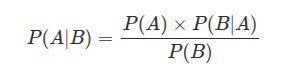
P(A|B)=P(A)×P(B|A)P(B)
Breaking down the equation:
- P(A|B) = The probability of a successful lead in this case
- P(A) = The overall probability of a lead being successful regardless of the conditions
- P(B|A) = The probability of this being the case given a lead is successful
- P(B) = The probability of this being the case
The term in this case refers to the variables that can affect a lead being successful in Saasmate. This can include variables such as the assigned Salesperson, the source of the lead, the language of the lead, and other historical and demographic data.
Which variables are considered in this calculation can be configured to tailor the calculation to each business’s needs.
The probability of success of each opportunity is displayed on the opportunity form, and it updates automatically as the opportunity progresses through the CRM pipeline.
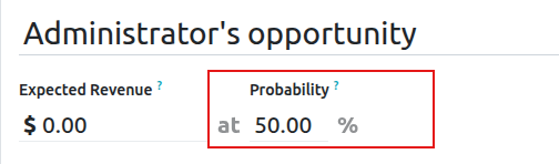
When an opportunity moves to the next stage, its probability of success automatically increases according to the predictive lead scoring algorithm.
Configuration
Predictive lead scoring is always active in Saasmate CRM. However, the variables used to calculate the probability of success can be customized in the settings.
To customize the variables used by predictive lead scoring, go to CRM ‣ Configuration ‣ Settings. Under Predictive Lead Scoring, click on the Update Probabilities button.
Then, click on the drop-down menu to choose which variables the predictive lead scoring feature will take into account.
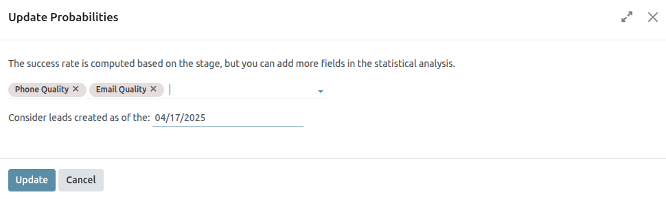
Any number of the following variables can be activated:
- State: the geographical state from which the opportunity originates
- Country: the geographical country from which the opportunity originates
- Phone Quality: whether or not a phone number is listed for the opportunity
- Email Quality: whether or not an email address is listed for the opportunity
- Source: the source of an opportunity (e.g. search engine, social media)
- Language: the spoken language specified on the opportunity
- Tags: the tags placed on the opportunity
Next, click on the date field next to the option Consider leads created as of the: to select the date from which predictive lead scoring will begin its calculations.
Lastly, click Confirm to save changes.
Assign leads based on probability
Saasmate CRM can assign leads/opportunities to sales teams and salespeople based on specified rules. Create assignment rules based on the leads’ probability of success to prioritize those that are more likely to result in deals.
Configure rule-based assignment
To activate rule-based assignment, navigate to CRM ‣ Configuration ‣ Settings, and activate Rule-Based Assignment.
The rule-based assignment feature can be set to run Manually, meaning an Saasmate user must manually trigger the assignment, or Repeatedly, meaning Saasmate will automatically trigger the assignment according to the chosen time period.
To set up automatic lead assignment, select Repeatedly for the Running section. Then, customize how often Saasmate will trigger the automatic assignment in the Repeat every section.
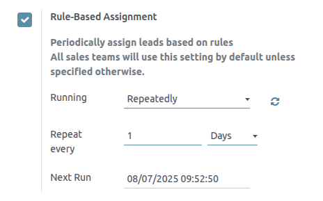
If rule-based assignment is set to run Repeatedly, the assignment can still be triggered manually using the circular arrow icon in the Rule-Based Assignment settings (or using the Assign Leads button on the sales team configuration page).
Configure assignment rules
Next, configure the assignment rules for each sales team and/or salesperson. These rules determine which leads Saasmate assigns to which people. To get started, navigate to CRM ‣ Configuration ‣ Sales Teams, and select a sales team.
On the sales team configuration form, under Assignment Rules, click on Edit Domain to configure the rules that Saasmate uses to determine lead assignment for this sales team. The rules can include anything that may be relevant for this company or team, and any number of rules can be added.
Click Add Filter to start creating assignment rules. Click on the + sign on the right of the assignment rule to add another line. Click on the x symbol to remove the line.
To create an assignment rule based on an opportunity’s probability of success, click on the far left drop-down menu of an assignment rule line, and select Probability.
From the middle drop-down menu, select the desired equation symbol—most likely the symbol for greater than, less than, greater than or equal to, or less than or equal to.
In the far right space, enter the desired number value of the probability. Finally, click Save to save changes.
Separate assignment rules can also be configured for individual team members. From the sales team configuration page, click on a team member in the Members tab, then edit the Domain section. Click Save to save changes.
If automatic lead assignment is configured in the settings, both the sales team and individual team members have the option to Skip auto assignment. Check this box to omit a particular sales team or salesperson from being assigned leads automatically by Saasmate’s rule-based assignment feature. If Skip auto assignment is activated, the sales team or salesperson can still be assigned leads manually.
To manually assign leads to this sales team, click on the Assign Leads button at the top of the sales team configuration page. This will assign any leads that are currently unassigned and match this team’s specified domain.
Unattended Leads report
Unattended leads are those with scheduled activities that are either due today or past due. When an activity is scheduled, Saasmate tracks its due date and sends email reminders to the assigned user.
An unattended leads report compiles all active leads in the pipeline with due or overdue activities, enabling sales managers to identify which opportunities require immediate attention.
By reviewing the unattended leads report daily, sales managers can prompt their teams to follow up on outstanding activities before they are missed. This helps prevent leads from being neglected and encourages a more proactive sales approach.
Create an Unattended Leads Report
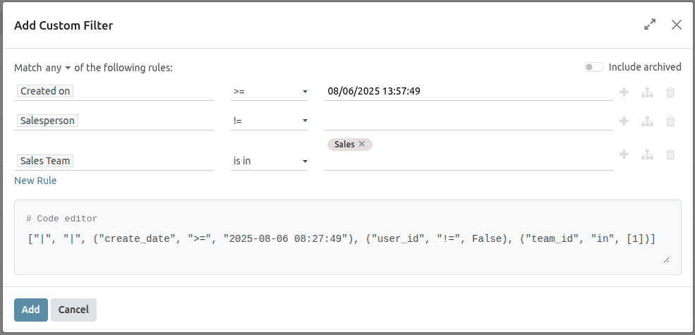
To create an unattended leads report, first navigate to CRM app ‣ Reporting ‣ Pipeline to open the Pipeline Analysis dashboard. Click into the Search… bar at the top of the page, and remove all of the default filters.
Next, add custom filters by clicking the 🔻(triangle pointed down) icon to the right of the Search… bar to open the drop-down menu that contains Filters, Group By, and Favorites columns. Under the Filters column, click Add Custom Filter, which opens an Add Custom Filter pop-up window.
The Add Custom Filter pop-up window allows for the creation of more specific filters.
Add custom filters
In order to generate an unattended leads report, filters need to be created for the following conditions:
- Past due activities: limits the results to only include leads with an assigned activity where the due date has past. This can be altered to include activities due to occur on the date the report is generated as well.
- Unassigned leads: excludes leads without an assigned salesperson.
- Specific sales teams: limits results to only include leads assigned to one or more sales teams. This filter is optional and should not be included if the report is intended for the entire company.
Add filter for past due activities
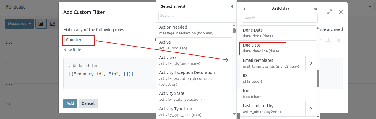
Click the first field for the new rule, and type Activities in the Search… bar, or scroll to search through the list to locate it. Then, next to Activities, click the > (greater than sign) to open a new drop-down menu with secondary conditions.
Type Due Date in the Search… bar, or scroll to search through the list. Click Due Date to add it to the rule.
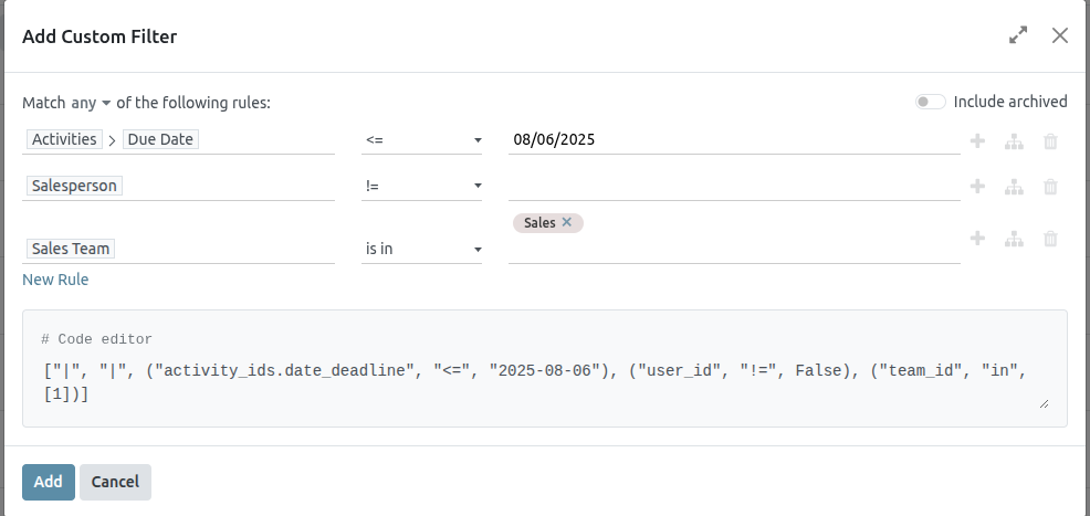
Then, click into then next field and select <= from the drop-down menu. Selecting this operator includes all activities with a due date up to, and including, the date selected in the next field.
The third field can be left as today’s date, or adjusted as needed.
Exclude unassigned leads
After filtering for activities, add a New Rule. Then, click into the first field for the new rule, and type Salesperson in the Search… bar, or scroll to search through the list to locate it.
In the rule’s second field, select is set from the drop-down menu. Selecting this operator excludes any leads not assigned to a specific salesperson.
Add a Sales team
To limit the results of the report to one or more sales teams, click New Rule. Next, click the first field for the new rule, and type Sales Team in the Search… bar, or scroll to search through the list to locate it.
In the rule’s second field, select is in from the drop-down menu. Selecting this operator limits results to the sales teams selected in the next field.
Lastly, in the third field, select the desired sales team from the drop-down menu. Multiple teams can be added in this field, where each parameter is treated with an “or” (e.g. “any”) operator in the search logic.
View results
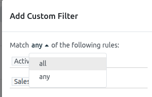
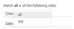
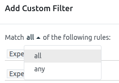
At the top of the Add Custom Filter form, there is an option to match any or all of the rules. In order to properly run the report, only records that match all of the following filters should be included. Before adding the filters, make sure all is selected in this field.
After the filters are configured, click Add. The resulting report displays all leads assigned to a salesperson where an activity is past due, or is due on the current date. The default display is a bar graph, where the leads are grouped by stage.
To group the results by salesperson, click the 🔻(triangle pointed down) icon to the right of the Search… bar to open the drop-down menu that contains Filters, Group By, and Favorites columns. Under the Group By heading, select Salesperson.
To change to a list view, click the ≣ (list) icon in the top-right corner of the screen.
Quality Leads report
A quality lead is a lead that is likely to result in a sale. It should match the characteristics most commonly believed to help salespeople close a deal, in addition to more precise criteria that is specific to each organization.
Create a quality leads report
To create a quality leads report, first navigate to CRM app ‣ Reporting ‣ Pipeline to open the Pipeline Analysis dashboard. Click into the Search… bar at the top of the page and remove any active filters.
Click the 🔻(triangle pointed down) icon to the right of the Search… bar to open the drop-down mega menu that contains Filters, Group By, and Favorites columns. Click Add Custom Filter. This opens a Add Custom Filter pop-up window.
The Add Custom Filter pop-up window allows for the creation of more specific filters.
Add custom filters
In order to generate a quality leads report, filters need to be created for the following conditions:
- Starting date: limits results to those created within a specific time frame.
- Specific sales teams: limits results to only include leads for one or more sales teams. This filter is optional and should not be included if the is intended for the entire company.
- Exclude unassigned leads: excludes leads without an assigned salesperson.
- Include archived leads: ensures that both active and inactive leads are included in the results.
- Add rules for quality leads: includes or excludes results based on criteria that is specific to a company or sales team.
Add a starting date filter
Begin by first defining the rule’s parameter with a date range, by clicking into the first field, on the left of the row, and typing Created On in the Search… bar, or by scrolling through the menu’s list to locate it.
In the rule’s operator drop-down menu, define the parameter further by selecting either:
- >= (greater than or equal to) to specify a start date and include all entries after that start date (as well as the initial value itself); or
- is between to more sharply define a time frame with a clear start and end date. All matching entries that fit within the defined start and end dates are included in the report.
With either option, use the pop-up calendar’s day and time pickers, in the far right field, to define the respective date range. Setting these values concludes the creation of the first rule.
Add a sales team filter
To limit the results of the report to one or more sales teams, click New Rule. Next, click the first field for the new rule, and type Sales Team in the Search… bar, or scroll to search through the list to locate it.
In the rule’s second field, select is in from the drop-down menu. Selecting this operator limits results to the sales teams selected in the next field.
Lastly, in the third field, select the desired sales team from the drop-down menu. Multiple teams can be added in this field, where each parameter is treated with an “or” (e.g. “any”) operator in the search logic.
Exclude unassigned leads
Next, add a New Rule. Then, click into the first field for the new rule, and type Salesperson in the Search… bar, or scroll to search through the list to locate it.
In the rule’s second field, select is set from the drop-down menu. Selecting this operator excludes any leads not assigned to a specific salesperson.
Include archived leads
Next, in the upper-right corner of the Add Custom filter pop-up window, move the Include archived toggle to active.
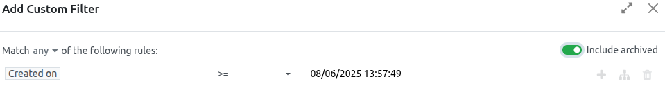
Enabling this feature adds archived (inactive) leads to the report.
Add rules for quality leads
The filters added in this step vary, based on how an organization defines a quality lead.
Define a quality lead
As defined earlier, a quality lead is a lead that is likely to result in a won opportunity. Although the exact criteria for a quality lead varies from organization to organization, it is often a combination of factors commonly attributed to positive sales outcomes, in addition to factors valued by the specific organization.
In addition to the basic filters and grouping options outlined in the general Quality leads report, consider the following filters when defining a quality lead:
- Email or Phone: the information in these fields can help determine whether or not a lead is a professional contact.
- Source: this field links to the marketing and lead generation efforts from other Saasmate applications, including Live Chat, Social Marketing, and Email Marketing.
- Stage: this filter can be used to eliminate or target leads that have reached specific stages.
- Medium: a lead’s source can indicate its quality level, as various channels have different won rates and expected revenues.
- Campaign: adding this filter helps track of the success of different marketing efforts to capture high quality leads.
- Lost Reason: exclude leads that may appear to be quality based on various criteria, but have been marked as lost for specified reasons.
- Tags: include or exclude results based on one or more customized tags.
View the report
After the filters are configured, click Add. The default display for the report is a bar graph, where the leads are grouped by stage.
To group the results by salesperson, click the 🔻(triangle pointed down) icon to the right of the Search… bar to open the drop-down mega menu. Under the Group By heading, select Salesperson. In the same column, under the Group By heading, click Add a Custom Group, then select Active on the resulting drop-down menu to layer in lead status, under the parent Salesperson grouping.
The report now displays the total count of quality leads each salesperson has received in the designated time period. Because there are layered Group By filters, the grouped leads are also color-coded to identify whether they are active or marked as lost.
Marketing Attribution Reports
Use the Saasmate CRM app to compile a marketing attribution report, which analyzes the source of leads, and groups them in such a way as to calculate marketing’s overall impact on lead generation, attribution, won rate, and more.
Leads Analysis dashboard
Begin by navigating to the Leads Analysis dashboard by going to CRM app ‣ Reporting ‣ Leads.
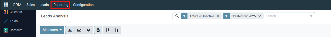
The (graph) view is shown, by default, with Active or Inactive and Created on: [current year] filters active in the Search… bar. The graph visualization displays the number of leads generated, by month and by sales team, with each sales team attributed to its own color per month shown.
Switch the view to the (list) option, by clicking the respective icon located at the top-right of the dashboard. This allows leads to easily be displayed in the grouping set by the Group By parameters.

Add UTM parameters
Urchin Tracking Modules (UTMs) are snippets of text embedded in URLs that are used to track visitor data. This includes parameters relating to how a visitor reached the link, such as the type of website visited, and/or marketing campaign the visit came from.
Saasmate can use these UTMs as parameters in the marketing attribution report to track the metrics and performance of marketing campaigns.
Create UTMs
The link tracker in Saasmate can be used to create and configure UTMs.
UTMs can also be automatically generated by the Email Marketing and Marketing Automation apps.
The UTM parameters used in a marketing attribution report are Medium, Source, and Campaign, in descending order of coverage.
- Medium is the UTM with the widest coverage, and is used to identify the medium used to access the link. This can include mediums such as social media, email, or cost per click (CPC).
- Source is more narrow, and is used to identify the source of traffic. For example, the name of a website, search engine used, or a specific social media platform.
- Campaign is the most narrow, and can track specific marketing campaigns by name. This can include a contest or product name, type of sale, etc.
Create reports
To start creating a report, click the (down arrow) to the right of the Search… bar to see the list of filtering and grouping parameters.
Filters, located in the left column of the search options, can be used to keep only the results that fit the filter. For example, selecting the Won filter only shows leads that have been won in the attribution report.
Group By, found in the middle column, is used to organize the results into groups, and can be used with or without filters.
Export reports
To set the measures of the report, begin by navigating to the (pivot view) on the Leads Analysis dashboard.
Click the Measures button to view the available measures of the report. Select the desired measures from the drop-down menu (multiple measures can be selected), and verify the measures, filters, and groups are all displayed correctly in the pivot table. This ensures the data is ready for export.
To quickly export the data in a list, as a .xlsx file, navigate to the =(list view). Click on the Actions (gear) icon, located to the right of Lead Analysis in the top-left of the page, and click Export All. The report downloads automatically as a .xlsx file.
For more export options, the report can be exported to the Saasmate Documents app. From the (list view) of Leads Analysis page, begin by clicking the Actions (gear) icon again. Now, navigate to Spreadsheet, and click Insert list in spreadsheet. A pop-up window titled, Select a spreadsheet to insert your list. appears.
The report can be renamed using the Name of the list field, if desired. The number of items on the report can be set with the field labeled: Insert the first _ records of the list. Next, select either a new Blank spreadsheet, or export into an existing spreadsheet. Finally, click the Confirm button.
To export the report as a .xlsx file, for use in an external spreadsheets program, click the Actions (gear) icon, and select the Export All option. If prompted, choose a file location, name the file, then click Save.
Lead Distribution Report
A lead distribution report can be used to see if active leads are being assigned equitably across sales members. It can also be used to view the distribution of good or quality leads , and see how frequently each salesperson is receiving (and keeping) leads.
Lead distribution reports can be run each week to help keep salespeople on track, while providing them with ample good leads. These reports can also be used to see whether sales members are staying productive, if good leads are being lost too often by one salesperson, and what percentage of good leads are being retained overall.
Create lead distribution reports
To create a lead distribution report, first navigate to CRM app ‣ Reporting ‣ Pipeline, which reveals the Pipeline Analysis dashboard.
Remove all the default filters in the search bar at the top of the page. Doing so displays data related to all leads.
Custom filters can now be added by clicking the (down caret) icon, to the right of the search bar, to reveal a drop-down menu of search and filter options.
Three columns are displayed: Filters, Group By, and Favorites. To begin, navigate to the bottom of the Filters column, and click Add Custom Filter. This opens an Add Custom Filter pop-up window, where the essential filters can be added one at a time.
Essential filters
The following filter conditions are used to create a basic lead distribution report. Together they gather all leads created within a certain timespan that have an associated contact method and have been assigned to a sales team.
Lead creation date
Click the first field, under Match any of the following rules: , that has the value Country in it. In the popover that appears, type Created on in the search bar, or scroll to search through the list to locate and select it.
Then, in the second field of that row, select >= from the drop-down menu. This operator only includes values greater than (or equal to) the value in the third, rightmost field.
The third field on the Add Custom Filter pop-up window should contain the earliest date leads are selected from.
Sales team
Click New rule to add another row to the form, and choose Sales Team for this rule’s parameter. Then, click the second field of the new rule, and select contains from the drop-down menu. Selecting this operator filters for any records that contain the words in the third, rightmost field.
In this third field, enter the name of the desired sales team(s) that are to be included in the report. It is important for all contains argument values to be specific enough and spelled correctly as they exist in Saasmate, otherwise this risks returning multiple (or zero) values.
Click the default any menu item and be sure the all option is chosen instead. This setting will only show records that match all the rules contained inside the form.
Contact method
Add another New rule to the form and set the first field to the first field to Phone. Then, select is set from the drop-down menu in the second field. Selecting this operator only filters for records that have a phone number associated with the lead.
Alternatively (or in addition to the above rule), click New rule and set the first field to Email. Then, select is set from the drop-down menu in the second field.
These rules add only leads with an associated contact method to the report.
Active status
Click the (Add branch) icon to the right of the Phone is set line, to add a new rule that branches from the rules above.
Two horizontal sets of fields appear below a line showing any of: option. This setting filters for records that match any of the rules contained inside. This uses the same logic as an OR (|) logical operator.
Set the first field to Active. Then, select is set in the next field.
Next, click the (Add New Rule) button next to Active is set to create a new line of fields beneath it.
Set the first field to Active. Then, select is not set in the next field.
Group by
Once all filters are set, click the Add button to add these filters to the search bar. To have the report grouped appropriately, click the (down caret) icon, to the right of the search bar, and click Salesperson in the Group By section. All results are now grouped by the salesperson assigned to each lead.
Once the rules for the filter are set, click the purple Confirm button at the bottom of the pop-up menu to save the custom filter and close the pop-up menu.
The Pipeline Analysis dashboard is now displayed again with each filter rule in the search bar.
Click the (Graph) icon, to the right of the search bar, to view the report as a bar chart. Alternatively, click the (List) icon to view leads in a grouped list.
Filter for quality leads
The following additional conditions are provided as an example of a good, but not comprehensive, set of rules for finding quality leads. These filters should be applied on top of the Essential filters in the order specified to achieve a heavily-detailed filter.
- Referred-by:Filter for referrals, such as by appointment or sales member.
- Source:Filter for specific source UTMs, such as Facebook or LinkedIn.
- Notes:Filter for internal notes.
- Tags:Filter for categorical tags.
- Email:Filter for specific email domains, such as gmail.com or yahoo.com.
- Salesperson:Filter for leads associated with certain sales members.
Pipeline Analysis
The CRM app manages the sales pipeline as leads/opportunities move from stage to stage, origination to sale (Won) or archival (Lost).
After organizing the pipeline, use the search options and reports available on the Pipeline Analysis page to gain insight into the effectiveness of the pipeline and its users.
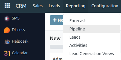
To access the Pipeline Analysis page, go to CRM app ‣ Reporting ‣ Pipeline.
Navigate the pipeline analysis page
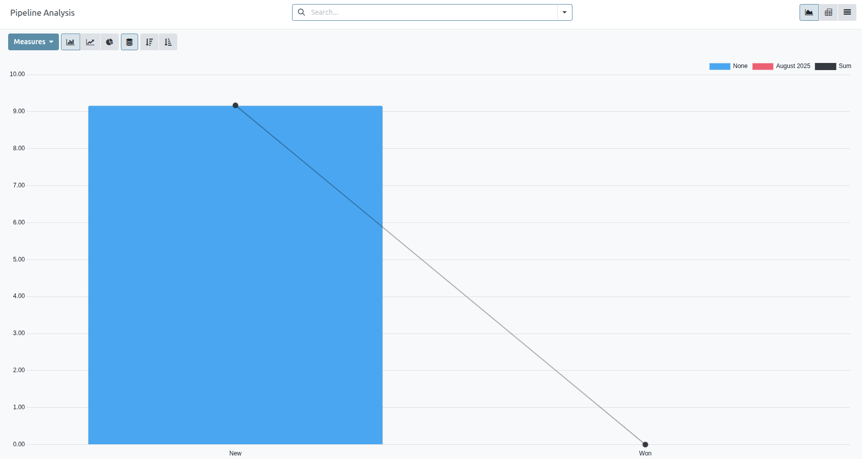
Upon accessing the Pipeline Analysis page, a bar graph showcasing the leads from the past year automatically populates. The bars represent the number of leads in each stage of the sales pipeline, color-coded to show the month the lead reached that stage.
The interactive elements of the Pipeline Analysis page manipulate the graph to report different metrics in several views. From left-to-right, top-to-bottom, the elements include:
-
Actions: represented by the ⚙️ (gear) icon, located next to the Pipeline Analysis page title.
When clicked, a drop-down menu appears with three options, each with their own sub-menu:
Knowledge, Dashboard, Spreadsheet. (See Save and share reports for more information)
- The Knowledge option is for linking to or inserting the graph in a Knowledge app article.
- The Dashboard option is for adding the graph to a dashboard in the Dashboards app.
- The Spreadsheet option is for linking the graph in a spreadsheet in the Documents app.
- Search… bar: shows the filters and groupings currently being applied to the graph. To add new filters/groups, type them into the search bar, or click the ⬇️ (down arrow) icon, at the end of the bar, to open a drop-down menu of options. (See Search Options for more information)
In the upper-right corner, there are view options represented by different icons. (See View Options for more information)
In the upper-right corner, there are view options represented by different icons. (See View Options for more information)
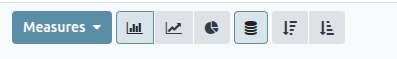
- Graph view: displays the data in a bar graph. This is the default view.
- Pivot view: displays the data in a customizable, categorized metrics table.
- Cohort view: displays and organizes the data, based on their Created on and Closed Date week (default), day, month, or year.
- List view: displays the data in a list.
Located on the far-left side of the page, beneath the Pipeline Analysis page title, there are more configurable filter and view options.
- Measures: opens a drop-down menu of different measurement options that can be seen in the graph, pivot, or cohort view. The Measure drop-down menu is not available in the list view. (See Measurement Options for more information)
- Insert in Spreadsheet: opens a pop-up window with options for adding a graph or pivot table to a spreadsheet in the Documents app or a dashboard in the Dashboards app. This option is not available in the cohort or list view.
With the graph view selected, the following options are available:
- Bar Chart: switches the graph to a bar chart.
- Line Chart: switches the graph to a line chart.
- Pie Chart: switches the graph to a pie chart.
- Stacked: when selected, the results of each stage of the graph are stacked on top of each other. When not selected, the results in each stage are shown as individual bars.
- Descending: re-orders the stages in the graph in descending order from left-to-right. Click the icon a second time to deselect it. Depending on the search criteria, this option may not be available.
- Ascending: re-orders the stages in the graph in ascending order from left-to-right. Click the icon a second time to deselect it. Depending on the search criteria, this option may not be available.
With the pivot view selected, the following options are available:
- Flip Axis: flips the X and Y axis for the entire table.
- Expand All: when additional groupings are selected using the ➕ (plus sign) icons, this button opens those groupings under every row.
- Download xlsx: downloads the table as an Excel file.
Search options
The Pipeline Analysis page can be customized with various filters and grouping options.
To add new search criteria, type the desired criteria into the search bar, or click the ⬇️ (down arrow) icon, next to the search bar, to open a drop-down menu of all options. See the sections below for more information on what each option does.
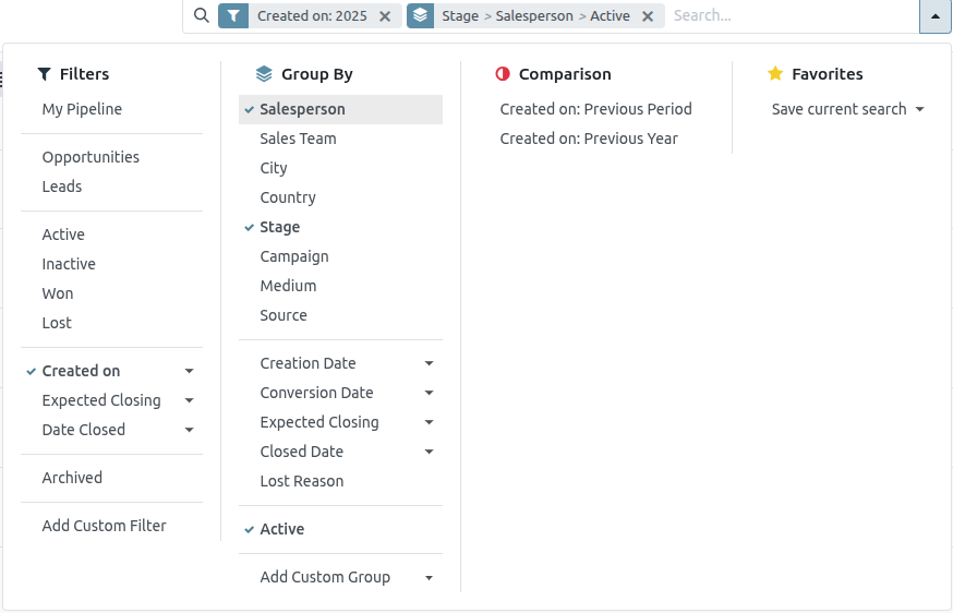
Filters
The Filters section allows users to add pre-made and custom filters to the search criteria. Multiple filters can be added to a single search.
- My Pipeline: show leads assigned to the current user.
- Opportunities: show leads that have been qualified as opportunities.
- Leads: show leads that have yet to be qualified as opportunities.
- Active: show active leads.
- Inactive: show inactive leads.
- Won: show leads that have been marked Won.
- Lost: show leads that have been marked Lost.
- Created On: show leads that were created during a specific period of time. By default, this is the past year, but it can be adjusted as needed, or removed entirely.
- Expected Closing: show leads that are expected to close (marked Won) during a specific period of time.
- Date Closed: show leads that were closed (marked Won) during a specific period of time.
- Archived: show leads that have been archived (marked Lost).
- Add Custom Filter: allows the user to create a custom filter with numerous options.
Group By
The Group By section allows users to add pre-made and custom groupings to the search results. Multiple groupings can be added to split results into more manageable chunks.
- Salesperson: groups the results by the Salesperson to whom a lead is assigned.
- Sales Team: groups the results by the Sales Team to whom a lead is assigned.
- City: groups the results by the city from which a lead originated.
- Country: groups the results by the country from which a lead originated.
- Company: groups the results by the company to which a lead belongs (if multiple companies are activated in the database).
- Stage: groups the results by the stages of the sales pipeline.
- Campaign: groups the results by the marketing campaign from which a lead originated.
- Medium: groups the results by the medium (Email, Google Adwords, Website, etc.) from which a lead originated.
- Source: groups the results by the source (Search engine, Lead Recall, Newsletter, etc.) from which a lead originated.
- Creation Date: groups the results by the date a lead was added to the database.
- Conversion Date: groups the results by the date a lead was converted to an opportunity.
- Expected Closing: groups the results by the date a lead is expected to close (marked “Won”).
- Closed Date: groups the results by the date a lead was closed (marked “Won”).
- Lost Reason: groups the results by the reason selected when a lead was marked “Lost.”
- Add Custom Group: allows the user to create a custom group with numerous options.
Comparison
The Comparison section allows users to add comparisons to the same search criteria over another period of time.
This option is only available if the search includes time-based filters, such as Created On, Expected Closing, or Date Closed. While multiple time-based filters can be added at once, only one comparison can be selected at a time.
- Previous Period:adds a comparison to the same search criteria from the previous period.
- Previous Year:adds a comparison to the same search criteria from the previous year.
Favorites
The Favorites section allows users to save a search for later, so it does not need to be recreated every time.
Multiple searches can be saved, shared with others, or even set as the default for whenever the Pipeline Analysis page is opened.
- Save current search: save the current search criteria for later.
- Default filter: when saving a search, check this box to make it the default search filter when the Pipeline Analysis page is opened.
- Shared: when saving a search, check this box to make it available to other users.
Add custom filters and groups
In addition to the pre-made options in the search bar, the Pipeline Analysis page can also utilize custom filters and groups.
Custom filters are complex rules that further customize the search results, while custom groups display the information in a more organized fashion.
To add a custom filter:
- On the Pipeline Analysis page, click the down arrow icon next to the Search... bar.
- In the drop-down menu, click Add Custom Filter.
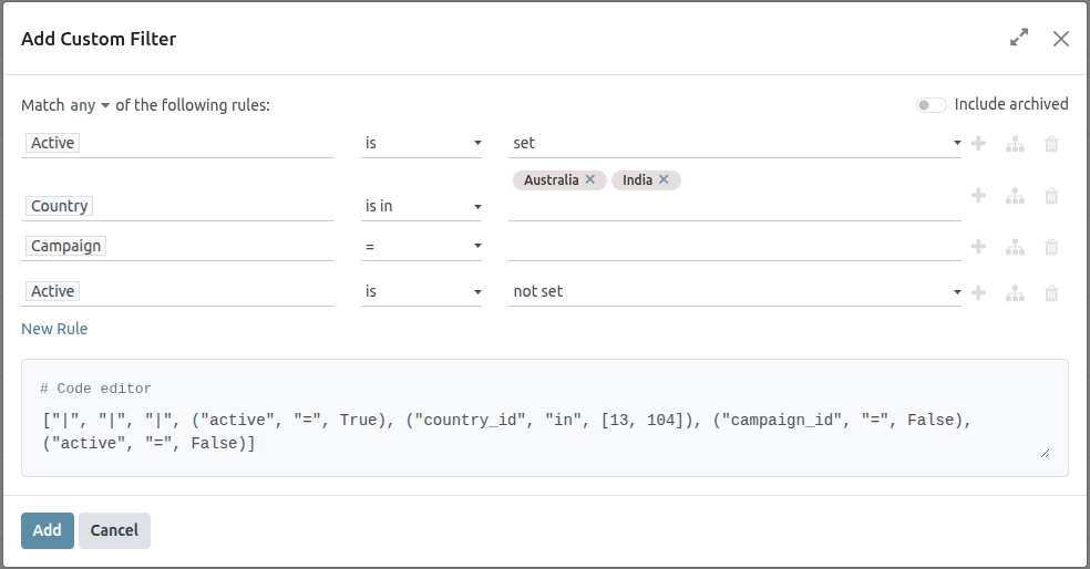
- The Add Custom Filter pop-up window appears with a default rule (Country is in _____) comprised of three unique fields. These fields can be edited to make a custom rule, and multiple rules can be added to a single custom filter.
- To edit a rule, start by clicking the first field (Country), and select an option from the drop-down menu. The first field determines the primary subject of the rule.
- Next, click the second field, and select an option from the drop-down menu. The second field determines the relationship of the first and third fields, and is usually an "is" or "is not" statement, but can also be "greater than" or "less than" statements, and more.
- Finally, click the third field, and select an option from the drop-down menu. The third field determines the secondary subject of the rule.
-
With all three fields selected, the rule is complete.
- To add more rules: click New Rule and repeat steps 4–7, as needed.
- To delete a rule: click the 🗑️ (trash) icon to the right of the rule.
- To duplicate an existing rule: click the ➕ (plus sign) icon to the right of the rule.
- To create more complex rules: click the Add branch icon to the right of the rule. This adds another modifier below the rule for adding an “all of” or “any of” statement.
Once all rules have been added, click Add to add the custom filter to the search criteria.
- To remove a custom filter: click the ✖ (x) icon beside the filter in the search bar.
To add a custom group:
- On the Pipeline Analysis page, click the down arrow icon next to the search bar.
- In the drop-down menu that appears, click Add Custom Group.
-
Scroll through the options in the drop-down menu, and select one or more groups.
- To remove a custom group: click the ✖ (x) icon beside the custom group in the search bar.
Measurement options
By default, the Pipeline Analysis page measures the total Count of leads that match the search criteria, but can be changed to measure other items of interest.
To change the selected measurement, click the Measures button on the top-left of the page, and select one of the following options from the drop-down menu:
- Days to Assign: measures the number of days it took a lead to be assigned after creation.
- Days to Close: measures the number of days it took a lead to be closed (marked Won).
- Days to Convert: measures the number of days it took a lead to be converted to an opportunity.
- Exceeded Closing Days: measures the number of days by which a lead exceeded its Expected Closing date.
- Expected MRR: measures the Expected Recurring Revenue of a lead.
- Expected Revenue: measures the Expected Revenue of a lead.
- Prorated MRR: measures the Prorated Monthly Recurring Revenue of a lead.
- Prorated Recurring Revenues: measures the Prorated Recurring Revenues of a lead.
- Prorated Revenue: measures the Prorated Revenue of a lead.
- Recurring Revenues: measures the Recurring Revenue of a lead.
- Count: measures the total amount of leads that match the search criteria.
View options
After configuring filters, groupings, and measurements, the Pipeline Analysis page can display the data in a variety of ways. By default, the page uses the graph view, but can be changed to a pivot view, cohort view, or list view.
To change the pipeline to a different view, click one of the four view icons, located in the top-right of the Pipeline Analysis page.
1) Graph
The graph view is the default selection for the Pipeline Analysis page. It displays the analysis as either a: bar chart, line chart, or pie chart.
This view option is useful for quickly visualizing and comparing simple relationships, like the Count of leads in each stage, or the leads assigned to each Salesperson.
By default, the graph measures the Count of leads in each group, but this can be changed by clicking the Measures button, and selecting another option from the resulting drop-down menu.
2) Pivot view
The pivot view displays the results of the analysis as a table. By default, the table groups the results by the stages of the sales pipeline, and measures Expected Revenue.
The pivot view is useful for analyzing more detailed numbers than the graph view can handle, or for adding the data to a spreadsheet, where custom formulas can be set up, like in an Excel file.
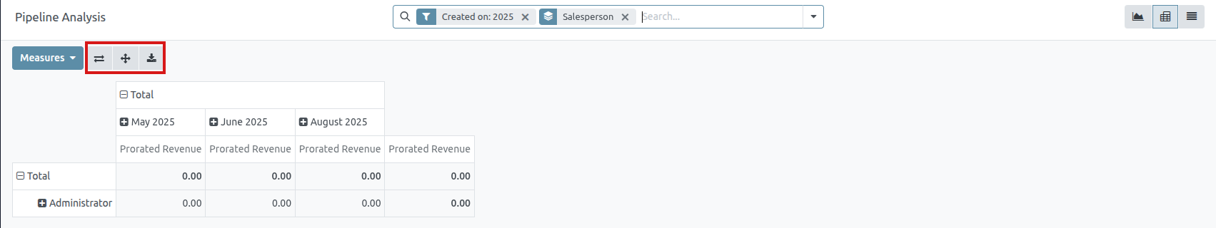
The three icons at the top-left of the page perform the following functions:
- Flip Axis: flips the X and Y axis for the entire table.
- Expand All: when additional groupings are selected using the ➕ (plus sign) icons, this button opens those groupings under every row.
- Download xlsx: downloads the table as an Excel file.
3) List view
The list view displays a single list of all leads matching the search criteria. Clicking a lead opens the record for closer review. Additional details such as Country, Medium, and more can be added to the list, by clicking the Filters icon in the top-right of the list.
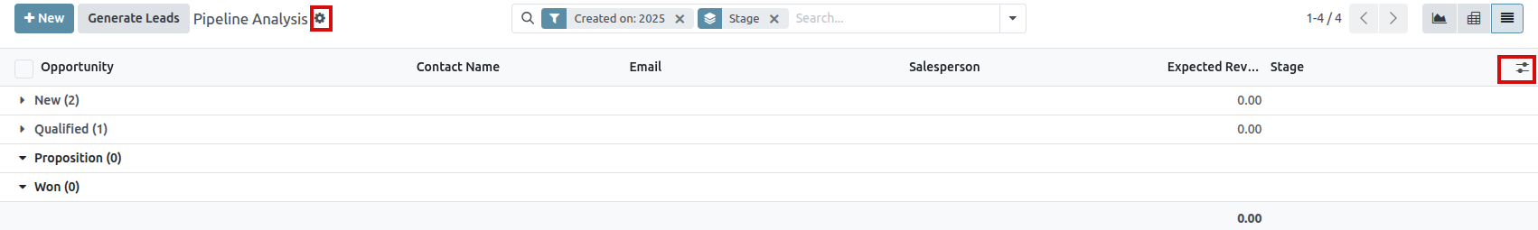
- Import records: opens a page for uploading a spreadsheet of data, as well as a template spreadsheet to easily format that data.
- Export All: downloads the list as an xlsx file for Excel.
- Knowledge: inserts a view of, or link to, the list in an article in the Knowledge app.
- Dashboard: adds the list to My Dashboard in the Dashboards app.
- Spreadsheet: links to, or inserts, the list in a spreadsheet in the Documents app.
Create reports
After understanding how to navigate the pipeline analysis page, the Pipeline Analysis page can be used to create and share different reports. Between the pre-made options and custom filter and groupings, almost any combination is possible.
Once created, reports can be saved to favorites, shared with other users, and/or added to dashboards and spreadsheets.
A few common reports that can be created using the Pipeline Analysis page are detailed below.
Win/Loss reports
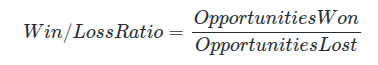
Win/Loss is a calculation of active or previously active leads in a pipeline that were either marked as Won or Lost over a specific period of time. By calculating opportunities won over opportunities lost, teams can clarify key performance indicators (KPIs) that are converting leads into sales, such as specific teams or team members, certain marketing mediums or campaigns, and so on.
A win/loss report filters the leads from the past year, whether won or lost, and groups the results by their stage in the pipeline. Creating this report requires a custom filter, and grouping the results by Stage.

Follow the steps below to create a win/loss report:
Navigate to CRM app ‣ Reporting ‣ Pipeline.
On the Pipeline Analysis page, click the ⬇️ (down arrow) icon, next to the search bar, to open a drop-down menu of filters and groupings.
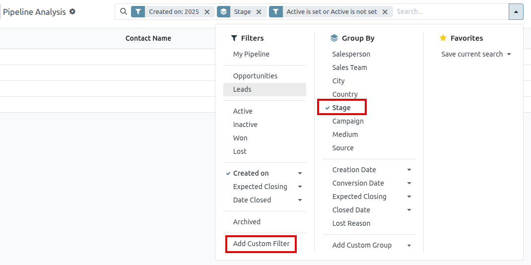
- In drop-down menu that appears, under the Group By heading, click Stage.
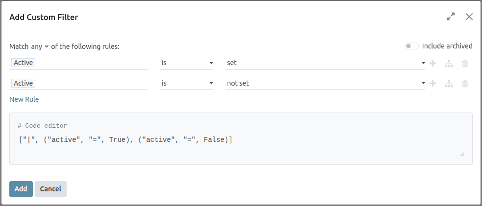
- Under the Filters heading, click Add Custom Filter to open another pop-up menu.
- In the Add Custom Filter pop-up menu, click on the first field in the Match any of the following rules: section. By default, this field displays Country.
- Clicking that first field reveals a sub-menu with numerous options to choose from. From this sub-menu, locate and select the Active option. Doing so automatically populates the remaining fields.
- The first field reads: Active. The second field reads: is. And lastly, the third field reads: set.
- In total, the rule reads: Active is set.
- Click New Rule, change the first field to Active, and the last field to not set. In total, the rule reads Active is not set.
- Click Add.
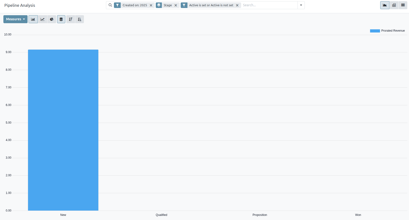
The report now displays the total Count of leads, whether “Won” or “Lost,” grouped by their stage in the CRM pipeline. Hover over a section of the report to see the number of leads in that stage.
Save To Favorites
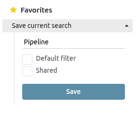
To save a report for later:
- On the Pipeline Analysis page, click the ⬇️ (down arrow) icon, next to the search bar.
- In the drop-down menu that appears, under the Favorites heading, click Save current search.
- In the next drop-down menu that appears, enter a name for the report.
- Checking the Default filter box sets this report as the default analysis when the Pipeline Analysis page is accessed.
- Checking the Shared box makes this report available to other users.
- Finally, click Save. The report is now saved under the Favorites heading.
Expected Revenue Report
Expected revenue is the total cash value of leads that are expected to close by a certain date, usually the end of the current month.
An expected revenue report compiles all active leads in a sales pipeline that have a set expected closing date, and compares how sales teams are performing in a given time frame.
By pulling a monthly expected revenue report, sales managers can see which team members are reaching their goals, and who may need additional assistance to close valuable deals.
Create an expected revenue report
To create an expected revenue report, first navigate to CRM app ‣ Reporting ‣ Pipeline . This opens the Pipeline Analysis dashboard.
On the top-left of the report, click Measures, then select Expected Revenue from the drop-down menu.
At the top of the page, click the 🔻(triangle pointed down) icon to the right of the Search… bar to open the drop-down menu that contains Filters, Group By, and Favorites columns. Under the Filters column, click Add Custom Filter, which opens an Add Custom Filter pop-up window.
Add custom filters
In order to generate an expected revenue report, filters need to be created for the following conditions:
- Expected closing date: limits results to only include leads expected to close within a specific time frame.
- Exclude unassigned leads: excludes leads without an assigned salesperson.
- Specific sales teams: limits results to only include leads assigned to one or more sales teams. This filter is optional and should not be included if the report is intended for the entire company.
Add filter for expected closing date
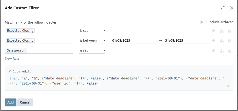
On the Add Custom Filter pop-up window, click into the first field of the new rule. Type Expected Closing into the Search… bar, or scroll to select it from the list. Click in the second field and select is set. This limits the results to only include leads where an estimated closing date is listed.
Next, click the ➕ (plus) icon to the right of the rule to duplicate it.
In the second field of the new rule, select is between from the drop-down menu. This creates a set time frame during which the expected closing date must occur for leads to be included in the results.
Click in each date field, one at a time, and use the calendar popover window to add both a start and end date to the rule. This is usually the beginning and ending of the current month, or fiscal quarter.
Exclude unassigned leads
After filtering for the expected closing date, add a New Rule . Then, click into the new rule’s first field, and type Salesperson in the Search… bar, or scroll through the list to select it. Click in the rule’s second field and select is set from the drop-down menu. This excludes any results without an assigned salesperson.
Add a filter for sales teams
To limit the results of the report to one or more sales teams, click New Rule. Next, click the first field for the new rule, and type Sales Team in the Search… bar, or scroll to search through the list to locate it.
In the rule’s second field, select is in from the drop-down menu. Selecting this operator limits results to the sales teams indicated in the next field.
Lastly, click into the third field, and either: make a selection from the complete list revealed in the popover menu, or type the first few characters of the specific sales team’s title to quickly find and select it as a parameter.
View results
At the top of the Add Custom Filter form, there is an option to match any or all of the rules. In order to properly run the report, only records that match all of the following filters should be included. Before adding the filters, make sure all is selected in this field.
View options
The expected revenue report benefits from utilizing multiple views. The default graph view can be used to identify which salespeople are expected to bring in the most revenue, while the list view and pivot view provide more detail on specific deals.
1) Graph View
The graph view is used to visualize data, and is beneficial in identifying patterns and trends.
Bar charts are used to show the distribution of data across several categories or among several salespeople.
Line charts are useful to show changing trends over a period of time.
Pie charts are useful to show the distribution, or comparison, of data among a small number of categories or salespeople, specifically how they form the meaningful part of a whole picture.
The default view for the expected revenue report is the bar chart, stacked. To change to a different graph view, click one of the icons at the top-left of the report. While both the line chart and bar chart are available in stacked view, the pie chart is not.
2) List View
The list view provides a list of all leads that are expected to close by the designated date. Clicking on a lead in list view opens the record for detailed analysis, but many insights can be gleaned from the basic view.
To switch to the list view, click the ≣ (list) icon at the top-right of the report.
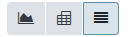
To add additional metrics to the report, click the additional options menu indicated by the toggle icon at the top-right of the list.

Select any additional metrics from the drop-down menu to add them to the list view. Some options that may be useful are Expected Closing and Probability.
3) Pivot View
The pivot view arranges all leads that are expected to close by the designated date into a dynamic table.
To switch to the pivot view, click the Pivot icon at the top-right of the report.
When the pivot view is selected for this report, the X-axis lists the stages in the pipeline, while the Y-axis defaults to group the results by their creation date. To switch these groupings, click the flip access icon (⇄) at the top of the report.
To add additional measures to the report, click the Measures button at the top-left of the report. Select any additional metrics from the drop-down menu.
To add a group to a row or column to the pivot view, click the ➕ (plus sign) next to Total, and then select one of the groups. To remove one, click the ➖ (minus sign) and de-select the appropriate option.
Click Insert in Spreadsheet to add the pivot view into an editable spreadsheet format within the Dashboards app. If the Saasmate Documents app is installed, the report can be inserted into a blank or existing spreadsheet, and exported.
Forecast Report
The Forecast report in the CRM app allows users to view upcoming opportunities and build a forecast of potential sales. Opportunities are grouped by the month of their expected closing date, and can be dragged-and-dropped to adjust the deadline.
To access the Forecast report, navigate to CRM app ‣ Reporting ‣ Forecast.
Navigate the forecast report
The default Forecast report includes opportunities assigned to the current user’s pipeline, and are expected to close within four months. It also shows opportunities without an assigned expected closing date. The opportunities are grouped by month in a (Kanban) view.
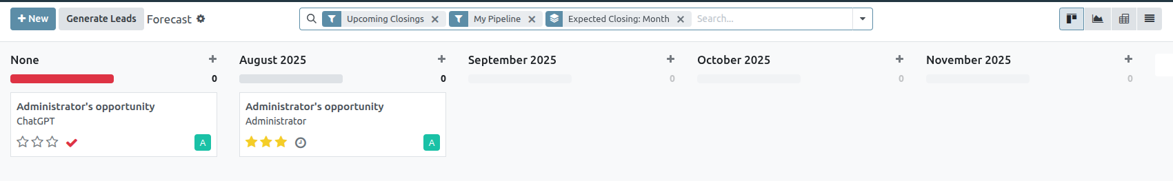
Expected closing date
Opportunities are grouped by the date assigned in the Expected Closing field on an opportunity form. To change this date directly from the Forecast page, select the Kanban card for the desired opportunity, then click and drag the card to the desired column.
After an opportunity is added to a new month, the Expected Closing field on the opportunity form is updated to the last date of the new month.
Prorated revenue
At the top of the column for each month on the Forecast reporting page, to the right of the progress bar, is a sum of the prorated revenue for that time frame.
The prorated revenue is calculated using the formula below:

As opportunities are moved from one column to another, the column’s revenue is automatically updated to reflect the change.
View results
- Click the (area chart) icon to change to graph view. Then, click the corresponding icon at the top of the report to switch to a (bar chart), (line chart), or (pie chart).
- Click the (pivot) icon to change to the pivot view, or the (list) icon to change to the list view.
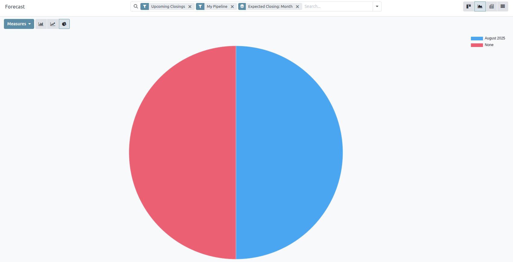
Enrich contacts with partner autocomplete
Partner autocomplete enriches the contacts database with corporate data. In any module, enter the new company name into the Customer field (partner_id technical field), and select one of the companies suggested in the drop-down menu. Instantly get valuable company information full of hard-to-find data for a desired company.
The information provided by partner autocomplete can include general information about the business (including full business name and logo), Phone number, Email, Tax ID, address and UNSPSC activities as Tags.
Configuration
Go to Settings app ‣ Contacts section. Then, activate the Partner Autocomplete feature, by ticking the checkbox beside it, and clicking Save.
Enrich contacts with corporate data
From any module, as the user is typing in the name of a new company contact, Saasmate reveals a large drop-down menu of potential match suggestions. If any are selected, the contact is then populated with corporate data related to that specific selection.
For example, after typing Saasmate, the following information populates:
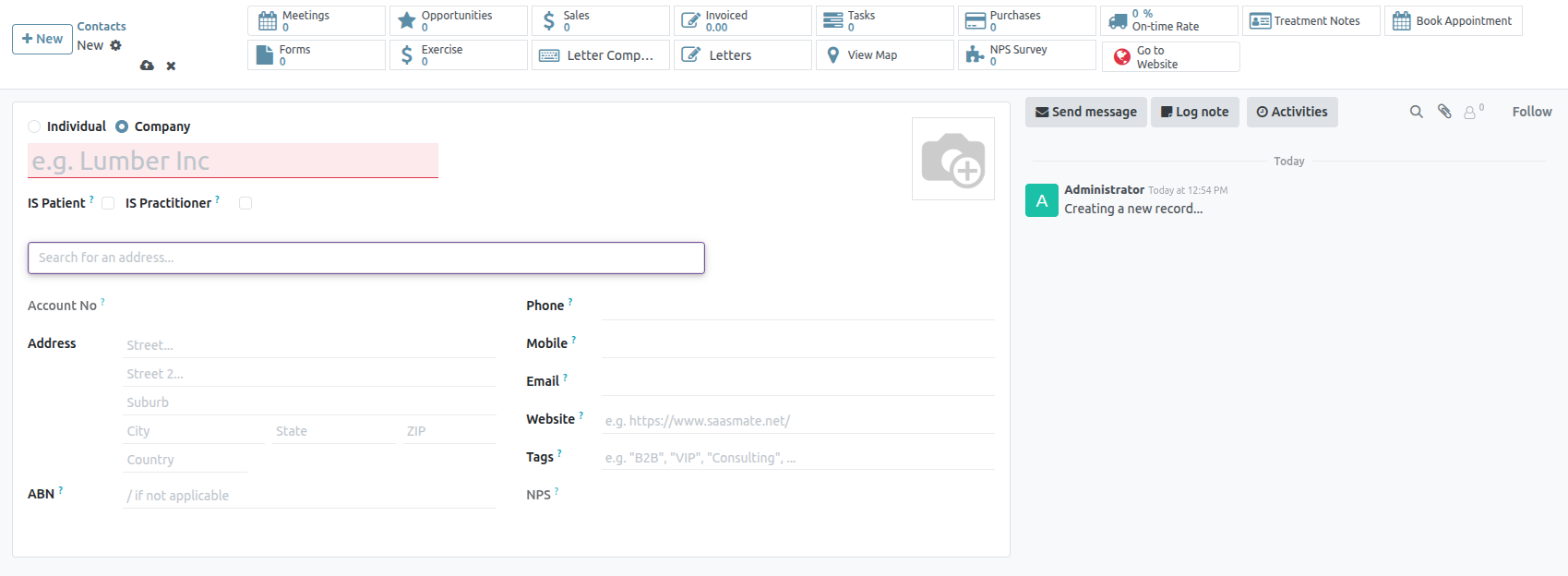
CRM Gamification
In Saasmate’s CRM app, gamification tools provide the opportunity to evaluate and motivate users through customizable challenges, goals, and rewards. Goals are created to target actions within the CRM app, and can be tracked and rewarded automatically to participating sales teams.
Configuration
To install the CRM Gamification module, navigate to the Apps application. Click into the Search… bar at the top of the page and remove the Apps filter. Type CRM Gamification to search.
On the CRM Gamification module, click Install. This module features goals and challenges related to the CRM and Sales applications.
To access the Gamification Tools menu, first enable Developer mode (debug mode).
Next, navigate to Settings app ‣ Gamification Tools.
Create badges
Badges are awarded to users when they have completed a challenge. Different badges can be awarded based on the type of task completed, and can be issued to more than one user, depending on the time they accomplish the goal.
To view the existing badges, or create a new one, navigate to Settings ‣ Gamification Tools ‣ Badges.
To create a new badge, click New at the top-left of the page to open a blank form. Enter a name for the Badge, followed by a description.
The Allowance to Grant field determines when a badge can be granted, and by whom:
- Everyone: this badge can be manually granted by any user.
- A selected list of users: this badge can only be granted by a select group of users. If this option is selected, it generates a new field, Authorized Users. Choose the appropriate users from this drop-down list.
- People having some badges: this badge can only be granted by users who have already been awarded a specific badge. If this option is selected it generates a new field, Required Badges. Use this drop-down list to select the badge(s) a user must have before they can award this badge to others.
- No one, assigned through challenges: this badge cannot be manually granted, it can only be awarded through challenges.
To limit the number of badges a user can send, tick the Monthly Limited Spending checkbox. This sets a limit on the number of times a user can grant this badge. In the Limitation Number field, enter the maximum number of times this badge can be sent per month, per person.
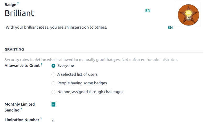
Create a challenge
To create a challenge, navigate to to Settings ‣ Gamification Tools ‣ Challenges. Click New in the top-left corner to open a blank challenge form.
At the top of the form, enter a Challenge Name.
Create assignment rules
To assign the challenge to specific users, one or more assignment rules must be utilized.
Click into the first field under Assign Challenge to, and select a parameter from the drop-down list to define the rule. Then, click into the next field to define the rule’s operator. If necessary, click into the third field to further define the parameter.
Add goals
Challenges can be based on a single goal, or can include multiple goals with different targets. To add a goal to the challenge, click Add a line on the Goals tab.
In the Goal Definition field, choose a goal from the drop-down list. The Condition field automatically updates to reflect the condition set on the goal definition.
Enter a Target for the goal based on the Suffix.
Repeat these steps for each additional goal.
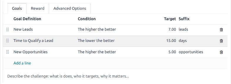
Add rewards
Next, click the Reward tab. Choose the badges to be awarded For 1st User and For Every Succeeding User by selecting them from the drop-down lists.
After setup is complete, click the Start Challenge button at the top-left of the page to begin the challenge.
Utilize activities for sales teams
Activities are follow-up tasks tied to a record in an Saasmate database. Activities can be scheduled on any page of the database that contains a chatter thread, Kanban view, list view, or activities view of an application.
Activity types
A set of preconfigured activity types is available in the CRM app. To view the list of available activity types, navigate to the CRM app ‣ Configuration ‣ Activity Types .
The preconfigured activity types for the CRM app are as follows:
- Email: adds a reminder to the chatter that prompts the salesperson to send an email.
- Call: opens a calendar link where the salesperson can schedule time to call the contact.
- Meeting: opens a calendar link where the salesperson can schedule time to have a meeting with the contact.
- To Do: adds a general reminder task to the chatter.
- Upload Document: adds a link on the activity where an external document can be uploaded. Note that the Documents app is not required to utilize this activity type.
Create a new activity type
To create a new activity type, click New at the top-left of the page to open a blank form.
At the top of the form, start by choosing a Name for the new activity type.
Activity settings
The Action field specifies the intent of the activity. Some actions trigger specific behaviors after an activity is scheduled.
- If Upload Document is selected, a link to upload a document is added directly to the planned activity in the chatter.
- If either Phonecall or Meeting are selected, users have the option to open their calendar to schedule a time for this activity.
- If Request Signature is selected, a link is added to the planned activity in the chatter that opens a signature request pop-up window.
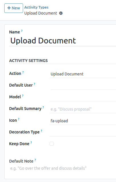
Default user
To automatically assign this activity to a specific user when this activity type is scheduled, choose a name from the Default User drop-down menu. If this field is left blank, the activity is assigned to the user who creates the activity.
Default summary
To include notes whenever this activity type is created, enter them into the Default Summary field.
Next activity
To automatically suggest, or trigger, a new activity after an activity has been marked complete, the Chaining Type must be set.
Suggest next activity
In the Chaining Type field, select Suggest Next Activity . Upon doing so, the field underneath changes to: Suggest . Click the Suggest field drop-down menu to select any activities to recommend as follow-up tasks to this activity type.
In the Schedule field, choose a default deadline for these activities. To do so, configure a desired number of Days, Weeks, or Months. Then, decide if it should occur after completion date or after previous activity deadline.
This Schedule field information can be altered before the activity is scheduled.
When all configurations are complete, click Save.
Trigger next activity
Setting the Chaining Type to Trigger Next Activity immediately launches the next activity once the previous one is completed.
If Trigger Next Activity is selected in the Chaining Type field, the field beneath changes to: Trigger. From the Trigger field drop-down menu, select the activity that should be launched once this activity is completed.
In the Schedule field, choose a default deadline for these activities. To do so, configure a desired number of Days, Weeks, or Months. Then, decide if it should occur after completion date or after previous activity deadline.
This Schedule field information can be altered before the activity is scheduled.
When all configurations are complete, click Save.
Activity tracking
To keep the pipeline up to date with the most accurate view of the status of activities, as soon as a lead is interacted with, the associated activity should be marked as Done . This ensures the next activity can be scheduled as needed. It also prevents the pipeline from becoming cluttered with past due activities.
The pipeline is most effective when it is kept up-to-date and accurate to the interactions it is tracking.
Activity plans
Activity plans are preconfigured sequences of activities. When an activity plan is launched, every activity in the sequence is scheduled automatically.
To create a new plan, navigate to CRM app ‣ Configuration ‣ Activity Plan. Click New at the top-left of the page to open a blank Lead Plans form.
Enter a name for the new plan in the Plan Name field. On the Activities to Create tab, click Add a line to add a new activity.
Select an Activity Type from the drop-down menu. Click Search More to see a complete list of available activity types, or to create a new one.
Next, in the Summary field, enter any details to describe the specifics of the activity, including instructions for the salesperson or information due upon the completion of the activity. The contents of this field are included with the scheduled activity, and can be edited later.
In the Assignment field, select one of the following options:
- Ask at launch: activities are assigned to a user when the plan is scheduled.
- Default user: activities are always assigned to a specific user.
If Default user is selected in the Assignment field, choose a user in the Assigned to field.
Launch an activity plan
To launch an activity plan on a CRM opportunity, navigate to CRM app and click on the Kanban card of an opportunity to open it.
At the top-right of the chatter, click Activities to open the Schedule Activity pop-up window.
In the Plan field, select the desired activity plan to launch. This generates a Plan summary, listing out the activities included in the plan. Select a Plan Date using the calendar popover. This updates the Plan summary with deadlines based on the intervals configured on the activity plan.
Select a user in the Assigned To field. This user is assigned to any of the activities on the plan were configured with Ask at launch in the Assignment field.
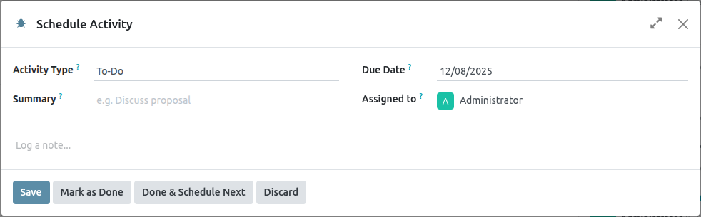
Click Schedule.
The details of the plan are added to the chatter, in addition to each of the activities.
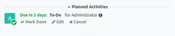
Lead Enrichment
Lead enrichment is a service that provides business information for a contact attached to a lead. Lead enrichment is an In-App Purchase (IAP) that requires credits to use, and is available for existing leads in an Saasmate database.
The information provided by lead enrichment can include general information about the business (including full business name and logo), social media accounts, Company type, Founded information, Sectors information, the number of Employees, Estimated revenue, Phone number, Timezone, and Technologies Used.
Lead enrichment set up
To set up lead enrichment in the CRM application, navigate to CRM app ‣ Configuration ‣ Settings. Then, under the Lead Generation section, tick the checkbox next to Lead Enrichment, and select either Enrich leads on demand only or Enrich all leads automatically. Click the Save button to activate the changes.
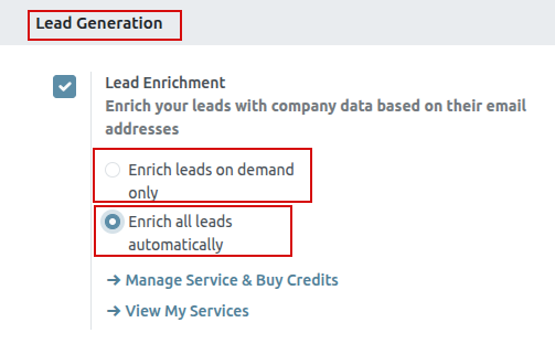
Enrich leads
Enrichment of leads is based on the domain of the email address of the customer set on the lead. There are two different ways that a lead can be enriched: automatically or manually.
Automatically enrich leads
During set up, if Enrich all leads automatically was selected on the CRM Settings page, then no action needs to be taken by the user to enrich the lead. A scheduled action runs automatically, every sixty minutes, and enrichment occurs on leads, after a remote database is contacted.
Manually enrich leads
If the Enrich leads on demand only option was selected on the CRM Settings page, when activating Lead Enrichment, each lead that a user wishes to enrich must be manually enriched. This is achieved by clicking the Enrich button in the top menu of the lead.
The same information will be retrieved at the same IAP credit cost (one per enrichment). This method of enrichment is useful when every lead does not need to be enriched, or cost is an issue.
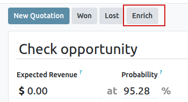
Pricing
Lead enrichment is an In-App Purchase (IAP) feature, and each enriched lead costs one credit.
To buy credits, navigate to CRM app ‣ Configuration ‣ Settings. In the Lead Generation section, under the Lead Enrichment feature, click on Buy Credits.
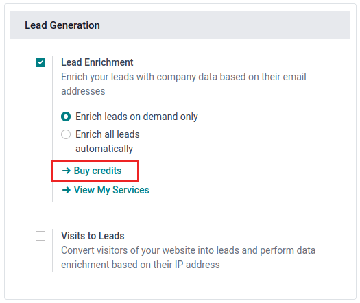
Create Quotations
In Saasmate Sales, quotations can be created and sent to customers. Once a quotation has been confirmed, it officially turns into a sales order, which can then be invoiced and paid for.
Quotation settings
To access these setting options, navigate to Sales app ‣ Configuration ‣ Settings , and scroll to the Quotations & Orders section.
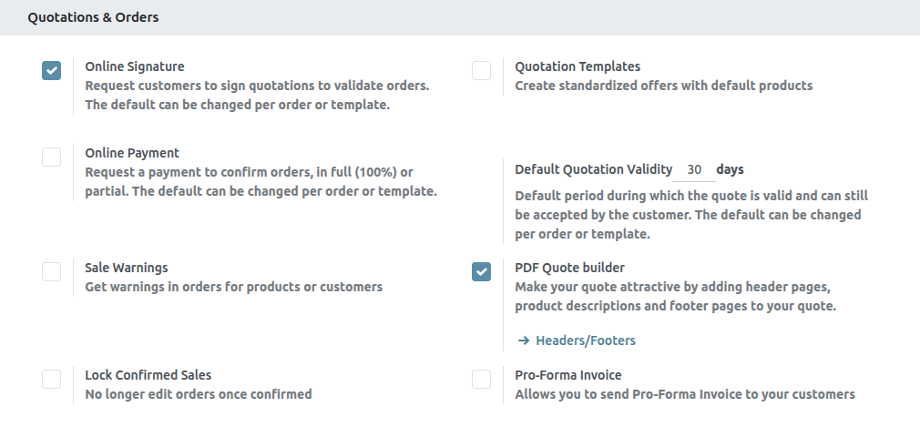
- Quotation Templates: Enable this option to create quotation templates featuring standard product offers, which are then selectable on quotation forms. When this checkbox is ticked, an additional field, Default Template, appears, along with a link to the Quotation Templates page.
- Online Signature: Request an online signature to confirm orders.
- Online Payment: Request an online prepayment from customers to confirm orders. Request a full or partial payment (via down payment). When this checkbox is ticked, an additional field, Prepayment amount (%), appears. There is also a link to the Payment Providers page.
- Default Quotation Validity: Determine a set amount (in days) that quotations can remain valid for.
- Default Recurrence: Select a default period from the drop-down menu to use as a recurrence period for a new quotation.
- Sale Warnings: Get warning messages about orders that include specific products or customers.
- PDF Quote builder: Customize the look of quotations with header pages, product descriptions, footer pages, and more.
- Lock Confirmed Sales: Ensure no further edits can be made to confirmed orders.
- Pro-Forma Invoice: Send pro-forma invoices to customers.
To activate any of these settings, tick the checkbox beside the desired option(s). Then, click Save.
Quotations dashboard
The Quotations dashboard is the page that appears when the Sales app is opened.
By default, the Quotations dashboard displays all quotations in the database related to the current user, as indicated by the default My Quotations filter present in the search bar.
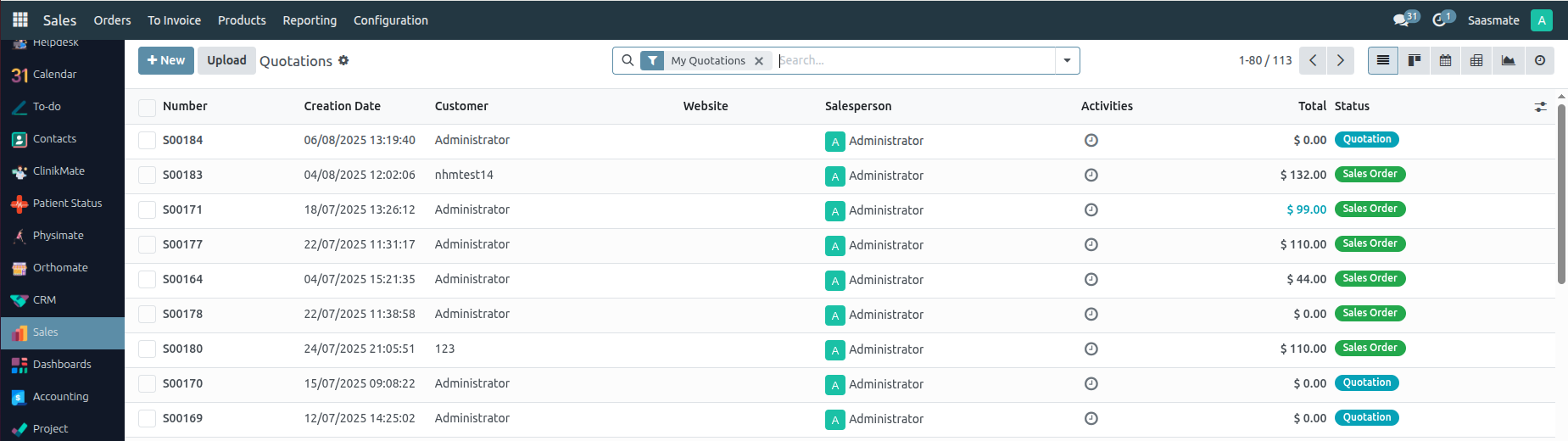
Quotations on this page appear in a default list view, but can also be viewed in a Kanban view, Calendar, Pivot table, Graph, or Activity view.
To view and/or modify any listed quotation from the Quotations dashboard, click on the desired quotation line from the list, and Saasmate reveals the specific form for that selected quotation.
Create quotation
To create a quotation, open the Sales app , and click the New button, located in the upper-left corner of the main Quotations dashboard.
Clicking the New button reveals a blank quotation form, with various fields and tabs to configure.
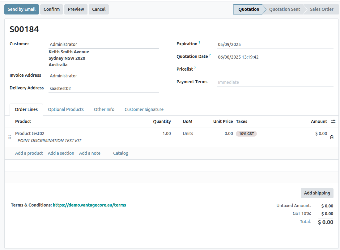
Begin by entering the customer’s name in the Customer field at the top of the form. This is a required field.
If the customer’s information is already in the database, the Invoice Address and Delivery Address fields auto-populate with the saved information for those respective fields, based on the data from that customer’s contact record (found in the Contacts application).
If the customer was referred by another customer or contact, enter their name in the Referrer field.
If a Referrer is selected, a new field, Commission Plan appears, in which a commission can be selected from the drop-down menu. This commission is rewarded to the contact selected in the Referrer field.
Next, if they have not already been auto-populated with the customer’s information, enter the appropriate addresses in the Invoice Address and Delivery Address fields. Both of these fields are required.
Then, if desired, choose a Quotation Template from the drop-down field to apply to this quotation. It should be noted that some additional fields may appear, depending on the template selected.
The default date that appears in the Expiration field is based on the number configured in the Default Quotation Validity setting (in Sales app ‣ Configuration ‣ Settings).
If the quotation is for a recurring product or subscription, select the desired Recurring Plan from that specific drop-down menu.
If desired, select a specific Pricelist to be applied to this quotation.
Lastly, select any specific Payment Terms to be used for this quotation.
Order Lines tab
The first tab on the quotation form is the Order Lines tab.
In this tab, select products, and quantities of those products, to add them to the quotation.
There are two ways to add products to the quotation from this tab.
Click Add a product, select the desired item from the Product drop-down field, and proceed to adjust the quantity of that selected product, if necessary.
Or, click Catalog to reveal a separate page, showcasing every item (and every potential product variant) in an organized catalog display, with items organizable by Product Category and Attributes.
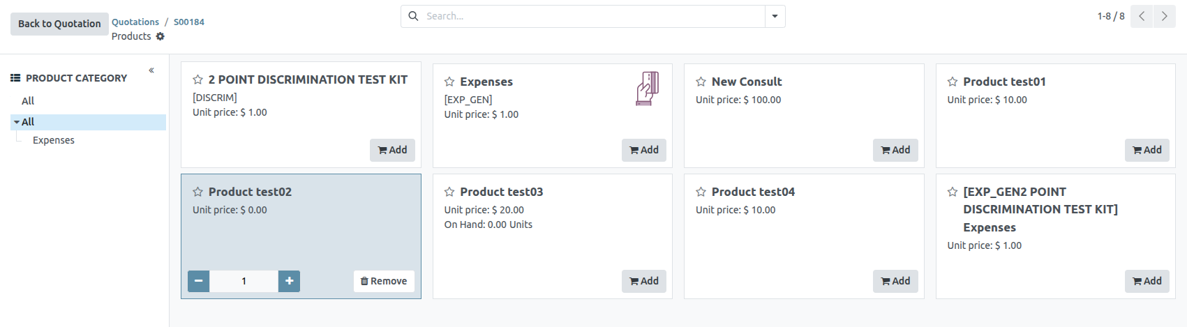
From here, simply locate the desired items, click the Add button on the product card, and adjust the quantity, if needed. When complete, click the Back to Quotation button in the upper-left corner to return to the quotation, where the newly-selected catalog items can be found in the Order Lines tab.
If multiple items should be presented in a more organized way on the quotation, click Add a section, enter a name for the section, and drag-and-drop that section heading in the desired location amongst the items in the Order Lines tab. The section heading appears in bold.
If needed, click Add a note beneath a certain product line to add a custom note about that specific product. The note appears in italics. Then, if needed, proceed to drag-and-drop the note beneath the desired product line.
Beneath the product lines, there are buttons that can be clicked to apply any of the following: Coupon Code, Promotions, Discount, and/or Add shipping.
Optional Products tab
Open the Optional Products tab to select related products that can be presented to the customer, which may result in an increased sale.
For example, if the customer wants to buy a car, an optional product that could be offered is a Trailer Hitch.
Other Info tab
In the Other Info tab, there are various quotation-related configurations separated into four different sections: Sales, Delivery, Invoicing, and Tracking.
Sales section
In the Sales section of the Other Info tab, there are sales specific fields that can be configured.
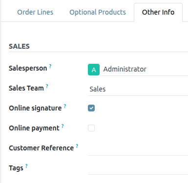
- Salesperson: Assign a salesperson from the drop-down menu to be associated with this quotation. The user who originally created the quotation is selected in this field, by default.
- Sales Team: Assign a specific sales team to this quotation. If the selected Salesperson is a member of a sales team, that team is auto-populated in the field.
- Company: Select a company from the drop-down menu this quotation should be associated with. This field only appears when working in a multi-company environment.
- Online signature: Tick this checkbox to request an online signature from the customer to confirm the order. This field only appears if the Online Signature setting has been enabled.
- Online payment: Tick this checkbox, and enter a desired percentage in the adjacent field, to request an online payment from the customer (for that designated percentage of the total amount) to confirm the order. This field only appears if the Online Payment setting has been enabled.
- Customer Reference: Enter a custom reference ID for this customer. The entered reference ID can contain letters, numbers, or a mix of both.
- Tags: Add specific tags to the quotation for added organization and enhanced searchability in the Saasmate Sales application. Multiple tags can be added, if necessary.
Delivery Section
In the Delivery section of the Other Info tab, there are delivery-specific fields that can be configured.
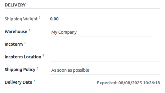
- Shipping Weight: Displays the weight of the items being shipped. This field is not modifiable. Product weight is configured on individual product forms.
- Incoterm: Select an Incoterm (International Commerical Term) to use as predefined commerical terms for international transactions.
- Incoterm Location: If an Incoterm is being used, enter the international location in this field.
- Shipping Policy: Select a desired shipping policy from the drop-down menu. If all products are delivered at once, the delivery order is scheduled, based on the greatest product lead time. Otherwise, it is based on the shortest lead time. The available options are: As soon as possible or When all products are ready.
- Delivery Date: Click into the empty field to reveal a calendar popover, from which a customer delivery date can be selected. If no custom date is required, refer to the Expected date listed to the right of that field.
Invoicing section
In the Invoicing section of the Other Info tab, there are invoicing specific fields that can be configured.
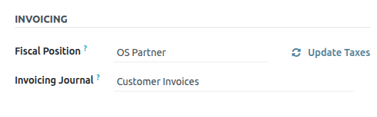
- Fiscal Position: Select a fiscal position to be used to adapt taxes and accounts for particular customers or sales orders/invoices. The default value comes from the customer. If a selection is made in this field, an Update Taxes clickable link and icon appear. When clicked, the taxes for this partiuclar customer and quotation are updated. A confirmation window appears, as well.
- Analytic Account: Select an analytic account to apply to this customer/quotation.
Tracking Section
In the Tracking section of the Other Info tab, there are tracking specific fields that can be configured.
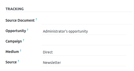
- Source Document: Enter the reference of the document that generated the quotation/sales order, if applicable.
- Opportunity: Select the specific opportunity (from the CRM app) related to this quotation, if applicable.
- Campaign: Select the marketing campaign related to this quotation, if applicable.
- Medium: Select the method by which this quotation originated (e.g. Email), if applicable.
- Source: Select the source of the link used to generate this quotation (e.g. Facebook), if applicable.
Notes tab
In the Notes tab of the quotation form, enter any specific internal notes about the quotation and/or customer, if desired.
Sending and confirming quotations
Once all the necessary fields and tabs have been configured, it is time to send the quotation to the customer for confirmation. Upon confirmation, the quotation turns into an official sales order.
At the top of the form, there is a series of buttons:
- Send by Email: When clicked, a pop-up window appears with the customer’s name and email address in the Recipients field, the quotation (and reference ID) in the Subject field, and a brief default message in the body of the email, which can be modified, if needed. Below that, a PDF copy of the quotation is attached. When ready, click Send to send the quotation, via email, to the customer, so they can review and confirm it.
- Send PRO-FORMA Invoice: This button only appears if the Pro-Forma Invoice setting has been enabled. When clicked, a pop-up window appears with the customer’s name and email address in the Recipients field, the Proforma invoice (and reference ID) in the Subject field, and a brief default message in the body of the email, which can be modified, if needed. Below that, a PDF copy of the quotation is attached. When ready, click Send to send the quotation, via email, to the customer, so they can review and confirm it.
- Confirm: When clicked, the quotation is confirmed, and the status changes to Sales Order.
- Preview: When clicked, Saasmate reveals a preview of the quotation the customer sees when they log into their customer portal. Click the Back to edit mode link at the top of the preview page, in the blue banner, to return to the quotation form.
- Cancel: When clicked, the quotation is canceled.
At this point, the quotation has been confirmed, turned into a sales order, and is now ready to be invoiced and paid for.
For more information about invoicing, refer to the Invoice based on delivered or ordered quantities
Quotation Templates
Reusable quotation templates can be made in Saasmate’s Sales app for common products or services.
By using these templates, quotations can be tailored and sent to customers at a quicker pace, without having to create new quotations from scratch every time a sales negotiation occurs.
Configuration
To use quotation templates, begin by activating the setting in Sales app ‣ Configuration ‣ Settings, and scroll to the Quotations _Orders heading.
Under the heading, tick the Quotation Templates checkbox. Doing so reveals a new Default Template field, in which a default quotation template can be chosen from the drop-down menu.
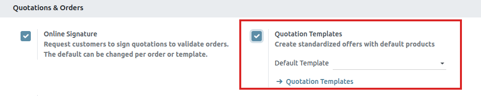
Upon activating the Quotation Template feature, an internal Quotation Templates link appears beneath the Default Template field.
Clicking this link reveals the Quotation Templates page, from which templates can be created, viewed, and edited.
Before leaving the Settings page, do not forget to click the Save button to save all changes made during the session.
Create quotation templates
To create a quotation template, click the Quotation Templates link on the Settings page once Quotation templates are enabled, or navigate to Sales app ‣ Configuration ‣ Quotation Templates. Both options reveal the Quotation Templates page, where quotation templates can be created, viewed, and edited.
To create a new quotation template, click the New button, located in the upper-left corner. Doing so reveals a blank quotation template form that can be customized.
Start by entering a name for the template in the Quotation Template field.
Then, in the Quotation Validity field, designate how many days the quotation template will remain valid for, or leave the field on the default 0 to keep the template valid indefinitely.
Next, in the Confirmation Mail field, click the blank drop-down menu to select a preconfigured email template to be sent to customers upon confirmation of an order.
If working in a multi-company environment, use the Company field to designate to which company this quotation template applies.
If a journal is set in the Invoicing Journal field, all sales orders with this template will invoice in that specified journal. If no journal is set in this field, the sales journal with the lowest sequence is used.
If the Online Signature and/or Online Payment features are activated in the Settings (Sales app ‣ Configuration ‣ Settings), those options are available on quotation template forms.
Check the box beside Online Signature to request an online signature from the customer to confirm an order.
Check the box beside Online Payment to request an online payment from the customer to confirm an order. When Online Payment is checked, a new percentage field appears, in which a specific percentage of payment can be entered.
Both options, Online Signature and Online Payment can be enabled simultaneously, in which case the customer must provide both a signature and a payment to confirm an order.
Lines tab
In the Lines tab, products can be added to the quotation template by clicking Add a product, organized by clicking Add a section (and dragging/dropping section headers), and further explained with discretionary information (such as warranty details, terms, etc.) by clicking Add a note.
To add a product to a quotation template, click Add a product in the Lines tab of a quotation template form. Doing so reveals a blank field in the Product column.
When clicked, a drop-down menu with existing products in the database appears. Select the desired product from the drop-down menu to add it to the quotation template.
If the desired product is not readily visible, type the name of the desired product in the Product field, and the option appears in the drop-down menu. Products can also be found by clicking Search More… from the drop-down menu.
Then, drag and drop the product to the desired position, via the six squares icon, located to the left of each line item.
To add a section, which serves as a header to organize the lines of a sales order, click Add a section in the Lines tab. When clicked, a blank field appears, in which the desired name of the section can be typed. When the name has been entered, click away to secure the section name.
Then, drag and drop the section name to the desired position, via the (six squares) icon, located to the left of each line item
To add a note, which appears as a piece of text for the customer on the quotation, click Add a note in the Lines tab. When clicked, a blank field appears, in which the desired note can be typed. When the note has been entered, click away to secure the note.
Then, drag and drop the note to the desired position, via the (six squares) icon.
To delete any line item from the Lines tab (product, section, and/or note), click the (remove record) icon on the far-right side of the line.
Optional Products tab
Using optional products is a marketing strategy that involves the cross-selling of products along with a core product. The aim is to offer useful and related products to customers, which may result in an increased sale.
Optional products appear as a section on the bottom of sales orders and eCommerce pages. Customers can immediately add them to their online sales orders themselves, if desired.
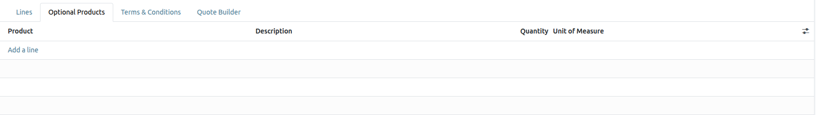
In the Optional Products tab, Add a line for each cross-selling product related to the original items in the Lines tab, if applicable.
Clicking Add a line reveals a blank field in the Product column.
When clicked, a drop-down menu with products from the database appear. Select the desired product from the drop-down menu to add it as an optional product to the quotation template.
To delete any line item from the Optional Products tab, click the (remove record) icon.
Terms & Conditions tab
The Terms & Conditions tab provides the opportunity to add terms and conditions to the quotation template. To add terms and conditions, type the desired terms and conditions in this tab.
Use quotation templates
When creating a quotation ( Sales app ‣ New ), choose a preconfigured template in the Quotation Template field.
To view what the customer will see, click the Preview button at the top of the page to see how the quotation template appears on the front-end of the website through Saasmate’s customer portal.
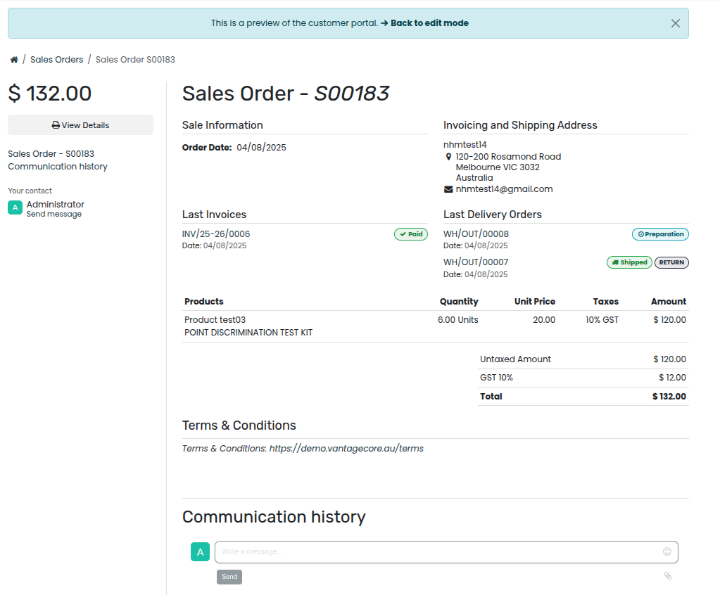
When all blocks and customizations are complete, click the Save button to save the configuration.
The blue banner located at the top of the quotation template preview can be used to quickly return Back to edit mode. When clicked, Saasmate returns to the quotation form in the back-end of the Sales application.
Mass cancel quotations/sales orders
Cancel multiple quotations (or sales orders) by navigating to the Sales app ‣ Orders ‣ Quotations dashboard, landing, by default, in the list view. Then, on the left side of the table, tick the checkboxes for the quotations to be canceled.
Then, with the desired quotations (or sales orders) selected from the list view on the Quotations page, click the Actions button to reveal a drop-down menu.
From this drop-down menu, select Cancel quotations.
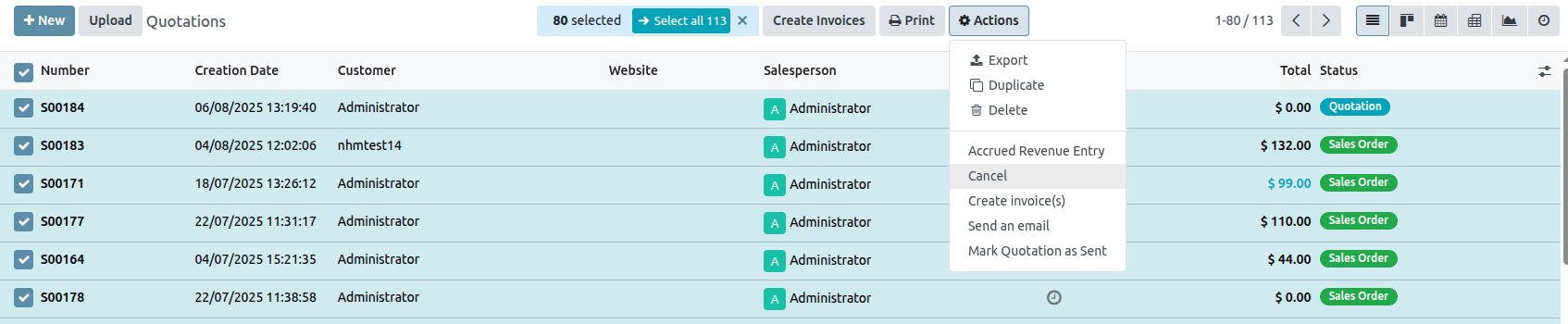
Upon selecting the Cancel quotations option, a Cancel quotations confirmation pop-up window appears. To complete the cancellation, click the Cancel quotations button.
Optional Products
The use of optional products is a marketing strategy that involves the cross-selling of products along with a core product. The aim is to offer useful and related products to customers, which may result in an increased sale.
For instance, if a customer wants to buy a car, they have the choice to order massaging seats, as well, or ignore the offer and simply buy the car. Presenting the choice to purchase optional products enhances the customer experience.
Optional products on quotations
With the Saasmate Sales application, it is possible to add or modify optional products directly on quotations by navigating to the Optional Products tab on a quotation form.
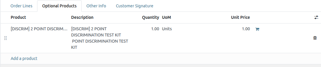
To add an optional product(s) to a quotation, click Add a product in the Optional Products tab of a quotation. Doing so reveals a blank field in the Product column.
When clicked, a drop-down menu with products from the database appear. Select the desired product from the drop-down menu to add it as an optional product to the quotation template.
To delete any line item from the Optional Products tab, click the 🗑️ (trash can) icon.
Click the Preview button, located in the upper-left corner of the quotation, to reveal a preview of the quotation customers would receive, via email, along with the optional products they can potentially add to their order, located in the Options section
Customers are able to add different optional products to an order by clicking the 🛒 (shopping cart) icon, located to the right of the optional product line.
If a customer selects optional products, these are automatically added to the quotation managed by the salesperson.
When the customer adds an optional product(s) to an order, the salesperson is instantly notified about the change, along with any other change the customer makes to an order. This allows salespeople to stay up-to-date with everything related to an order in the backend of the Sales application.
Optional products on quotation templates
For quotation templates, just like a typical quotation form, there is also an Optional Products tab, wherein related products or services can be added to a quotation template.
To add optional products to a quotation template, navigate to Sales app ‣ Configuration ‣ Quotation Templates. Then, either select an existing quotation template to edit, or create a new one by clicking New.
On the quotation template form, click the Optional Products tab. Under the Optional Products tab, click Add a line, and select the desired product to add as an optional product to the quotation template.
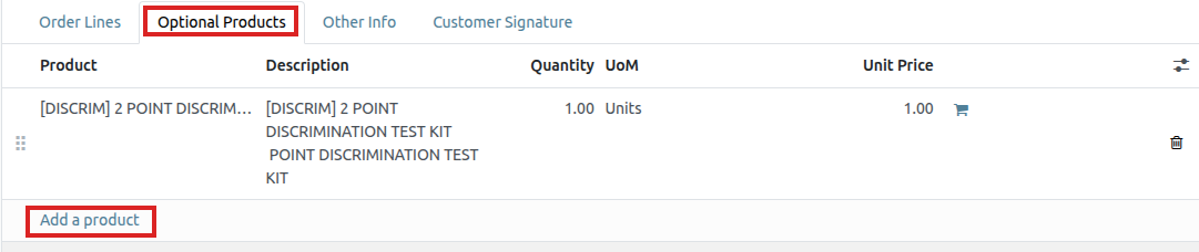
The products added in the Optional Products tab are present in the quotation, by default, whenever that particular quotation template is used. These products can be removed, and additional products can be added, before the quotation is sent to a customer.
Online Signatures for Order Confirmations
The Saasmate Sales application provides customers with the ability to confirm orders, via an online signature, directly on the sales order. Once the sales order is electronically signed by the customer, the salesperson attached to the sales order is instantly notified that the order is confirmed.
Activate online signatures
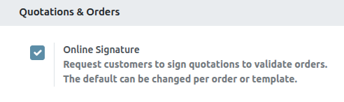
Then, click the Save button in the top-left corner.
Order confirmations with online signatures
When clients access quotations online through their customer portal, there’s a Sign & Pay button directly on the quotation.
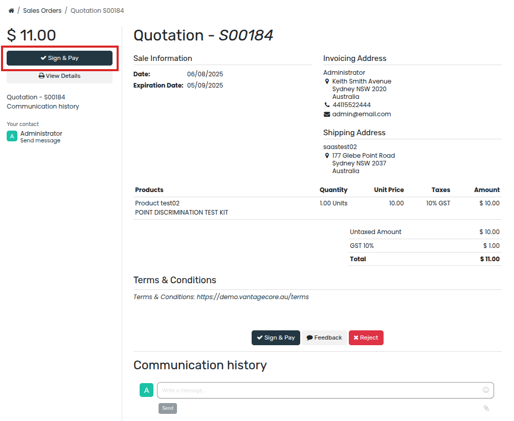
When clicked, a Validate Order pop-up window appears. In this pop-up window, the Full Name field is auto-populated, based on the contact information in the database.
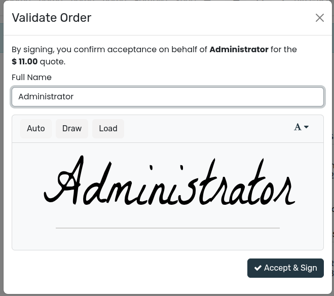
Then, customers have the option to enter an online signature with any of the following options: Auto, Draw, or Load.
Auto lets Saasmate automatically generate an online signature based on the information in the Full Name field. Draw lets the customer use the cursor to create a custom signature directly on the pop-up window. And Load lets the customer upload a previously-created signature file from their computer.
After the customer has chosen any of the three previously mentioned signature options (Auto, Draw, or Load), they will click the Accept & Sign button.
When Accept & Sign is clicked, the various payment method options become available for them to choose from (if the online payment option applies to this quotation).
Then, when the quotation is paid and confirmed, a delivery order is automatically created (if the Saasmate Inventory app is installed).
Online Payment Order Confirmation
The Saasmate Sales application provides customers with the ability to confirm orders, via an online payment, directly on a sales order. Once the sales order is electronically paid for by the customer, the salesperson attached to the sales order is instantly notified that the order is confirmed.
Activate online payments
In order to have customers confirm orders with an online payment, the Online Payment setting must be activated.
To activate the Online Payment feature, go to Sales app ‣ Configuration ‣ Settings, scroll to the Quotations & Orders heading, check the box next to the Online Payment feature, and click Save.
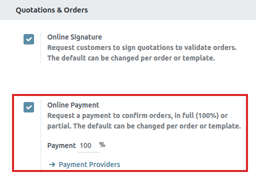
Beneath the Online Payment option on the Sales Settings page, there’s a Default Quotation Validity field. In this field, there’s the option to add a specific number of days for quotations to remain valid by default.
To enable this feature on a standard quotation, click the checkbox for the Payment feature option, located in the Online confirmation field, on the Other Info tab.
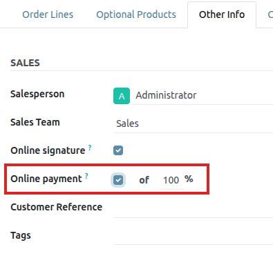
Payment providers
After activating the Online Payment feature, a link to configure Payment Providers appears beneath it.
Clicking that link reveals a separate Payment Providers page, in which a large variety of payment providers can be enabled, customized, and published.
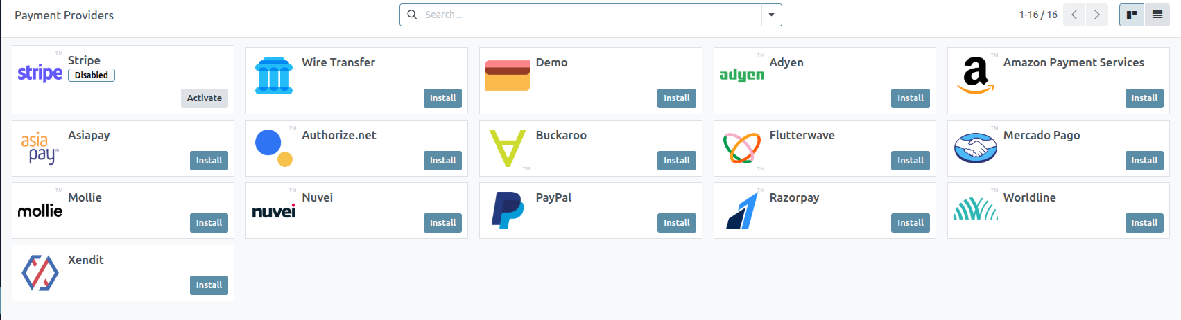
Register a payment
After opening quotations in their customer portal, customers can click Accept & Pay to confirm their order with an online payment.
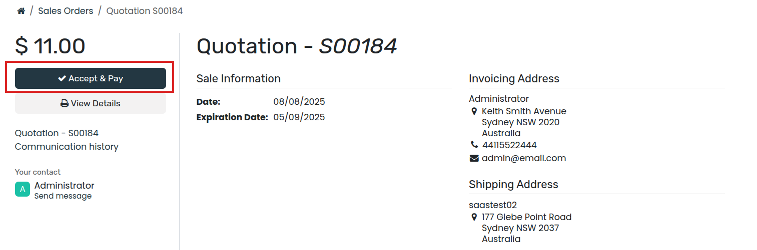
After clicking Accept & Pay , customers are presented with Validate Order pop-up window containing different options for them to make online payments, in the Pay with section.
Quotation Deadlines
In the Saasmate Sales application, it is possible to set deadlines on sales quotations. Doing so encourages customers to act quickly during sales negotiations, for they might fear for missing out on a good deal. As well, deadlines also can also act as protection for a company in case an order has to be fulfilled at a price that is no longer profitable for the business.
Quotation expiration
In Saasmate Sales, there’s the option to add an expiration date to a quotation.
To add an expiration date to a quotation, navigate to Sales app, and select a desired quotation, or create a new one by clicking New.
On the quotation form, click the Expiration field to reveal a pop-up calendar. From this pop-up calendar, select the desired month and date as the expiration date for the quotation.
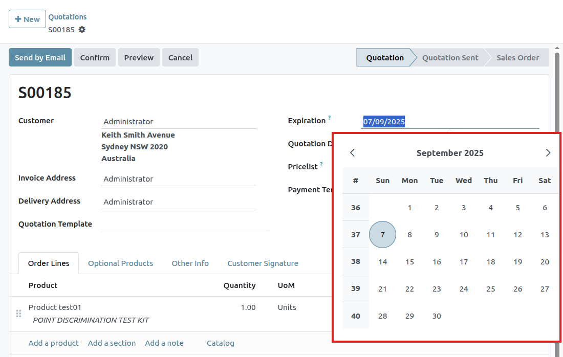
Deliveries and Invoices to Different Addresses
People and businesses often use separate addresses for billing (invoicing) and shipping (delivery) purposes. With the Saasmate Sales app, contacts can have different specified addresses for delivery and invoicing.
Settings
To properly utilize multiple addresses in Saasmate, go to Accounting app ‣ Configuration ‣ Settings, and scroll down to the Customer Invoices heading. Then, tick the checkbox.
Contact form configuration
To add multiple addresses to a contact, go to Sales app ‣ Orders ‣ Customers , and clear any default filters from the search bar. Then, click on the desired customer to open their contact form.
From the contact form, click Edit , and then select Add , which is located under the Contacts & Addresses tab. Doing so reveals a Create Contact pop-up form, in which additional addresses can be configured.
Address added to quotations
When a customer is added to a quotation, the Invoice Address and Delivery Address fields autopopulate with the corresponding addresses specified on the customer’s contact form.
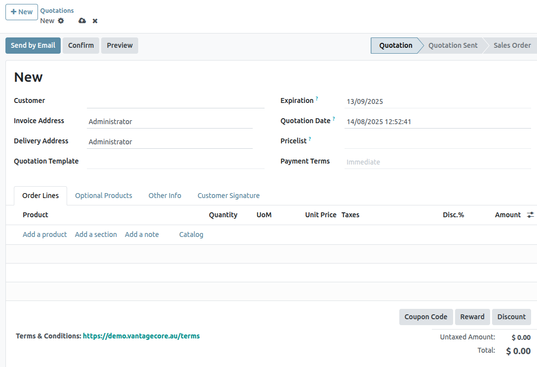
The Invoice Address and Delivery Address can also be edited directly from the quotation by clicking the Edit button, and then clicking the ➡️ (right arrow) internal link buttons next to each address line.
These addresses can be updated at any time to ensure accurate invoicing and delivery.
Product variants on quotations and sales orders
Before getting into detail about how to use product variants on quotations and sales orders, it’s recommended to learn about product variants in Saasmate.
Once familiarized with the basics surrounding product variants, the following covers how product variants can be added to quotations and sales orders using the product configurator or order grid entry.
Settings
When working with product variants, Saasmate uses the product configurator, by default. To add the variant grid entry option, that feature must be enabled in the Saasmate Sales application. The variant grid entry option provides a pop-up window on the quotation/sales order to simplify the variant selection process.
To enable that setting, go to Sales app ‣ Configuration ‣ Settings, and scroll to the Product Catalog section. Then, check the box next to the Variant Grid Entry option, and click Save.
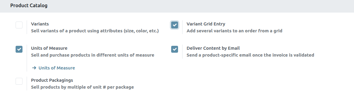
Product configuration
Once the Variant Grid Entry setting is enabled, both options (Product Configurator and Order Grid Entry) become available on every product form.
To configure a product form to use either a product configurator or variant grid entry, start by navigating to Sales app ‣ Products ‣ Products to view all the products in the database.
Then, select the desired product to configure, or click New, to create a new product from scratch. Once on the product form, click into the Attributes & Variants tab, where product variants can be viewed, modified, and added.
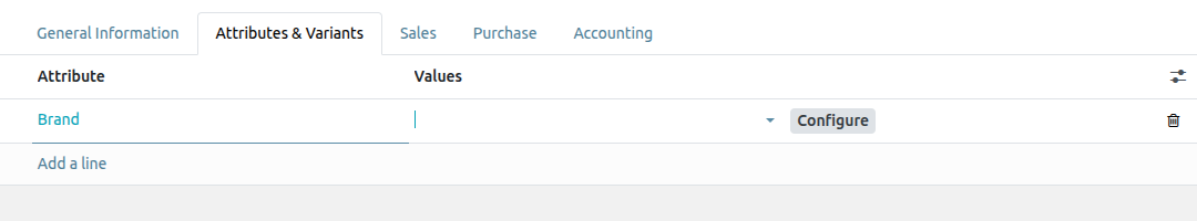
These options determine which method is used when adding product variants to quotations or sales orders.
The Product Configurator provides a pop-up window that neatly displays all the available product variants for that particular product when it’s added to a quotation. However, only one variant can be selected/added at a time.
The Order Grid Entry provides the same information as the Product Configurator in a table layout, allowing the user to select larger numbers of unique product variants, and add them to a quotation/sales order, in a single view.
Order grid entry
The order grid entry feature appears as a Choose Product Variants pop-up window, as soon as a product with (at least two) variants is added to a quotation or sales order, but only if the Order Grid Entry option is selected on its product form.
The Choose Product Variants pop-up window features all the variant options for that particular product. From this pop-up window, the salesperson can designate how many of each variant they’d like to add to the quotation/sales order at once.
When all the desired quantities and variants have been selected, the salesperson simply clicks Confirm, and those orders are instantly added to the quotation/sales order in the Order Lines tab.
PDF Quote Builder
The PDF Quote Builder in Saasmate Sales provides the opportunity to send customers a fully customized PDF file for quotes, showcasing the company and products, with various information and design elements, instead of just showing the price and total.
The PDF Quote Builder groups header pages, product descriptions, the price(s), and footer pages to create a detailed quote. It can also inject dynamic texts or custom notes in the PDF to personalize the offer for the customer.
Having a customized PDF in quotes provides a heightened conclusion to the shopping experience for customers, and adds an elegant level of professionalism to a company.
Configuration
In order to add custom PDF files for quotes, the PDF Quote builder feature must be configured.
To do that, navigate to Sales app ‣ Configuration ‣ Settings. Then, on the Settings page, scroll to the Quotations & Orders section, and locate the PDF Quote builder feature.
Add PDF as Header/Footer
In Saasmate Sales, it’s possible to add a custom PDF that can be used either as a header or a footer. When the PDF quote builder is activated in a quotation, you can then select as many headers and footers as you wish to use, these PDF will then also be inserted in the final PDF.
To add a custom PDF as header or footer, start by navigating to Sales app ‣ Configuration ‣ Headers/Footers. From this page, either click New or Upload.
Clicking Upload instantly provides the opportunity to upload the desired document. Then, the document can be further configured on the document card, or by clicking the (vertical ellipsis) icon in the top right corner of the document card, and then clicking Edit.
Clicking New reveals a blank documents form, in which the desired PDF can be uploaded via the Upload your file button on the form, located in the File Content field.
Various information and configurations related to the uploaded document can be modified here.
The first field on the documents form is for the Name of the document, and it is grayed-out (not clickable) until a document is uploaded. Once a PDF has been uploaded, the Name field is auto-populated with the name of the PDF, and it can then be edited.
Then, in the Document Type field, click the drop-down menu, and select either: Header, or Footer to define whether these files would be selectable to be at the beginning or at the end of your quote.
Under this, in the Quotation Templates section, this PDF can be restricted quotation templates only.
Lastly, beside the File Content field, you have the possibility to Configure dynamic fields.
Dynamic text in PDFs
While creating custom PDFs for quotes, use dynamic text for Saasmate to auto-fill the PDF content with information related to the quote from the Saasmate database, like names, prices, etc.
Dynamic text values are form components (text inputs) that can be added in a PDF file, and Saasmate automatically fills those values in with information related to the quote.
Dynamic text values
Below are common dynamic text values used in custom PDFs that are already mapped to the correct fields, and what they represent.
For headers and footers PDF:
- name: Sales Order Reference
- partner_id__name: Customer Name
- user_id__name: Salesperson Name
- amount_untaxed: Untaxed Amount
- amount_total: Total Amount
- delivery_date: Delivery Date
- validity_date: Expiration Date
- client_order_ref: Customer Reference
For product PDF:
- description: Product Description
- quantity: Quantity
- uom: Unit of Measure (UoM)
- price_unit: Price Unit
- discount: Discount
- product_sale_price: Product List Price
- taxes: Taxes name joined by a comma (,)
- tax_excl_price: Tax Excluded Price
- tax_incl_price: Tax Included Price
After uploading a PDF, you can then Configure dynamic fields. This will allow you to map any field name found in your PDF to the field you want to show by writing down any existing path. Headers and footers starts from the current sale_order model, whereas product document follows their path from their sale_order_line. Leaving that path empty allows you to fill a custom notes, directly from the specific quote that requires it.
Add PDF to product
In Saasmate Sales, it’s also possible to add a custom PDF to a product form. When a PDF is added to a product, and that product is used in a quotation, that PDF is also inserted in the final PDF.
To add a custom PDF to a product, start by navigating to Sales app ‣ Products ‣ Products, and select the desired product to add a custom PDF to.
On the product page, click the Documents smart button at the top of the page to navigate to a Documents page for that product, where files related to that product can be uploaded. From this page, either click New or Upload.

Clicking Upload opens the computer’s local file directory. An uploaded document can be further configured on the document card, or by clicking the (vertical ellipsis) icon in the top-right corner of the document card, and then clicking Edit.
Clicking New reveals a blank documents form, in which the desired PDF can be uploaded via the Upload your file button on the form, located in the File Content field.
PDF form configuration
The first field on the documents form is for the Name of the document, and it is grayed-out (not clickable) until a document is uploaded. Once a PDF has been uploaded, the Name field is auto-populated with the name of the PDF, and it can then be edited.
Prior to uploading a document, there’s the option to designate whether the document is a File or URL from the Type drop-down field menu.
Then, in the Sales section, in the Visible at field, click the drop-down menu, and select either: On quotation, On confirmed order, or Inside quote pdf.
- Quotation: the document is sent to (and accessible by) customers at any time.
- Confirmed order:the document is sent to customers upon the confirmation of an order. This is best for user manuals and other supplemental documents.
- Inside quote:the document is included in the PDF of the quotation, between the header pages and the Pricing section of the quote.
Beside the File Content field, you have the possibility to Configure dynamic fields. When doing so, remember that the starting model is the sale_order_line, unlike for headers and footers that start from the sale_order.
Lastly, in the E-Commerce section, decide whether or not to Publish on Website so that the PDF appears on the product page in the online store.
Invoice Based on Delivered or Ordered Quantities
Different business policies might require different options for invoicing:
- The Invoice what is ordered rule is used as the default mode in Saasmate Sales, which means customers are invoiced once the sales order is confirmed.
- The Invoice what is delivered rule invoices customers once the delivery is done. This rule is often used for businesses that sell materials, liquids, or food in large quantities. In these cases, the ordered quantity may differ slightly from the delivered quantity, making it preferable to invoice the quantity actually delivered.
Being able to have different invoicing options provides more flexibility.
Invoicing policy features
To activate the necessary invoicing policy features, go to Sales app ‣ Configuration ‣ Settings, and under the Invoicing heading, select an Invoicing Policy rule: Invoice what is ordered or Invoice what is delivered.
Invoicing policy on product form
On any product page, via the Sales app ‣ Products ‣ Products dashboard , locate the Invoicing Policy option located under the General Information tab. It can be changed manually using the drop-down menu.
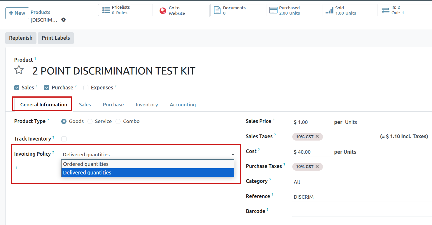
Impact on sales flow
In Saasmate Sales, the basic sales flow starts with the creation of a quotation. Then, that quotation is sent to a customer. Next, it needs to be confirmed, which turns the quotation into a sales order. This, in turn, creates an invoice.
The following is a breakdown of how invoicing policy rules impact the aforementioned sales flow:
- Invoice what is ordered: No impact on the basic sales flow. An invoice is created as soon as a sale is confirmed.
- Invoice what is delivered: Minor impact on sales flow, because the delivered quantity needs to be manually entered on the sales order. Or, the Inventory app can be installed and used to confirm the delivered quantity before creating an invoice with the Sales app.
Finally, there are a few different options to create an invoice: Regular invoice , Down payment (percentage) or Down payment (fixed amount) .
Down Payments
A down payment is an initial, up-front payment made during the confirmation of a sales transaction. Down payments reduce the risk for both parties (the seller and the buyer) as they indicate a mutual commitment to complete the sales transaction.
With a down payment, the buyer pays a portion of the total amount owed while agreeing to pay the remaining amount at a later date. In turn, the seller provides goods or services to the buyer upon or after accepting the down payment, trusting that the remaining amount will be paid later on.
In the Saasmate Sales app, down payments can be customized to fit the needs of each individual sales transaction.
Create invoices
When a sales order is confirmed, the option to create an invoice becomes available, via the Create Invoice button. When clicked, a Create invoice(s) pop-up appears.
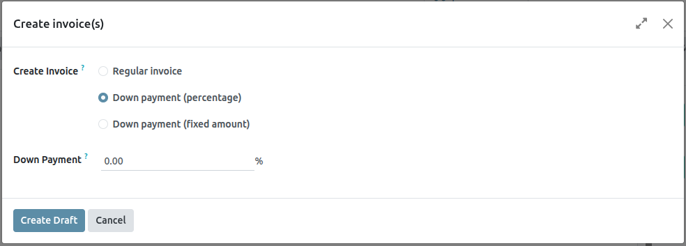
On the Create invoices pop-up, there are 3 options to choose from in the Create Invoice field:
- Regular invoice
- Down payment (percentage)
- Down payment (fixed amount)
Initial down payment request
On the Create invoice(s) pop-up window, the down payment options are:
- Down payment (percentage)
- Down payment (fixed amount)
Select the desired down payment option, then designate the desired amount, either as a percentage or a fixed amount, in the Down Payment Amount field.
Once all fields are filled in, click the Create Draft button. Upon clicking this button, Saasmate reveals the Customer Invoice Draft.
In the Invoice Lines tab of the Customer Invoice Draft, the down payment that was just configured in the Create invoices pop-up form appears as a Product.
Example: request down payment
First, navigate to Sales app ‣ New, and add a Customer to the quotation.
Then, click Add a product in the Order Lines tab, and select the Cabinet with Doors product.
When the order is confirmed (via the Confirm button), the quotation turns into a sales order. Once this occurs, create and view the invoice by clicking Create Invoice.
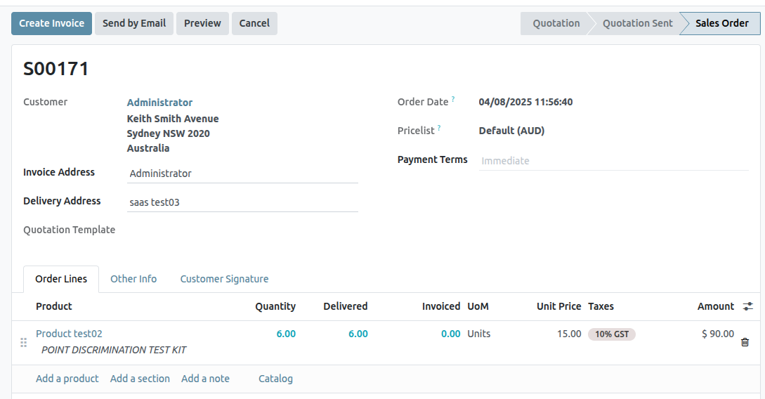
Next, on the Create invoices pop-up window that appears, select Down payment (percentage), and type 50 in the Down Payment Amount field.
Lastly, click Create Draft Invoice to create and view the invoice draft.
Clicking Create Draft Invoice reveals the draft invoice, which includes the down payment as a Product in the Invoice Lines tab.
From there, the invoice can be confirmed and posted by clicking Confirm. Confirming the invoice changes the status from Draft to Posted. It also reveals a new series of buttons at the top of the page.
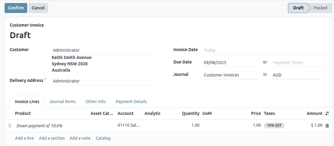
From those buttons, the payment can be registered by clicking Pay
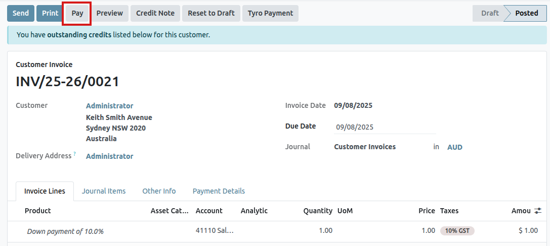
Doing so reveals a Pay pop-up form, which is auto-populated with the necessary information. Confirm the information provided is correct, and make any necessary adjustments. When ready, click the Create Payment button.
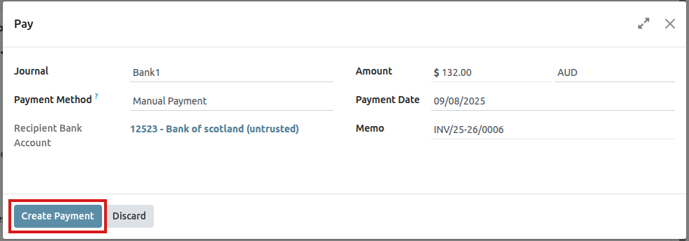
After clicking Create Payment, Saasmate reveals the customer invoice, now with a green In Payment banner in the upper-right corner.
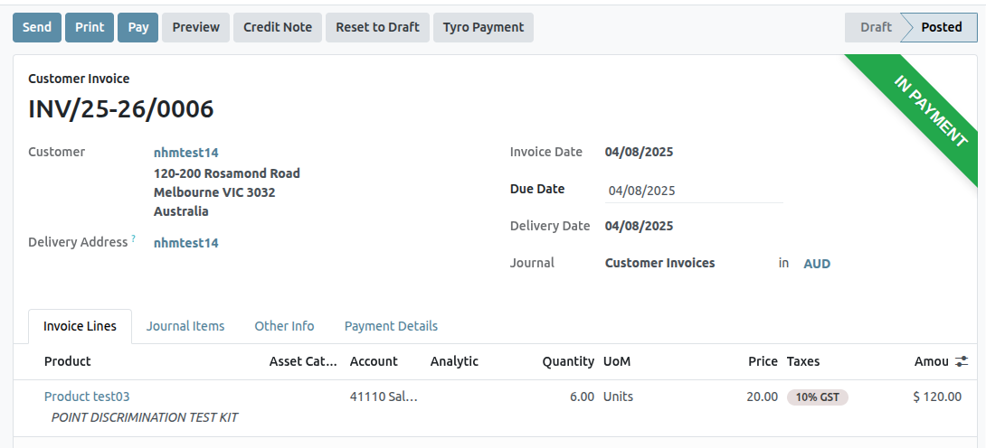
Income account modification on down payments
To change or adjust the income account attached to the Down Payment product page, the Accounting app must be installed.
Navigate to the Products page (Sales app ‣ Products ‣ Products), search for the Down Payment product in the search bar, and select it to reveal the product detail page.
With the Accounting app installed, the Accounting tab becomes available on the product page.
In the Accounting tab, the income account can be changed in the Income Account field, located in the Receivables section.
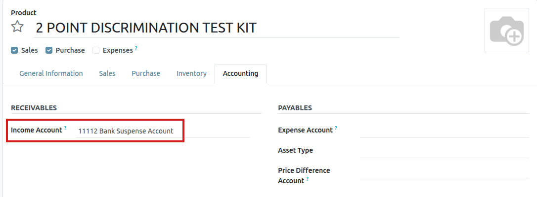
Pro-forma Invoices
A pro-forma invoice is an abridged or estimated invoice sent in advance of a delivery of goods. It notes the kind and quantity of goods, their value, and other important information, such as weight and transportation charges.
Pro-forma invoices are commonly used as preliminary invoices with a quotation. They are also used during importation for customs purposes. They differ from a normal invoice, in that they are not a demand (or request) for payment.
Configuration
In order to utilize pro-forma invoices, the Pro-Forma Invoice feature must be activated.
To enable this feature, navigate to Sales app ‣ Configuration ‣ Settings, and in the Quotations & Orders section, click the checkbox next to Pro-Forma Invoice. Then, click Save to save all changes.
Send pro-forma invoice
With the Pro-Forma Invoice feature activated, the option to send a pro-forma invoice is now available on any quotation or sales order, via the Send Pro-Forma Invoice button.
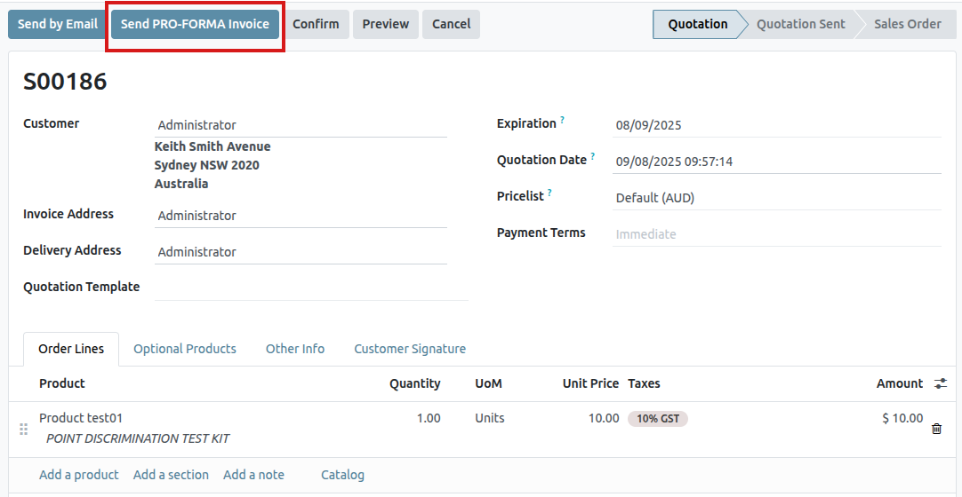
When the Send Pro-Forma Invoice button is clicked, a pop-up window appears, from which an email can be sent.
In the pop-up window, the Recipients field is auto-populated with the customer from the sales order or quotation. The Subject field and the body of the email can be modified, if necessary.
The pro-forma invoice is automatically added as an attachment to the email.
When ready, click Send, and Saasmate instantly sends the email, with the attached pro-forma invoice, to the customer.
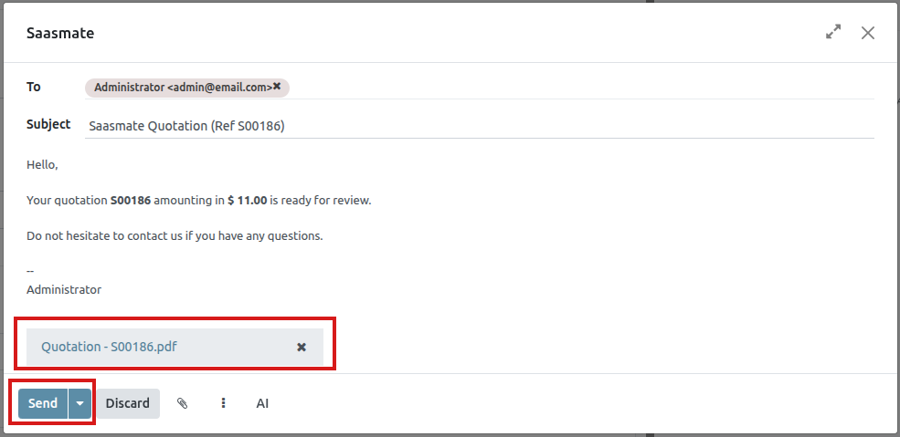
Invoicing Based on Time and Materials
Invoicing based on time and/or materials is typically used when accurately estimating the size of a project isn’t possible, or when the requirements of a project may change.
This is different from a fixed-price contract, when a customer agrees to pay a specified total for the fulfillment of the contract—no matter what needs to be paid to the employees, sub-contractors, vendors, suppliers, and so on.
The Saasmate Sales app can invoice for time and various other expenses (e.g. transport, lodging), as well as purchases needed to fulfill an order.
App and settings configuration
First, in order to accurately keep track of the progress of a project, the Saasmate Project and Accounting apps must be installed.
To install the Project app, navigate to Saasmate main dashboard ‣ Apps. Then, on the Apps page, locate the Project app block, and click Activate. The page automatically refreshes and returns to the main Saasmate dashboard, where the Project app is now available to access.
Repeat the same process to install the Accounting application.
After installation, click the Accounting app icon from the main Saasmate dashboard, and navigate to Configuration ‣ Settings. On the Settings page, scroll down to the Analytics section, and ensure the box next to Analytic Accounting is checked.
Then, click Save to save all changes.
Then, navigate to Saasmate main dashboard ‣ Project app ‣ Configuration ‣ Settings. On the Settings page, in the Time Management section, ensure the box beside the Timesheets feature is checked.
Then, click Save to save all changes.
Expenses configuration
In order to track and invoice expenses related to a sales order, the Saasmate Expenses app must be installed.
To install the Expenses app, navigate to Saasmate main dashboard ‣ Apps. Then, on the Apps page, locate the Expenses app block, and click Activate.
The page automatically refreshes and returns to the main Saasmate dashboard, where the Expenses app is now available to access.
Add expenses to sales order
To add an expense to a sales order, first navigate to the Expenses app. Then, from the main Expenses dashboard, click New, which reveals a blank expense form.
On the expense form, add a Description of the expense (e.g. Hotel Stay, Plane Ticket). Next, in the Category field, select the appropriate option from the drop-down menu (e.g. Meals, Miles, Travel & Accommodation).
Then, enter the total amount of the expense in the Total field, as well as any Included Taxes that may apply. Next, ensure that the correct Employee is selected, and designate who paid for the expense in the Paid By field: the Employee (to reimburse) or the Company.
Next, in the Customer to Reinvoice field, select the appropriate sales order from the drop-down menu. Then, select that same sales order information from the Analytic Distribution field, as well.
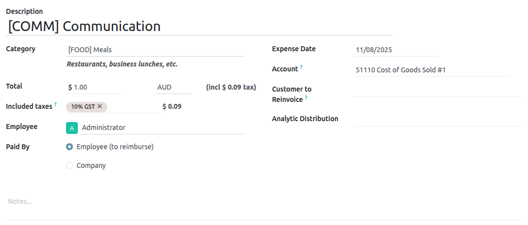
If there are any receipts that should be uploaded and attached to the expense, click the Attach Receipt button, and upload the necessary documents to the expense. This is not required, but it may affect whether or not an expense is approved.
When all the information has been entered, click Create Report to create an expense report detailing all the expense information that was just entered.
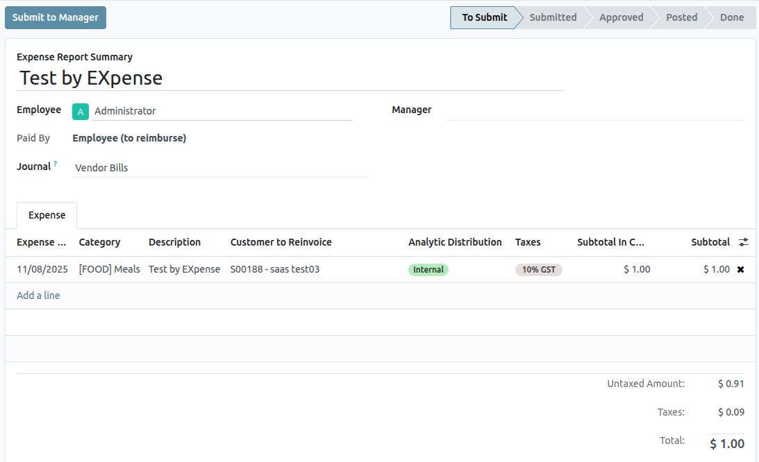
Then, there’s the option to Submit to Manager for approval. Once approved, the Report in Next Payslip appears.
To showcase a complete flow in this example, select Submit to Manager. Then, the manager would click Approve to approve this expense, and click Post Journal Entries to post this expense to the accounting journal.
Invoice expenses
To invoice a customer for an expense on a sales order, navigate to the related sales order, either from the Sales app or from the expense report in the Expenses app. From the expense report, click the Sales Orders smart button at the top of the page.
If the expense report was linked to the sales order, the newly-configured expense now has its own line in the Order Lines tab, and can be invoiced to the customer.
To invoice the customer for the expense on the sales order, click Create Invoice, select Regular Invoice from the Create invoices pop-up window, then click Create Draft Invoice.
Doing so reveals a Customer Invoice Draft for the expense. Then, the invoicing process can be completed as usual.
Reinvoice Expenses to Customers
While working on a project for a client, employees often have to spend their own money on various expenses related to the project.
For example, an employee may need to use their own money to pay for a hotel, while they provide an on-site service for a client. As a company, this expense should be reinvoiced to the customer. With Odoo, these kinds of expenses can quickly be reinvoiced to the customer related to the project.
Expenses application
To be able to reinvoice a customer for an expense, the Expenses application must be installed.
To install the Expenses application, navigate to main Saasmate dashboard ‣ Apps, and click Install on the Expenses application block. When clicked, Saasmate installs the application, refreshes the page, and returns to the main Saasmate dashboard.
Add expenses to sales orders
To begin, have a sales order confirmed in the Sales app to which a reinvoiced expense can be added. Or, create a new sales order from scratch. To do that, navigate to the Sales app ‣ New. Doing so reveals a blank quotation form.
Then, add a Customer, and add a product to the Order Lines tab, by clicking Add a product. Next, select a product from the drop-down menu.
Lastly, click Confirm to confirm the sales order.
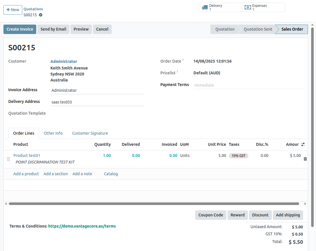
With the sales order confirmed, it’s time to create an expense.
To do that, navigate to the Expenses application, by going to main Saasmate dashboard ‣ Expenses.
Then, from the Expenses dashboard, click New to reveal a blank expenses form.
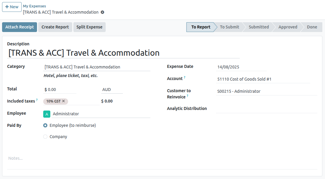
On the expenses form, add a Description to easily reference the expense.
Then, in the Category field, select one of the following options from the drop-down menu:
- Communication: any form of communication related to a project/order.
- Others: expense that doesn’t fit into any other categories.
- Meals: any form of meal costs related to a project/order.
- Gifts: any form of gift costs related to a project/order.
- Mileage: any form of mileage (gas) costs related to project/order.
- Travel & Accommodation: any travel or accommodation costs related to a project/order.
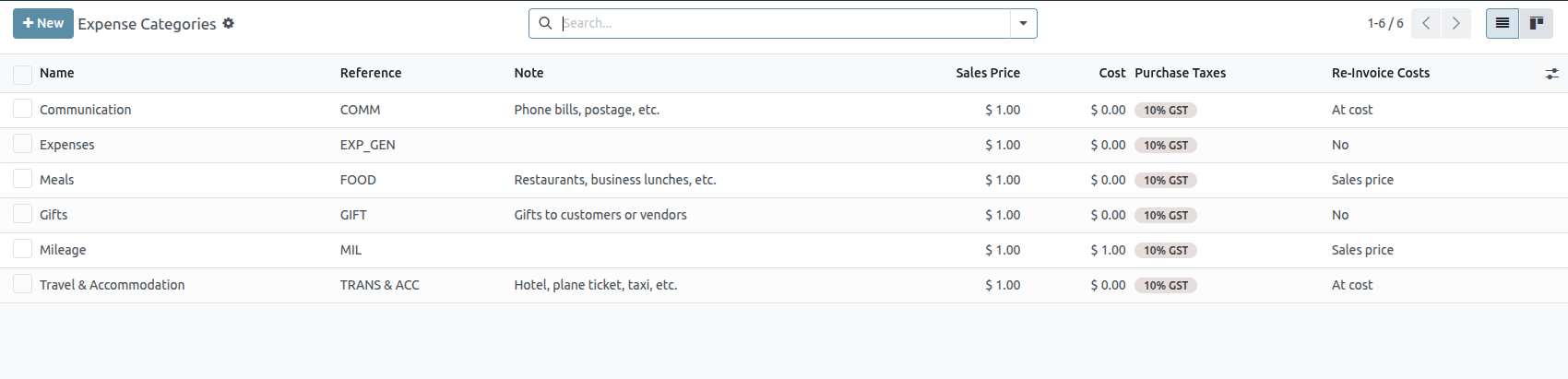
For this sample workflow, which will reinvoice a customer for a brief hotel stay, the Category for this example is [TRANS & ACC] Travel & Accommodation.
Beneath the Category field, enter in the amount to be expensed in the Total field.
Next, designate if there are any Included taxes in the Total. If a preconfigured tax amount is selected from the Included taxes field, Saasmate auto-calculates the taxed amount, based on the amount entered in the Total field.
Then, choose which Employee was responsible for the expense, and choose an option in the Paid By field: Employee (to reimburse) or Company.
In this case, our employee paid for the hotel with their own money, so the Employee (to reimburse) option is chosen.
On the right-hand side of the expenses form, the option to add a Bill Reference is available. Beneath that, the auto-populated Expense Date and Account fields are available.
At the top of the expense form, there are buttons to Attach Receipt, Create Report, and Split Expense.
If there is a physical or digital receipt that should be attached to the expense, click Attach Receipt.
If the cost of this expense needs to be split, click Split Expense. This feature can be used for a number of reasons (spitting expense with another employee, to accommodate different tax rates, etc.).
If neither of these options are necessary, click Create Report to lock in the expense report that was just configured.
Doing so reveals an Expense Report Summary for the new expense.
Here, once the details related to the expense have been confirmed, click Submit to Manager. This sends the expense report to the approving manager, who will review the expense.
The manager in charge of reviewing and approving the expense will inspect the details related to the expense, and if there are no issues, they will click the Approve button — which only appears on the manager’s view of the Expense Report Summary that’s been submitted to the manager by the employee.
Once approved, the buttons at the top of the Expense Report Summary change once again. At this point, the buttons at the top of the Expense Report Summary are: Post Journal Entries, Report in Next Payslip, Refuse, and Reset to Draft.
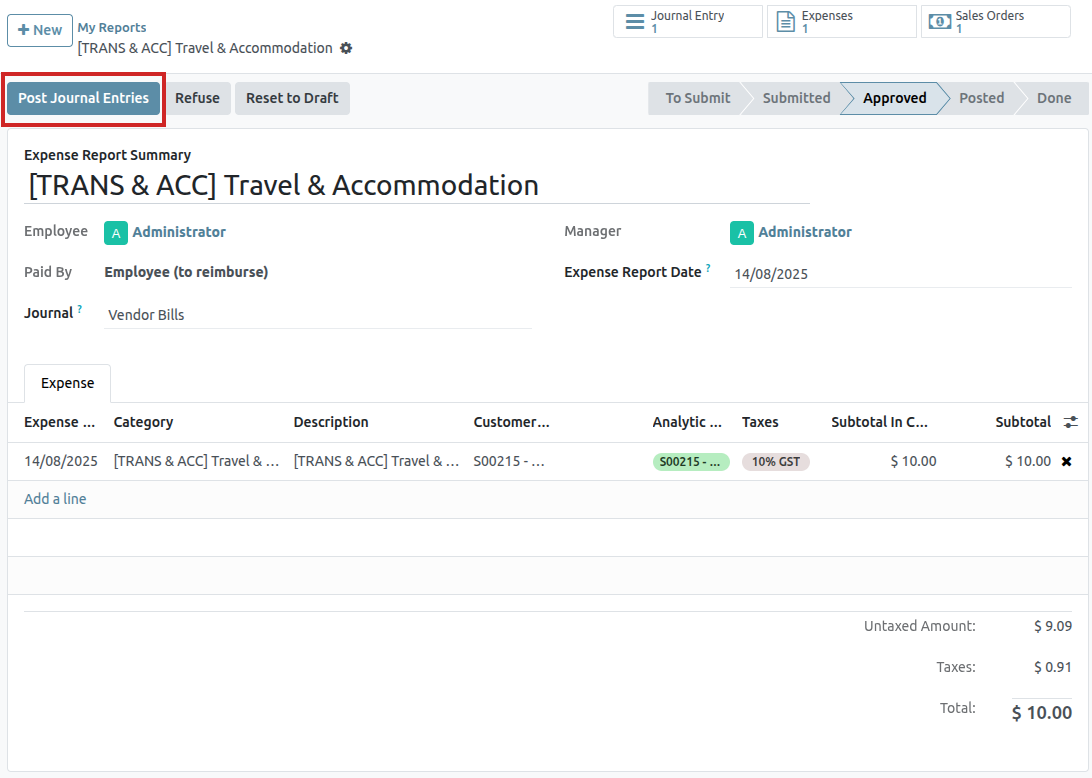
When the manager is satisfied with the Expense Report Summary, they’ll click Post Journal Entries.
Upon clicking Post Journal Entries, that button disappears, and the Analytic Distribution column in the Expense tab is filled with the sales order that was initially configured to the expense in the Customer to Reinvoice field.
Reinvoice expense
With those steps completed, it’s time to return to the sales order to complete the reinvoice of the expense to the customer.
To do that, navigate to main Saasmate dashboard ‣ Sales app, and select the appropriate sales order that should be reinvoiced for the expense.
On the sales form, the newly-configured expense is now in the Order Lines tab, with its Delivered column filled in, and ready to be invoiced.
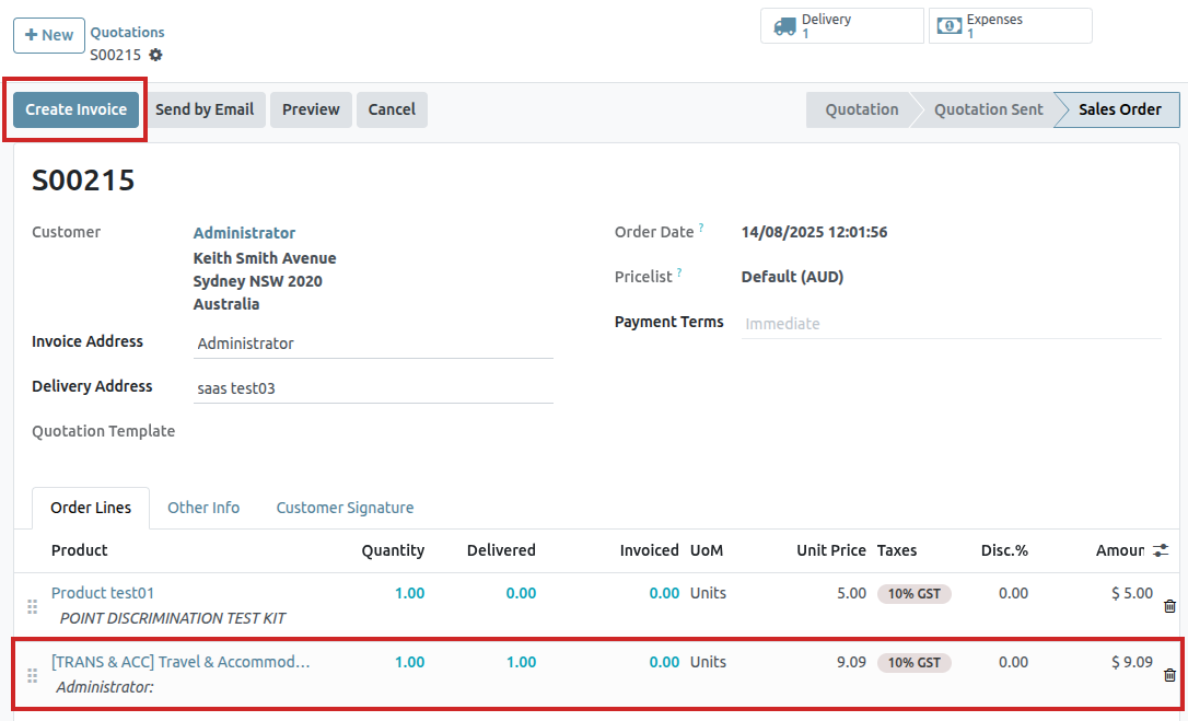
After confirming the details of the expense, click Create Invoice at the top of the sales order. When clicked, a Create invoices pop-up window appears.
From this pop-up window, leave the Create Invoice field on the default Regular invoice option, and click Create Draft Invoice.
Doing so reveals a Customer Invoice Draft showing only the expense in the Invoice Lines tab.
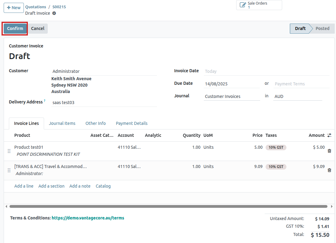
If all the information related to the expense is correct, click Confirm to confirm the invoice. Doing so moves the status of the invoice from Draft to Posted.
To send the invoice to the customer, click Send & Print. Doing so reveals a Send pop-up window, with a preconfigured message and PDF invoice in the body of the message. The message can be reviewed and modified, if needed.
Once ready, click Send & Print to send the invoice to the customer. When clicked, the pop-up window disappears, and Saasmate sends the message/invoice to the customer. Additionally, a PDF of the invoice is automatically downloaded for record-keeping and/or printing purposes.
Back on the Customer Invoice, click the Register Payment button when the customer pays for the invoiced expense.
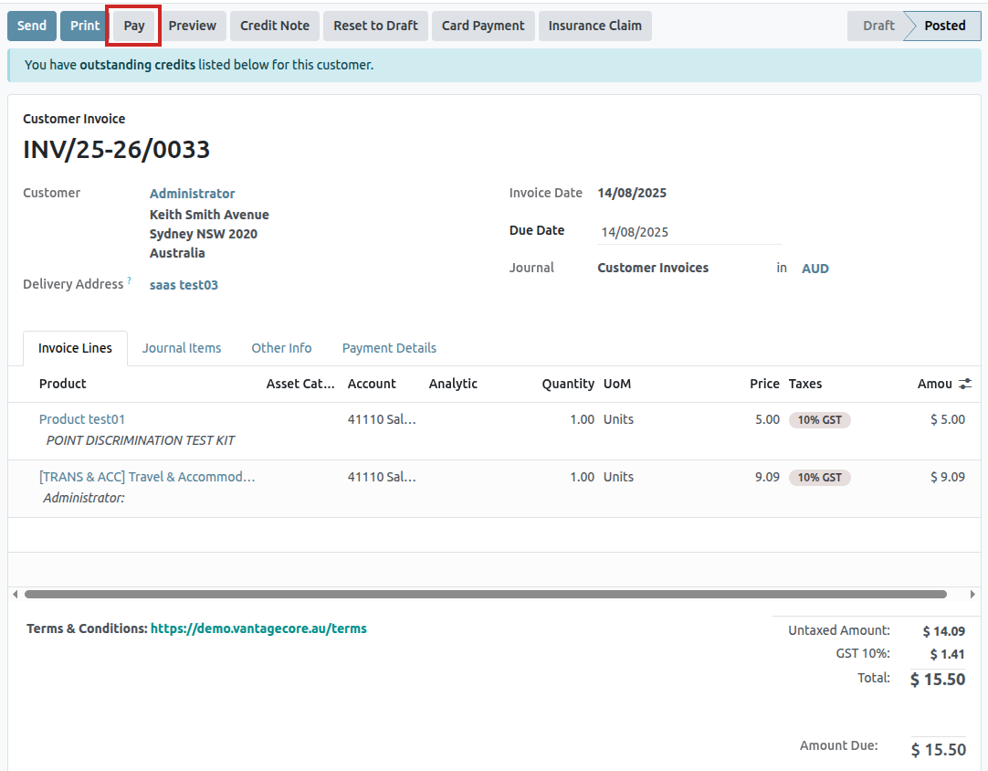
When Register Payment is clicked, a Register Payment pop-up window appears. In this pop-up window, the necessary fields are auto-populated with the correct information. After reviewing the information, click Create Payment.
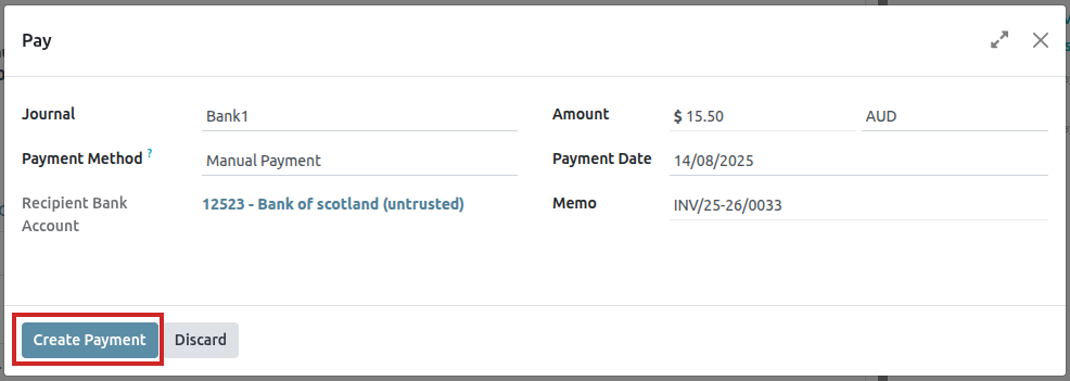
Once Create Payment is clicked, the pop-up window disappears, and a green In Payment banner is in the upper-right corner of the invoice, signifying this invoice is paid for in full. Thus, completing the workflow.
Import Products
Saasmate Sales provides a template for importing products with categories and variants, which can be opened and edited with any spreadsheet software (Microsoft Excel, OpenOffice, Google Sheets, etc.).
When this spreadsheet is filled out properly, it can be quickly uploaded to the Saasmate database. When uploaded, those products are instantly added, accessible, and editable in the product catalog.
Import template
In order to import products with categories and variants, the Import Template for Products must be downloaded. Once downloaded, the template can be adjusted and customized, and then uploaded back into the Saasmate database.
To download the necessary import template, navigate to Sales app ‣ Products ‣ Products. On the Products page, click the ⚙️ (gear) icon in the upper-left corner. Doing so reveals a drop-down menu.
From this drop-down menu, select the Import records option.
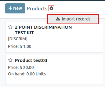
Selecting Import records reveals a separate page with a link to download the Import Template for Products. Click that link to download the template.
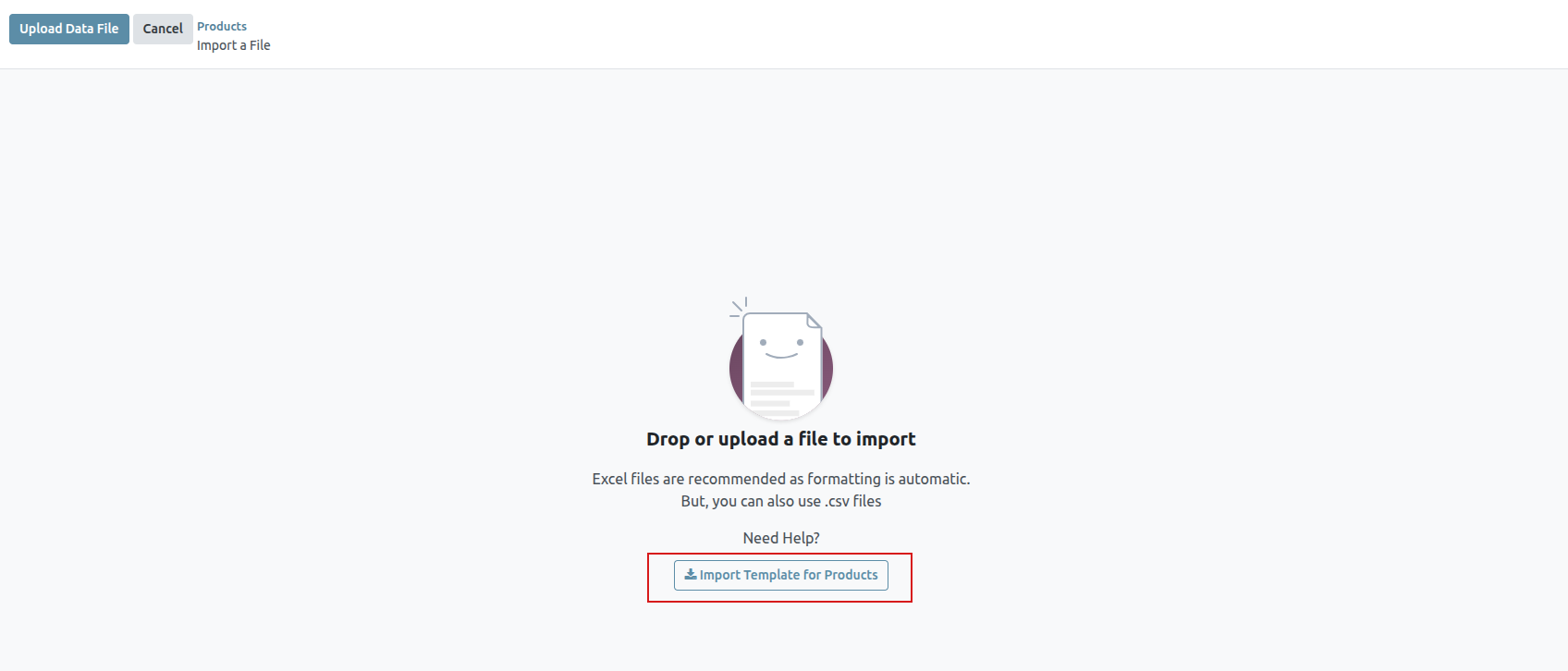
Customize product import template
When the import template has been downloaded and opened, it’s time to modify its contents. However, before any changes are made, there are a few elements to keep in mind during the process:
- Feel free to remove any columns that aren’t deemed necessary. But, it is strongly advised that the Internal Reference column remains. While it’s not mandatory, having a unique identifier (e.g. FURN_001) in the Internal Reference column for each product can be helpful in many cases. This can even be from previous software spreadsheets to ease the transition into Saasmate. For example, when updating imported products, the same file can be imported several times without creating duplicates, thus enhancing the efficiency and simplicity of imported product management.
- Do not change the labels of columns that are meant to be imported. Otherwise, Saasmate won’t recognize them, forcing the user to map them on the import screen manually.
- Feel free to add new columns to the template spreadsheet, if desired. However, to be added, those fields must exist in Saasmate. If Saasmate can’t match the column name with a field, it can be matched manually during the import process. During the import process of the completed template, Saasmate reveals a page showcasing all the elements of the newly-configured product template spreadsheet, separated by File Column, Saasmate Field, and Comments. To manually match a column name with a field in Saasmate, click the Saasmate Field drop-down menu next to the File Column that needs a manual adjustment, and select the appropriate field from that drop-down menu.
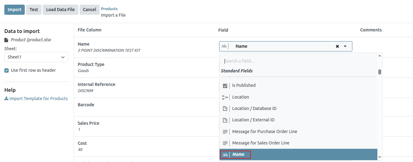
Import product template spreadsheet
After customizing the product template spreadsheet, return to the Saasmate product import page, where the template download link is found, and click the Upload File button in the upper-left corner.
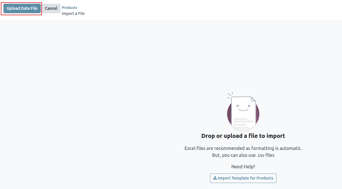
Then, a pop-up window appears, in which the completed product template spreadsheet file should be selected and uploaded to Saasmate.
After that, Saasmate reveals a page showcasing all the elements of the newly-configured product template spreadsheet, separated by File Column, Saasmate Field, and Comments.
From here, the File Column can be manually assigned to an Saasmate Field, if necessary.
To make sure everything is appropriate, and all the columns and fields are lined up accurately, click the Test button in the upper-left corner.
If everything is lined up and applied correctly, Saasmate reveals a blue banner at the top of the page, informing the user that Everything seems valid.
If there are any errors, Saasmate reveals a red banner at the top of the page, with instructions of where to locate the specific issues, and how to fix them.
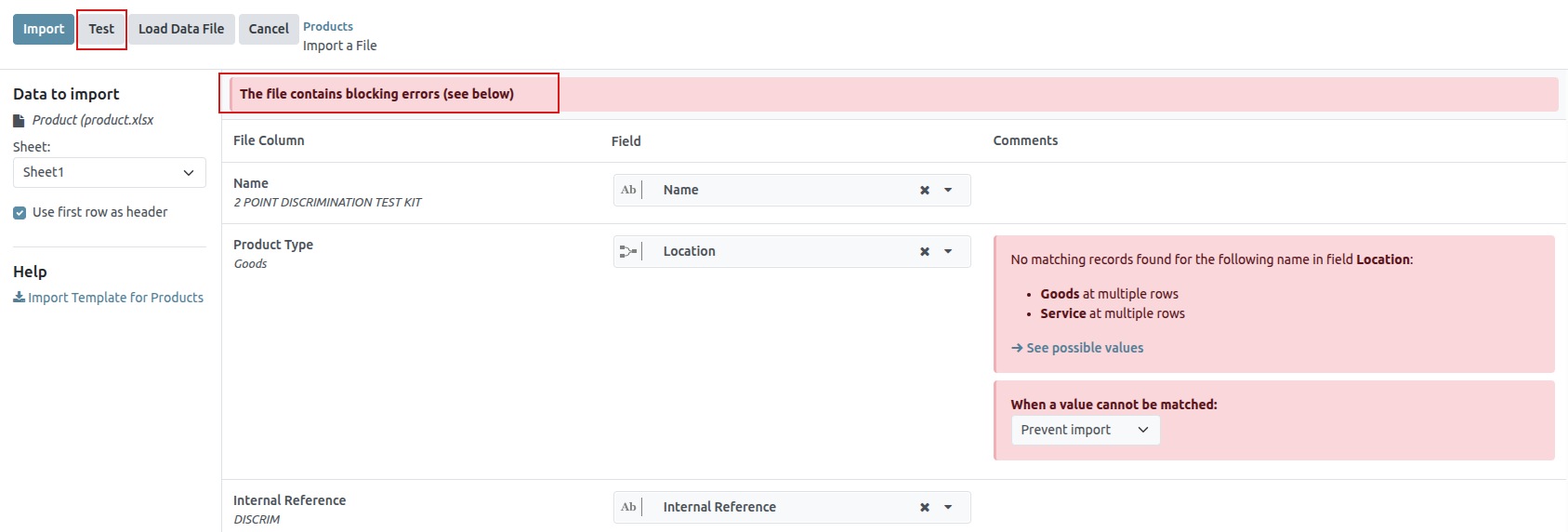
Once those errors are fixed, click Test again to ensure all necessary issues have been remedied appropriately.
If additional product template spreadsheets need to be uploaded, click the Load File button, select the desired product template spreadsheet, and repeat the process.
When everything is ready, click the Import button.
When clicked, Saasmate instantly imports those products, and reveals the main Products page, with a pop-up message in the upper-right corner. This pop-up message informs the user how many products were successfully imported.
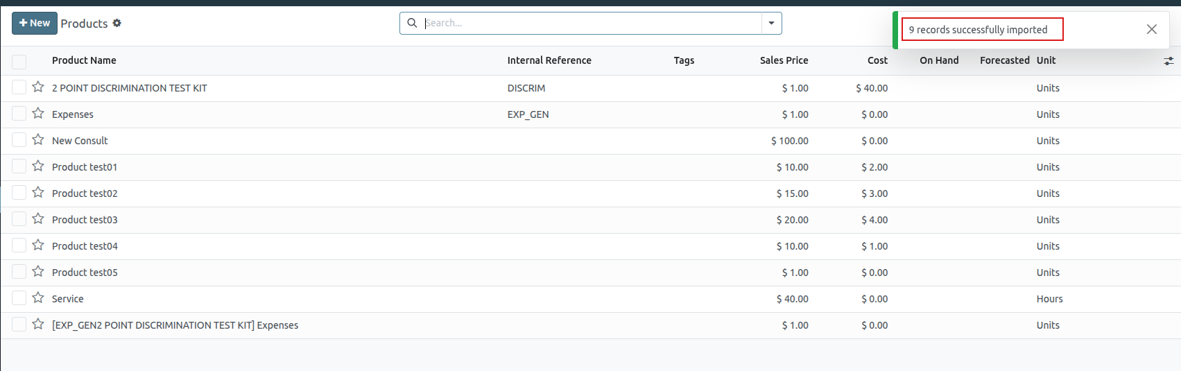
Import relation fields, attributes, and variants
It’s important to note that an Saasmate object is always related to many other objects. For example, a product is linked to product categories, attributes, vendors, and things of this nature. These links/connections are known as relations.
Relation fields
On product forms in Saasmate, there are a number of fields that can be modified and customized at any time. These fields are found under every tab on a product form. While these fields are easily editable directly on the product form, they can also be modified via a product import.
As mentioned, relation fields of this nature can only be imported for products if they already exist in the database. For example, if a user attempts to import a product with a Product Type, it can only be one of the preconfigured product types existing in the database (e.g. Storable Product, Consumable, etc.).
To import information for a relation field on a product import template spreadsheet, add the name of the field as a column name/title on the spreadsheet. Then, on the appropriate product line, add the desired relation field option.
When all desired relation field information has been entered, save the spreadsheet, and import it to the database, per the process mentioned above (Sales app ‣ Products ‣ Products ‣ ⚙️ (gear) icon ‣ Import records ‣ Upload File).
Once the spreadsheet with the newly-configured relation field information has been uploaded, click Import, and Saasmate returns to the Products page.
When the newly-changed/modified products, complete with the new relation field information, has been imported and uploaded, that new information can be found on the Products page.
Attributes and values
Saasmate also allows users to import product attributes and values that can be used for products that already exist in the database, and/or with imported products.
To import attributes and values, a separate spreadsheet or CSV file dedicated to attributes and values must be imported and uploaded before they can be used for other products.
The column names/titles of the attributes and values spreadsheet should be as follows: Attribute, Display Type, Variant Creation Mode, and Values / Value.
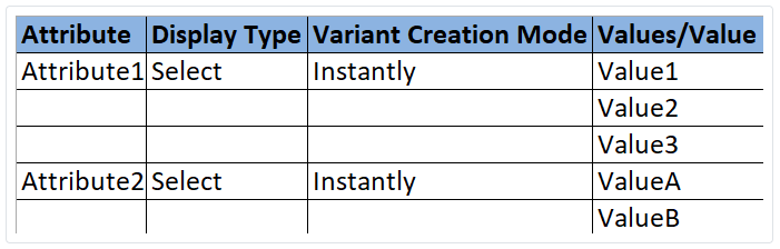
- Attribute: name of the attribute (e.g. Size).
- Display Type: display type used in the product configurator. There are three display type options:
- Radio: values displayed as radio buttons
- Selection: values displayed in a selection list
- Color: values denoted as a color selection
- Variant Creation Mode: how the variants are created when applied to a product. There are three variant creation mode options:
- Instantly: all possible variants are created as soon as the attribute, and its values, are added to a product
- Dynamically: each variant is created only when its corresponding attributes and values are added to a sales order
- Never: variants are never created for the attribute
- Values/Value: values pertaining to the corresponding attribute. If there are multiple values for the same attribute, the values need to be in individual lines on the spreadsheet.
- Once the desired attributes and values have been entered and saved in the spreadsheet, it’s time to import and upload it into Saasmate. To do that, navigate to Sales app ▸ Configuration ▸ Attributes ▸ ⚙️ (gear) icon ▸ Import records ▸ Upload File.
- Once the spreadsheet with the newly-configured attributes and values has been uploaded, click Import, and Saasmate returns to the Attributes page. That’s where those newly-added attributes and values can be found and edited, if necessary.
- As mentioned previously, when attributes and values have been added to the Saasmate database, they can be used for existing or imported products.
Product variants
When product attributes and values are configured in the database, they can be used on product import spreadsheets to add more information and detail to products being imported.
To import products with product attributes and values, the product import template spreadsheet must be configured with specific Product Attributes / Attribute, Product Attributes / Values, and Name columns.
There can be other columns, as well, but these columns are required in order to properly import products with specific variants.
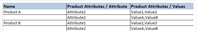
- Name: product name
- Product Attributes / Attribute: name of attribute
- Product Attributes / Values: values pertaining to the corresponding attribute
When the desired products and product variants have been entered and saved in the spreadsheet, it’s time to import and upload them into Saasmate. To do that, navigate to Sales app ‣ Products ‣ Products ‣ ⚙️ (gear) icon ‣ Import records ‣ Upload File.
Once the spreadsheet with the newly-configured products and product variants has been uploaded, click Import, and Saasmate returns to the Products page. That’s where the newly-added products can be found.
To view and modify the attributes and variants on any products, select the desired product from the Products page, and click the Attributes & Variants tab.
Product Variants
Product variants are used to give single products a variety of different characteristics and options for customers to choose from, such as size, style, or color, just to name a few.
Products variants can be managed via their individual product template, or by navigating to either the Product Variants or Attributes page. All of these options are located within the Saasmate Sales application.
Configuration
To use product variants, the Variants setting must be activated in the Saasmate Sales application.
To do that, go to Sales app ‣ Configuration ‣ Settings, and locate the Product Catalog section at the top of the page.
In that section, check the box to enable the Variants feature.
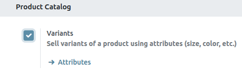
Then, click Save at the top of the Settings page.
Attributes
Before product variants can be set up, attributes must be created. To create, manage, and modify attributes, navigate to Sales app ‣ Configuration ‣ Attributes .
To create a new attribute from the Attributes page, click New. Doing so reveals a blank attributes form that can be customized and configured in a number of ways.
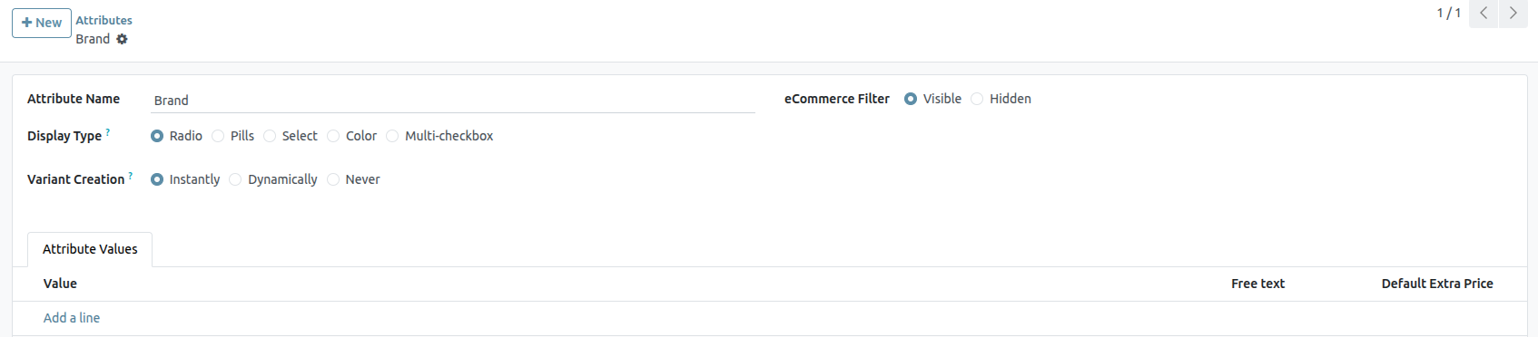
First, create an Attribute Name, such as Color or Size.
Next, select one of the options from the Display Type field. The Display Type determines how this product is shown on the online store, Point of Sale dashboard, and Product Configurator.
The Display Type options are:
- Pills: options appear as selectable buttons on the product page of the online store.
- Color: options appear as small, colored squares, which reflect any HTML color codes.
- Radio: options appear in a bullet-style list on the product page of the online store.
- Select: options appear in a drop-down menu on the product page of the online store.
- Multi-checkbox (option): options appear as selectable checkboxes on the product page of the online store.
The Variant Creation Mode field informs Odoo when to automatically create a new variant once an attribute is added to a product.
- Instantly: creates all possible variants as soon as attributes and values are added to a product template.
- Dynamically: creates variants only when corresponding attributes and values are added to a sales order.
- Never (option): never automatically creates variants.
The eCommerce Filter Visibility field determines whether or not these attribute options are visible to the customer on the front-end, as they shop on the online store.
- Visible: the attribute values are visible to customers on the front-end.
- Hidden: the attribute values are hidden from customers on the front-end.
Lastly, in the optional eCommerce Category field, select a category from a drop-down menu to group similar attributes under the same section for added specificity and organization.
Attribute values
Attribute values should be added to the Attribute Values tab. Values can be added to an attribute at any time, if needed.
To add a value, click Add a line in the Attribute Values tab.
Then, enter the name of the value in the Value column. Next, check the box in the Is custom value column, if the value is custom (i.e. the customer gets to provide unique specifications that are specific to this particular value).
Colors
Next to Display Type, select the Color option. Go to the Attribute Values tab to modify the value settings.
In this pop-up window, select a specific color by dragging the color slider to a particular hue, and clicking on the color portion directly on the color gradient window.
Or, choose a specific color by clicking the dropper icon, and selecting a desired color that’s currently clickable on the screen.
If you sell products with specific patterns, you can also add an image to display the pattern of the product. To do so, click the (camera) icon, then click the (pencil) icon and select an image from your local drive. This pattern will appear as a color option on the ecommerce product page.
Product variants
Once an attribute is created, use the attribute (and its values) to create a product variant. To do that, go to Sales app ‣ Products ‣ Products, and select an existing product to view that desired product’s form. Or, click Create to create a new product, to which a product variant can be added.
On the product form, click the Attributes & Variants tab to view, manage, and modify attributes and values for the product.
To add an attribute to a product, and subsequent attribute values, click Add a line in the Attributes & Variants tab. Then, choose the desired attribute from the drop-down menu that appears
Once an attribute is selected in the Attribute column, proceed to select the specific attribute values to apply to the product, via the drop-down menu available in the Values column.
Pricelists
A pricelist is a method of dynamic pricing that applies a list of prices (or price rules) to adjust sales prices. This adjustment can apply to specific customers, customer groups, sales orders, time periods, etc., and is useful for creating pricing strategies and optimizing sales margins.
Saasmate Sales has a useful pricelist feature that can be tailored to fit any unique pricing strategy. Pricelists suggest certain prices, but they can always be overridden on the sales order.
Configuration
To enable pricelists in the Saasmate Sales app, first navigate to Sales app ‣ Configuration ‣ Settings. In the Pricing section, tick the checkbox next to the Pricelists feature, and click Save to save all changes.
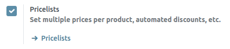
After activating and saving the Pricelists feature, the Settings page reloads. From here, either select the Pricelists link (beneath the Pricelists feature on the Settings page), or navigate to Sales app ‣ Products ‣ Pricelists.
Either option reveals the Pricelists page, in which pricelists can be created and/or modified at any time.

Creating and editing pricelists
From the Pricelists page, either select the pricelist to edit, or click New to create a new pricelist, which reveals a blank pricelist form that can be configured in a number of different ways.
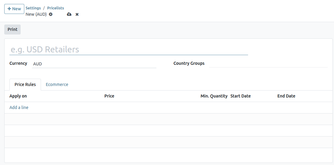
When creating a new pricelist, start by adding a name for the pricelist at the blank field at top of the form. Next, select which Currency should be used.
If working in a multi-company environment, select which company this pricelist should apply to in the Company field. If this field is left blank, the pricelist is automatically applied to all companies in the database.
If working in a multinational company, select the countries where this pricelist will apply under the Country Groups column.
Price Rules tab
In the Price Rules tab, each line creates a new record that will implement customized pricing to the sales order where the pricelist is applied. To create a new price rule, click on Add a line, which opens a new pricelist rules form.
Then, select whether to apply this set of rules to a Product or Category.
From here, there are several configuration options:
- Product: If selected in the Apply To field, use this field to choose one or more products to which this pricelist will apply.
- Category: Select one or more product categories to which this pricelist will apply.
- Price Type: Select whether the specialized pricing will fall under Discount, Formula, or Fixed Price. Depending on the price type, there will be additional configurations on how to apply the pricelist.
- Discount: Enter the percentage to be discounted. A mark-up can be configured by using a negative value in this field.
- Formula: Calculate the pricelist rules based on the following configuration:
- Discount: Percentage discount to be applied. Negative values can be entered to increase prices.
- Round off to: Numerical value to act as round-off multiple, to be applied after discount. The rounding method sets the price so that it is a multiple of the value in this field.
- Min Qty: Specify the minimum quantity of selected products for this pricelist to apply.
- Validity Period: Specify the start and end date during which this pricelist can be applied to quotations.
Foreign Currencies
With Saasmate, pricelists can be used to manage prices in a number of foreign currencies. Specifically, Saasmate has the ability to work with 169 total currencies.
Settings
Once the Accounting app has been installed, foreign currencies can be added to the database. Navigate to Accounting app ‣ Configuration ‣ Settings, scroll to the Currencies section, and locate the Main Currency setting.
Saasmate automatically sets the main currency as the currency of the country the company is based in.
To change the main currency of the company, select the drop-down menu in the Currency field, select the desired currency, and be sure to Save the changes.
View, edit, and add currencies
To view, edit, and add currencies to the database, making them available on pricelists and on the Main Currency drop-down menu, click the Currencies link, located beneath the Currency field on the Accounting app ‣ Settings page.
When the Currencies link is clicked, a separate Currencies page is revealed.
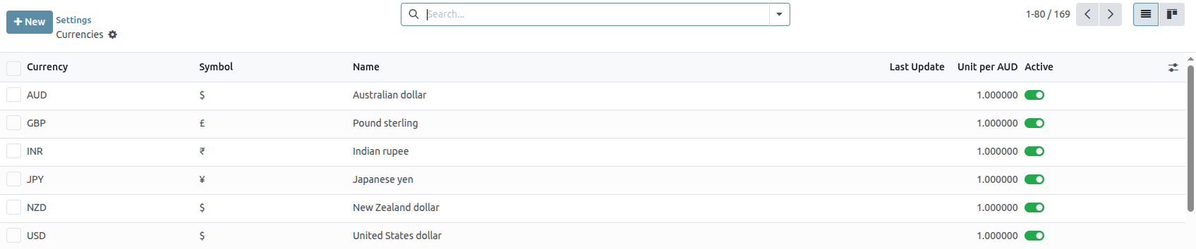
On this page, Saasmate provides a master list of 167 global currencies. Each row shows the corresponding Currency, Symbol, Name, date of the Last Update, and Current Rate (compared to the default currency of the country in which the company is based).
To the far right, there are two columns, which can be toggled on or off:
- Active: this currency is activated, which means it can be added to a pricelist, or used as the main currency of the company, if desired (via Accounting app ‣ Configuration ‣ Settings ‣ Currencies section).
To toggle options on/off, click the toggle switch in the row for the corresponding column. When on the color of the switch is green. When off , the color of the switch is grey.
Currency detail form
To edit any currency on the Currencies page, click the desired currency to reveal the detail form for that specific currency, and proceed to make any necessary changes.
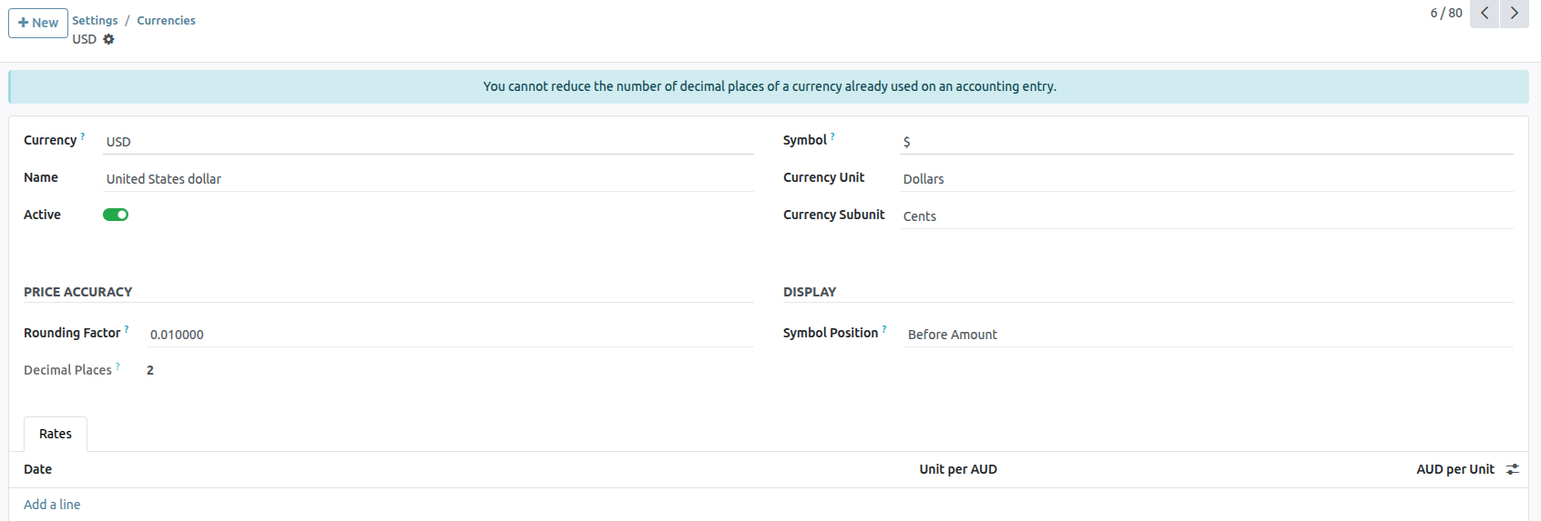
On the currency detail form, the relevant currency code appears in the Currency field. Beneath that, the name for the currency is in the Name field.
Then, toggle the currency’s availability with the Active toggle: on is indicated with a green switch, and off is indicated with a grey switch.
On the right of the currency detail form, the appropriate Currency Unit (e.g. Dollars) and Currency Subunit (e.g. Cents) can be found.
Next, under the Rates tab, the various conversion rates can be viewed, added, or deleted. Each row shows the Date of that specific rate, the Company to which it is connected, followed by the Unit per… and …per Unit.
To add a new rate, click Add a line in the Rates tab, and proceed to fill in the necessary information in the aforementioned columns.
Main currency detail form
If the selected currency is the main currency of the company, a blue banner appears at the top of the currency detail form with the message: This is your company’s currency..
All the fields are the same as a typical currency detail form, but there will not be a Rates tab because all other currency rates are based off the main currency of the company.
Create new currency
If a desired currency isn’t on the Currencies page, click the New button to open a blank currency template form.
On the blank currency detail form, proceed to enter the desired currency code in the Currency field. Beneath that, enter the name for the currency in the Name field.
Then, toggle the currency’s availability with the Active toggle switch.
On the right of the currency detail form, enter the appropriate Currency Unit (e.g. Dollars) and appropriate Currency Subunit (e.g. Cents).
Next, under the Rates tab, add a new rate by clicking Add a line. Then, proceed to confirm and adjust the Date, Company, Unit per…, and …per Unit fields to ensure all the auto-populated information is accurate.
Currency-specific pricelists
It is recommended that at least one pricelist is created per active currency in the database. To create (or assign) a pricelist to a specific currency, start by navigating to Sales app ‣ Products ‣ Pricelists.
From the Pricelists page, either select an existing pricelist to edit, or click New to create a new pricelist.
On the pricelist detail form, for either a new or existing pricelist, adjust the Currency field as desired.
Auto-conversion from public price
It should be noted that the public price seen on products is directly related to the main currency the company has set, which is configured by navigating to Accounting app ‣ Configuration ‣ Settings ‣ Currencies section ‣ Main Currency ‣ Currency drop-down menu.
The sales price automatically updates if the pricelist is changed to a different pricelist that has a different currency than the company’s main currency. The change in price is directly related to the updated conversion rate for that currency.
Set product prices
In order to have product prices set in place to avoid any changes in currency rates, start by navigating to Sales app ‣ Products ‣ Products.
From the Products page, select the desired product to modify. Or, create a new product by clicking the New button.
Then, on the product detail form, click the Extra Prices smart button, located in the upper-left corner. Doing so reveals a separate Price Rules page, specific to that particular product.
Click New, and select the desired pricelist from the drop-down menu in the Pricelist column.
The Applied On field is auto-populated with the product, so proceed to enter in the desired figures in the Min. Quantity and Price fields.
If necessary, configure a Start Date and End Date for the set prices. Leaving those columns blank ensures the set price will remain valid, regardless of the date of sale.
If working in a multi-company environment, designate to which company this price rule should be applied in the Company field. Leaving that field blank ensures the price rule applies to all companies in the database.
With those configurations complete, regardless of any changes/updates in conversion, whenever those designated pricelists are applied to a customer trying to purchase this specific product, these pre-determined set prices appear.
Discounts
The Discounts feature allows users to decrease or increase the price on item lines in a sales quotation or order. This is calculated as a percentage of the products’ sales price.
To access discounts in the Sales app, navigate to Sales app ‣ Configuration ‣ Settings. In the Pricing section, tick the Discounts checkbox, then click Save.
After the setting has been activated, navigate to the desired quotation by going to Sales app ‣ Orders ‣ Quotations at the top of the page. Once there, click on the desired quote from the list.
Discounts on product lines
In the Order Lines tab of the quotation form, a new column heading appears labeled Disc.%. This column is used to set discounts on individual line items. Enter the desired discount for each product line and the new price is automatically calculated in the Total at the bottom of the page.
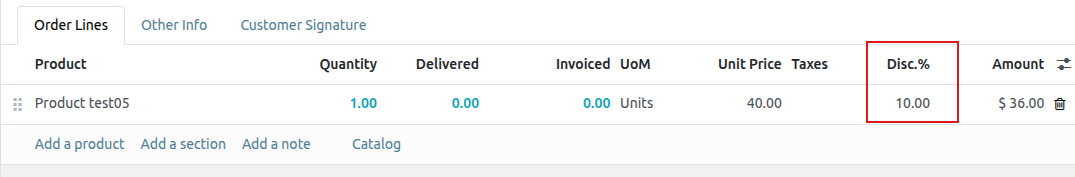
Discount button
With the Discounts settings enabled, a Discount button appears at the bottom of sales orders.
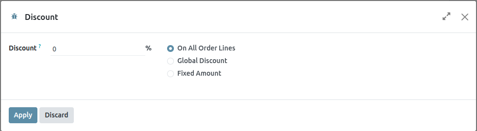
Clicking the Discount button on a sales order opens a pop-up window, where the Discount percentage, and options are configured:
- On All Order Lines: Add the specified discount percentage (configured in the Discount field of the pop-up window) on all existing order lines of the sales order.
- Global Discount:Add a discount product line to the order, which has the cumulative value equivalent to the specified discount percentage.
Returns and Refunds
The Saasmate Sales app provides two different ways to process returns. The method used depends on whether or not an invoice has been sent.
Before invoicing
Returns are completed using Reverse Transfers when a customer decides to return a product before an invoice has been sent or validated.
To start a return before invoicing, navigate to the Sales app, select the desired sales order, and click on the Delivery smart button to open the associated delivery order.
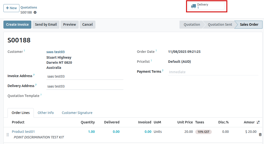
On the validated delivery order, click Return .
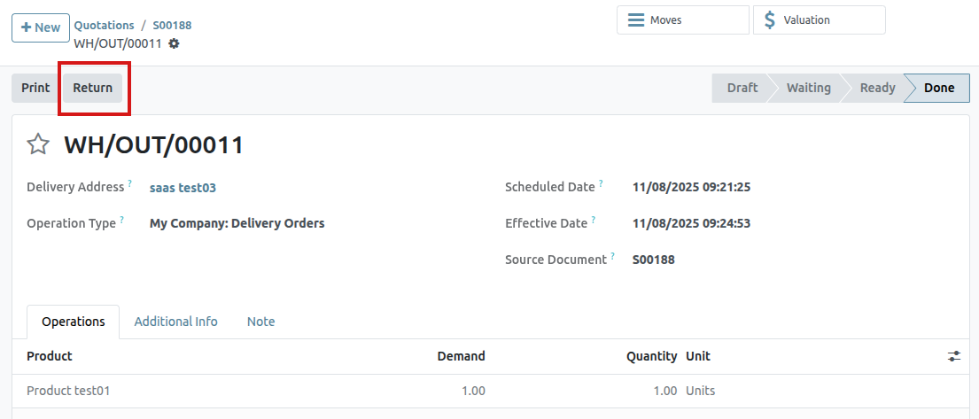
This opens a Reverse Transfer pop-up window.
By default, the Quantity matches the validated quantities from the delivery order. Update the quantities, if necessary. Click on the 🗑️ (trash) icon next to a line item to remove it from the return.
Next, click Return to confirm the return. This generates a new warehouse operation for the incoming returned product(s).
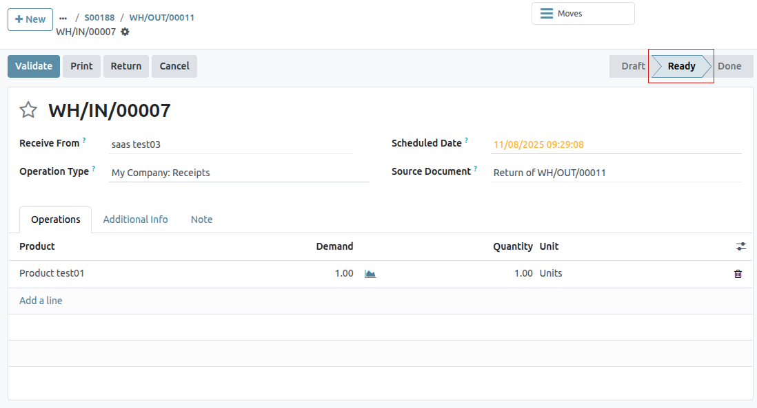
Upon receiving the return, the warehouse team validates the warehouse operation by clicking Validate . Then, on the original sales order, the Delivered quantity updates to reflect the difference between the initial validated quantities and the returned quantities.
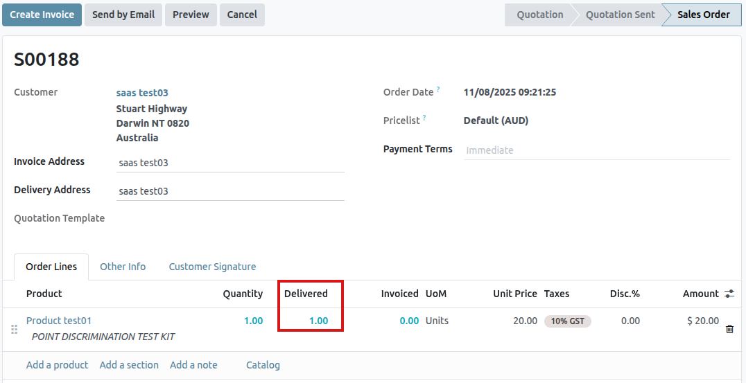
When an invoice is created, the customer receives an invoice only for the products they are keeping, if any.
After invoicing
Sometimes, customers return an item after they receive and/or pay for their invoice. In these cases, a return using only Reverse Transfers is insufficient since validated, or sent, invoices cannot be changed.
However, Reverse Transfers can be used in conjunction with Credit Notes to complete the customer’s return.
To start a return after invoicing, navigate to the relevant sales order in the Sales app.
If there is a payment registered on the sales order, the payment details appear in the chatter, and the invoice (accessible through the Invoices smart button) has a green In Payment banner.
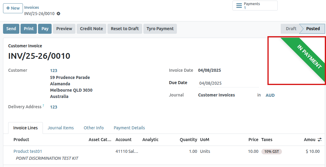
From the sales order, click on the Delivery smart button to view the validated delivery order. Then, click Return to open the Reverse Transfer pop-up window.
Next, edit the Product and/or Quantity, as needed for the return. Then, click Return. This generates a new warehouse operation for the incoming returned product(s), which is validated by the warehouse team once the return is received by clicking Validate.
Then, on the sales order, the Delivered quantity updates to reflect the difference between the initial validated quantities and the returned quantities.
To process a refund, navigate to the relevant invoice (from the sales order, click on the Invoices smart button). Then, click the Credit Note button at the top of the validated invoice.
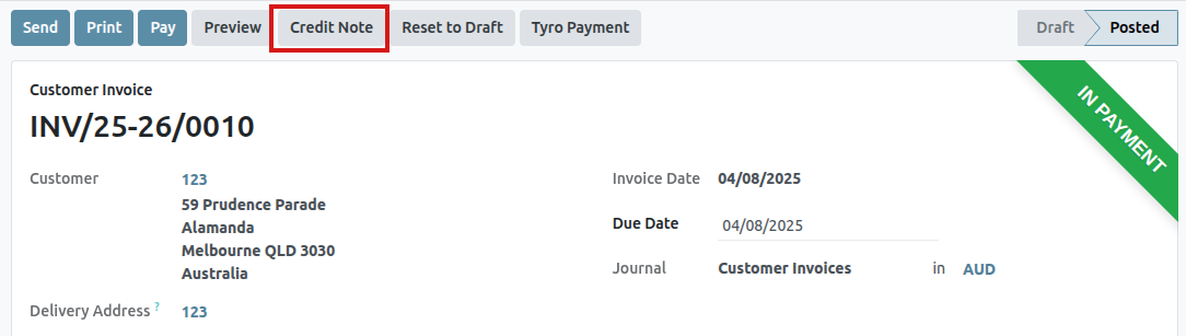
Doing so reveals a Credit Note pop-up form.
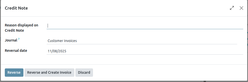
Start by entering a Reason displayed on Credit Note and a specific Journal to process the credit. Then, select a specific Reversal Date.
After the information is filled in, click Reverse or Reverse and Create Invoice. Then, edit the draft, if needed.
Lastly, click Confirm to confirm the credit note.
When complete, a blue banner reading: You have outstanding credits for this customer. You can allocate them to mark this invoice as paid. appears at the top of the page.
Use eWallets and Gift Cards
With Saasmate, customers can use eWallets and gift cards for online and in-store shopping.
To enable eWallets and gift cards for eCommerce and Point of Sale (PoS), first enable Discounts, Loyalty & Gift Card under Sales app ‣ Configuration ‣ Settings ‣ Pricing section. Once enabled, go to Sales app ‣ Products ‣ Gift cards & eWallet and Create a new eWallet or gift card program.
eWallets
eWallets allow customers to save credits on their online account and use these credits as a payment method when buying items in an online store or a brick-and-mortar store. eWallets can also be used to centralize multiple gift cards.
Before creating an eWallet program, it is necessary to create an eWallet top-up product. Top-ups are pre-defined digital credit values added to an eWallet in exchange for its equivalent in real currency. These credits can then be used as a payment method in the eCommerce shop or PoS. Top-up values can be of different amounts.
To create a top-up product, go to Sales app ‣ Products ‣ Products and Create a new product. On the product template, configure the options as follows:
- Product Name: enter a name for the top-up product (for example, $50 Top-Up)
- Can be Sold: enabled
- Product Type: select Service
- Invoicing Policy: select Prepaid/Fixed Price
- Create on Order: select Nothing
- Sales Price: enter the amount of the top-up
Once the top-up is created, go to Sales app ‣ Products ‣ Gift cards & eWallet to Create an eWallet program. The following configuration options are available:
- Program Name: enter a name for the eWallet program
- Program Type: select eWallet
- eWallet Products: select the eWallet top-up created earlier. Repeat the process if you created top-ups of different amounts.
- Email template: select the email template used for the email sent to the customer. To create a new template, click on the field, select Search More, and then click Create.
- Currency: select the currency to use for the eWallet program
- Company: select the company for which the program is valid and available
- Available On: select the applications on which the program is valid and available
- Website: select the website on which the program is valid and available. Leave this field empty to include all websites.
- Point of Sale: select the PoS in which the program is valid and available. Leave this field empty to include all PoS.
Once the program is configured, click the Generate eWallet button in the upper-left corner to generate eWallets. eWallets can be generated based on Customers and/or Customer Tags. The quantity is automatically adapted according to the Customers and Customer Tags selected. Then, set the eWallet value. Finally, set the Valid Until period if applicable.
Generated eWallets can be accessed through the eWallets smart button in the upper-right corner. From there, Send or Share the eWallets via email or a URL link.
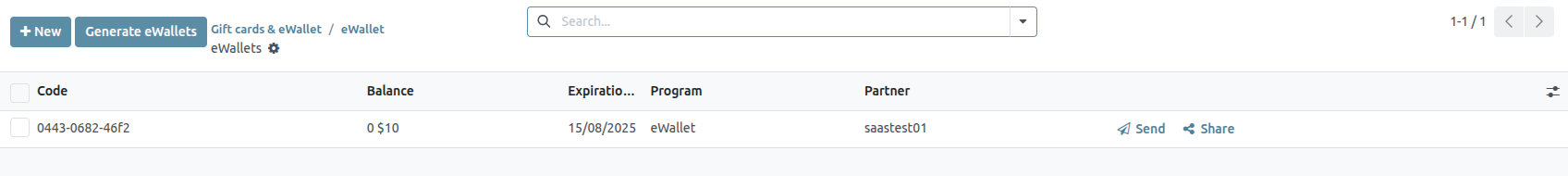
Click on an eWallet to change the Expiration Date, Partner, or Balance. The Code of an eWallet cannot be changed, deleted, or duplicated.
Gift cards
Gift cards can be purchased by customers, and in turn used as a payment method upon checkout at an eCommerce shop or PoS.
Before creating a new gift card program, it is necessary to first create gift cards as products. To do so, go to Sales app ‣ Products ‣ Products and Create a product. On the product template, configure the options as follows:
- Product Name: enter a name for the gift card product
- Can be Sold: enabled
- Product Type: select Service
- Invoicing Policy: select Prepaid/Fixed Price
- Create on Order: select Nothing
- Sales Price: enter the amount of the gift card
Once the gift card product is created, go to Sales app ‣ Products ‣ Gift cards & eWallet to Create a gift card program. The following configuration options are available:
- Program Name: enter a name for the gift card program
- Program Type: select Gift Card
- Gift Card Products: select the gift card product created earlier. Repeat the process if you created gift card products of different amounts.
- Email template: select the default Gift Card: Gift Card Information template, or create a new template by clicking on the field, selecting Search More, and then clicking Create.
- Print Report: select Gift Card
- Currency: select the currency to use for the gift card program
- Company: select the company for which the program is valid and available
- Available On: select the applications on which the program is valid and available
- Website: select the website on which the program is valid and available. Leave this field empty to include all websites.
- Point of Sale: select the PoS in which the program is valid and available. Leave this field empty to include all PoS.
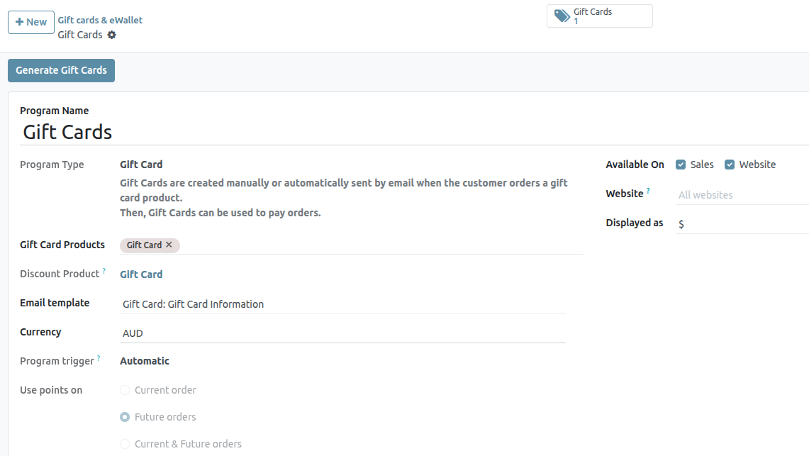
Once the program is configured, click the Generate Gift Cards button in the upper-left corner to generate gift cards. Gift cards can be generated either for Anonymous Customers or Selected Customers. Set the Quantity to generate for Anonymous Customers, or select the Customers and/or Customer Tags for Selected Customers. Then, set the Gift Card value. Finally, set the Valid Until period if applicable.
Generated gift cards can be accessed through the Gift Cards smart button in the upper-right corner. From there, Send or Share the gift cards via email or a URL link.
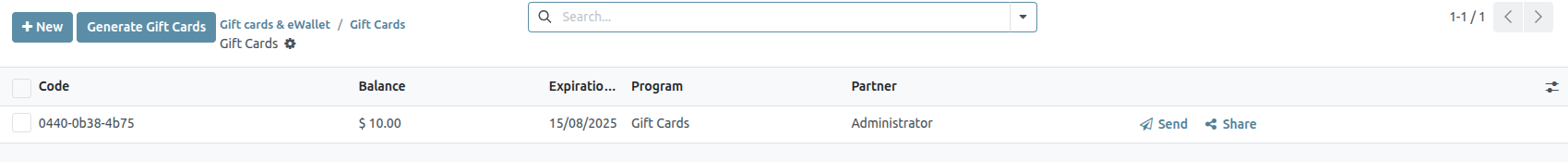
Click on a gift card to change the Expiration Date, Partner, or Balance. The Code of a gift card cannot be changed, deleted, or duplicated.
Discount and Loyalty Programs
The Saasmate Sales, eCommerce, and Point of Sale applications allow users to create discount and loyalty programs that customers can use for online and in-store shopping. These programs offer more varied, public, and time-sensitive pricing options than pricelists.
Configure the settings
To begin using discount and loyalty programs, navigate to Sales ‣ Configuration ‣ Settings . Under the Pricing heading, activate the Discounts, Loyalty & Gift Card setting by checking the box next to the feature. Finally, click Save to save the changes.
Configure discount and loyalty programs
To create discount and loyalty programs, go to Sales ‣ Products ‣ Discount & Loyalty.
If no discount or loyalty programs have been created yet, Saasmate provides a choice of templates to help create the first program. Choose one of the template cards, or click New to create a new program from scratch.
Or, if there are already existing programs, select an existing program to edit it.
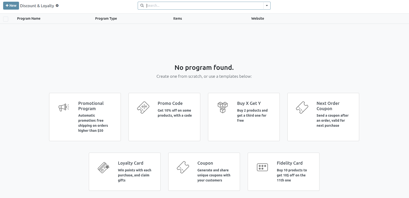
Creating or editing a program opens the program form.
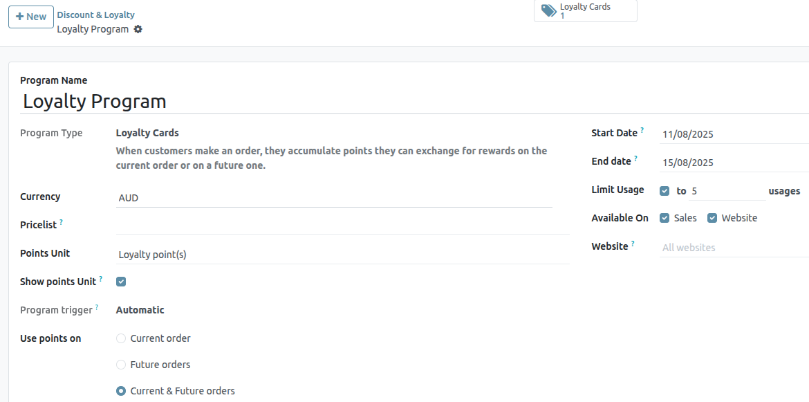
The program form contains the following fields:
- Program Name: Enter the name of the program in this field. The program name is not visible to the customer.
- Program Type: Select the desired program type from the drop-down menu.
- Currency: Select the currency used for the program.
- Pricelist: If desired, select a pricelist from the drop-down menu to have this loyalty program applied to a specific pricelist (and customers attached to the pricelist). More than one pricelist can be selected in this field. When a single loyalty program is linked to several pricelists, it makes it viable for different customer segments to have different pricelists, but the same loyalty programs. If this field is left blank, the program applies to everyone, regardless of pricelist.
- Points Unit: Enter the name of the points used for the Loyalty Cards program (e.g. Loyalty Points). The points unit name is visible to the customer. This field is only available when the Program Type is set to Loyalty Cards.
- Start Date: Select the date on which the program becomes valid. Leave this field blank if the program should always be valid and not expire.
- End Date: Select the date on which the program stops being valid. Leave this field blank if the program should always be valid and not expire.
- Limit Usage: If desired, tick this checkbox, and enter a number of usages to limit the number of times the program can be used during the validity period.
- Company: If working in a multi-company database, choose the one company for which the program is available. If left blank, the program is available to all companies in the database.
- Available On: Select the apps on which the program is available.
- Website: Select a website on which the program is available. Leave this field blank to make it available on all websites.
- Point of Sale: Select the point(s) of sale at which the program is available. Leave this field blank to make it available at all PoS.
All of the existing cards, codes, coupons, etc. that have been generated for the program are accessible through the smart button located at the top of the form.
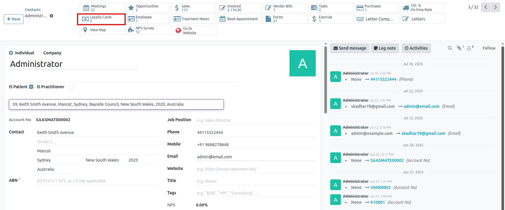
Program types
The different Program Types available on the program form are:
- Coupons: Generate and share single-use coupon codes that grant immediate access to rewards.
- Loyalty Cards: When making purchases, the customer accumulates points to exchange for rewards on current and/or future orders.
- Promotions: Set conditional rules for ordering products, which, when fulfilled, grant access to rewards for the customer.
- Discount Code: Set codes which, when entered upon checkout, grant discounts to the customer.
- Buy X Get Y: for every (X) item bought, the customer is granted 1 credit. After accumulating a specified amount of credits, the customer can trade them in to receive (Y) item.
- Next Order Coupons: Generate and share single-use coupon codes that grant access to rewards on the customer’s next order.
Conditional rules
Next, configure the Conditional rules that determine when the program applies to a customer’s order.
In the Rules & Rewards tab, click Add next to Conditional rules to add conditions to the program. This reveals a Create Conditional rules pop-up window.
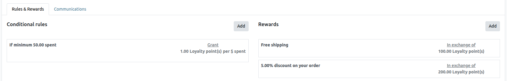
The following options are available for configuring conditional rules:
- Discount Code: Enter a custom code to be used for the Discount Code program, or use the default one generated by Saasmate. This field is only available when the Program Type is set to Discount Code.
- Minimum Quantity: Enter the minimum number of products that must be purchased in order to access the reward. Set the minimum quantity to at least 1 to ensure that the customer must make a purchase in order to access the reward.
- Minimum Purchase: Enter the minimum amount (in currency), with tax Included or tax Excluded, that must be spent in order to access the reward. If both a minimum quantity and minimum purchase amount are entered, then the customer’s order must meet both conditions.
- Products: Select the specific product(s) for which the program applies. Leave this field blank to apply it to all products.
- Categories: Select the category of products for which the program applies. Choose All to apply it to all product categories.
- Product Tag: Select a tag to apply the program to products with that specific tag.
- Grant: Enter the number of points the customer earns per order, per currency spent, or per unit paid (for the Loyalty Cards and Buy X Get Y programs).
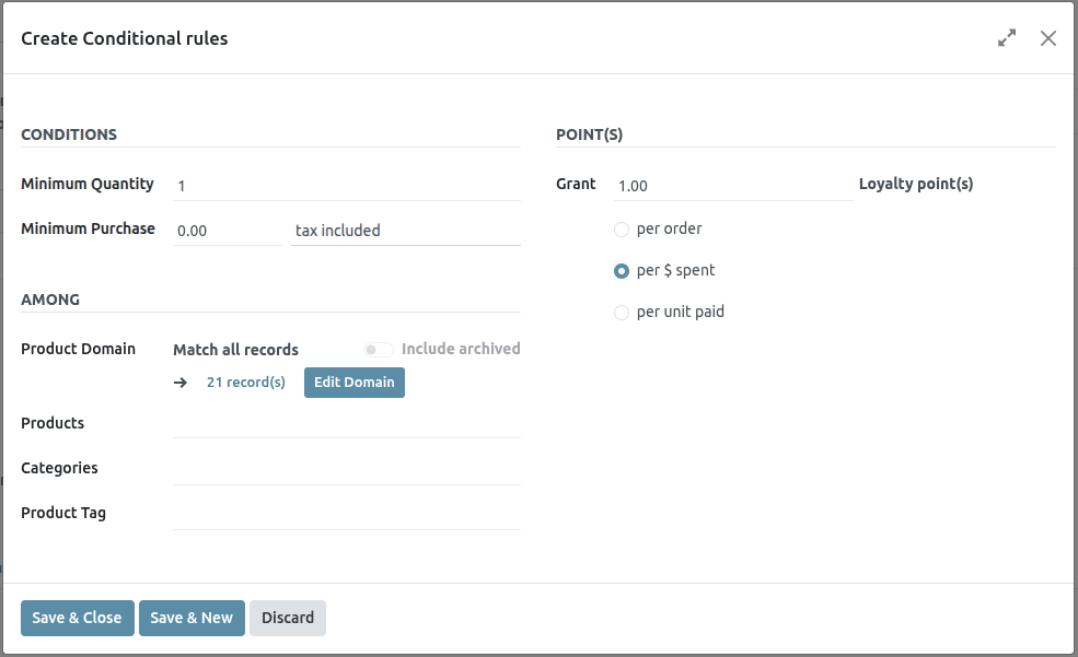
Click Save & Close to save the rule and close the pop-up window, or click Save & New to save the rule and immediately create a new one.
Rewards
In the Rules & Rewards tab of the program form, click Add next to Rewards to add rewards to the program. This reveals a Create Rewards pop-up window.
The following options are available for configuring rewards:
The following options are available for configuring rewards:
Reward Type: Select the reward type among Free Product, Discount, and Free Shipping. The other options for reward configuration depend on the Reward Type selected.
Free Product:
- Quantity Rewarded: Select the number of free products rewarded to the customer.
- Product: Select the product given for free as a reward. Only one product can be selected.
- Product Tag: Select a tag to further specify the free product eligible for the reward.
Discount:
- Discount: Enter the discounted amount in either percentage, currency per point, or currency per order. Then, select whether the discount applies to the entire Order, only the Cheapest Product on the order, or only Specific Products.
- Max Discount: Enter the maximum amount (in currency) that this reward may grant as a discount. Leave this field at 0 for no limit.
Free Shipping:
- Max Discount: Enter the maximum amount (in currency) that this reward may grant as a discount. Leave this field at 0 for no limit.
In exchange of: Enter the number of points required to exchange for the reward (for the Loyalty Cards and Buy X Get Y programs).
Description on order: Enter the description of the reward, which is displayed to the customer upon checkout.
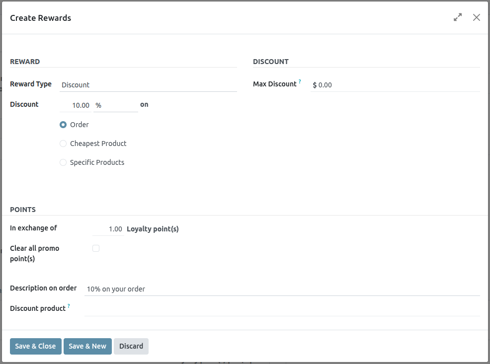
Building Blocks
You can design your website by dragging and dropping building blocks, then editing them to fit your content and layout needs.
Add a building block
To add a block to a website page, access the page, click Edit, then drag and drop the desired building block into the appropriate location. Two types of building blocks are available: Categories and Inner Content. Inner Content building blocks can only be added into Categories building blocks.
When clicking on a category block, a popup appears, allowing you to select between multiple templates for each category.
Once the category block is placed, you can drag and drop Inner content blocks within it. The Inner content blocks allow you to add elements, such as videos, images, social media buttons, etc., into pre-existing category blocks.
Form
The Form block is used to collect information from website visitors and create records in your database, if applicable.
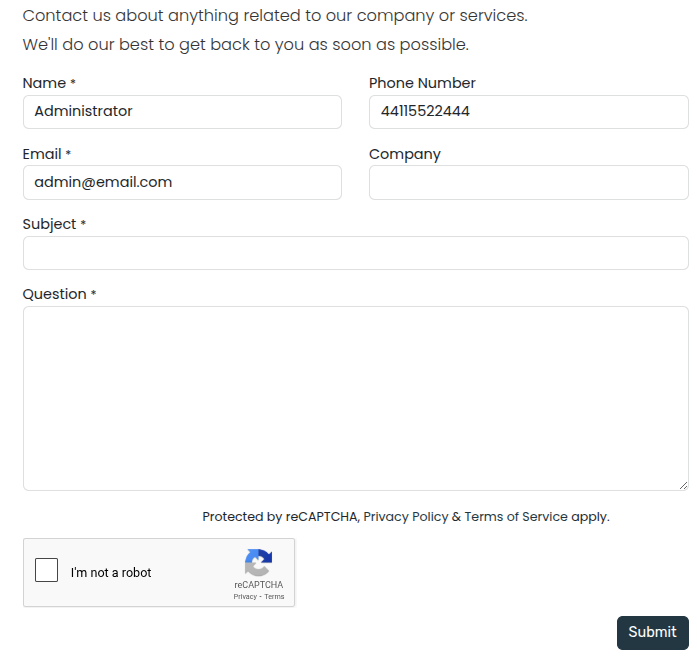
Action
By default, when the form is submitted, an email containing the information entered by the visitor is automatically sent. Depending on the apps installed on your database, additional actions that can automatically create records may become available. To choose a different action, click Edit, click the form, navigate to the Customize tab, and select the desired Action:
- Apply for a Job(Recruitment)
- Create a Customer(eCommerce)
- Create a Ticket(Helpdesk)
- Create an Opportunity(CRM)
- Subscribe to Newsletter(Email Marketing)
- Create a Task(Project)
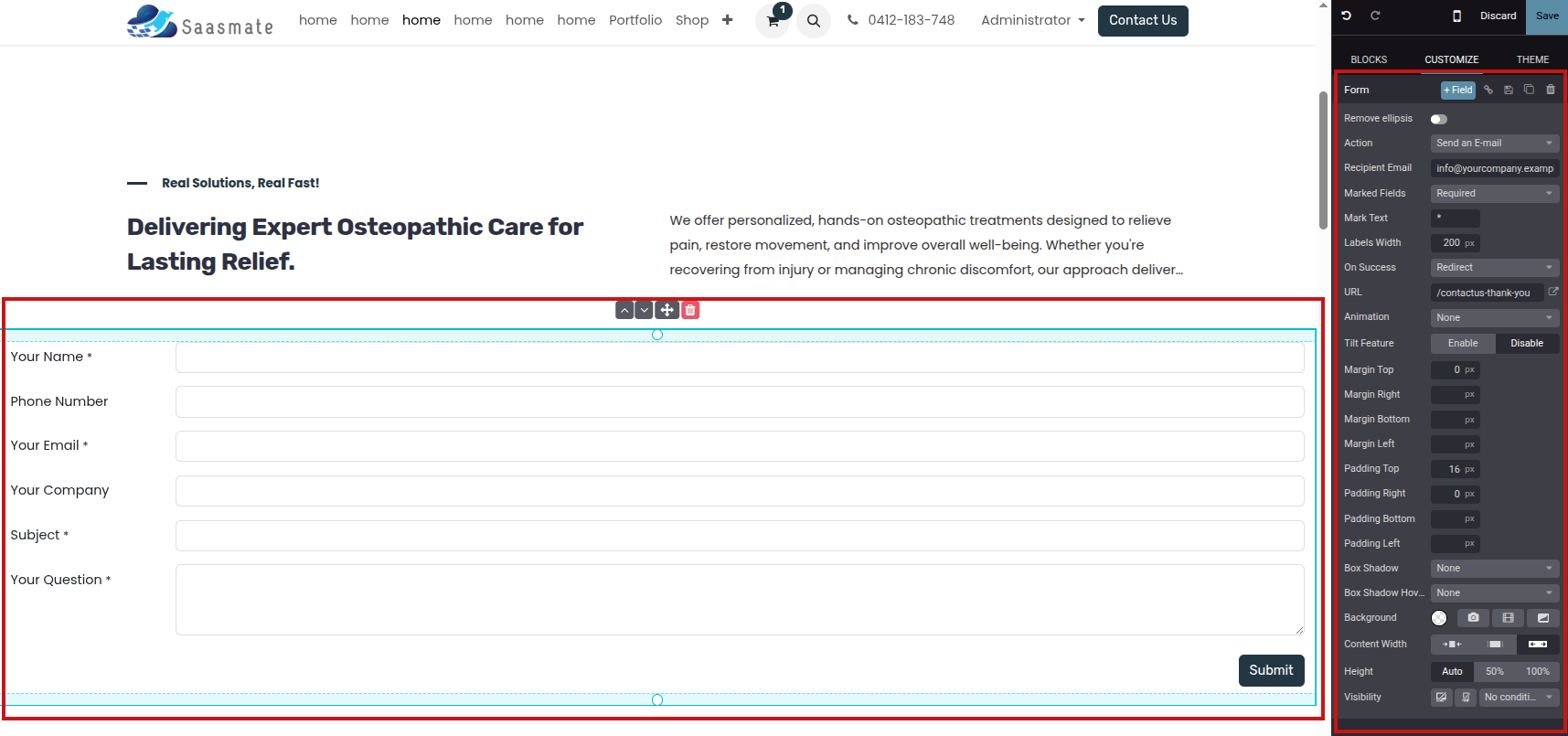
By default, submitting the form redirects visitors to a Thank you page. Use the URL field to send them to a different page. Alternatively, you can choose not to redirect and keep them on the form’s page by selecting Nothing or Show Message in the On Success field.
Fields
To add a new field to the form, navigate to the Customize tab and click the + Field button next to the Form or Field section. To modify the new (or any other) field on the form, select the field, then use the options available in the Field section of the Customize tab. For example, you can:
- Change the field Type.
- Edit the field’s Label and adapt its Position.
- Enable a field Description. Click the default description on the form to modify it.
- Add a Placeholder or Default value.
- Specify if the field is Required.
- Edit the field’s visibility settings.
- Add an animation.
Once you have made the desired changes, click Save.
Embed code
Embedding code allows you to integrate content from third-party services into a page, such as videos from YouTube, maps from Google Maps, social media posts from Instagram, etc.
After adding the block to a page, click the block, then go to the Customize tab and click Edit. Replace the placeholder code with your custom embed code.
Move, switch, or delete a building block
Pull the turquoise borders on the block to reduce or increase the space at the top or bottom of it.
Change the block order by clicking (chevron up) or (chevron down) and move the block on the page by clicking (arrows). When you have multiple columns, move a column to the left or right by clicking (chevron left) or (chevron right).
To delete a block, click (trash).
Edit a building block
To edit the content of a building block, click on it and go to the Customize tab. Available customization options vary depending on the type of block selected.
Background
To modify the background of a building block, select the block, go to the Customize tab, and click the color dot or another Background option. You can change the color and/or add an image, video, and/or shape. Once you’ve selected a shape, new fields appear to allow you to customize the shape.
Layout: grid and columns
For most building blocks, you can choose between two layout styles: grid or columns (cols). To change the default layout style, click the block, go to the Customize tab, and set the Layout field to Grid or Cols.
Grid
The Grid layout allows you to reposition and resize elements, such as images or text, by dragging and dropping them. When Grid is selected, additional options are available to Add Elements by clicking Image, Text, or Button.
Cols
Choosing the Cols layout allows you to determine the number of elements per line within the block. To do so, select the block to modify, click the dropdown next to the Cols field, and adjust the number. You can then modify a specific column’s settings using the options in the Column section of the Customize tab.
Duplicate a building block
To duplicate a building block, click the (duplicate) icon at the top of the Customize tab. Once duplicated, the new block appears on the page beneath the original one.
Save a custom building block
You can save a customized building block to reuse it elsewhere. To do so, select it, navigate to the Customize tab, and click the (floppy disk) icon. Click the Save and reload button in the popup to confirm saving your custom block.
To add a saved building block to the page, navigate to the Blocks tab and drag and drop the Custom block from the Categories section. In the popup that opens, click the desired block in the Custom category.
Create an anchor link
Anchor links are hyperlinks that direct users to a specific section of a page. To create an anchor link for a block, follow these steps:
- Click Edit and select the block you want to link to.
- Click (link) at the top of the Customize tab.
- To edit the default anchor name, click Edit in the green popup message that opens.
- Replace the anchor name and click Save & copy.
Once the anchor is saved, you can link to it from anywhere on your website.
General Theme
Saasmate offers various options to shape your website’s theme, including its colors, fonts, and layout.
When setting up your website for the first time, you are prompted to select a theme. Hover your mouse over the themes to see an extended preview of each one. Click on a theme to select it.
In the website builder, the Theme tab offers various options to customize your website’s general theme. To access it, click Edit and go to the Theme tab.
Once you have made the desired changes, click on Save to confirm and apply them to your website.
Theme
In the Website section, click on Switch Theme to open the theme selector. Hover your mouse over the themes to see an extended preview of each one. Click on a theme to apply it to your website.
Colors
Saasmate’s website editor features two main types of colors: theme colors and status colors.
Theme colors
Theme colors refer to the set of colors displayed across all pages of your website. These are made of five colors: three main colors and two light and dark colors.
To edit your website’s colors, go to the Colors section in the website editor, then:
- Click on the color dot you want to change, then select a Solid color or click on Custom to pick a specific color tone manually (or add its #HEX or RGBA code).
- Click on the paint palette icon and choose a color palette. As a result, all color customizations are reset; click a color dot to change a specific color.
Saasmate automatically creates Color Presets for your chosen palette. These are predefined color combinations applied to different elements of your website to provide a structured and visually appealing design. When you select a color palette, its presets define how those colors are distributed across different elements from a building block, such as buttons, backgrounds, and text. If you want to modify them, click on Color Presets and click on a preset to customize it further. Each color preset contains colors for your building block’s background, text, headings, links, primary buttons, and secondary buttons.
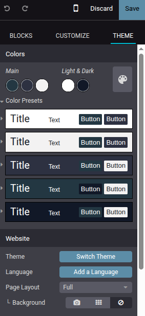
To apply a color preset to a building block on your site, select the building block, go to the Customize tab, click the color dot located next to Background, and choose a Theme.
Status colors
Status colors are used to indicate the status of certain actions (e.g., Success, Warning, etc.). They’re used in pop-up messages that appear to provide feedback to users and website visitors. To customize your website’s Status Colors, scroll down to the Advanced section and click on the dots to change their color.
Page layout
The Page layout option in the Website section allows you to change the overall display and spacing of building blocks and website elements on pages. Click the dropdown menu and select the desired layout. Under Page Layout, customize your Background by choosing an Image, using a selected image in a Pattern, or leaving it blank.
Fonts
Saasmate allows you to customize the font family and size for specific elements on your website, including paragraphs, headings, buttons, and input fields.
- Font Family: In the Paragraph, Headings, and Button sections, select a font from the dropdown menu.
- Font Size: In the Paragraph, Headings, Button, and Input Fields sections, use the Font Size field to set a default size. Click the (arrow) icon to expand the section and define custom sizes (e.g., based on the heading level, button size, etc.).
Additionally, each element-specific section offers extra styling options, such as Line Height and Margins, for further customization.
Custom fonts
It is possible to use fonts on your website that are not offered by default in Saasmate. To add a custom font, click the dropdown menu related to the Font Family field and select Add a Custom Font at the bottom of the dropdown menu. In the pop-up window:
- To add a Google font, click on Select a Google Font and click on the desired font in the list. Toggle off the Serve font from Google servers if your website is operated from a location where regulations require compliance with laws such as, but not limited to, the European Union’s GDPR. This will ensure that the Google Font is stored on your website’s server instead of Google’s.
- To upload a custom font from your computer, click on Choose File.
Once done, click on Save and Reload.
Button styles
To customize the style of your website’s primary and secondary buttons, navigate to the Button section in the website editor and edit the relevant options:
- Click the arrow next to the Primary Style or Secondary Style fields and select one of the available styles for each type of button: Fill, Outline, or Flat. When selecting Outline, the Border Width option appears below, allowing you to adjust the width of the button’s outline.
- Modify the fonts.
- Adjust the Padding to change the size of the spacing (in pixels) around the buttons’ labels.
- Customize the buttons’ border radius using the Round Corners option.
- Add an animation when a button is clicked in the On Click Effect dropdown menu.
Link style
In the Link section, click on Link Style to choose the appearance of links on your website. Select No Underline, Underline On Hover, or Always Underline in the dropdown menu.
Elements
Elements help structure and present content effectively. They range from text-based components like titles, lists and text highlights to interactive ones such as buttons and links. Visual elements like images, icons, videos, and animations can also be added to improve content presentation and organization.
To add or modify a website element:
- Navigate to the relevant website page and click on Edit.
- Click the section on the page where you want to add or modify an element.
- Make the necessary changes.
- Click on Save.
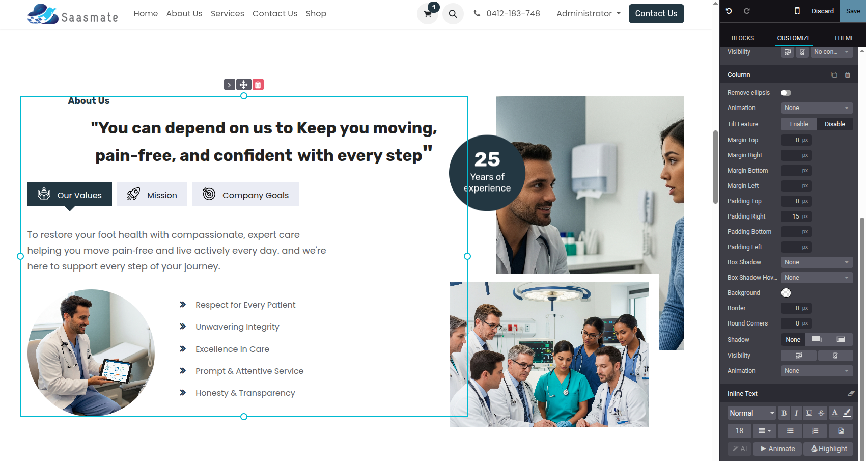
Titles
Titles define headings and organize website content into different levels for clarity and structure. To insert a title, type /title, choose the heading style (Heading 1, Heading 2, or Heading 3), and type the text.
Buttons
Buttons are interactive elements that allow to link to another page or to a page anchor. To insert a button:
- Navigate to the relevant website page and click on Edit.
- Click the section on the page where you want to add or modify an element.
- Make the necessary changes.
- Click on Save.
Images
To insert an image:
- Type /image.
- Search the Unsplash database or click Upload an image to choose a file from your local images.
- Click Add.
-
To customize the image, click on the image and edit the options in the Image section of the website editor.
For example:
- Replace the image.
- Define an alt tag in the Description field.
- Enter a title tag in the Tooltip field (this text appears when hovering).
- Add a Shape (some shapes allow color customization).
- Adjust the image’s Width (smaller sizes may be suggested for better performance).
- Resize the image using the Transform tool.
- Adjust the Padding to add space (in pixels) around the image.
- Etc.
Videos
To add a video, type /video, insert the URL, and turn on the desired options:
- Autoplay: to automatically play the video when the page is accessed. The video is automatically muted by default.
- Loop: to play the video on a loop.
- Hide player controls
- Hide fullscreen button
Icons
To insert an icon, type /image, go to the Icons tab, select an icon, and click Add. To modify an icon, click on it and use the Icon section of the website editor to customize options, such as Color, Size, Aniamtions, Shape, etc.
Links
Links are used to connect different pages and resources, guiding visitors and improving navigation. To add a link, type /link, then, in the pop-up that opens, enter the link’s Label and add the URL or Email. Type / to search for a page and # to link to an anchor.
Lists
Lists help organize content clearly, making information easier to read and improving web pages’ structures. Type /list and choose from three different types of lists: Bulleted lists, Numbered lists, or Checklists.
Text highlights
Highlights can be added to titles and text using in the Inline Text section of the website editor. To add a highlight:
- Select the text or title you want to highlight.
- In the website editor, click on Highlight.
- Select the highlight style.
- Modify its Color.
- Choose its Thickness.
Animations
Animations are used to add movement to building blocks and website elements such as images and text. Three types of animation are available: On Scroll, On Appearance, and On Hover (for images only).
To add an animation to a website element:
- Click on the element.
- In the website editor, go to the relevant section for the element (e.g., Button, Column, Inline Text, etc.).
- In the Animation field, select the desired animation type.
- Customize the animation settings as needed. Available options vary based on the selected animation type.
Animations on scroll
For animations on scroll, it is possible to:
- Choose In to add the animation when the element enters the screen and Out to add it when it leaves the screen.
- Select an Effect.
- Choose the Direction of the effect.
- Adapt the Intensity of the effect.
- Define the Scroll Zone, where the first value represents the percentage of the screen shown when the effect starts, and the second value represents its percentage at the end.
Animations on appearance
For animations on appearance, it is possible to:
- Choose among different effects.
- Choose the Direction of the effect.
- Pick a Trigger option to define when the animation occurs: either the First Time only or Every Time.
- Adapt the Intensity of the effect.
- If you want the animation to be triggered after a number of seconds, define this number in the Start After field.
- Choose a Duration for the animation.
Animations on hover (for images only)
Animations On hover can be added to images. You can choose the Effect of the animation, as well as the Color and the Stroke Width.
Visibility
You can choose to display or hide building blocks based on a visitor’s:
- device type (mobile or computer),
- country (IP-based geolocation),
- website language,
- UTM parameters, and
- login state.
Mobile/computer
To toggle the visibility of a building block based on the visitor’s device type:
It is also sometimes possible to hide elements within blocks. It is mostly used to hide specific elements inside blocks that may be too wide to be correctly displayed on mobile devices. To see if the option is available, select an element within a block and look for the Visibility option under the element’s customization option.
Conditions
To access the country, website language, UTM parameters, and login state conditions:
- Open the Website Editor and select a block.
-
In the Customize tab, under the block’s customization options, look for Visibility.
- Click the Show/Hide on Desktop button to hide the block for visitors using a computer.
- Click the Show/Hide on Mobile button to hide the block for visitors using a mobile device.
- Click Save to apply the changes.
It is also sometimes possible to hide elements within blocks. It is mostly used to hide specific elements inside blocks that may be too wide to be correctly displayed on mobile devices. To see if the option is available, select an element within a block and look for the Visibility option under the element’s customization option.
Conditions
To access the country, website language, UTM parameters, and login state conditions:
- Open the Website Editor and select a building block.
- In the Customize tab, look for Visibility.
-
Click No condition and select Conditionally instead to display the different options:
- Country: the country of the visitor’s IP address.
- Languages: the website language used by the visitor.
- UTM Campaign: the selected campaign.
- UTM Medium: the selected medium of any campaign.
- UTM Source: the selected source of any campaign.
- Users: select whether the visitor should be Logged In or Logged Out to view the block.
By default, the option is set to Visible for Everyone.
- For one or more of the first five options, choose if the block should be Visible for or Hidden for, then click Choose a record… and select it.
Click Save to apply the changes.
Invisible elements
Blocks and elements with custom visibility settings are listed at the bottom of the website editor sidebar. You can preview how the page would look like by clicking the (visible) button to hide a block or element, or the (hidden) to show it in the website editor.
Headers and Footers
The website header is the top section of a web page and usually contains elements such as the logo, the menu, the search bar, the sign-in/customer account button, etc. The footer is displayed at the bottom of a web page and usually contains information such as contact details, links, legal notices, and other options.
Header design
To modify the header’s design, click on Edit, then click on the header. The following options are available in the Header section of the Customize tab in the website editor:
- Choose a Template: select a Template from the drop-down menu.
- Background Settings: change the color palette through different Theme styles, Custom color options, and Gradient ones.
- Add a Border: define the header's size, style, and color.
- Adapt Round Corners: fit the design by adjusting the corner radius.
- Add a Shadow: define its Color, Offset, Blur, and Spread.
- Add a Scroll Effect: hover on an effect to preview it.
- Header Position: choose between Regular, Hidden, and Over The Content. When Over The Content is selected, you can customize the Background and Text Color.
- Show or Hide Elements: control visibility of text, the search bar, Sign in button, social media links, Contact us button, and logo.
To finalize changes, click on Save.
Header content
Menus organize the header’s content and help users navigate through web pages effectively. User-friendly and well-structured menus also play a crucial role in improving search engine rankings.
Menu editor
The menu editor allows to edit the website’s header and add menu items and mega menus.
To edit the header’s content, go to Website ‣ Site ‣ Menu Editor. From there, you can:
- Rename a menu item or change its URL using the Edit Menu Item icon;
- Delete a menu item using the Delete Menu Item icon;
- Move a menu item by dragging and dropping it to the desired place in the menu;
- Create a regular drop-down menu by dragging and dropping the sub-menu items to the right, underneath their parent menu.
Adding menu items
By default, pages are added to the menu as drop-down menu items when they are created. To add a new menu item, follow these steps:
- Go to Website ‣ Site ‣ Menu Editor.
- In the menu editor, click Add Menu Item.
- In the pop-up window, enter the Name to be displayed in the menu.
- Type / in the URL or Email field to search for a page on your website or # to search for an existing custom anchor.
- Click OK.
- Edit the menu structure if needed, then Save.
Menu item design
To modify the menu items, click on Edit, click on a menu item, then go to the Navbar section of the website editor. The following options are available:
- Adapt the Mobile Alignment.
- Choose the Font for the menu items.
- Change the font size, color, and alignment in the Format field.
- Select a Links Style to highlight the current page in the menu.
- Change the style of the header buttons.
- Choose to display the Sub Menus On Hover or On Click.
To finalize changes, click on Save.
Mega menus
Mega menus are similar to drop-down menus, but instead of a simple list of sub-menus, they display a panel divided into groups of navigation options. This makes them suitable for websites with large amounts of content or e-commerce websites, as they can help include all of your web pages or e-commerce categories in the menu while still making all menu items visible at once.
To create a mega menu, go to Website ‣ Site ‣ Menu Editor and click Add Mega Menu Item. Enter the Name of the mega menu in the pop-up, click OK, then Save.
To adapt the options and content of the mega menu, click on a mega menu item in the header, then click Edit. Mega menus are composed of building blocks, which means you can customize each component individually. For example:
- Edit the text directly in the building block.
- Edit a menu item’s URL by selecting the menu item and clicking the Edit link button in the small preview pop-up. Type / to search for a page on your website, or # to search for an existing custom anchor.
- Move a menu item by dragging and dropping the related block to the desired position in the mega menu.
- Delete a menu item by deleting the related block.
To adapt the general layout of the mega menu, go to the Customize tab of the website editor, then, in the Mega Menu section:
- Choose a Template.
- Pick the Size: either Full-Width or Narrow.
To finalize changes, click on Save.
Footer design
To modify the footer, click on Edit, click on the footer, and in the Footer section of the Customize tab in the website editor:
- Select a Template.
- Choose its Colors.
- Choose a Slideout Effect: Regular (i.e., no effect), Slide Hover, or Shadow.
- Toggle the Copyright switch to hide or show the copyright.
- Choose the Border size.
- Add a Shadow.
- Add a Scroll Top Button and choose its position.
- Hide or show the footer by toggling the Page visibility switch.
To finalize changes, click on Save.
Search Engine Optimization (SEO)
Search Engine Optimization, often abbreviated as SEO, is a digital marketing strategy to improve a website’s visibility and ranking in search engine results (e.g., in Google). It involves optimizing various elements on your website, including its content, social sharing, URLs, images, and page speed.
Content optimization
To optimize a webpage’s SEO, access the page, then go to Website ‣ Site ‣ Optimize SEO.
Meta tags
Meta tags are HTML elements that provide information about a webpage to search engines and website visitors. They play a crucial role in SEO by helping search engines understand the content and context of a webpage and attract visitors with appealing content. There are two types of meta tags in Saasmate:
- Title tags specify a webpage’s title and are displayed as a clickable link in search engine results. They should be concise, descriptive, and relevant to the page’s content. You can update the title tag of your webpage or keep it empty to use the default value based on the page’s content.
- Description tags summarize the webpage’s content, often displayed in search engine results below the title. They are used to encourage the user to visit the page. You can update the description tag of your webpage or keep it empty to use the default value based on the page’s content.
Keywords
Keywords are one of the main elements of SEO. A website that is well optimized for search engines speaks the same language as potential visitors, with keywords for SEO helping them to connect to your site.
You can enter the keywords you consider essential in the Keyword field and click ADD to see how they are used at different levels in your content (H1, H2, page title, page description, page content) and the related searches in Google. The tool also suggests relevant keywords to drive your web traffic. The more keywords are present on your webpage, the better.
Image for social share
When you share your page on social media, your logo image is selected, but you can upload any other image by clicking the upward arrow.
Images
The size of images has a significant impact on page speed, which is an essential criterion for search engines to optimize SEO ranking.
Saasmate automatically compresses uploaded images and converts them to Webp. With this file format, photos are smaller, which increases the page loading speed and, therefore, gives a better ranking in SEO. All images used in Saasmate official themes are also compressed by default. If you are using a third-party theme, it may provide images that are not compressed efficiently.
To modify an image from your website, select the image, click Edit, then go to the Customize tab, and adapt the Format in the Image section.
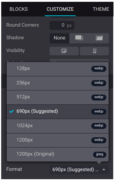
Address Autocomplete
You can use the Google Places API on your website to ensure that your users’ delivery addresses exist and are understood by the carrier. The Google Places API allows developers to access detailed information about places using HTTP requests. The autocompletion predicts a list of places when the user starts typing the address.
To do so, go to Website ‣ Configuration ‣ Settings and enable Address Autocomplete in the SEO section.
Insert your Google Places API key in the API Key field. If you don’t have one, create yours on the Google Cloud Console and follow these steps.
Step 1: Enable the Google Places API
Create a New Project: To enable the Google Places API, you first need to create a project. To do so, click Select a project in the top left corner, New Project, and follow the prompts to set up your project.
Enable the Google Places API: Go to the Enabled APIs & Services and click + ENABLE APIS AND SERVICES. Search for “Places API” and select it. Click on the “Enable” button.
Step 2: Create API Credentials
Go to APIs & Services –> Credentials.
Create credentials: To create your credentials, go to Credentials, click Create Credentials, and select API key.
Google Search Console
Google Search Console is a free web service provided by Google that allows website owners to monitor, maintain, and troubleshoot their site’s presence in Google Search results. It offers valuable insights into how Google views and interacts with your site, helping you optimize its performance.
To enable Google Search Console for your website, go to Google Search Console. Then, select the property type Domain property or URL prefix property.
Domain property
A domain property in Search Console tracks all versions of your website, including subdomains and protocols (http/https). This comprehensive view allows you to analyze your overall website’s search performance and make informed decisions to optimize its visibility. Enter the domain, e.g., example.com and click Continue.
URL prefix property
This type of verification is usually simpler as you have multiple verification methods, such as using your existing Google Analytics or Tag Manager account. It also makes sense to view a section of your website separately. For example, if you work with a consultant on a specific part of your website, you might want to verify this part separately to limit access to your data. Enter the URL, e.g., https://example.com/ and click Continue.
Site ownership verification
Before using Google Search Console for your website, you must verify your site ownership. This verification process is a security measure that protects both you and Google. It ensures that only authorized users have access to sensitive data and that you have control over how your website is treated in Google Search.
Five methods are available to do this:
- HTML file upload
- DNS record
- HTML tag
- Google Analytics tracking code
- Google Tag Manager container snippet
In your Saasmate database, go to Website ‣ Configuration ‣ Settings, and enable Google Search Console in the SEO section. Paste the verification code (e.g., google123abc.html) in the dedicated field.
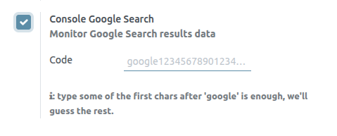
Cookies Bar
Cookies are small text files sent to your device when you visit a website. They are processed and stored by your browser and track user information like login details, preferences, and browsing history. Essential cookies are necessary for the website to function, while optional cookies are used to analyze behavior or display ads.
Data protection laws require notifying users about data collection methods and purposes. Cookies bar fulfill this obligation by informing users on their first visit and allowing them to decide whether to store all or only essential cookies on their device.
Configuration
To enable the cookies bar on your website, go to Website ‣ Configuration ‣ Settings and enable Cookies Bar in the Privacy section.
Customization
To adapt the display of the cookies bar, click Edit, go to the Invisible Elements section at the bottom of the panel, and click Cookies Bar. You can modify the Layout and Size of the cookies bar, and enable Backdrop to gray out the page in the background when the cookies bar is displayed on the screen.
Click anywhere in the building block to further customize the appearance of the cookies bar using Block, Column and/or Inline Text customization options.
To edit the contents of the cookies bar (i.e., the consent message), click directly in the building block.
Cookies policy
When you enable the cookies bar for your website, Saasmate creates the Cookie Policy page (/cookie-policy) containing a non-exhaustive list of cookies, with their purpose and examples. To access it, click the Cookie Policy hyperlink in the cookies bar or open the page from Website ‣ Site ‣ Pages.
To adapt the content of the page according to your needs, click the Edit button.
Translations
Your website is displayed in the language that matches your visitor’s browser. If the browser’s language has not been installed and added to your website, the content is shown in the default language. When additional languages are installed, users can choose their preferred language using the language selector.
The Translate feature on your website allows automatic translation of standard terms and provides a tool for manual content translation.
Install languages
To allow translation of your website, you must first install the required languages and add them to your website. To do so, go to Website ‣ Configuration ‣ Settings and click Install languages in the Website Info section. In the dialog box that opens, select the Languages you want from the dropdown menu, tick the required Websites to translate, and click Add.
To edit your website’s languages, go to Website -–> Configuration -–> Settings and add/remove the required languages in/from the Languages field in the Website info section.
Default language
When multiple languages are available on your website, you can set a default language to be used if the visitor’s browser language is not available. To do so, go to Website –-> Configuration -–> Settings, and select a language in the Default field.
Language selector
Your website’s visitors can switch languages using the language selector, available by default in the Copyright section at the bottom of the page. To edit the language selector menu:
- Go to your website and click Edit;
- Click the language selector available in the Copyright block and go to the Copyright section of the website builder;
- Set the Language Selector field to either Dropdown or Inline. Click None if you do not want to display the Language selector;
- Click Save.
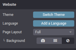
Multiple Websites
Saasmate allows you to create multiple websites from the same database. This can be useful, for example, if you have multiple brands operating under your organization, or to create separate websites for different products/services, or different audiences. In these cases, having different websites can help avoid confusion and make it easier to tailor your digital outreach strategies and reach your target audience.
Website creation
To create a new website, proceed as follows:
- Go to Website ‣ Configuration ‣ Settings.
- Click + New Website.
- Specify the Website Name and Website domain. Each website must be published under its own domain.
- Adapt the Company name, Languages and Default language if needed.
- Click the Create button.
You can then start building your new website.
Switching websites
To switch from one website to another, click the menu next to the +New button in the top right corner and select the website you want to switch to.
Website-specific configuration
Most website settings are website-specific, which means they can be enabled/disabled per website. To adapt the settings for a website, go to Website ‣ Configuration ‣ Settings. Select the desired website in the field Settings of Website at the top of the Settings page, in the yellow banner. Then, adapt the options for that specific website.
Website pages
To modify the website on which a page is to be published, proceed as follows:
- Go to Website ‣ Site ‣ Pages.
- Open the search panel and select the website on which the page is currently published.
- Tick the check box next to the page(s) you want to change.
- Click the Website field and select the website, or empty it to publish the page on all websites.
eCommerce features
eCommerce features such as products, eCommerce categories, pricelists, discounts, payment providers, etc. can be restricted to a specific website.
Pricing
Products can be priced differently based on the website using pricelists. The following configuration is required:
- Go to Website ‣ Configuration ‣ Settings.
- Scroll down to the Shop - Products section and select the Pricelists option Multiple prices per product.
- Click Pricelists to define new pricelists or edit existing ones.
- Select the pricelist or click New to create a new one, then select the Configuration tab and set the Website field.
Reporting
Analytics
Each website has its own analytics. To switch between websites, click the buttons in the upper right corner.
Other reporting data
Other reporting data such as eCommerce dashboard data, online sales analyses and visitors can be grouped by website if necessary. Open the search panel and select Group by –> Website.
Forms Spam Protection
Google reCAPTCHA v3 protect website forms, web sign-up pages, and password reset pages against spam and abuse. They attempt to distinguish between human and bot submissions using non-interactive challenges based on telemetry and visitor behavior.
reCAPTCHA v3 configuration
On Google
Open the reCAPTCHA website registration page. Log in or create a Google account if necessary.
On the website registration page:
- Give the website a Label.
- Leave the reCAPTCHA type on Score based (v3).
- Enter one or more Domains (e.g., example.com or subdomain.example.com).
- Under Google Cloud Platform, a project is automatically selected if one was already created with the logged-in Google account. If not, one is automatically created. Click Google Cloud Platform to select a project yourself or rename the automatically created project.
- Agree to the terms of service.
- Click Submit.
A new page with the generated keys is then displayed. Leave it open for convenience, as copying the keys to Saasmate is required next.
On Saasmate
- From the database dashboard, click Settings. Under Integrations, enable reCAPTCHA if needed.
- Open the Google reCAPTCHA page, copy the Site key, and paste it into the Site Key field in Saasmate.
- Open the Google reCAPTCHA page, copy the Secret key, and paste it into the Secret Key field in Saasmate.
Blog
Saasmate Blog allows you to create and manage blog posts on your website to engage your audience and build a community.
Creating a blog
To create or edit a blog, go to Website ‣ Configuration ‣ Blogs: Blogs. Click New, and enter the Blog Name and the Blog Subtitle.
The Blog menu item is added to your website’s menu the first time you create a blog and gathers all your blogs.
Adding a blog post
Go to your website, click +New in the top-right corner, and select Blog Post. In the pop-up, select the blog where the post should appear, write the post’s Title, and Save. You can then write the post’s content and customize the page using the website builder.
Using tags
Tags let visitors filter all posts sharing the same tag. By default, they are displayed at the bottom of posts, but can also be displayed on the blog’s main page. To do so, click Edit ‣ Customize and enable the Sidebar. By default, the sidebar’s Tags List is enabled.
To create a tag, go to Website ‣ Configuration ‣ Blogs: Tags and click New. Fill in the:
- Name
- Category: tag categories let you group tags displayed on the sidebar by theme.
- Used in: to apply the tag to existing blog posts, click Add a line, select the posts, and click Select.
You can add and create tags directly from posts by clicking Edit ‣ Customize and select the post’s cover. Under Tags, click Choose a record…, and select or create a tag.
Customizing blog homepages
Customize the content of blog homepages by opening a blog homepage and clicking Edit ‣ Customize.
Top Banner: Name/Latest Post displays the title of the latest post on the top banner, while Drop Zone for Building Blocks removes the top banner and lets you use any building block instead.
Layout: organizes posts as a Grid or List.
- Cards: adds a card effect.
- Increase Readability: improves the text’s readability.
Sidebar: displays a sidebar containing an About us section.
- Archives: allows visitors to select a month and filter all posts created during that month.
- Follow Us: displays links to your social media networks. They can be configured using the Social Media building block somewhere on your website.
- Tags List: displays all tags related to a blog. Visitors can select a tag to filter all related posts.
Posts List: Cover displays the posts’ images, and No Cover hides them.
- Author: displays the posts’ authors.
- Comments/Views Stats: displays the posts’ number of comments and views.
- Teaser & Tags: displays the posts’ first sentences and tags.
Customizing blog posts
Customize posts by opening a blog post and clicking Edit ‣ Customize.
Layout: Title Inside Cover displays the title inside the cover image, and Title above Cover displays it above.
- Increase Readability: increases the text’s readability.
Sidebar: displays the Sidebar and additional options:
- Archive: allows visitors to select a month and filter all posts created during that month.
- Author: displays the post’s author and creation date.
- Blog List: displays links to all your blogs.
- Share Links: displays share buttons to several social networks.
- Tags: displays the post’s tags.
Breadcrumb: displays the path to the post.
Bottom: Next Article displays the next post at the bottom, and Comments enable visitors to comment on the post.
Select To Tweet: visitors are offered to tweet the text they select.
Website Customize
Website Customize allows you to design and personalize your website without coding. You can edit layouts, colors, fonts, and content to match your brand identity. It helps create a professional, user-friendly website that engages visitors effectively.
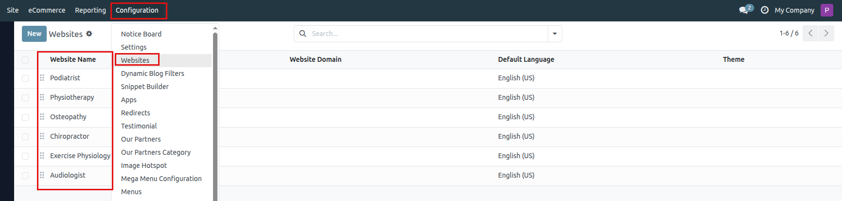
It shows the Websites menu under Configuration. In this view:
- Multiple websites are configured (like Podiatrist, Physiotherapy, Osteopathy, Chiropractor, Exercise Physiology, Audiologist).
- Each website entry has columns for Website Name, Website Domain, Default Language (English US), and Theme.
- The menu path is: Configuration → Websites.
- From here, you can manage different websites, set their domains, languages, and themes.
- Which website will appear first in this list view and work as the default on the website side
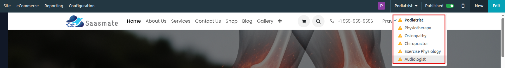
- At the top-right, you can see the current active website (Podiatrist) selected.
- The dropdown menu lists all available websites: Podiatrist, Physiotherapy, Osteopathy, Chiropractor, Exercise Physiology, and Audiologist.
- Each website can be individually managed, edited, and published/unpublished.
- This allows administrators to quickly switch between multiple websites under the same Saasmate instance.
All URLs Present – Need for Customization
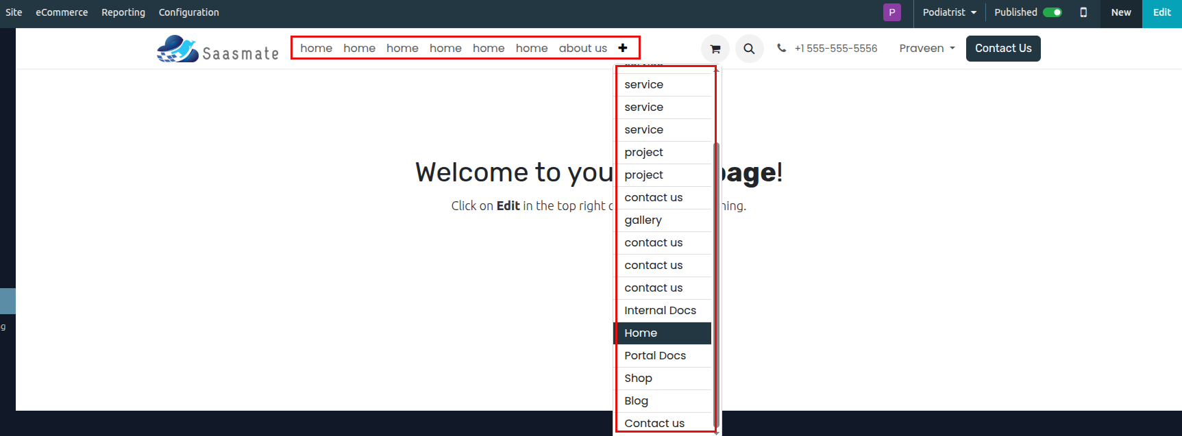
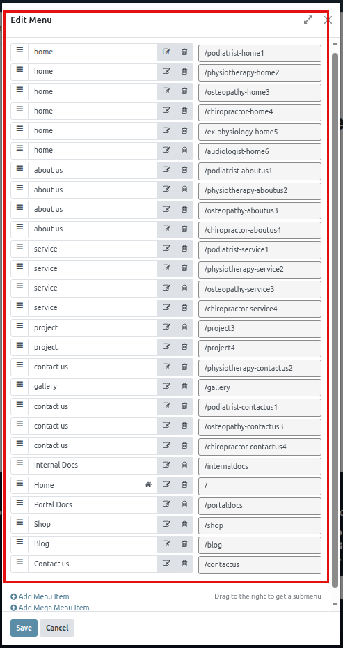
Currently, all menu URLs from every website are appearing together in the navigation. This creates duplication (multiple Home, About Us, Services, Contact Us links) and causes confusion. To resolve this, we must customize the menu URLs for each website so that:
- Each website has its own unique URLs (e.g., Home = /podiatrist-home1, About Us = /podiatrist-aboutus1, Services = /podiatrist-service1, Contact Us = /podiatrist-contactus1).
- Common links such as Shop = /shop, Blog = /blog, and Portal Docs = /portaldocs remain shared across all websites.
- Only the relevant menu items are displayed for the selected website.
- Website visitors see a clean, dedicated navigation menu without repeated or irrelevant URLs.
- The same rule applies to all other websites, including Physiotherapy, Osteopathy, Chiropractor, Exercise Physiology, and Audiologist.
Customize To Set Logo
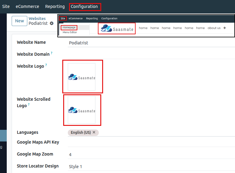
To Set Homepage Default
Homepage To Logo Click means There Present "Welcome to your Homepage!"like.
Next We Have to set logo to homepage
- In Saasmate, every website can have its own default homepage.
- To set this, go to the Site Menu → Properties of the page you want as homepage.
- In the Page Properties dialog, enable the “Is Homepage” toggle.
- This ensures that when visitors open a website (Podiatrist, Physiotherapy, Osteopathy, etc.), they directly see the correct homepage designed for that specialty.
- ✅ Done – The logo now links to the assigned homepage.
1)Podiatrist
"The Podiatrist website uses this menu structure with its own specific URLs."
- At the top (highlighted in red), you can see the main navigation menu items: Home, About Us, Services, Contact Us, Shop, Blog, Gallery, and Portal Docs.
- Each menu item has its URL path defined (e.g.,
/podiatrist-home1,/podiatrist-aboutus1,/shop,/blog). - The house icon next to Home indicates that it is set as the default homepage for this website.
- You can add new items using “Add Menu Item” or “Add Mega Menu Item”, and reorder existing items by dragging them.
2)Physiotherapy
"The Physiotherapy website uses this menu structure with its own specific URLs."
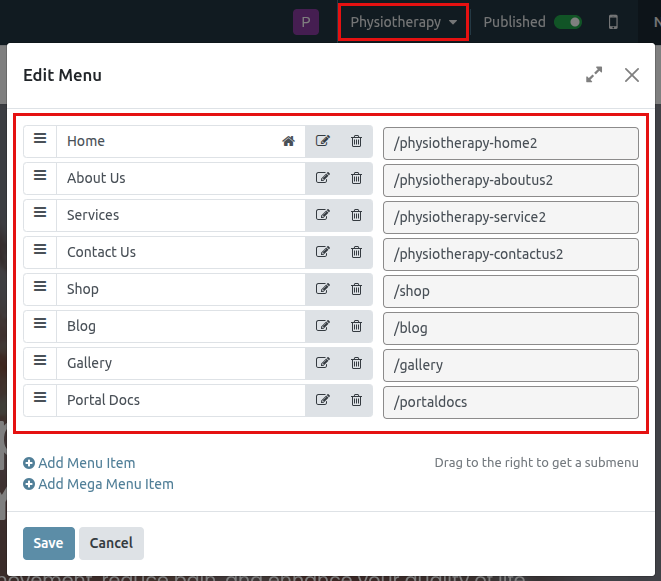
- At the top (highlighted in red), you can see the main navigation menu items: Home, About Us, Services, Contact Us, Shop, Blog, Gallery, and Portal Docs.
- Each menu item has its URL path defined (e.g.,
/physiotherapy-home2,/physiotherapy-aboutus2,/shop,/blog). - The house icon next to Home indicates that it is set as the default homepage for this website.
- You can add new items using “Add Menu Item” or “Add Mega Menu Item”, and reorder existing items by dragging them.
3)Osteopathy
"The Osteopathy website uses this menu structure with its own specific URLs."
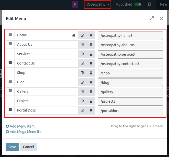
- At the top (highlighted in red), you can see the main navigation menu items: Home, About Us, Services, Contact Us, Shop, Blog, Gallery, and Portal Docs.
- Each menu item has its URL path defined (e.g.,
/osteopathy-home3,/osteopathy-aboutus3,/shop,/blog). - The house icon next to Home indicates that it is set as the default homepage for this website.
- You can add new items using “Add Menu Item” or “Add Mega Menu Item”, and reorder existing items by dragging them.
4)Chiropractor
"The Chiropractor website uses this menu structure with its own specific URLs."
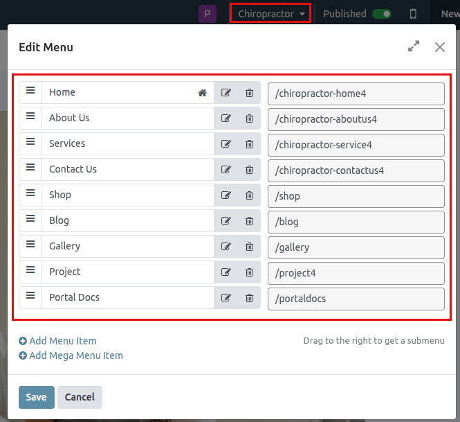
- At the top (highlighted in red), you can see the main navigation menu items: Home, About Us, Services, Contact Us, Shop, Blog, Gallery, and Portal Docs.
- Each menu item has its URL path defined (e.g.,
/chiropractor-home4,/chiropractor-aboutus4,/shop,/blog). - The house icon next to Home indicates that it is set as the default homepage for this website.
- You can add new items using “Add Menu Item” or “Add Mega Menu Item”, and reorder existing items by dragging them.
5)Exercise Physiology
"The Exercise Physiology website uses this menu structure with its own specific URLs."
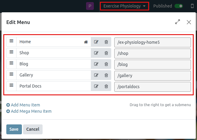
- At the top (highlighted in red), you can see the main navigation menu items: Home, About Us, Services, Contact Us, Shop, Blog, Gallery, and Portal Docs.
- Each menu item has its URL path defined (e.g.,
/ex-physiology-home5,/shop,/blog). - The house icon next to Home indicates that it is set as the default homepage for this website.
- You can add new items using “Add Menu Item” or “Add Mega Menu Item”, and reorder existing items by dragging them.
6)Audiologist
"The Audiologist website uses this menu structure with its own specific URLs."
- At the top (highlighted in red), you can see the main navigation menu items: Home, About Us, Services, Contact Us, Shop, Blog, Gallery, and Portal Docs.
- Each menu item has its URL path defined (e.g.,
/audiologist-home6,/shop,/blog). - The house icon next to Home indicates that it is set as the default homepage for this website.
- You can add new items using “Add Menu Item” or “Add Mega Menu Item”, and reorder existing items by dragging them.
Footer Customize
Footer Colour:
- Colors Circle – lets you set the footer’s solid color.
- Gradient Tab – switches the background style to gradient mode.
- Blue-Green Gradient Box – applies a blue → green gradient background to the footer.

Phone / Contact Number Change or Apply:
- Top Navigation Bar Phone Number: 0412-183-748
- Inline Text Editor (Right Panel) also shows the same number: 0412-183-748
- This means if you want to change or update the phone number on your site header, you just need to edit it in that Inline Text box (right side editor).
- For example, if you want to update it to +91 98765 43210, just replace the highlighted number in the Inline Text field → it will automatically update in the header.

1. Contact Us – Podiatrist Website
- Label: Contact Us
- Link Path: /podiatrist-contactus1
- Full URL: https://demo.vantagecore.au/podiatrist-contactus1
- Description: Used to direct users to the contact page specific to the Podiatrist website.

2. Contact Us – Physiotherapy Website
- Label: Contact Us
- Link Path: /physiotherapy-contactus2
- Full URL: https://demo.vantagecore.au/physiotherapy-contactus2
- Description: Used to direct users to the contact page specific to the Physiotherapy website.

3. Contact Us – Osteopathy Website
- Label: Contact Us
- Link Path: /osteopathy-contactus3
- Full URL: https://demo.vantagecore.au/osteopathy-contactus3
- Description: Used to direct users to the contact page specific to the Osteopathy website.

4. Contact Us – Chiropractic Website
- Label: Contact Us
- Link Path: /chiropractor-contactus4
- Full URL: https://demo.vantagecore.au/chiropractor-contactus4
- Description: Used to direct users to the contact page specific to the Chiropractic website.

5. Contact Us – Exercise Physiology Website
- Label: Contact Us
- Link Path: /podiatrist-contactus1
- Full URL: https://demo.vantagecore.au/podiatrist-contactus1
- Description: Since the Exercise Physiology website does not have its own contact page, it uses the Podiatrist contact page.

6. Contact Us – Audiologist Website
- Label: Contact Us
- Link Path: /podiatrist-contactus1
- Full URL: https://demo.vantagecore.au/podiatrist-contactus1
- Description: Since the Audiologist website does not have its own contact page, it uses the Podiatrist contact page.

Podiatrist Website:
The Useful Links section in the footer is specifically configured for the Podiatrist website. These links are assigned only to this site and should not be used elsewhere. Below is the detailed setup for each link
1. Home
- Label: Home
- Link Path: /podiatrist-home1
- Full URL: https://demo.vantagecore.au/podiatrist-home1
- Description: This link directs users to the home page of the Podiatrist website. It is exclusive to this site and leads to the main landing page with clinic details and services.
- Style: Small text, link format
- Open in new window: Disabled

2. About us
- Label: About us
- Link Path: /podiatrist-aboutus1
- Full URL: https://demo.vantagecore.au/podiatrist-aboutus1
- Description: Provides information about the clinic, its mission, and team. This page is specifically created for the Podiatrist site and should not be reused for other websites.
- Style: Small text, link format
- Open in new window: Disabled

3. Products
- Label: Products
- Link Path: # (placeholder)
- Full URL: Not linked
- Description: This is a placeholder link and currently not assigned to any page. It is intended for future use within the Podiatrist website only.
- Style: Small text, link format
- Open in new window: Disabled

4. Services
- Label: Services
- Link Path: /podiatrist-service1
- Full URL: https://demo.vantagecore.au/podiatrist-service1
- Description: Links to the services offered by the Podiatrist Website. This page is tailored specifically for the Podiatrist site and provides detailed information about treatments and consultations.
- Style: Small text, link format
- Open in new window: Disabled

Physiotherapy Website:
The Useful Links section in the footer is exclusively configured for the Physiotherapy website. These links are assigned only to this site and should not be used elsewhere. Below is the detailed setup for each link:
1. Home
- Label: Home
- Link Path: /physiotherapy-home2
- Full URL: https://demo.vantagecore.au/physiotherapy-home2
- Description: This link directs users to the home page of the Physiotherapy website. It is unique to this site and leads to the main landing page with clinic details, features, and navigation options.
- Style: Small text, link format
- Open in new window: Disabled

2. About us
- Label: About us
- Link Path: /physiotherapy-aboutus2
- Full URL: https://demo.vantagecore.au/physiotherapy-aboutus2
- Description: Provides information about the clinic’s mission, team, and approach to physiotherapy treatments. This page is specifically designed for the Physiotherapy website.
- Style: Small text, link format
- Open in new window: Disabled

3. Products
- Label: Products
- Link Path: # (placeholder)
- Full URL: Not linked
- Description: This is a placeholder link and currently not assigned to any page. It is intended for future use within the Physiotherapy website only.
- Style: Small text, link format
- Open in new window: Disabled

4. Services
- Label: Services
- Link Path: /physiotherapy-service2
- Full URL: https://demo.vantagecore.au/physiotherapy-service2
- Description: This link provides access to detailed information about the services offered by the Physiotherapy clinic. It is customized exclusively for this website.
- Style: Small text, link format
- Open in new window: Disabled

Osteopathy Website:
The Useful Links section in the footer is exclusively configured for the Osteopathy website. These links are assigned only to this site and should not be used elsewhere. Below is the detailed setup for each link:
1. Home
- Label: Home
- Link Path: /osteopathy-home3
- Full URL: https://demo.vantagecore.au/osteopathy-home3
- Description: This link directs users to the home page of the Osteopathy website. It is unique to this site and leads to the main landing page highlighting clinic details, treatments, and patient care.
- Style: Small text, link format
- Open in new window: Disabled

2. About us
- Label: About us
- Link Path: /osteopathy-aboutus3
- Full URL: https://demo.vantagecore.au/osteopathy-aboutus3
- Description: Provides information about the Osteopathy clinic, including its mission, approach, and expert team. This page is specifically designed for the Osteopathy website.
- Style: Small text, link format
- Open in new window: Disabled

3. Products
- Label: Products
- Link Path: # (placeholder)
- Full URL: Not linked
- Description: This is a placeholder link reserved for future content. It is part of the footer navigation for the Osteopathy website but currently does not point to any page.
- Style: Small text, link format
- Open in new window: Disabled

4. Services
- Label: Services
- Link Path: /osteopathy-service3
- Full URL: https://demo.vantagecore.au/osteopathy-service3
- Description: Links users to the services page where detailed information about Osteopathy treatments, therapies, and consultations is provided. It is tailored specifically for this website.
- Style: Small text, link format
- Open in new window: Disabled

Chiropractic Website:
The Useful Links section in the footer is exclusively configured for the Chiropractic website. These links are assigned only to this site and should not be used elsewhere. Below is the detailed setup for each link:
1. Home
- Label: Home
- Link Path: /chiropractic-home4
- Full URL: https://demo.vantagecore.au/chiropractic-home4
- Description: This link directs users to the home page of the Chiropractic website. It is unique to this site and leads to the main landing page highlighting chiropractic care, treatments, and patient resources.
- Style: Small text, link format
- Open in new window: Disabled

2. About us
- Label: About us
- Link Path: /chiropractic-aboutus4
- Full URL: https://demo.vantagecore.au/chiropractic-aboutus4
- Description: Provides information about the Chiropractic clinic, including its mission, values, and healthcare professionals. This page is specifically created for the Chiropractic website.
- Style: Small text, link format
- Open in new window: Disabled

3. Products
- Label: Products
- Link Path: # (placeholder)
- Full URL: Not linked
- Description: This is a placeholder link reserved for future content. It is part of the footer navigation for the Chiropractic website but does not yet link to any page.
- Style: Small text, link format
- Open in new window: Disabled

4. Services
- Label: Services
- Link Path: /chiropractic-service4
- Full URL: https://demo.vantagecore.au/chiropractic-service4
- Description: Links users to the services page where detailed information about chiropractic treatments, therapy options, and patient care is provided. It is tailored exclusively for this website.
- Style: Small text, link format
- Open in new window: Disabled

Exercise Physiology Website:
The Useful Links section in the footer is exclusively configured for the Exercise Physiology website. These links are assigned only to this site and should not be used elsewhere. Below is the detailed setup for each link:
1. Home
- Label: Home
- Link Path: /exercise-physiology-home5
- Full URL: https://demo.vantagecore.au/exercise-physiology-home5
- Description: This link is intended to direct users to the home page of the Exercise Physiology website. However, this page does not currently exist or is not assigned yet.
- Style: Small text, link format
- Open in new window: Disabled

2. About us
- Label: About us
- Link Path: /podiatrist-aboutus1
- Full URL: https://demo.vantagecore.au/podiatrist-aboutus1
- Description: Since the Exercise Physiology website does not have its own About Us page, it is temporarily linked to the Podiatrist About Us page. This setup is only for placeholder purposes until a dedicated page is created.
- Style: Small text, link format
- Open in new window: Disabled

3. Products
- Label: Products
- Link Path: # (placeholder)
- Full URL: Not linked
- Description: This placeholder link is reserved for future content and is part of the footer navigation for the Exercise Physiology website. It currently does not link to any page.
- Style: Small text, link format
- Open in new window: Disabled

4. Services
- Label: Services
- Link Path: /podiatrist-service1
- Full URL: https://demo.vantagecore.au/podiatrist-service1
- Description: Since the Exercise Physiology website does not have its own Services page, it is temporarily linked to the Podiatrist Services page. This is only for placeholder purposes and should be updated once a dedicated page is available.
- Style: Small text, link format
- Open in new window: Disabled

Audiologist Website:
The Useful Links section in the footer is exclusively configured for the Audiologist website. These links are assigned only to this site and should not be used elsewhere. Below is the detailed setup for each link:
1. Home
- Label: Home
- Link Path: /audiologist-home6
- Full URL: https://demo.vantagecore.au/audiologist-home6
- Description: This link is intended to direct users to the home page of the Audiologist website. However, this page does not currently exist or is not assigned yet.
- Style: Small text, link format
- Open in new window: Disabled

2. About us
- Label: About us
- Link Path: /podiatrist-aboutus1
- Full URL: https://demo.vantagecore.au/podiatrist-aboutus1
- Description: Since the Audiologist website does not have its own About Us page, it is temporarily linked to the Podiatrist About Us page. This placeholder link is used until a dedicated About Us page is created for the Audiologist site.
- Style: Small text, link format
- Open in new window: Disabled

3. Products
- Label: Products
- Link Path: # (placeholder)
- Full URL: Not linked
- Description: This placeholder link is reserved for future content. It is included in the footer navigation but currently does not link to any page.
- Style: Small text, link format
- Open in new window: Disabled

4. Services
- Label: Services
- Link Path: /podiatrist-service1
- Full URL: https://demo.vantagecore.au/podiatrist-service1
- Description: Since the Audiologist website does not have its own Services page, it is temporarily linked to the Podiatrist Services page. This placeholder is only for interim navigation and should be updated when dedicated content becomes available.
- Style: Small text, link format
- Open in new window: Disabled

Change Languages
You select the language of your database upon its creation. However, you can add and install additional languages to allow users to manage the database in another language or to translate your website.
Add languages
To download additional languages:
- Either: click the profile icon in the upper-right corner, select My profile, and click the 🌍 (globe) icon next to the Language field;
- Or: go to the Settings app, and click Add Languages in the Languages section.
You can then select the languages you want from the dropdown menu and click Add.
Change languages
To select their preferred language, users can click the profile icon in the upper-right corner, go to My profile, and select a Language in the dropdown list.
Change another user’s language
To change the database language for a user:
- Go to the Settings app and click Manage Users in the Users section.
- Click on the user whose language you want to change.
- Go to the Preferences tab and select a previously installed language from the Language dropdown menu.
Two-factor Authentication
Two-factor authentication (2FA) is a way to improve security, and prevent unauthorized persons from accessing user accounts.
- Log in to your account.
- Step for Two-Factor Authentication.
- Go to Settings, then navigate to the Users & Companies menu. Under the Users submenu, go to Account Security and enable Two-Factor Authentication.
- Click on 'Two-Factor Authentication'. Enter your account password, then click the 'Enable Two-Factor Authentication' button.
- After clicking the 'Enable Two-Factor Authentication' button, a confirmation window will pop up. Scan the QR code using Google Authenticator or Microsoft Authenticator, then enter the verification code and click Activate.
- Once one two-step verification is enabled, attempting to activate multiple two-step verifications will trigger an error pop-up.
- If you don't have access to the settings, please go to this link: https://demo.vantagecore.au/
- Example: https://demo.vantagecore.au/my/home - remove
my/hometo only have https://demo.vantagecore.au/. - It is available in the Connection & Security menu. Go to Website → Connection & Security.
- The 'Connection & Security' menu includes several features such as:
- Change Password
- Two-Factor Authentication
- Revoke All Sessions
- Steps to Enable Two-Factor Authentication:
- Click on 'Two-Factor Authentication'. Enter your account password, then click the 'Enable Two-Factor Authentication' button.
- After clicking the 'Enable Two-Factor Authentication' button, a confirmation window will pop up. Scan the QR code using Google Authenticator or Microsoft Authenticator, then enter the verification code.
- The Two-Factor Authentication is successfully enabled.
- Deactivate Two-Factor Authentication by clicking the 'Disable Two-Factor Authentication' button. It will be disabled.
- Once one two-step verification method is enabled, only one additional two-step verification can be activated. Enabling more than two will show a warning: "Already enabled."
- Go to Settings, then navigate to the Users & Companies menu. Under the Users submenu, go to Account Security and enable Email Two-step verification.
- Click on the 'Email Two-Step Verification' option for email verification. Enter your account password, then click the 'Enable Email Two-Step Verification' button.
- After clicking the 'Enable Email Two-Step Verification' button, an Email OTP Setup window will pop up. Your registered email will be displayed as: xx@gmail.com
- Click the 'Send OTP' button. The OTP will be sent to your registered email: xx@gmail.com. Please check your email for the OTP and enter the verification code in the corresponding field to activate the verification.
- Once one two-step verification is enabled, attempting to activate multiple two-step verifications will trigger an error pop-up.
- If you don't have access to the settings, please go to this link: https://demo.vantagecore.au/
- Example: https://demo.vantagecore.au/my/home - remove
my/hometo only have https://demo.vantagecore.au/. - It is available in the Connection & Security menu. Go to Website → Connection & Security.
- Steps to Enable Email Two-Step Verification:
- Click on 'Email Two-Step Verification'. Enter your account password, then click the 'Enable Email Two-Step Verification' button.
- After clicking the 'Enable Email Two-Step Verification' button, an Email OTP Setup window will pop up. Your registered email will be displayed as: xx@gmail.com
- Click the 'Send OTP' button. The OTP will be sent to your registered email: xx@gmail.com. Please check your email for the OTP and enter the verification code in the corresponding field to activate the verification.
- Email Two-Step Verification is successfully enabled.
- Once one two-step verification method is enabled, only one additional two-step verification can be activated. Enabling more than two will show a warning: "Already enabled."
- Create a configuration for SMS using Twilio. Set up a Twilio account, obtain a phone number, and retrieve the account SID and authentication token.
- Go to: https://www.twilio.com/ and click on “Sign up”.
- Enter your details and fill in your name, email, and password.
- Verify your email address by checking your inbox for a confirmation email.
- Twilio will ask for your personal phone number for verification. Enter the number, and you’ll receive an SMS or call with a code. Enter the code to verify.
- This is the home page of the Twilio Console. You have a trial balance of $15.50.
- Go to the Twilio Messaging tab. Under that, click on 'Send an SMS'. You will see a button labeled 'Get a Trial Phone Number'. However, when you click it, you do not receive a trial phone number.
- Add your number on Verified Numbers (Free Trial Limitation). If you're on a free trial, go to Verified Caller IDs in the console. Add and verify the number(s) you want to send SMS to.
- Navigate to Geo Permissions.
- Navigate to Messaging → Settings → Geo Permissions.
- Filter by your country and scroll or search for Australia (country code +61). Tick the checkbox next to Australia then click Save.
- Get SMS account credentials under your Project Dashboard.
- You can see the Account SID, Auth Token, and My SMS phone number here.
- You will get your Twilio Account SID, Auth Token, and Twilio phone number from your Twilio account.
- These details need to be entered in the SMS module under the configuration section:
- Account SID – Paste your Twilio Account SID here.
- Auth Token – Paste your Twilio Auth Token here.
- Phone Number – Enter your Twilio phone number here.
- Note: This is a trial version of Twilio, which only allows you to send SMS messages to verified phone numbers. SMS to unverified numbers is not allowed in the trial version.
- To send SMS without verifying the customer number, you need to upgrade your Twilio account and purchase a phone number from Twilio.
- Go to the 'Phone Numbers' section in Twilio. Under 'Active Numbers', click on 'Buy a Number' to purchase a new phone number.
- After clicking 'Buy Number', it will open the 'Buy a Number' page. You need to:
- Select the country and choose the capabilities you need (e.g., Voice, SMS, MMS, or Fax) by enabling the respective toggles.
- A list of available phone numbers will be displayed.
- Click 'Buy' next to the number you want, then complete the payment.
- Once the purchase is complete, the number will appear under your Active Numbers.
- Go to Settings, then navigate to the Users & Companies menu. Under the Users submenu, go to Account Security and enable SMS Two-Step Verification.
- Click on the 'SMS Two-Step Verification' option for SMS verification. Enter your account password, then click the 'Enable SMS Two-Step Verification' button.
- After clicking the 'Enable SMS Two-Step Verification' button, an SMS OTP Setup window will pop up. Your registered mobile number will be displayed as: +91 XXXXXXXXXXX.
- Click the 'Send OTP' button. The OTP will be sent to your registered mobile number: +91 XXXXXXXXXXX. Please check your mobile for the OTP and enter the verification code in the corresponding field to activate the verification.
- Once one two-step verification is enabled, attempting to activate multiple two-step verifications will trigger an error pop-up.
- If you don't have access to the settings, please go to this link: https://demo.vantagecore.au/
- Example: https://demo.vantagecore.au/my/home - remove
my/hometo only have https://demo.vantagecore.au/. - It is available in the Connection & Security menu. Go to Website → Connection & Security.
- Steps to Enable SMS Two-Step Verification:
- Click on 'SMS Two-Step Verification'. Enter your account password, then click the 'Enable SMS Two-Step Verification' button.
- Steps to Enable Email Two -Step Verification.
- After clicking the 'Enable SMS Two-Step Verification' button, an SMS OTP Setup window will pop up. Your registered mobile number will be displayed as: +91 XXXXXXXXXXX.
- Click the 'Send OTP' button. The OTP will be sent to your registered mobile number: +91 XXXXXXXXXXX. Please check your mobile for the OTP and enter the verification code in the corresponding field to activate the verification.
- SMS Two-Step Verification is successfully enabled.
- Once one two-step verification method is enabled, only one additional two-step verification can be activated. Enabling more than two will show a warning: "Already enabled."
- The 'Connection & Security' menu includes several features such as:
- Change Password
- Two-Factor Authentication
- Revoke All Sessions
- Steps to change your password:
- To change your password, click on the 'Connection & Security' menu, enter your current password, and then set a new password.
- Steps to Revoke All Sessions:
- Go to the 'Connection & Security' menu. Under the 'Revoke All Sessions' section, click on 'Log Out from All Devices'.
- A confirmation popup will appear asking you to verify your identity. Enter your current password to confirm that you own the account. Once confirmed, you will be logged out from all devices except the current session.
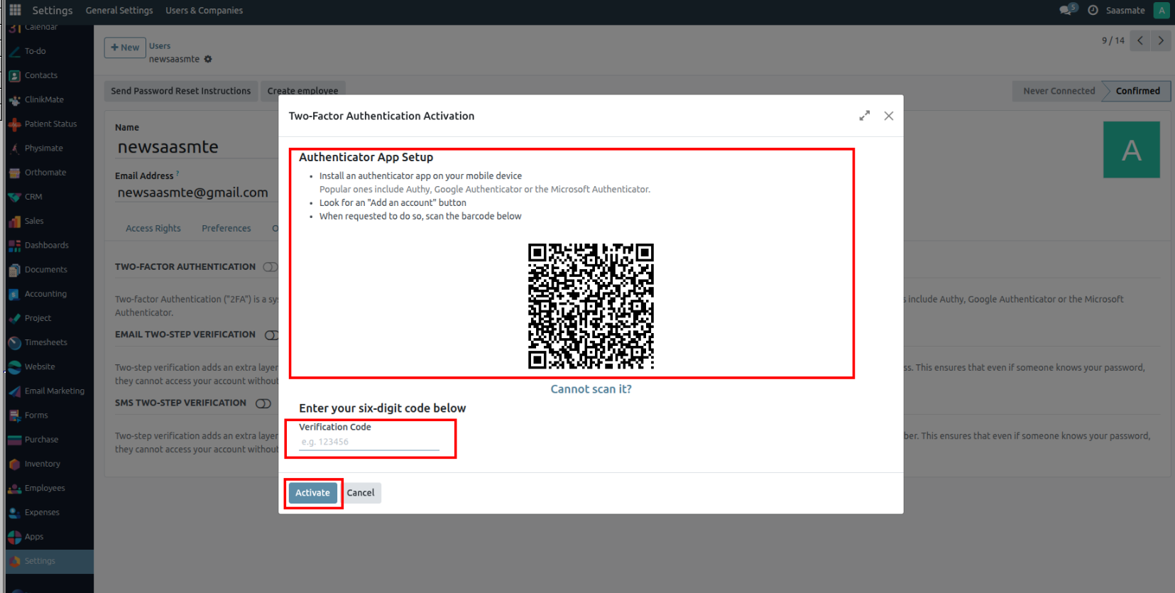

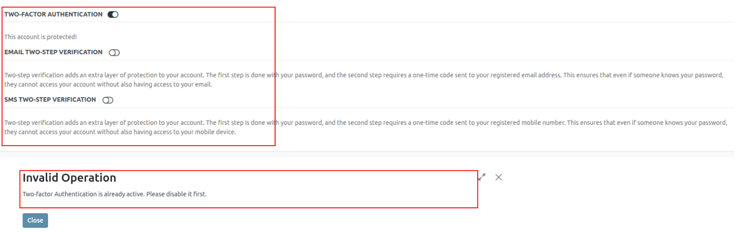

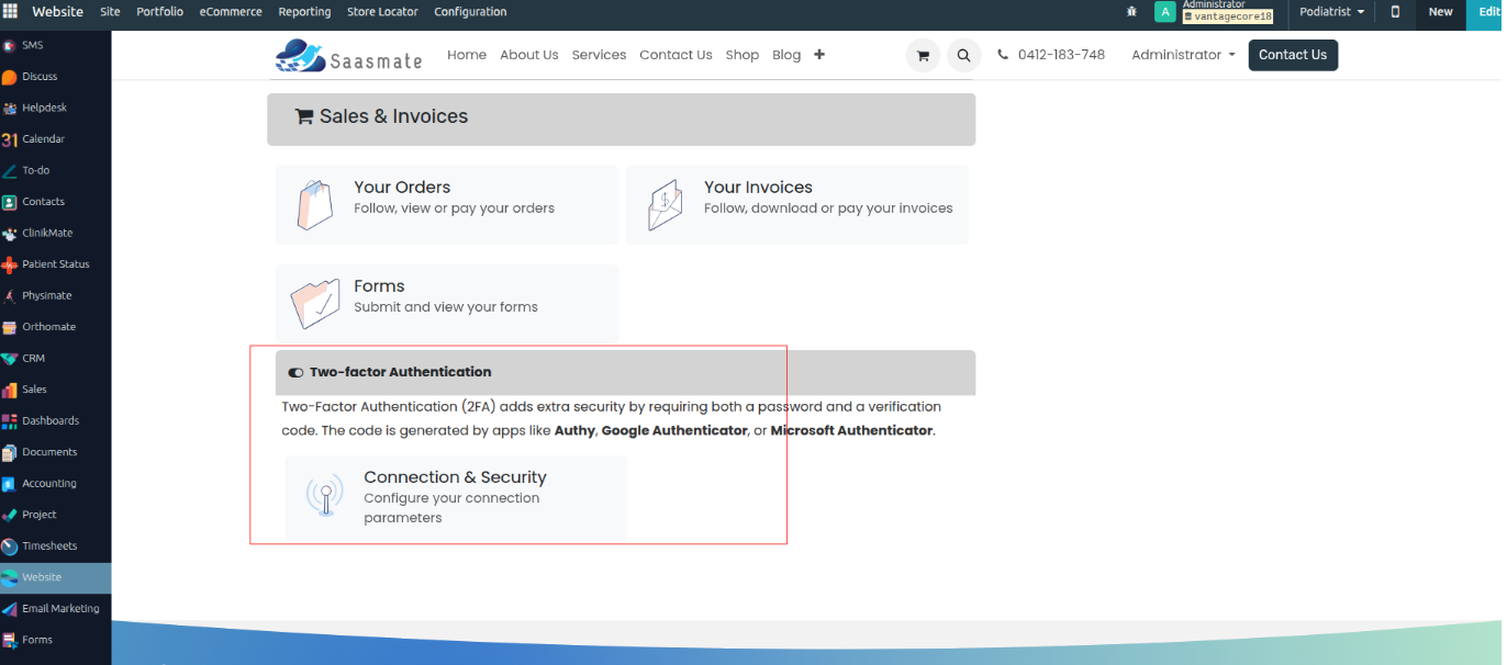
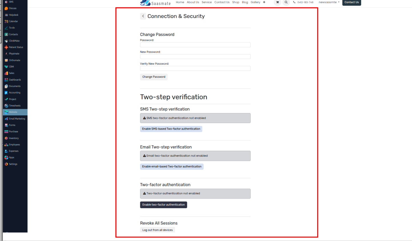
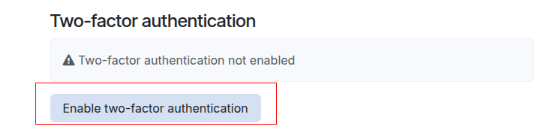
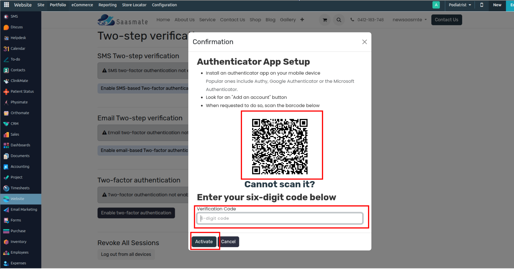
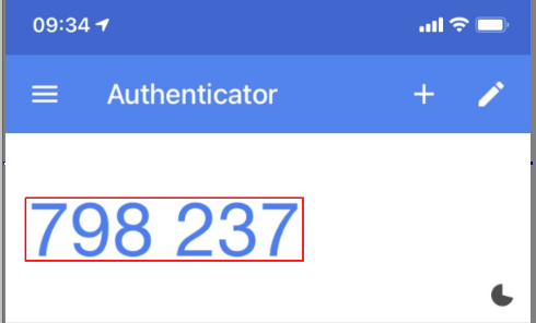
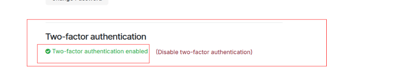
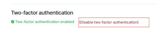
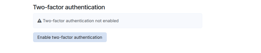
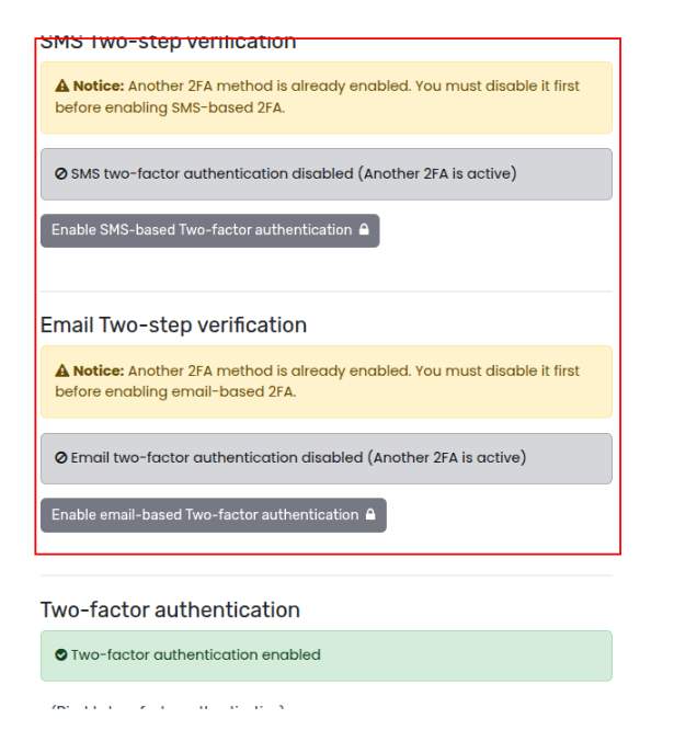
Steps for Email Two-Step Verification:
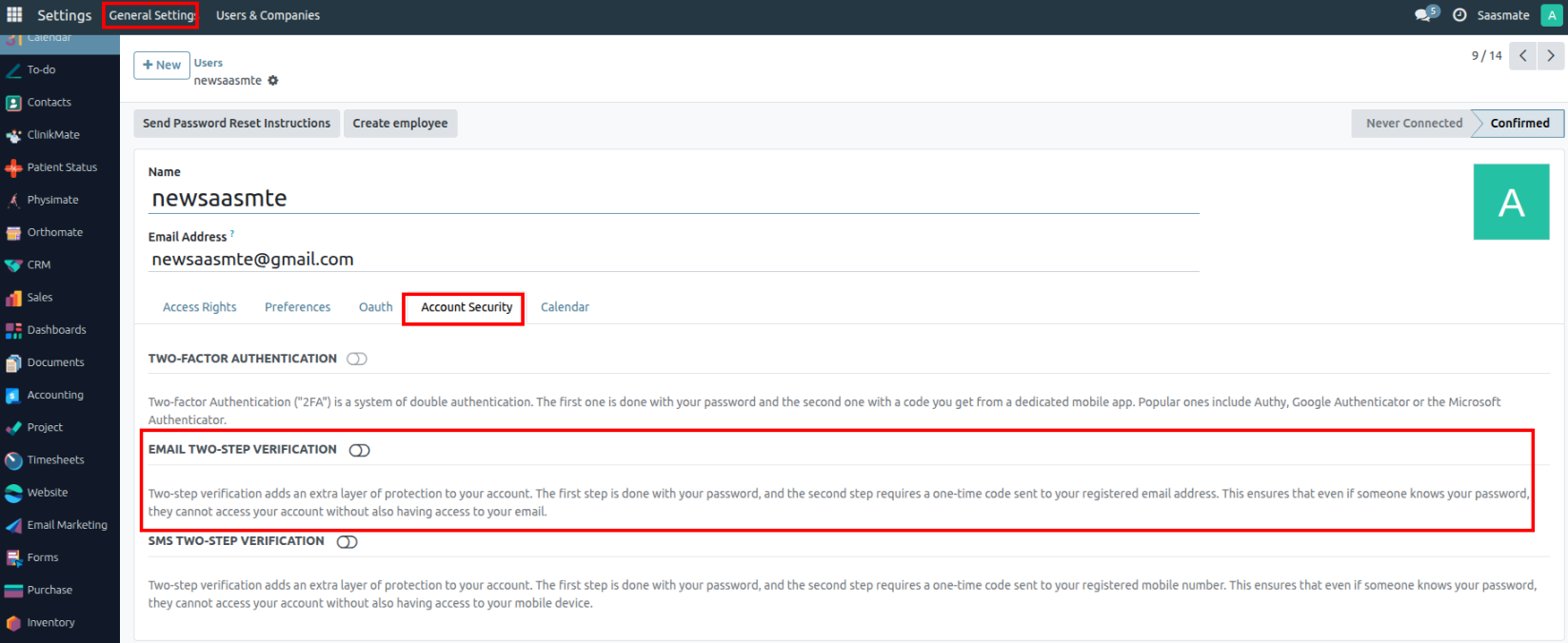
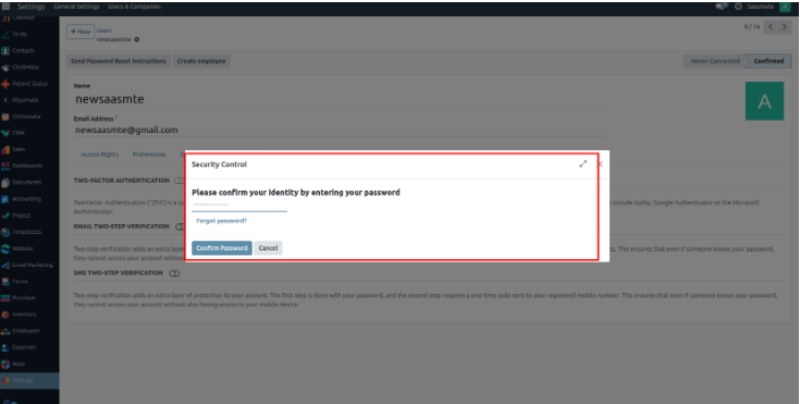
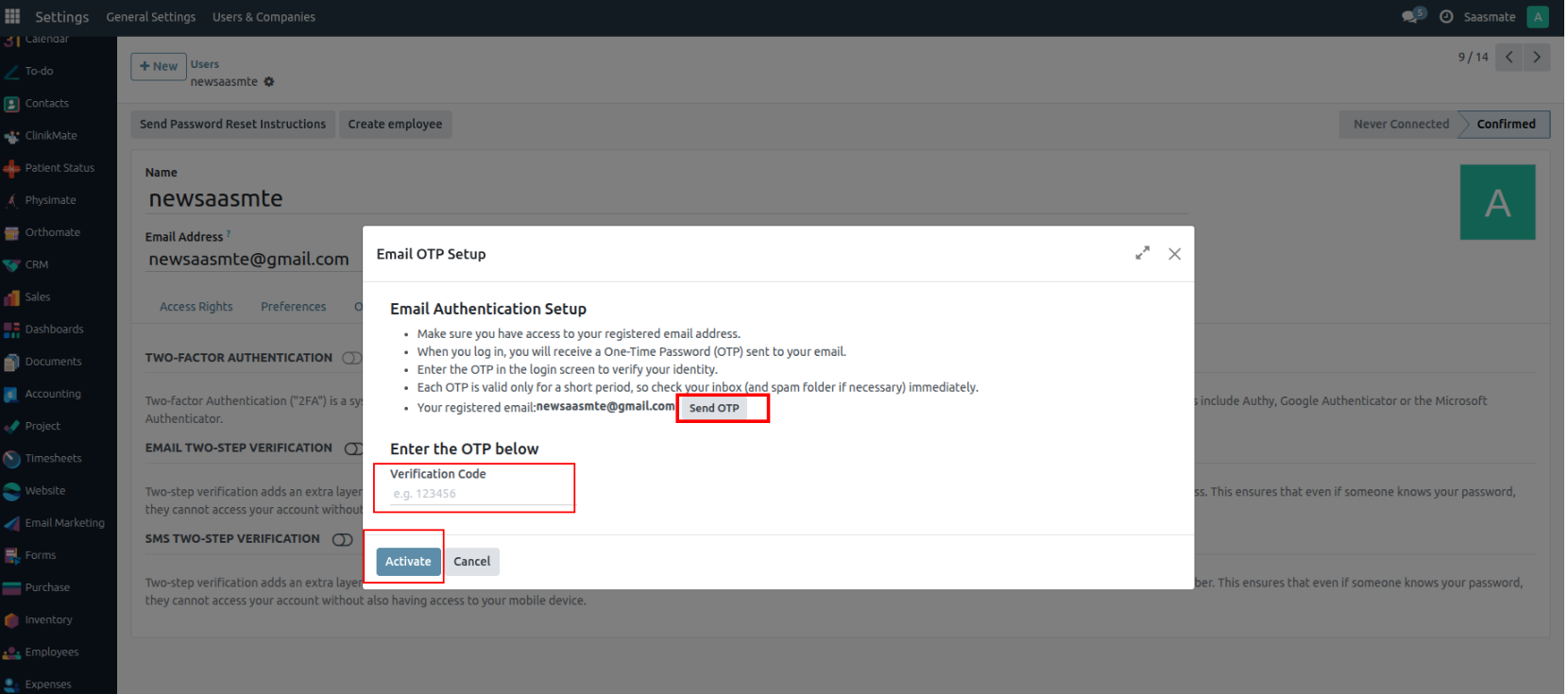
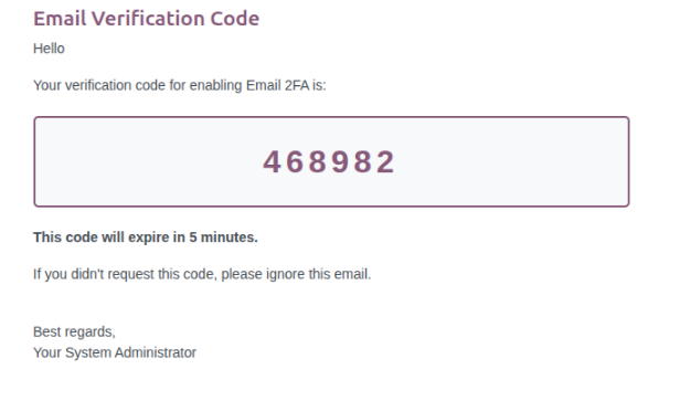
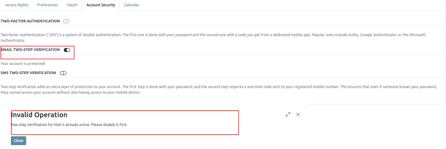
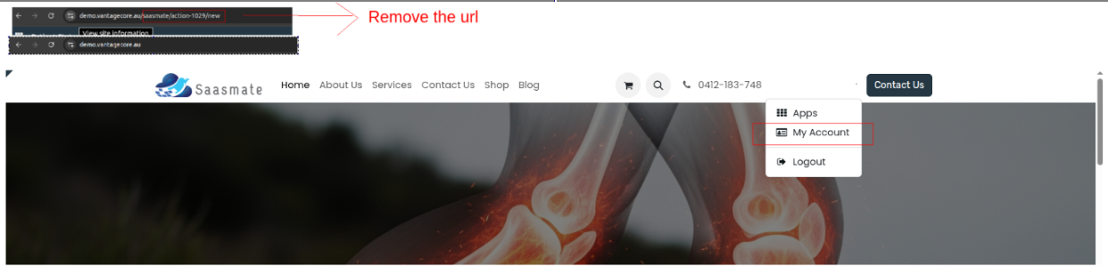
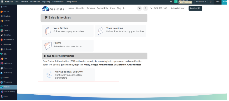
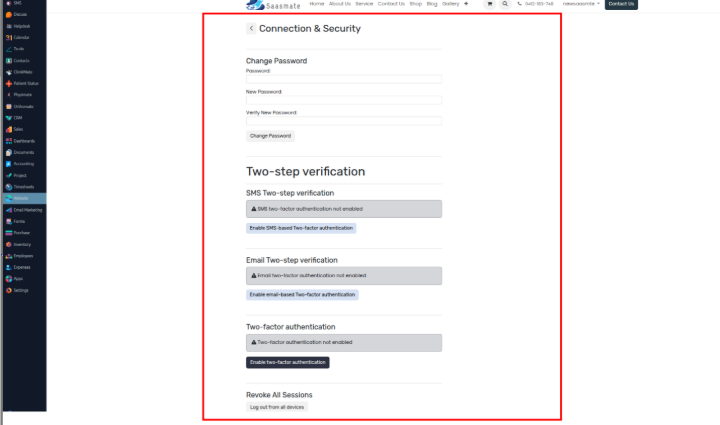
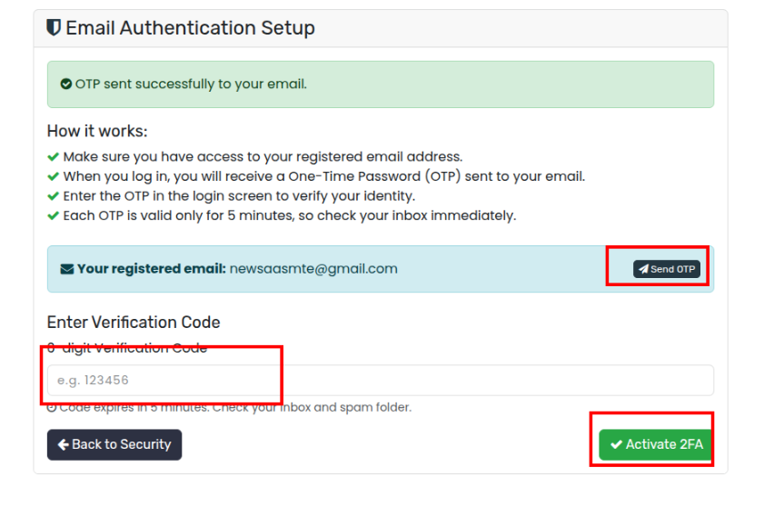
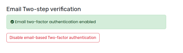
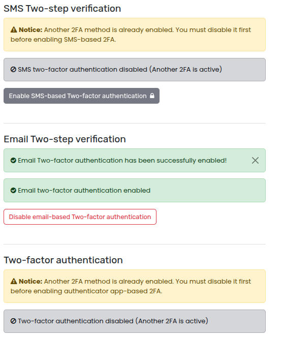
Steps for SMS Two-Step Verification:
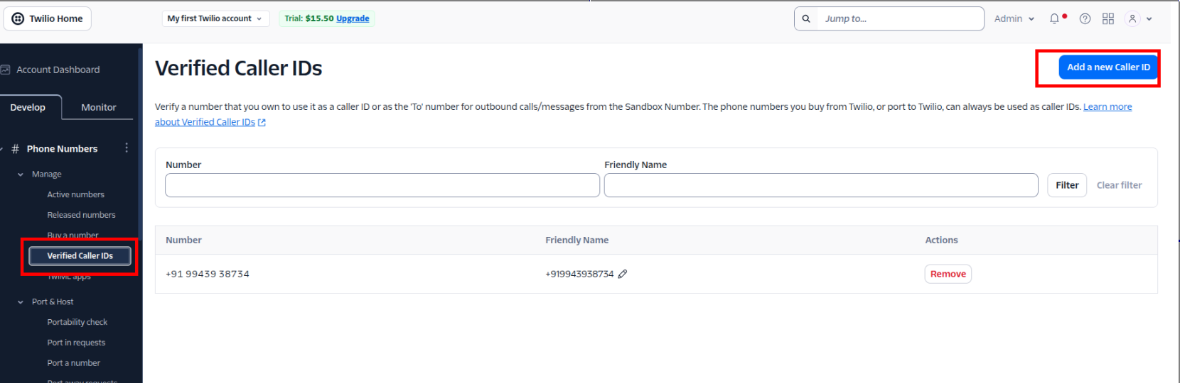
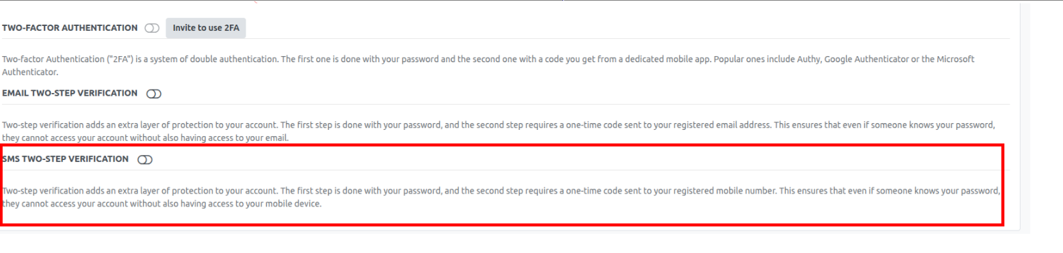
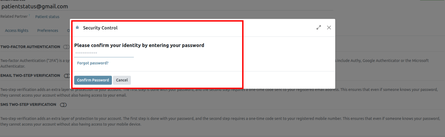
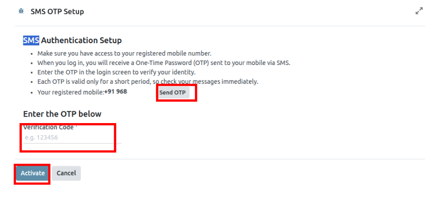
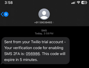
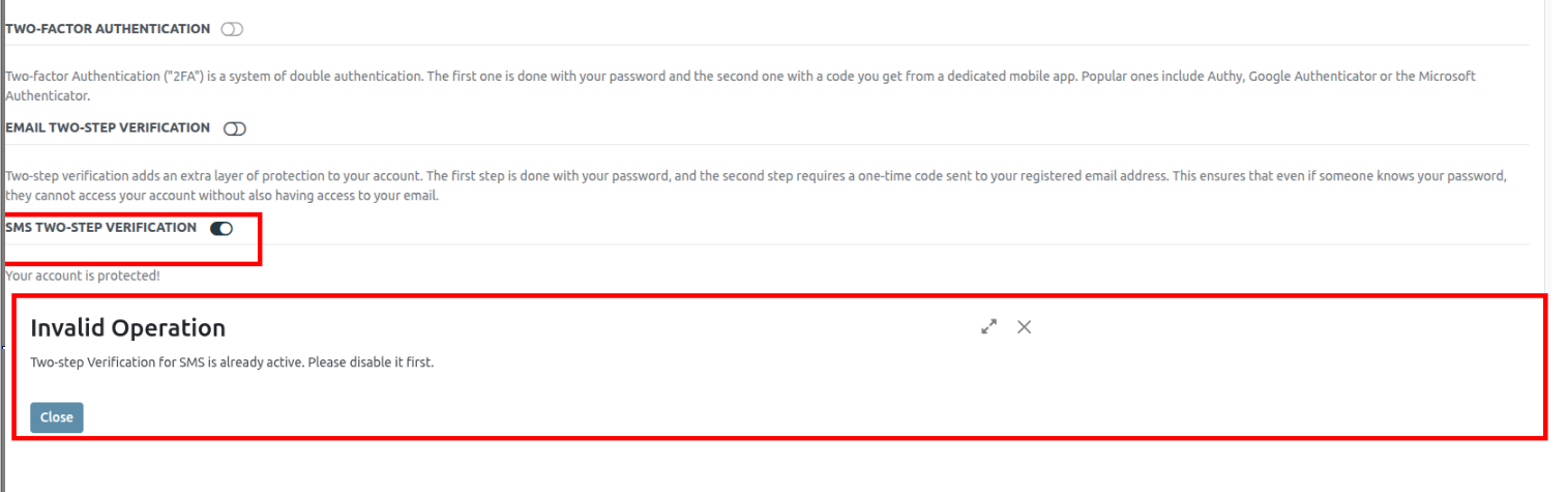
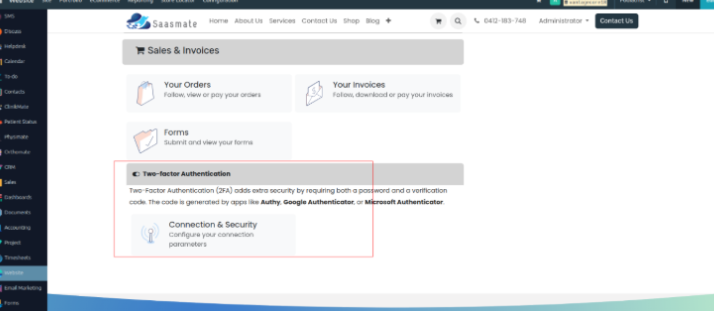
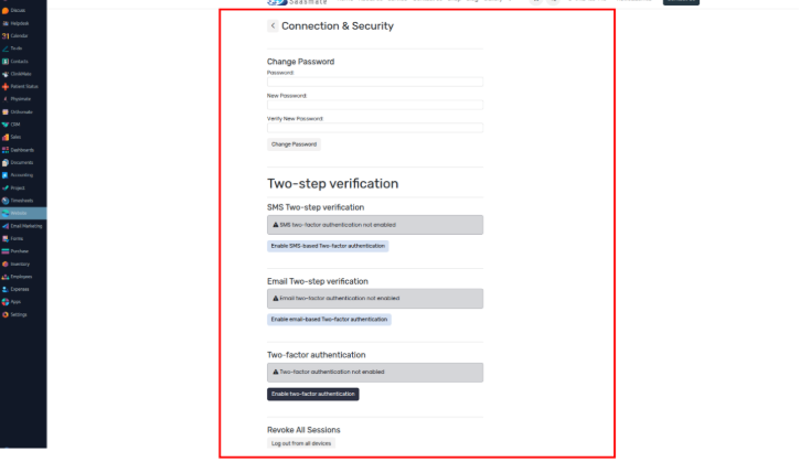
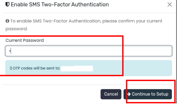
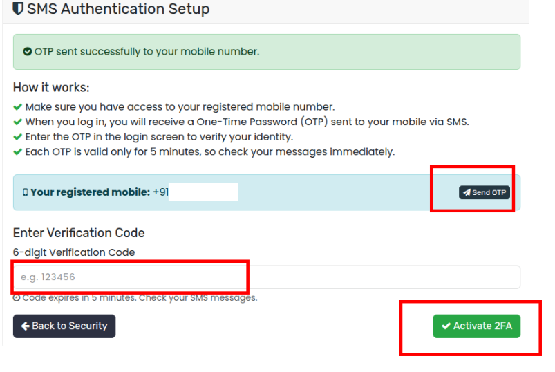
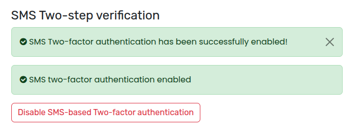
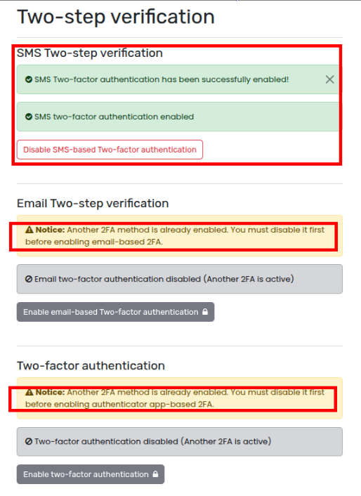
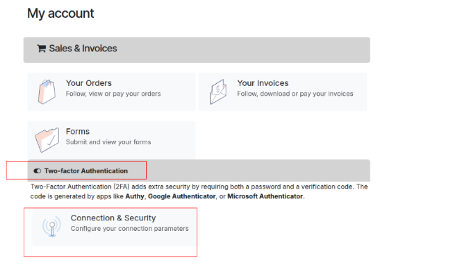
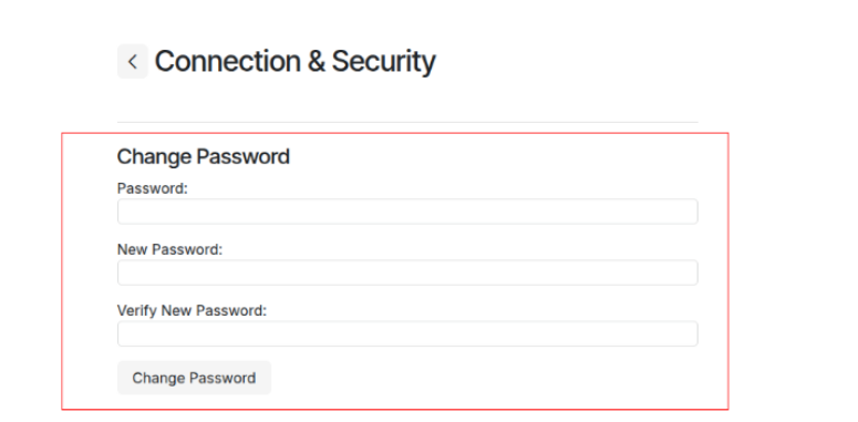

Access Rights
Access rights are permissions that determine the content and applications users can access and edit. In Saasmate, these permissions can be set for individual users or for groups of users. Limiting permissions to only those who need them ensures that users do not modify or delete anything they should not have access to.
Only an administrator can change access rights.
Users
The access rights for individual users are set when the user is added to the database, but they can be adjusted at any point in the user’s profile.
To make changes to a user’s rights, click on the desired user to edit their profile.
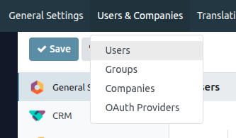
On the user’s profile page, in the Access Rights tab, scroll down to view the current permissions.
For each app, use the drop-down menu to select what level of permission this user should have. The options vary for each section, yet the most common are: Blank/None, User: Own Documents, User: All Documents, or Administrator.
The Administration field in the Access Rights tab has the following options: Settings or Access Rights.
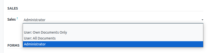
Create and modify groups
Groups are app-specific sets of permissions that are used to manage common access rights for a large amount of users. Administrators can modify the existing groups in Saasmate, or create new ones to define rules for models within an application.To access groups, first activate Saasamet's developer mode, then go to Settings app ‣ Users & Companies ‣ Groups.
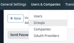
To create a new group from the Groups page, click Create. Then, from the blank group form, select an Application, and complete the group form (detailed below).
To modify existing groups, click on an existing group from the list displayed on the Groups page, and edit the contents of the form.
Enter a Name for the group and tick the checkbox next to Share Group, if this group was created to set access rights for sharing data with some users.
The group form contains multiple tabs for managing all elements of the group. In each tab, click Add a line to add a new row for users or rules, and click the (cancel) icon to remove a row.
- Users tab: lists the current users in the group. Users listed in black have administrative rights. Users without administrative access appear in blue. Click Add a line to add users to this group.
- Inherited tab: Inherited means that users added to this group are automatically added to the groups listed on this tab. Click Add a line to add inherited groups.
- Menus tab: defines which models the group can have access to. Click Add a line to add a specific menu.
- Views tab: lists which views in Saasmate the group has access to. Click Add a line to add a view to the group.
- Access Rights tab: lists the first level of rights (models) that this group has. The Name column represents the name for the current group’s access to the model selected in the Model column.
To link a new access right to a group, click Add a line. Select the appropriate model from the Model drop-down, then enter a name for the access right in the Name column. For each model, enable the following options as appropriate:
- Read: Users can see the object’s existing values.
- Write: Users can edit the object’s existing values.
- Create: Users can create new values for the object.
- Delete: Users can delete values for the object.
Superuser mode
Superuser mode allows the user to bypass record rules and access rights. To activate Superuser mode, first, activate developer mode. Then, navigate to the (debug) menu, located in the top banner.
Finally, towards the bottom of the menu, click Become Superuser.
To leave Superuser mode, log out of the account, by navigating to the upper-right corner, and clicking on the SaasBot username. Then, select the Log out option.
Portal Access
Portal access is given to users who need the ability to view certain documents or information within an Saasmate database.
Provide portal access to customers
From the main Saasmate dashboard, select the Contacts application. If the contact is not yet created in the database, click on the Create button, enter the details of the contact, and then click Save. Otherwise, choose an existing contact, and then click on the Action drop-down menu located at the top-center of the interface.
Then select Grant portal access. A pop-up window appears, listing three fields:
- Contact: the recorded name of the contact in the Saasmate database
- Email: the contact’s email address that they will use to log into the portal
- In Portal: whether or not the user has portal access
To grant portal access, first enter the contact’s Email they will use to log into the portal. Then, check the box under the In Portal column. Optionally, add text to the invitation message the contact will receive. Then click Apply to finish.
Change portal username
There may be times when a portal user wants to change their user login. This can be done by any user in the database with administrator access rights. The following process outlines the necessary steps to change the portal user login.
First, navigate to Settings app ‣ Users. Then, under Filters, select Portal Users, or select Add Custom Filter and set the following configuration Groups > contains > portal. After making this selection, search for (and open) the portal user that needs to be edited.
Next, click Edit (if necessary), click into the Email Address field, and proceed to make any necessary changes to this field. The Email Address field is used to log into the Saasmate portal.
Customer portal changes
There may be times when the customer would like to make changes to their contact information, password/security, or payment information attached to the portal account. This can be performed by the customer from their portal. The following process is how a customer can change their contact information.
Change customer info
First enter the username and password (login) into the database login page to access the portal user account. A portal dashboard will appear upon successfully logging in. Portal documents from the various installed Saasmate applications will appear with the number count of each.
Next, navigate to the upper-right corner of the portal, and click the Edit button, next to the Details section. Then, change the pertinent information, and click Confirm.
Change password
First enter the username and password (login) into the database login page to access the portal user account. A portal dashboard will appear upon successfully logging in.
If the customer would like to change their password for portal access, click on the Edit Security Settings link, below the Account Security section. Then, make the necessary changes, by typing in the current Password, New Password, and verify the new password. Lastly, click on Change Password to complete the password change.
Add two-factor authentication
First enter the username and password (login) into the database login page to access the portal user account. A portal dashboard will appear upon successfully logging in.
If the customer would like to turn on two-factor authentication (2FA) for portal access, click on the Edit Security Settings link, below the Account Security section.
Click on Enable two-factor authentication to turn on 2FA. Confirm the current portal password in the Password field. Then, click on Confirm Password. Next, activate 2FA in a 2FA app (Google Authenticator, Authy, etc.), by scanning the QR code or entering a Verification Code.
Finally, click Enable two-factor authentication to complete the setup.
Change payment info
First enter the username and password (login) into the database login page to access the portal user account. A portal dashboard will appear upon successfully logging in.
If the customer would like to manage payment options, navigate to the Manage payment methods in the menu on the right. Then, add the new payment information, and select Add new card.
Google Sign-In Authentication
The Google Sign-In Authentication is a useful function that allows Saasmate users to sign in to their database with their Google account.
This is particularly helpful if the organization uses Google Workspace, and wants employees within the organization to connect to Saasmate using their Google Accounts.
Configuration
The integration of the Google sign-in function requires configuration both on Google and Saasmate.
Google API Dashboard
- Go to the Google API Dashboard.
- Make sure the right project is opened. If there isn’t a project yet, click on Create Project, fill out the project name and other details of the company, and click on Create.
OAuth Consent Screen
-
On the left side menu, click on OAuth consent screen.
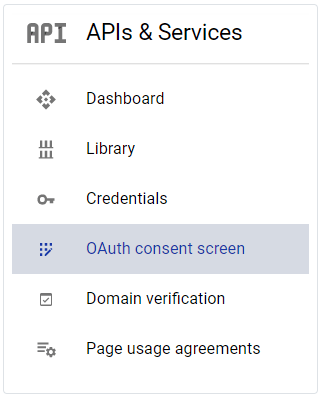
-
Choose one of the options (Internal / External), and click on Create.
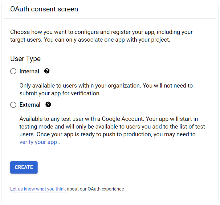
- Fill out the required details and domain info, then click on Save and Continue.
- On the Scopes page, leave all fields as is, and click on Save and Continue.
- Next, if continuing in testing mode (External), add the email addresses under the Test users step by clicking Add Users, then the Save and Continue button. A summary of the app registration appears.
- Finally, scroll to the bottom and click on Back to Dashboard.
Credentials
-
On the left side menu, click on Credentials.
-
Click on Create Credentials, and select OAuth client ID.
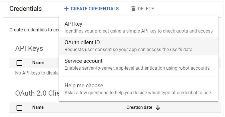
-
Select Web Application as the Application Type. Configure the allowed pages for Saasmate redirection:
In the Authorized redirect URIs field, enter the database’s domain immediately followed by
/auth_oauth/signin. Example: https://mydomain.example.com/auth_oauth/signin, then click Create. - Once the OAuth client has been created, a screen will appear with the Client ID and Client Secret. Copy the Client ID for later use in Saasmate configuration.
Google Authentication on Saasmate
Retrieve the Client ID
Once the previous steps are complete, two keys are generated on the Google API Dashboard: Client ID and Client Secret. Copy the Client ID.
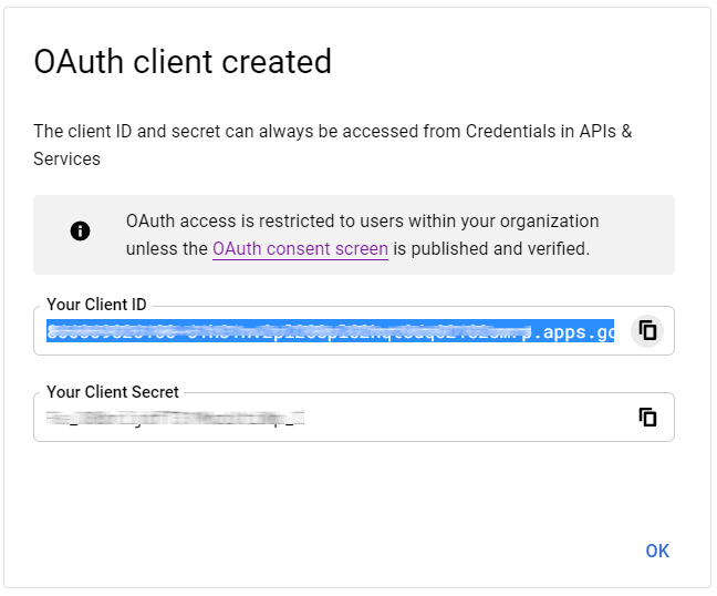
Saasmate activation
- Go to Saasmate General Settings ‣ Integrations and activate OAuth Authentication.
- Go back to General Settings ‣ Integrations ‣ OAuth Authentication, activate the selection and Save. Next, return to General Settings ‣ Integrations ‣ Google Authentication and activate the selection. Then fill out the Client ID with the key from the Google API Dashboard, and Save.
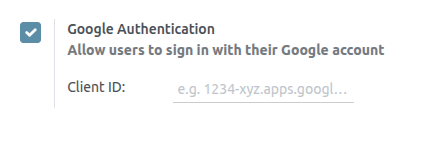
Log in to Saasmate with Google
To link the Google account to the Saasmate profile, click on Log in with Google when first logging into Saasmate.
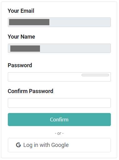
Existing users must reset their password to access the Reset Password page, while new users can directly click on Log in with Google, instead of choosing a new password.
Microsoft Azure Sign-in Authentication
The Microsoft Azure OAuth sign-in authentication is a useful function that allows Saasmate users to sign in to their database with their Microsoft Azure account.
This is particularly helpful if the organization uses Azure Workspace, and wants employees within the organization to connect to Saasmate using their Microsoft Accounts.
Configuration
Integrating the Microsoft sign-in function requires configuration on Microsoft and Saasmate.
Saasmate System Parameter
First activate the developer mode, and then go to Settings ‣ Technical ‣ System Parameters.
Click Create and on the new/blank form that appears, add the following system parameter auth_oauth.authorization_header to the Key field, and set the Value to 1. Then click Save to finish.
Microsoft Azure dashboard
Create a new application
Now that the system parameters in Saasmate have been set up, it’s time to create a corresponding application inside Microsoft Azure. To get started, go to Microsoft’s Azure Portal. Log in with the Microsoft Outlook Office 365 account if available; otherwise, log in with a personal Microsoft account.
Next, navigate to the section labeled Manage Microsoft Entra ID (formerly Azure Active Directory). The location of this link is usually in the center of the page.
Click on the Add (+) icon located in the top menu, and then select App registration from the drop-down menu. On the Register an application screen, rename the Name field to Saasmate Login OAuth or a similarly recognizable title. Under the Supported account types section, select the option for Accounts in this organizational directory only (Default Directory only - Single tenant).
Under the Redirect URL section, select Web as the platform, and input https://Saasmate base url/auth_oauth/signin in the URL field. The Saasmate base URL is the canonical domain at which your Saasmate instance can be reached (e.g., mydatabase.saasmate.com if hosted on Saasmate.com). Then, click Register to create the application.
Authentication
Edit the new app’s authentication by clicking on the Authentication menu item in the left menu after being redirected to the application’s settings from the previous step.
Next, the type of tokens needed for the OAuth authentication will be chosen. These are not currency tokens but rather authentication tokens that are passed between Microsoft and Saasmate. Therefore, there is no cost for these tokens; they are used merely for authentication purposes between two APIs. Select the tokens that should be issued by the authorization endpoint by scrolling down the screen and check the boxes labeled: Access tokens (used for implicit flows) and ID tokens (used for implicit and hybrid flows).
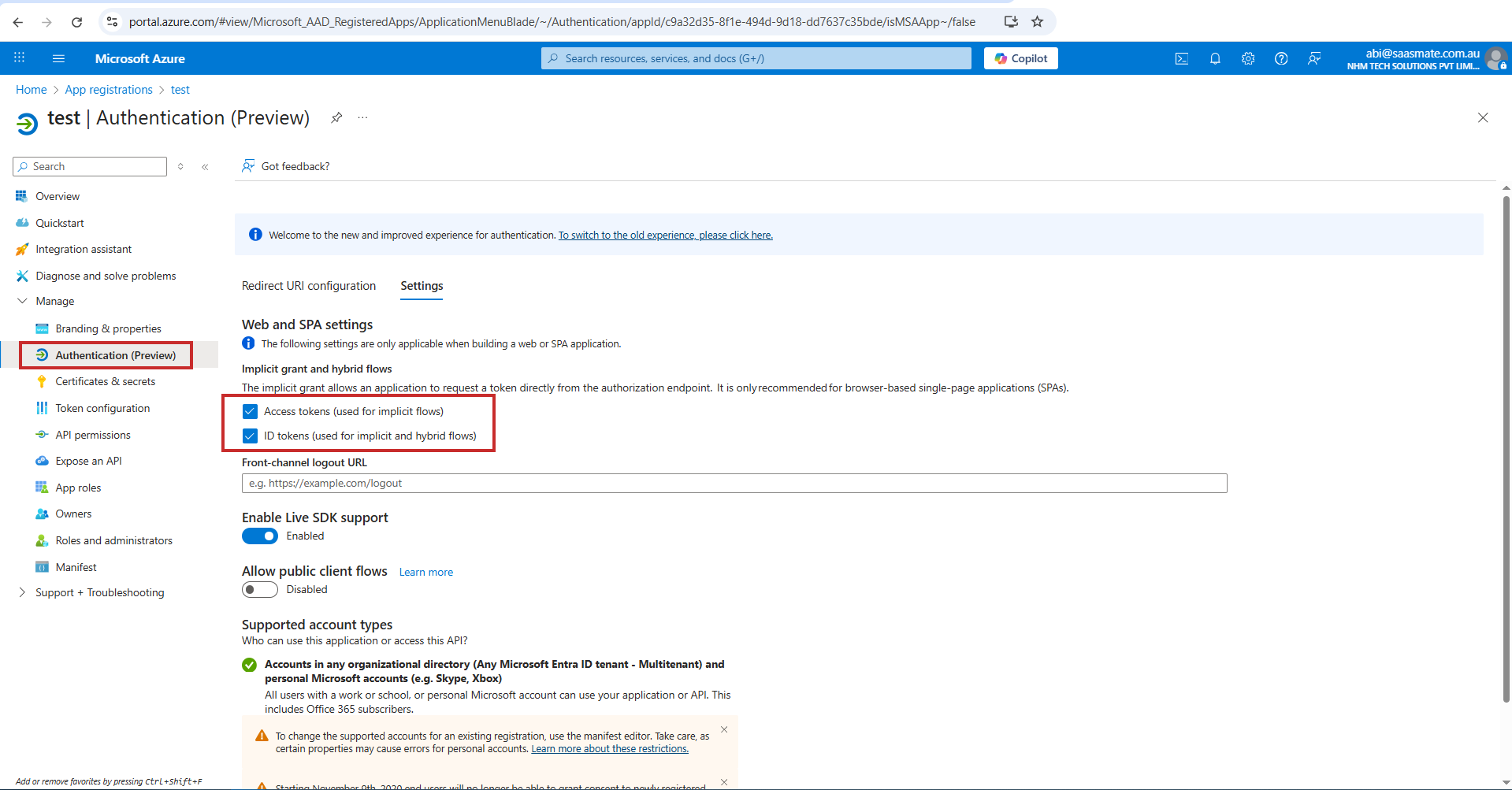
Click Save to ensure these settings are saved.
Gather credentials
With the application created and authenticated in the Microsoft Azure console, credentials will be gathered next. To do so, click on the Overview menu item in the left-hand column. Select and copy the Application (client) ID in the window that appears. Paste this credential to a clipboard / notepad, as this credential will be used in the Saasmate configuration later.
After finishing this step, click on Endpoints on the top menu and click the copy icon next to OAuth 2.0 authorization endpoint (v2) field. Paste this value in the clipboard / notepad.
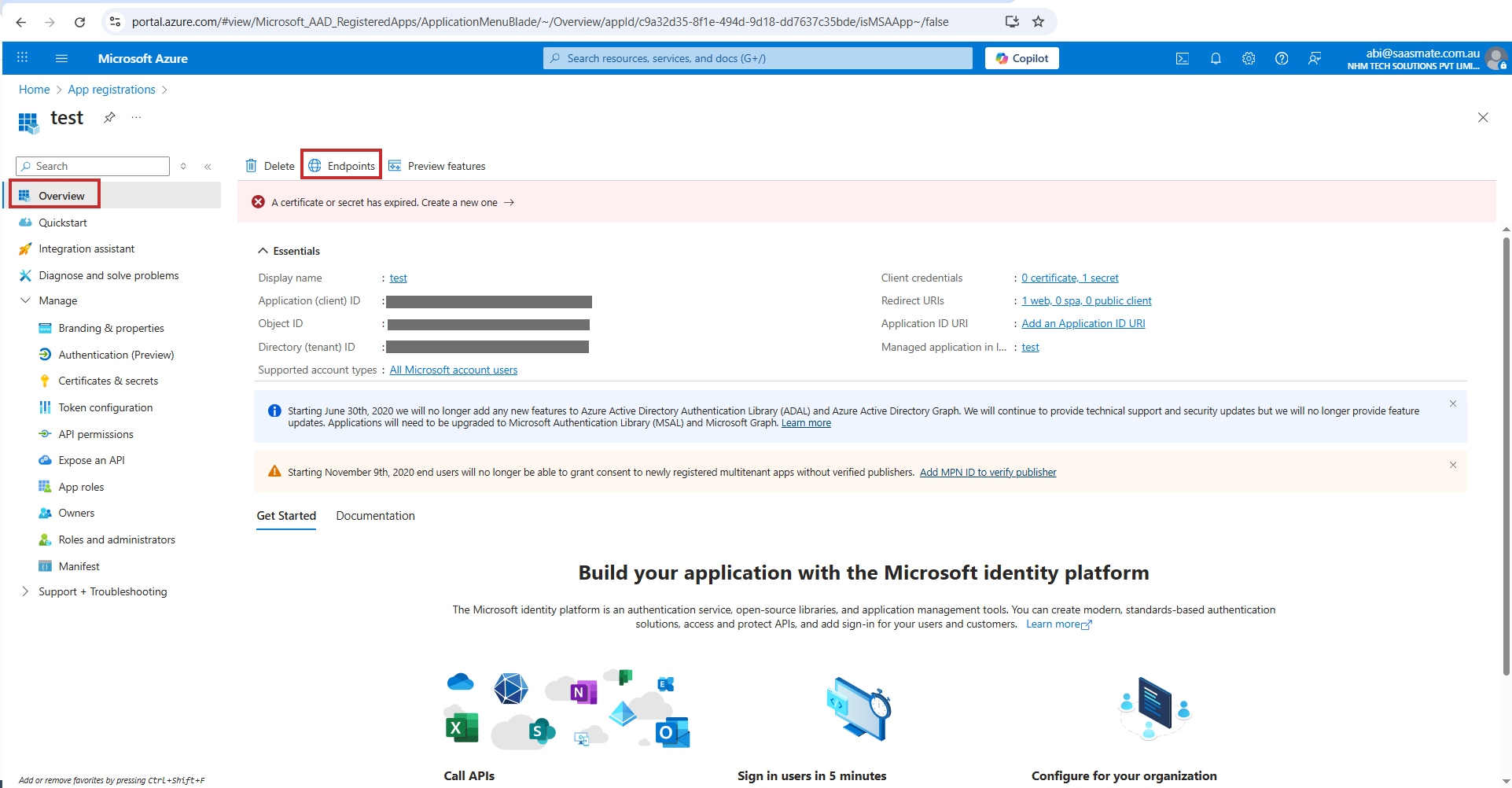
Saasmate setup
Finally, the last step in the Microsoft Azure OAuth configuration is to configure some settings in Saasmate. Navigate to Settings ‣ Integrations ‣ OAuth Authentication and check the box to activate the OAuth login feature. Click Save to ensure the progress is saved. Then, sign in to the database once the login screen loads.
Once again, navigate to Settings ‣ Integrations ‣ OAuth Authentication and click on OAuth Providers. Now, select New in the upper-left corner and name the provider Azure.
Paste the Application (client) ID from the previous section into the Client ID field. After completing this, paste the new OAuth 2.0 authorization endpoint (v2) value into the Authorization URL field.
For the UserInfo URL field, paste the following URL: https://graph.microsoft.com/oidc/userinfo
In the Scope field, paste the following value: openid profile email. Next, the Windows logo can be used as the CSS class on the login screen by entering the following value: fa fa-fw fa-windows in the CSS class field.
Check the box next to the Allowed field to enable the OAuth provider. Finally, add Microsoft Azure to the Login button label field. This text will appear next to the Windows logo on the login page.
Save the changes to complete the OAuth authentication setup in Saasmate.
User experience flows
For a user to log in to Saasmate using Microsoft Azure, the user must be on the Saasmate password reset page. This is the only way that Saasmate can link the Microsoft Azure account and allow the user to log in.
To sign in to Saasmate for the first time using the Microsoft Azure OAuth provider, navigate to the Saasmate password reset page (using the new user invitation link). A password reset page should appear. Then, click on the option labeled Microsoft Azure. The page will redirect to the Microsoft login page.
Enter the Microsoft Email Address and click Next. Follow the process to sign in to the account. If 2FA is enabled, an extra step may be required.
Finally, after logging in to the account, the page will redirect to a permissions page where the user will be prompted to Accept the conditions that the Saasmate application will access their Microsoft information.
Rest API - Framework
We created a group called API Access. The API Notebook will be visible only to users of this group. Other users will not be able to see the API Notebook.
Navigation Path to the Group: Go to Settings → Click on Users & Companies → Select Groups, then search for 'API Access'. Add the user.
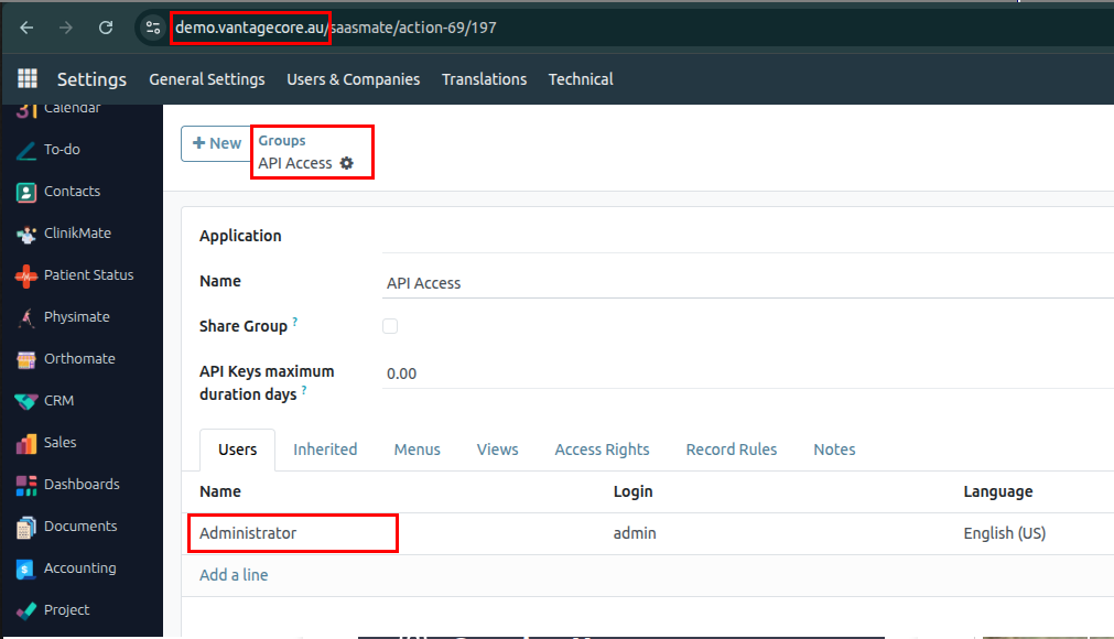
the API Key field will appear blank.
Once the Create API button is clicked, the API Key will be generated.
Note: Once the API Key is created, it is permanent and cannot be changed in the future.
Navigation Path: Under Setting Menu => Users & Companies => Select required user
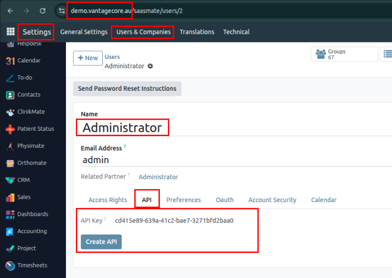
Developer Note: Configuring software.conf
- Add the following line to your
software.conffile:server_wide_modules = web,base,# Replacewith the module used for API (e.g., Postman integration) - If you need to uninstall the module, you must first remove this parameter from the configuration file.
- After that, you can proceed to install or uninstall the module as needed.
Accessing and Configuring the REST API:
After installing the module, the REST API menu will become available.
First, turn on the Debug mode.
Path: Setting => Technical => Rest API
From there, you need to create a new record using the New button.
We need to select the Model and its Methods.
For example, if the POST method is not selected, POST requests will not work, and Postman will show an error message. So, make sure to enable the required methods as per your needs.
POST Call:
In a POST call, we need to set the Parameters, Headers and Body to create the partner.
Params:
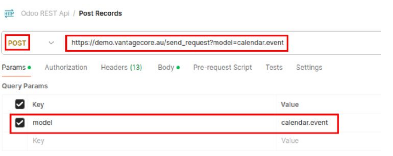
Headers:
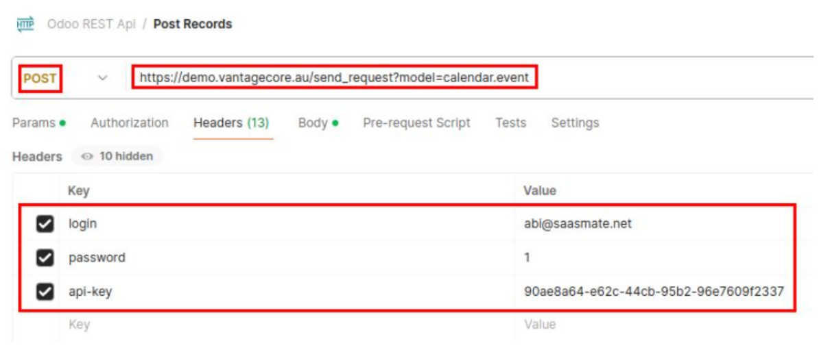
Body:
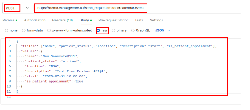
If everything is set up properly, you can send the request Postman to Software, and the Appointment will be created.
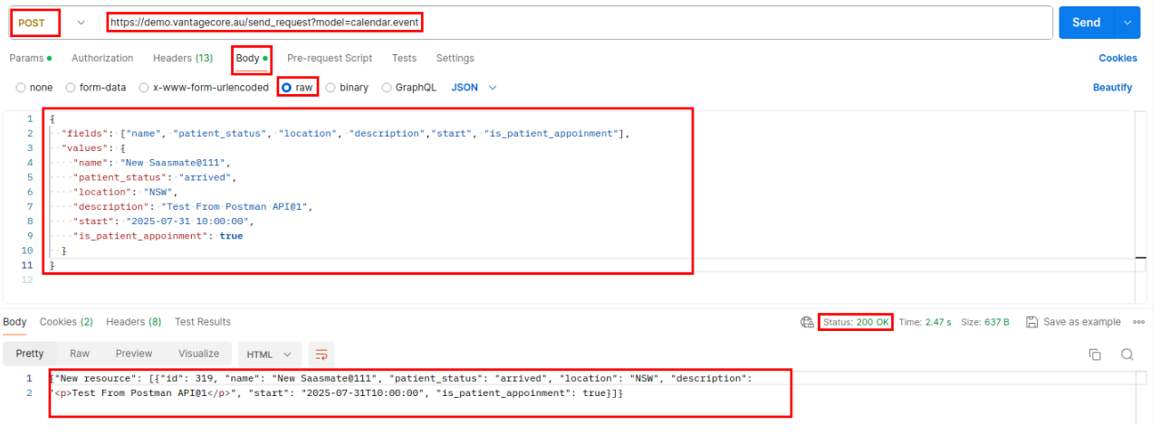
The Appointment has been Created in ClinikMate.
Note:
You must include all required and pre-filled fields in the request payload. These are the fields that are automatically populated when you click the Create or New button in the UI.
If any of these fields are missing, the request will fail and return an "Invalid JSON" error.
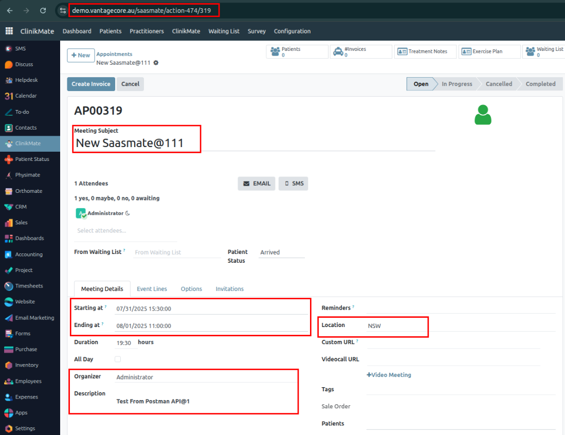
Get Call:
A GET call is similar to a POST call, but the ID needs to be included in the parameters. The headers specify the request details, and the body contains the fields we want to include.
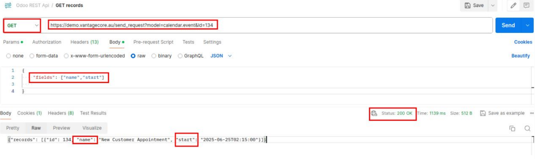
PUT Call:
A PUT call is similar to a POST call. Additionally, we need to include the ID in the parameters. The headers and body are the same,
But the body should specify the fields that need to be updated.
Params:
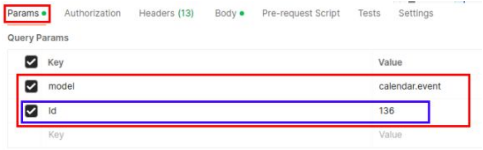
Body:
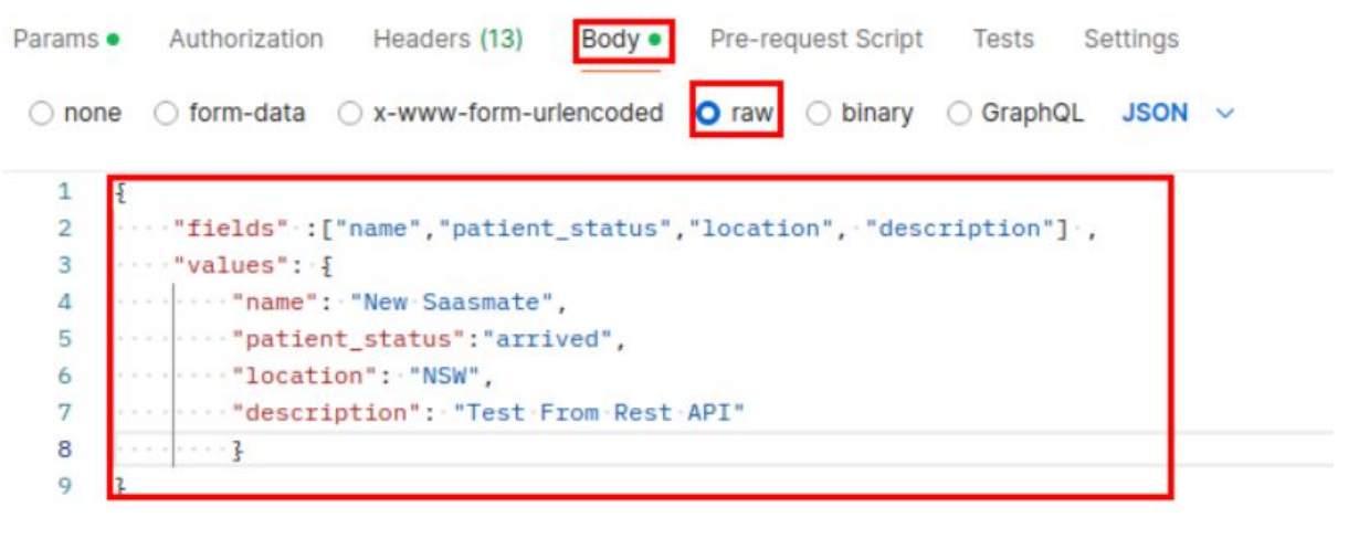
If everything is set up properly, you can send the request Postman to Software, and the Appointment will be updated.
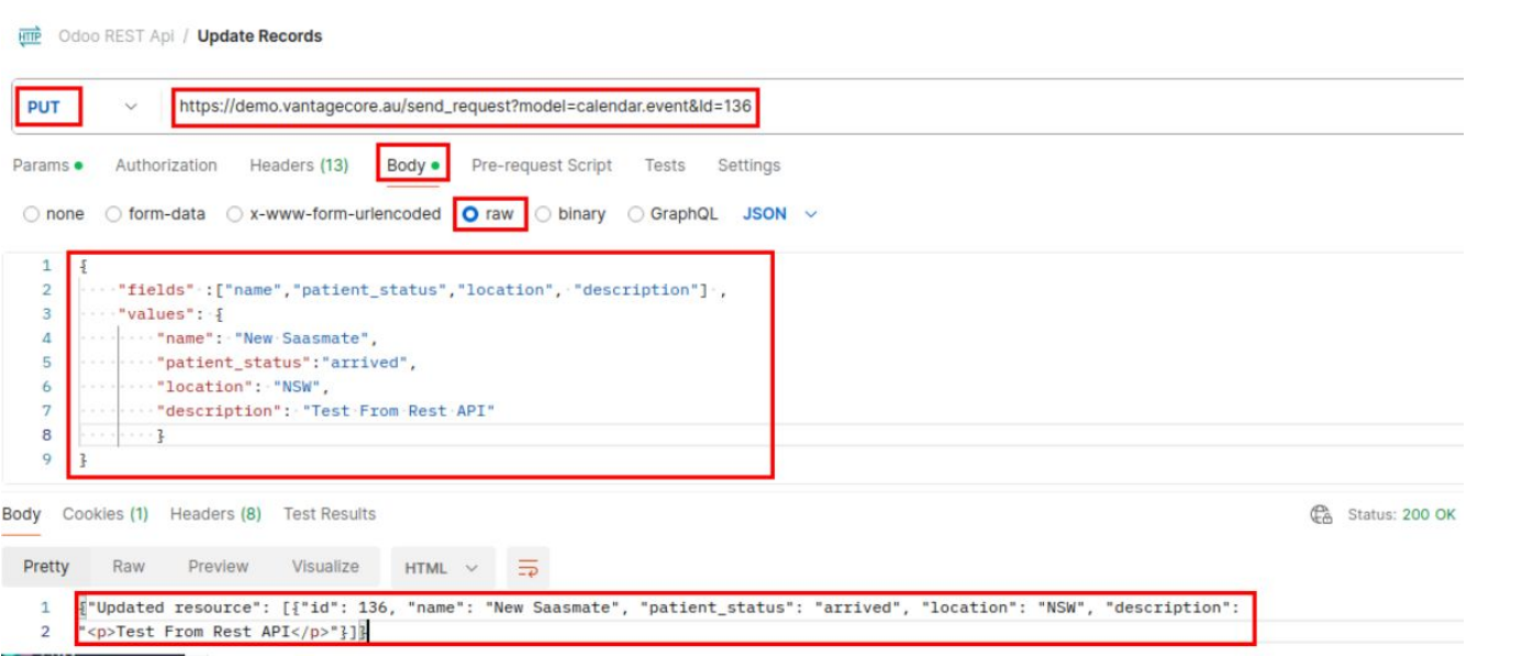
The Appointment has been Updated in ClinicMate.
DELETE:
The DELETE call is similar to the PUT call.
We need to specify the ID in the parameters, and the body should be empty. The headers are the same as those used in GET, POST, and PUT calls.
After sending the DELETE request, the record with the specified ID will be deleted from Software
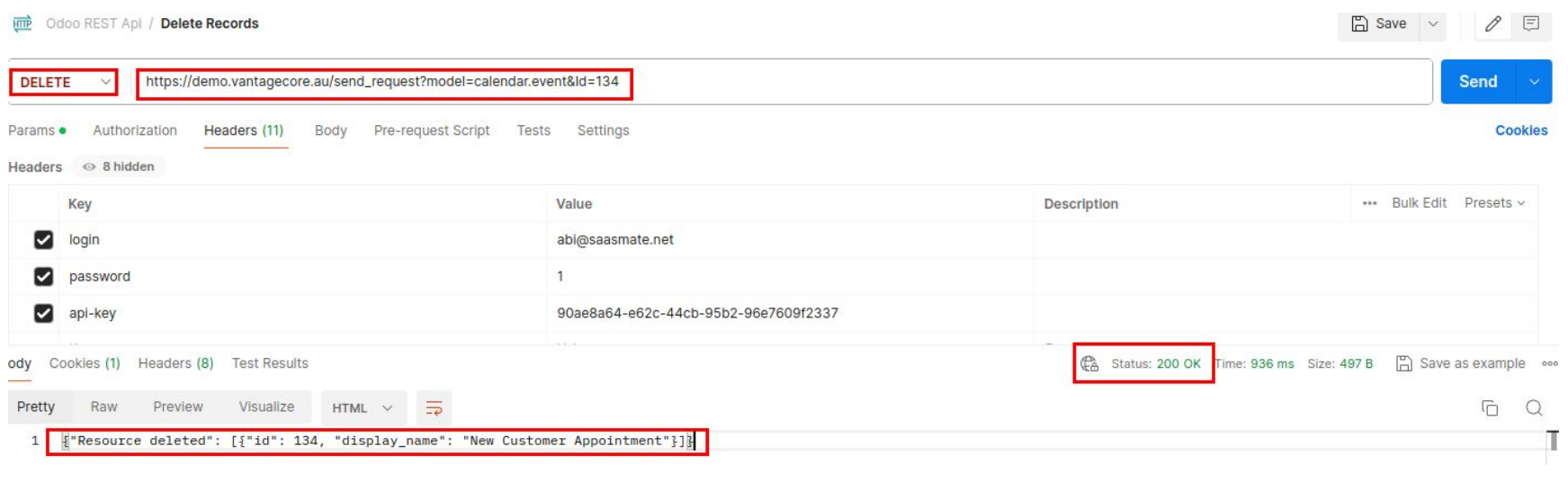
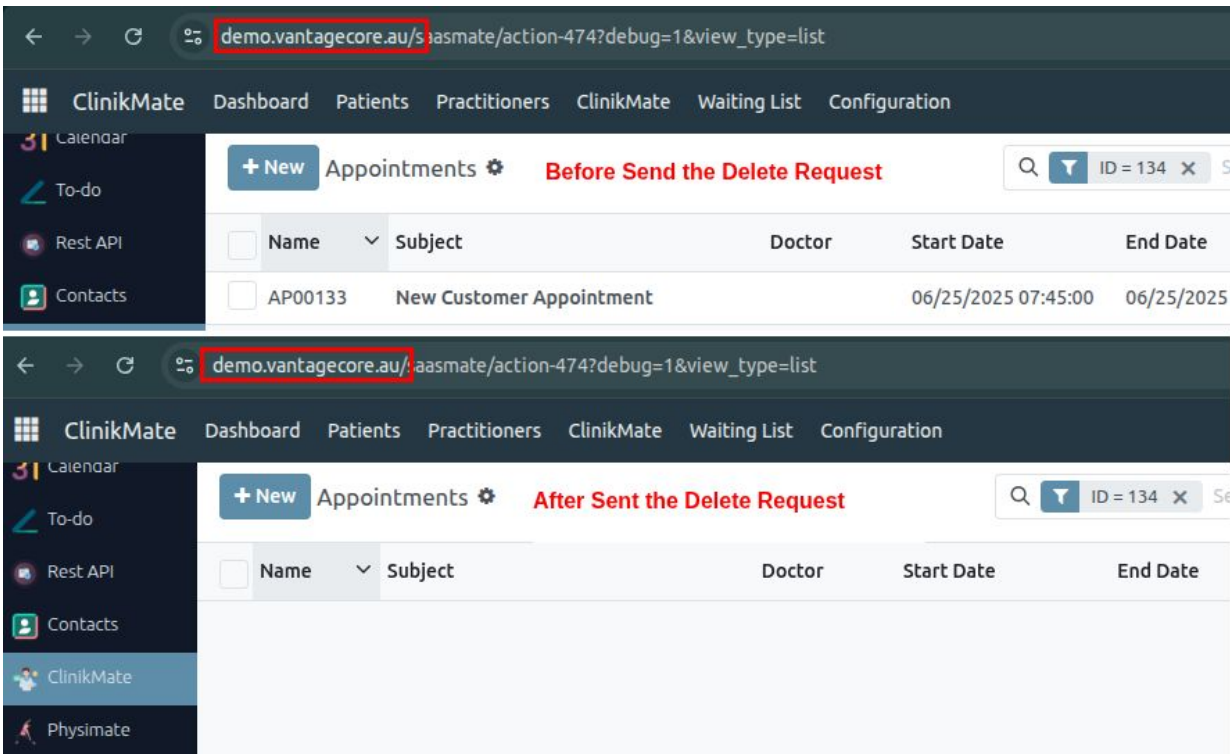
SMS
To enable SMS functionality, configure a gateway/service (e.g., Twilio, AWS SNS, or a direct GSM modem). Provide API credentials (e.g., Account SID, Auth Token, sender ID) and set endpoints for sending/receiving messages. Use HTTPS/REST protocols for secure communication. Optional: Implement templates, group handling, and scheduling at the application level. Always encrypt credentials and validate recipients.
1) Create a SMS Account
- Go to SMS login page: Twilio Login
- Sign up or log in: access your Twilio account.
- Verify: confirm your email and mobile number.
2) Access the sms Console
- Visit: https://console.twilio.com
- create a new account.
- Set the Account name and Billing Country.
- Navigate to your Project Dashboard
3) Get sms Account credentials under your Project Dashboard
- You can see the Account SID, Auth Token and My Sms phone number here.
4) Buy a SMS Phone Number
- Navigate: go to Phone Numbers → Manage → Buy number and click Add a new Buy number.
- Select Country: choose your country from the list. Make sure to pick the correct country code for the number you want to verify.
- Select Capabilities: enable the features you need. For example, enable SMS if you want to send messages.
- Buy: click Buy and confirm your purchase.
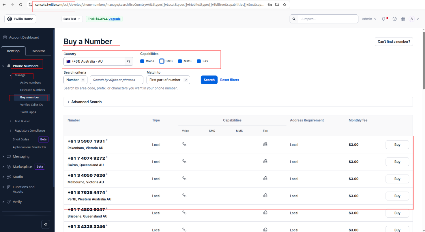
5) Verify Caller ID (For Trial Accounts Only)
- If you're on a trial account, you can only send messages to verified numbers.
- Navigate: go to Phone Numbers → Manage → Verified Caller IDs and click Add a new Caller ID button.
- Click: Add a Verified Number.
- Enter: the mobile number and verify it via SMS.
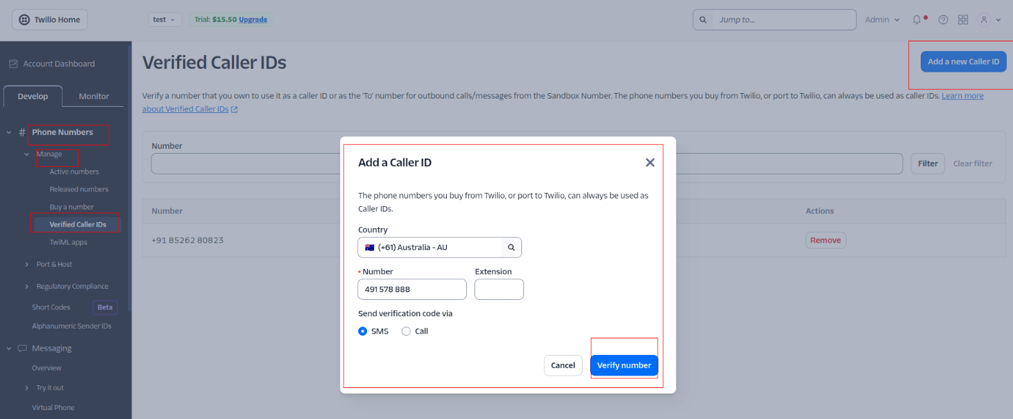
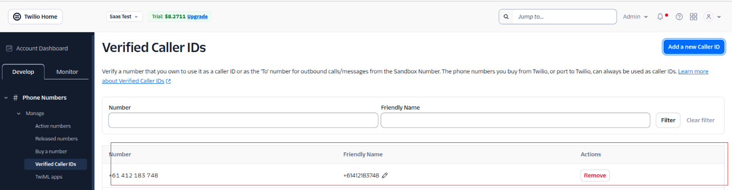
6) Navigate to Geo Permissions
- Navigate: go to Messaging ⇒ Settings ⇒ Geo Permissions.
- Filter: search or scroll for your country (e.g., Australia, country code +61).
- Enable: tick the checkbox next to Australia, then click Save.
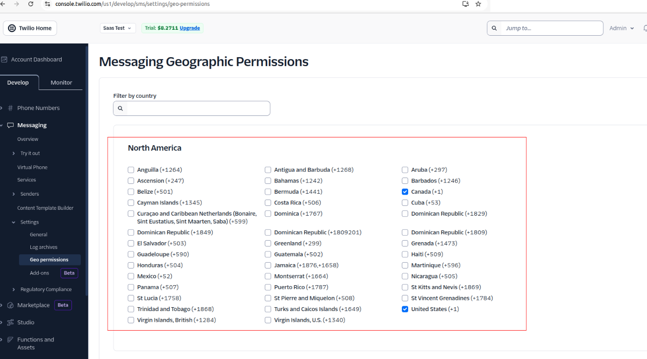
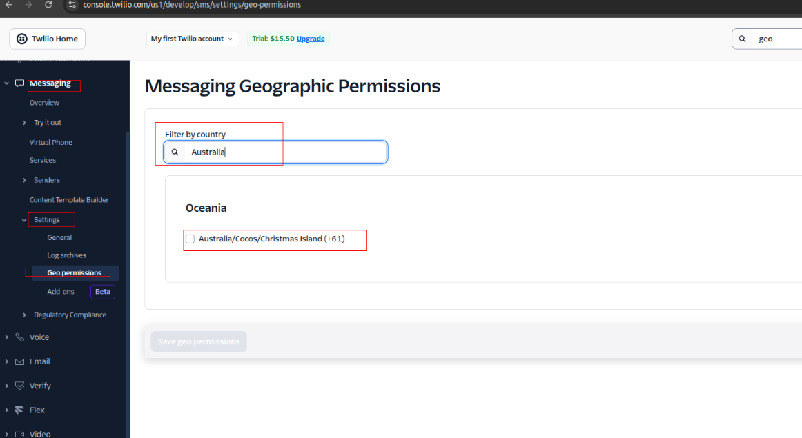
7) SMS Configuration
- Navigate: go to SMS ⇒ Configuration ⇒ Account.
- Fill Fields: enter the required information:
- Name: Reference name (e.g., Appointment SMS).
- Account SID: Copy from your SMS Console (Dashboard).
- Auth Token: Copy from your SMS Console (Dashboard).
- Your SMS Phone #: Your purchased SMS number (e.g., +12065551234).
- To: Recipient’s number in E.164 format (e.g., +614XXXXXXXX for Australia).
- Body: Message content (e.g., "Confirm Your Appointment. Reply YES or NO").
- Save: click Save to store the configuration and connect.
8) SMS Template
- Navigate: go to Configuration ⇒ SMS Template.
- Create Templates: use this option to create and save predefined SMS messages that can be reused for sending consistent and quick text messages.
9) Groups menu
- Navigate: go to Configuration ⇒ Groups under the SMS Groups menu.
- Manage Contacts: this section allows you to manage contacts for sending bulk SMS messages. Each entry represents a contact that can be included in a group message.
10) SMS from Appointment
- Open an appointment: go to ClinikMate → Appointments.
- Click the SMS button: the Message Content Wizard appears.
- Fields are auto-filled:
- SMS Account: Choose from dropdown.
- Recipient: Auto-filled with the patient's name.
- Receiving Number: Auto-filled from the patient's mobile.
- Message: Auto-filled from the selected template.
- Choose or edit the message template if needed.
- Click Send: SMS is sent to the patient using the message “Confirm Your Appointment. Reply YES or NO”.
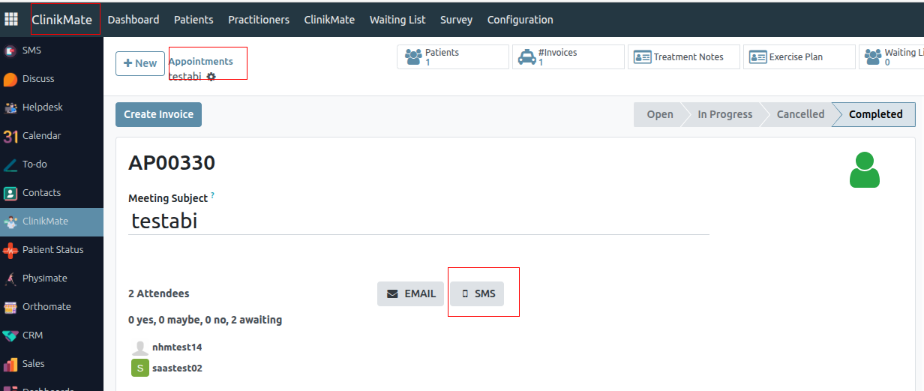
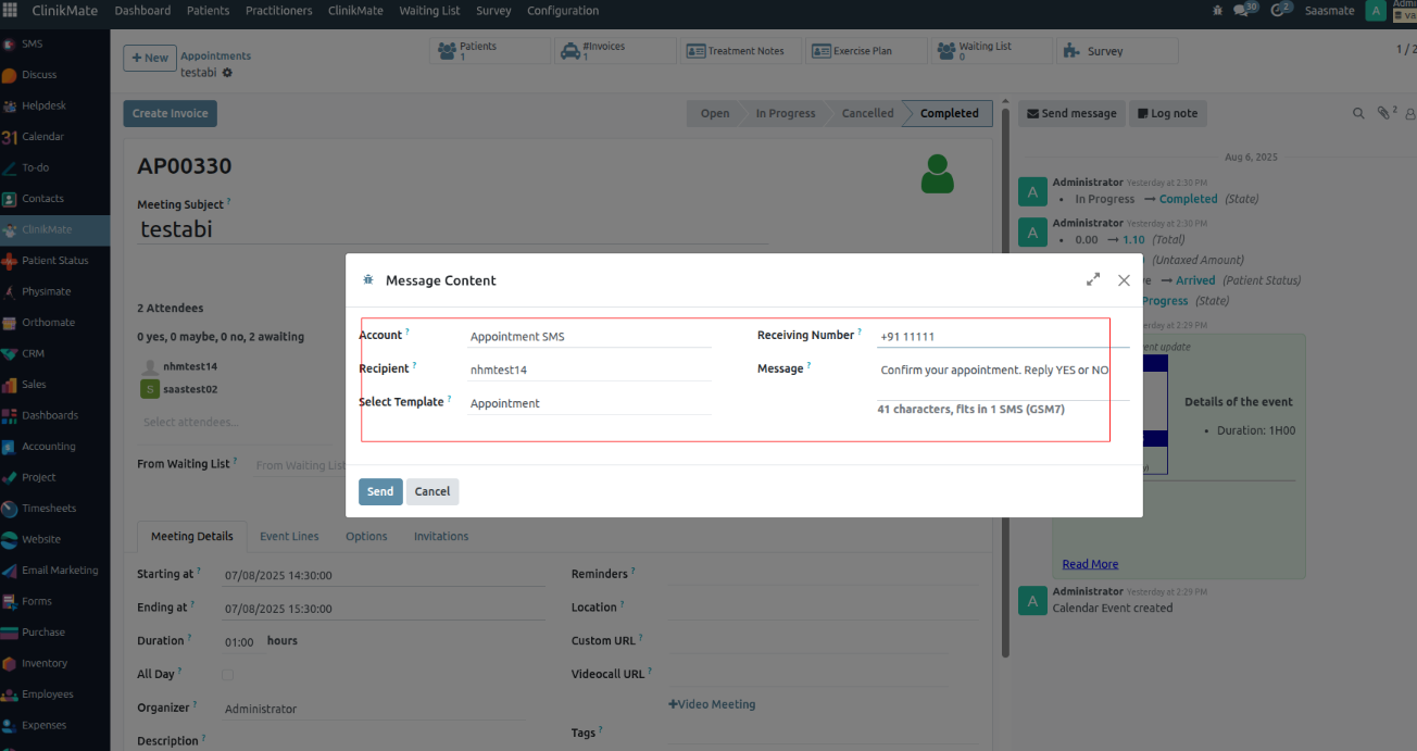
11) Set Up Webhook in Incoming SMS
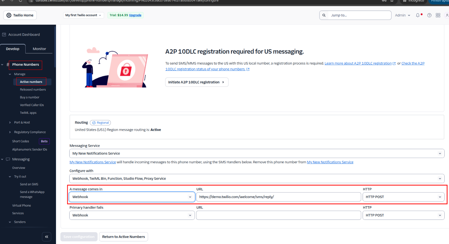
-
Navigate to Phone Numbers:
- In the left menu, go to Phone Numbers → Manage → Active Numbers.
- Click the phone number you're using to send/receive SMS.
-
Set the Webhook for Incoming Messages:
- Under the Messaging section, set A MESSAGE COMES IN → Select Webhook.
- In the input box, enter your Vantage webhook URL, e.g.: https://your-vantage-domain.com/sms/webhook/sms
- Choose the HTTP POST method.
- Save the Configuration: scroll down and click Save.
12) SMS Replies Webhook Menu
-
SMS Reply Workflow Using SMS Webhook and Vantage:
- SMS Sent from Vantage: Patient receives an SMS from Vantage. Example: "Confirm Your Appointment. Reply YES or NO."
- Patient Responds: Configuration → SMS Replies Webhook.
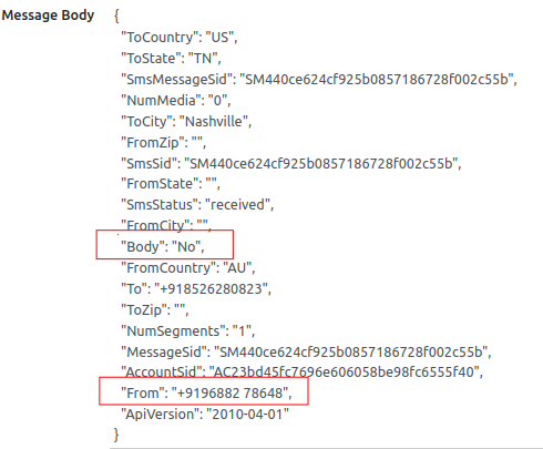
-
Webhook Processing:
- When a patient replies to an SMS with "Yes" or "No", SMS sends a POST request to a custom webhook URL (e.g., https://your-domain.com/sms/webhook/sms).
- The request contains:
- The mobile number (From).
- The message body (Body).
-
Webhook Controller Actions:
- Receives and parses the incoming data.
- Stores it in the "SMS Replies Webhook" table under SMS → Configuration.
- Searches for the patient using the mobile number stored in the mobile field of the res.partner table.
- Finds the related appointment for that patient.
-
Update Appointment Status Based on Reply:
- If the reply is "yes", the appointment status is set to Accepted.
- If the reply is "no", the appointment status is set to Declined.
Help Desk
Help Desk is a support system that manages customer queries, issues, and service requests. It helps track, prioritize, and resolve tickets efficiently. The tool improves customer satisfaction by ensuring quick and organized support.
1) Configure Incoming Mail Server
- Type: IMAP
- Server: pop.gmail.com | Port: 993 | SSL/TLS: Enabled
- Username/Password: Gmail credentials (secured)
- Action: Create Helpdesk Ticket
- Last Fetch: 09/11/2025 13:07:29 | Status: Confirmed
Ensures Gmail emails are securely fetched via IMAP and converted into Helpdesk tickets.
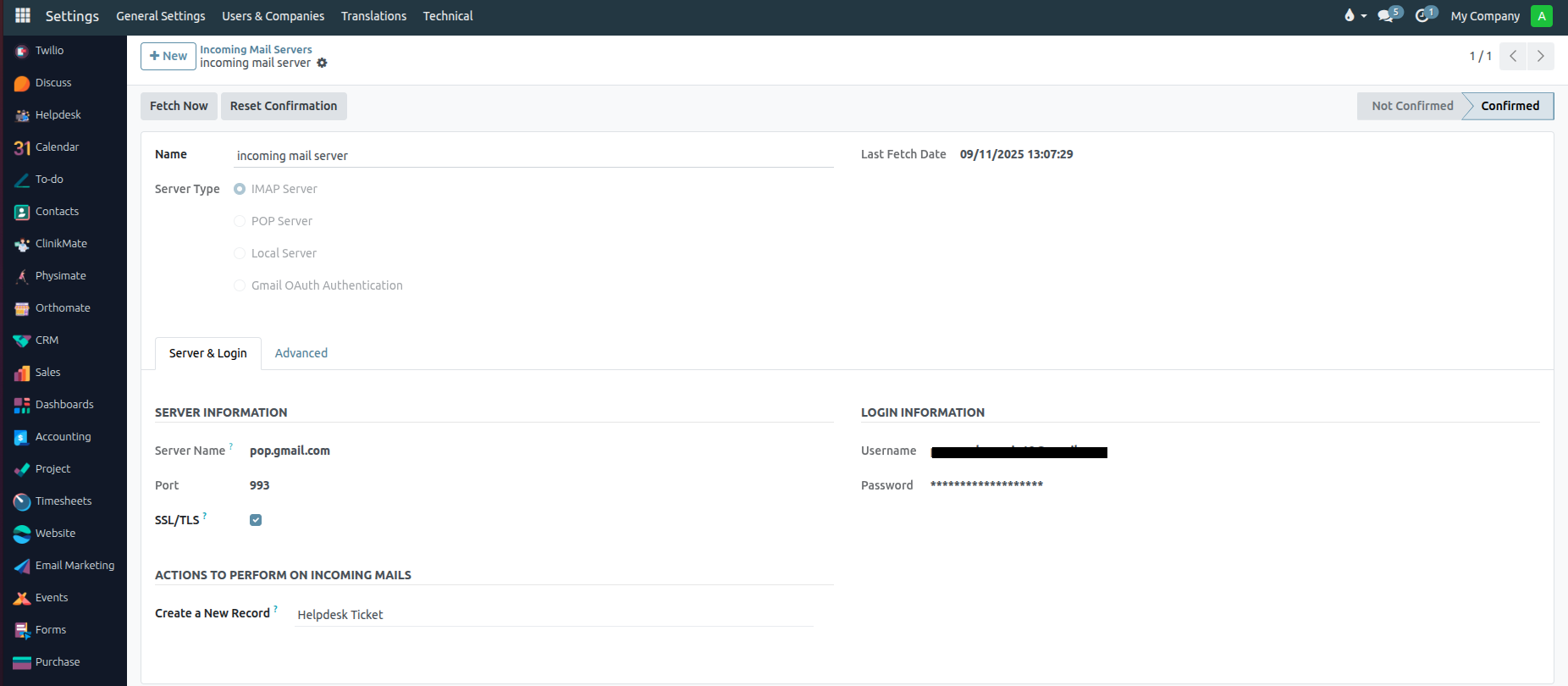
2) Incoming Mail To Fetch
- Emails sent from Gmail (as seen in Gmail’s Sent folder screenshot)
- Example email subject: "Testing The Helpdesk"
- Email body: "Testing purpose only...."
- Image attached in the email
The email is sent and stored in the Gmail Sent folder, confirming that outgoing mail is working and available for fetching.
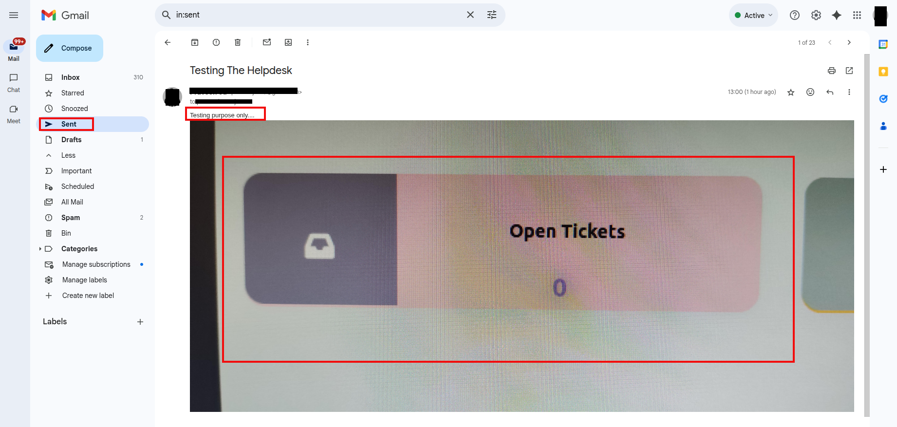
3) Create Tickets From Incoming Emails
- A Helpdesk Ticket is automatically created in the Helpdesk app.
- Example ticket displayed in the Helpdesk module:
- Ticket Number: TICKET00012
- Subject: Testing The Helpdesk
- Customer: Praveen
- Priority: Low
- Creation Date: 09/11/2025 13:00:55
- The incoming email content is displayed in the chatter with subject and body intact along with the attached image.
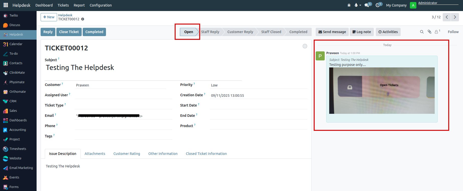
4) Configure Outgoing Mail Server
- Server: smtp.gmail.com | Port: 465 | SSL/TLS: Enabled
- Username/Password: Gmail credentials (secured)
- Debugging: Enabled
- Purpose: Sends staff replies & automated Helpdesk notifications via Gmail SMTP.
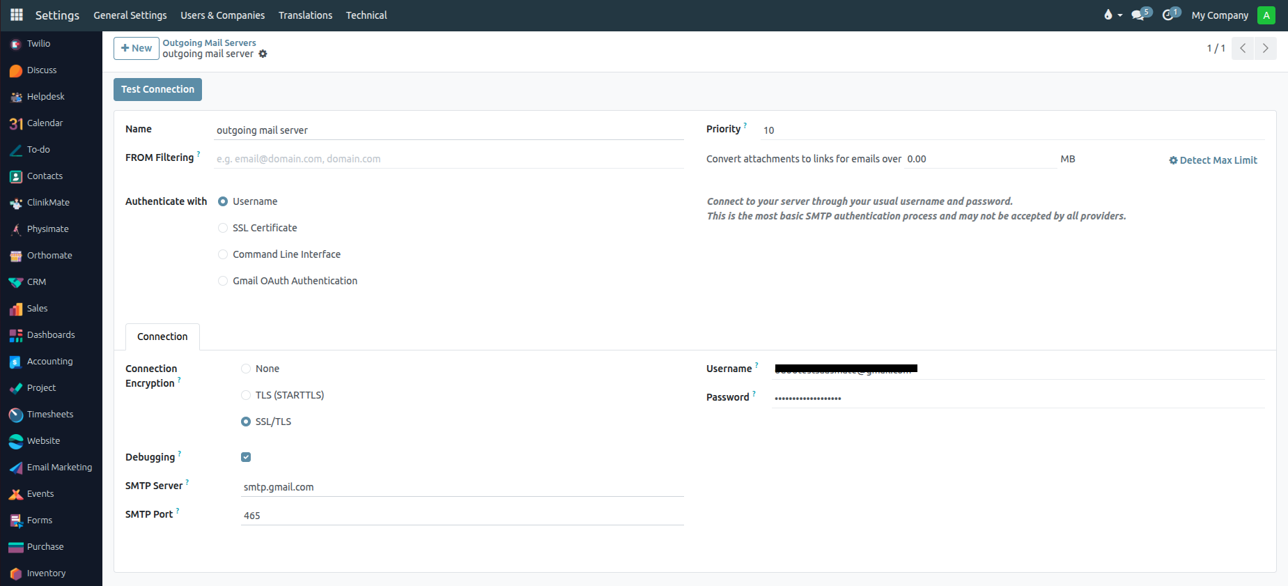
5) Ticket Fetched To Sent Staff Reply Mail
- Staff replies are sent from the Helpdesk and displayed in the chatter of the ticket.
- Example stage transition from Open → Staff Reply is recorded.
- Staff reply message shows:
- Message: “Noted Thank You For Mail..”
- Ticket chatter shows the reply message with relevant image and updates.
This confirms that outgoing mail is functioning and staff replies are sent through the configured SMTP server.
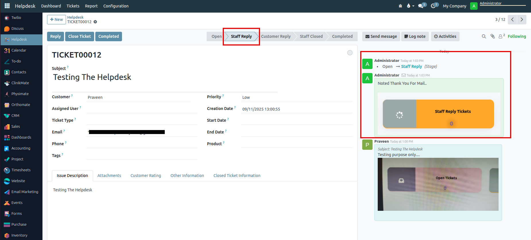
6) Message & Attachments Received from Customer → Customer Reply
- Customer sends a reply or update to the ticket (with/without attachments).
- Ticket stage automatically moves from Staff Reply → Customer Reply.
- Example: Customer Praveen replied with "Any Update for testing" along with an attachment.
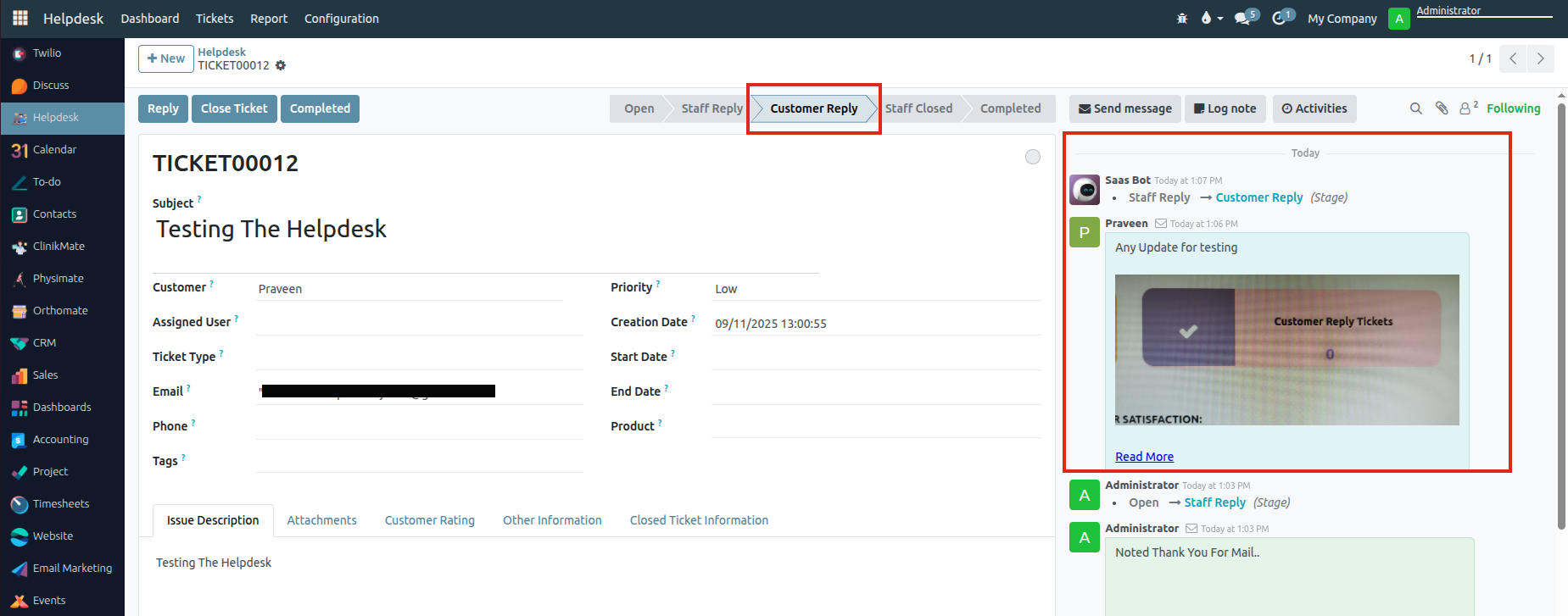
7) Staff Request to Close Ticket
- Staff clicks Close Ticket.
- A popup appears asking for a Close Message.
- Example: Staff entered “we are closing the ticket”.
- Ticket then moves from Customer Reply → Staff Closed.
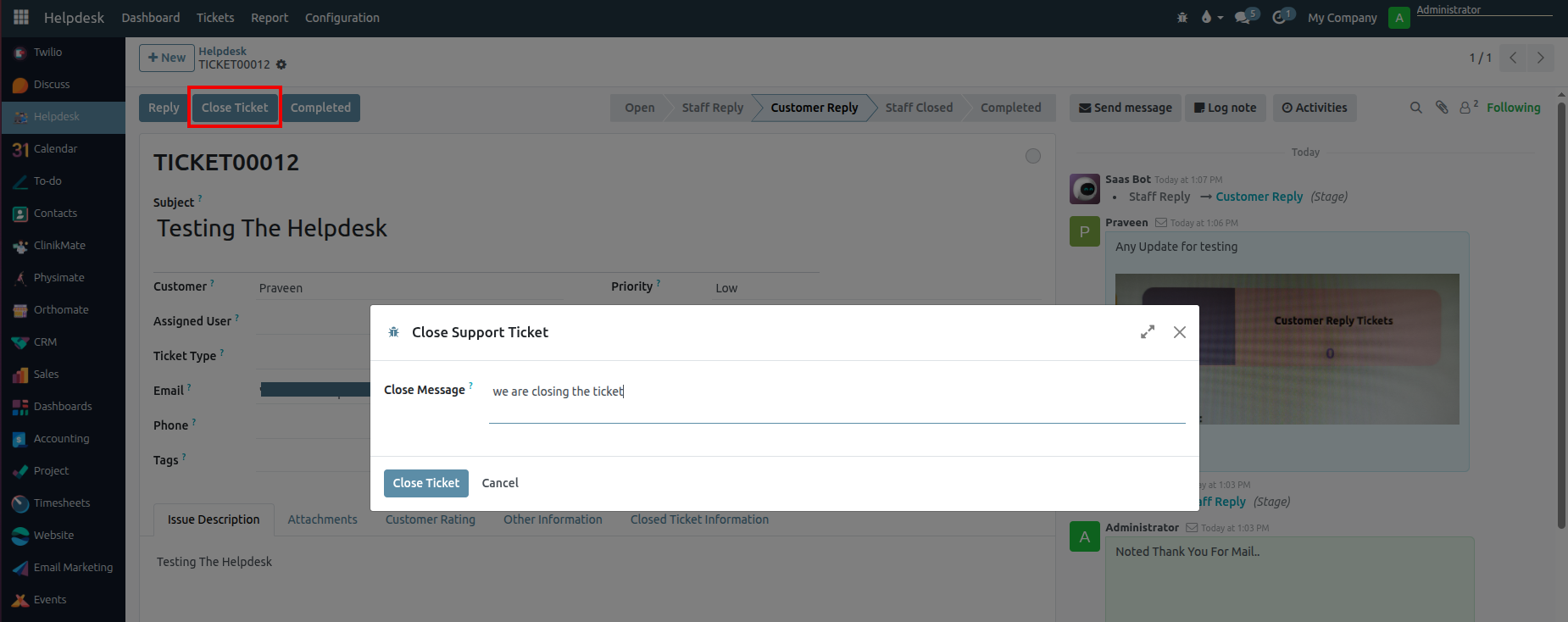
8) Staff Closed the Ticket
- System logs the closure action.
- Ticket is marked as Staff Closed.
- A closing note is visible in the thread, e.g. “Your Ticket is closed by Administrator. The closed comment is: we are closing the ticket”.
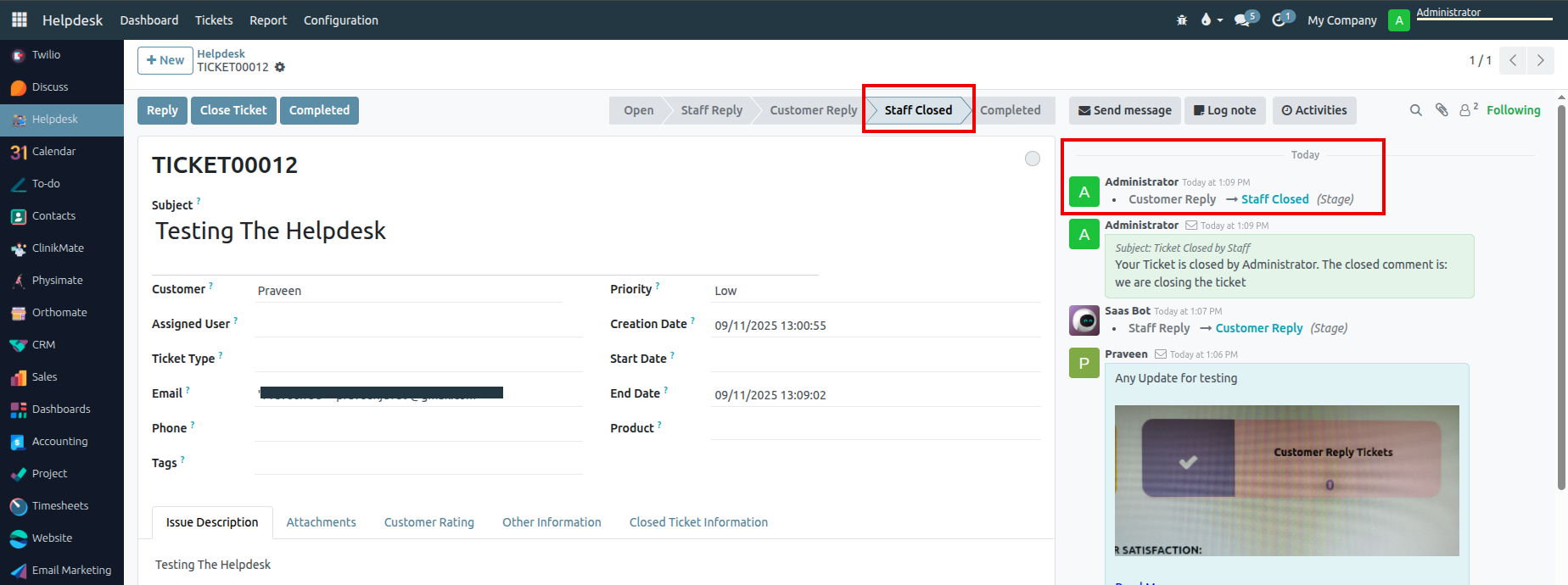
9) Staff Moved to Completed
- Staff clicks Completed to finalize the process.
- Ticket moves from Staff Closed → Completed.
- Final confirmation appears in the activity log, ensuring the ticket lifecycle is fully completed.
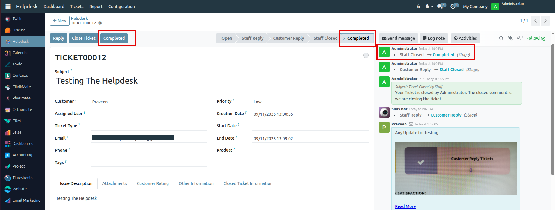
Clinikmate
Clinikmate is a healthcare management platform designed to streamline clinic operations, patient records, and appointment scheduling. It offers tools for managing medical histories, treatments, and reports efficiently. The platform enhances patient care while simplifying administrative tasks for healthcare providers.
Dashboard
- Under the Dashboard section of the ClinikMate module, Appointment details are displayed.
- The data is filtered based on the selected time period either Daily or Weekly or Monthly located on the right side of the corner.
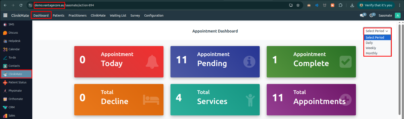
Patients
- Under the Patients menu in the ClinikMate module, Only patients retrieved from the Customer card are displayed.
- Patients are filtered based on the "Is Patient" boolean field in the Customer card - only those with this field set to True are shown in the Patients menu.
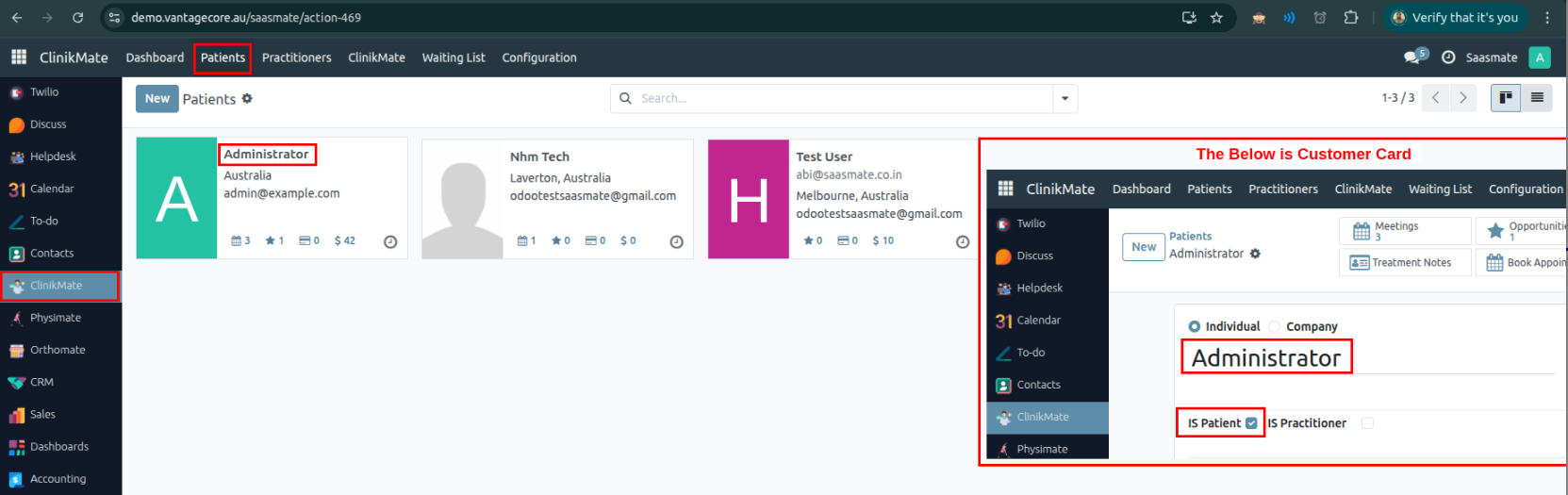
- If the Is Patient Boolean is True, The below Tabs will be shown,
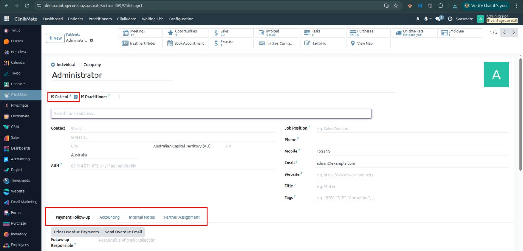
Practitioners
- Under the Practitioners menu in the ClinikMate module, Only practitioners retrieved from the Customer card are displayed.
- Practitioners are filtered based on the "Is Practitioner" boolean field in the Customer card - only those with this field set to True are shown in the Practitioners menu.
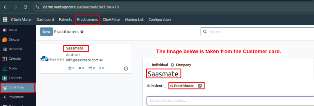
- If the Is Practitioners Boolean is True, The below Tabs will be shown,
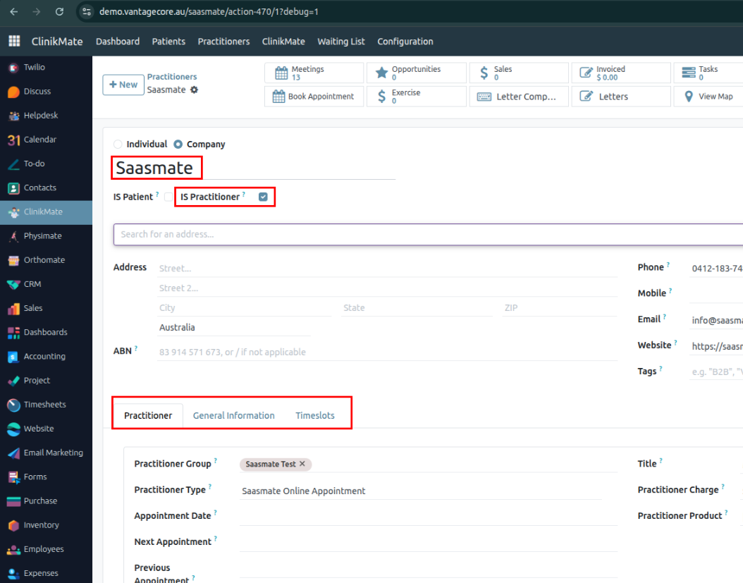
Appointment
- Appointment can be created through List Or Calendar View.
- We can find the Appointment menu under the ClinicMate module -> inside the ClinicMate menu.
- We can also view the Calendar & List views for Appointments.
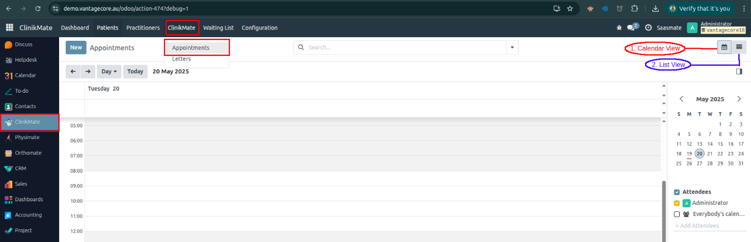
Calendar View
- When we click on a Date in the calendar view, a wizard opens to create a Patient Appointment.
- We can also see the following details in the wizard:
- Patient Name: Displayed as "Test Patient".
- Start: The scheduled time of the appointment.
- All Day: If selected, the patient can visit at any time during the day (no specific time is set).
- Attendees: Names of the people attending the appointment.
- Video Call URL: Link for joining the appointment via video call.
- Description: Details about the patient's medical issue.
- After saving, we can see the details as shown in the screenshot below. We can also easily edit or delete the appointment.
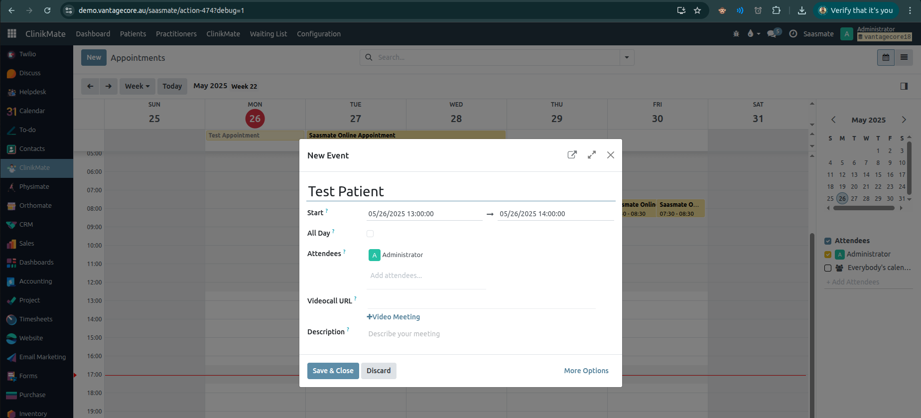
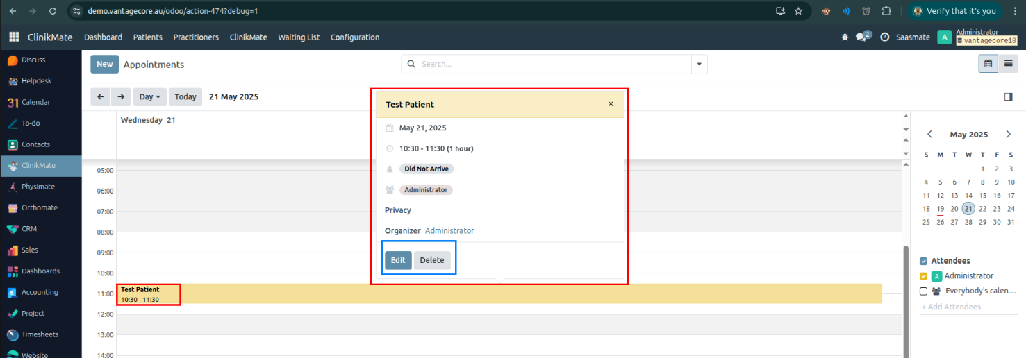
List View
- The list view appears as shown in the screenshot below. We can Create New Appointments for Patients here.
- When we click the New Button, The Form view will be opened.
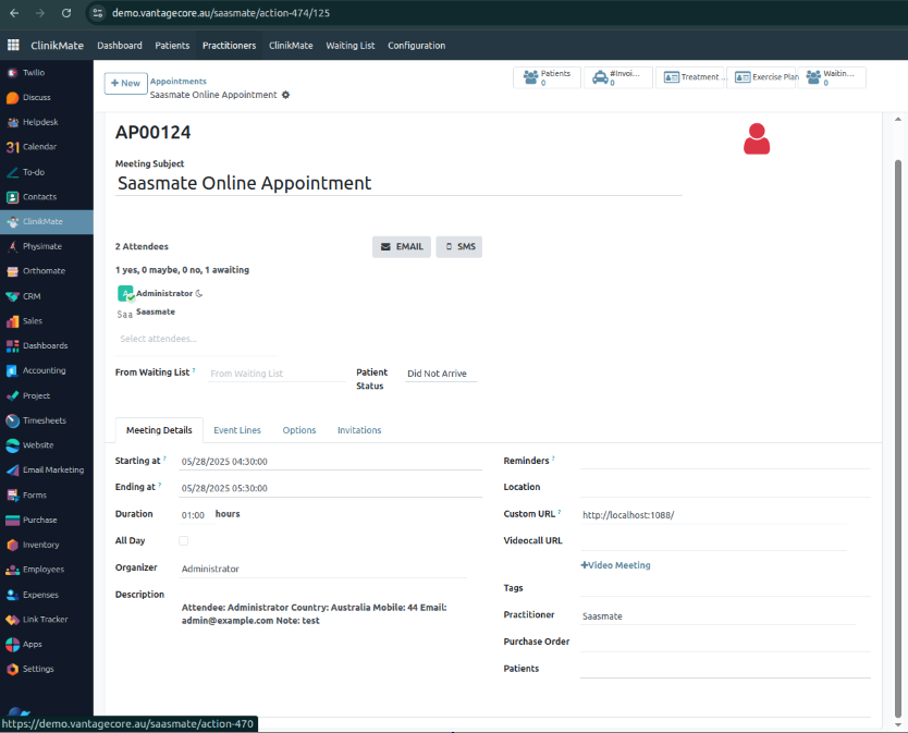
Buttons
Form View
- The Form view appears as shown in the screenshot below after clicks the List View New Button. Also, We can Create New Appointments for Patients here.
- Sequence: Initially shows as "New." After saving, the actual sequence number is displayed.
- Meeting Subject: Displays the patient's name (e.g., "Test Patient").
- Email & SMS: Options for sending notifications about the appointment.
- Attendees: Names of the attendees for the appointment.
- Patient Status: Shows the patient's arrival status. If the customer has arrived, the top logo changes to green; if not arrived, it remains red.
- Tracking Details: You can add tracking information for the appointment.
- From Waiting List: Comes from
waiting.listtable. - Starting at: The field will be updated when the appointment is created through the website, or it can be entered manually in the form view.
- Ending at: The field will be updated when the appointment is created through the website, or it can be entered manually in the form view.
- Duration: This field is automatically calculated based on Starting at & Ending at.
Appointments Create Via Web
Step:1
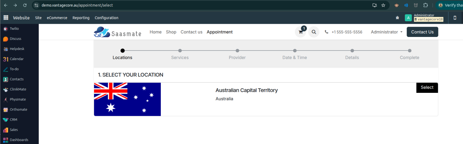
Step: 2 (Select Your Service)
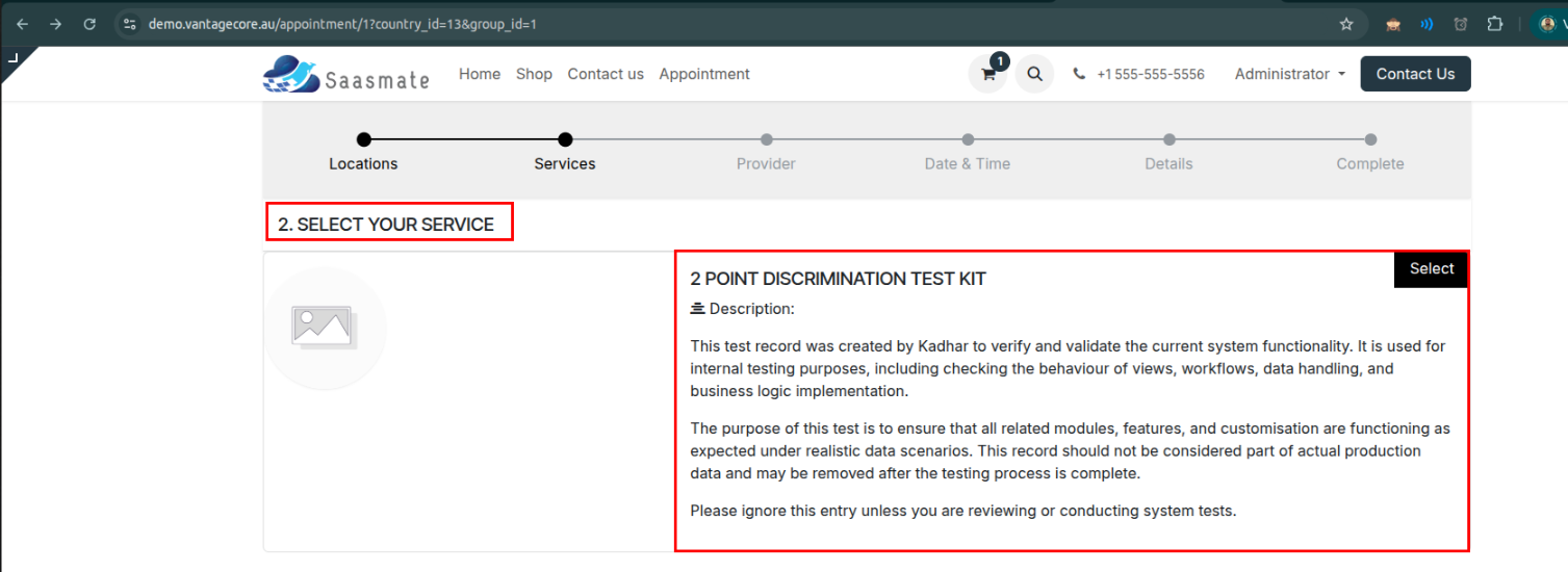
Step: 3 (Select Your Provider)
Step: 4 (Select Date & Time)
Step: 5 (Confirm your details)
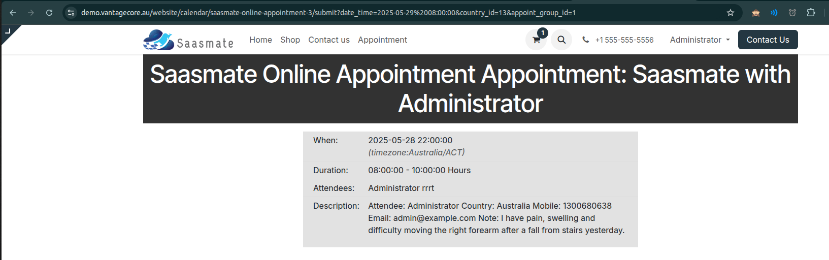
The Details will be saved under ClinikMate Module -> ClinikMate Menu -> Under Appointment Menu.
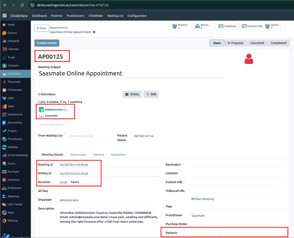
Letters
The Letter Will be crated as following Steps:
1. In the Customer card, we can see the "Compose Letter" button.
2. When clicked, a wizard will open. Within the wizard, you can access letter templates under the "Load Template" option.
3. Once the letter is printed, it will be automatically created and saved under the ClinikMate module → ClinikMate menu → Letters submenu.
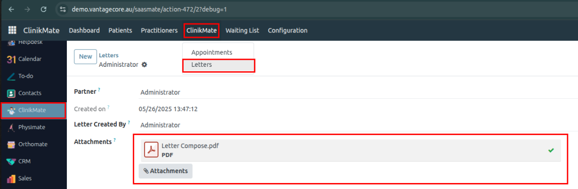
Waiting List
1.The Waiting LIst table linked with the Appointments Table.
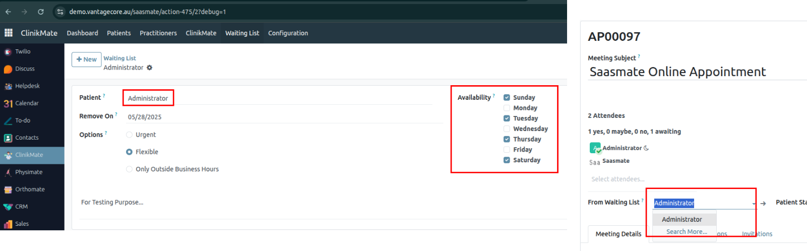
2. The Availability Comes from Configuration Module under Weekdays.adsd
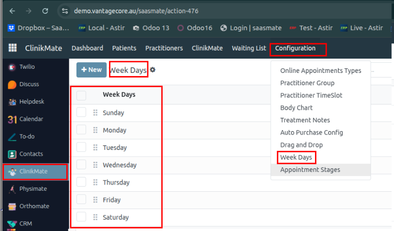
3. The “Remove Waiting List Patients” cron has been added and it will daily and execute – The cron will remove the previous day “Waiting List”,
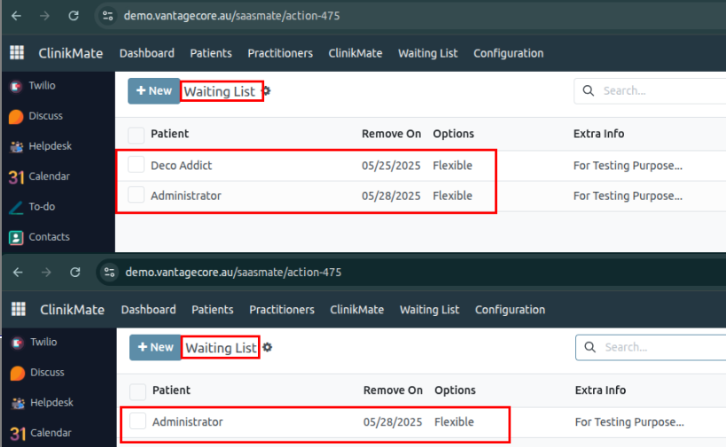
Online Appointments Type
The Online Appointments Type is used for create the Online appointment.
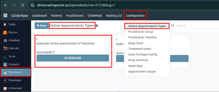
Practitioner Group
The Practitioner Group is used for Create the Group For Appointment.
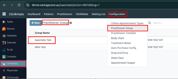
Body Chart
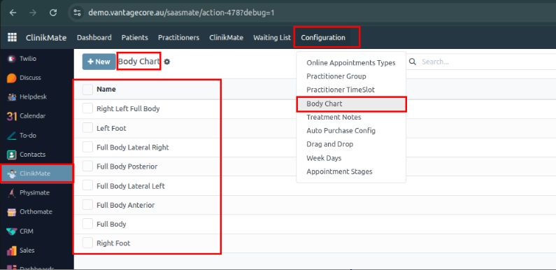
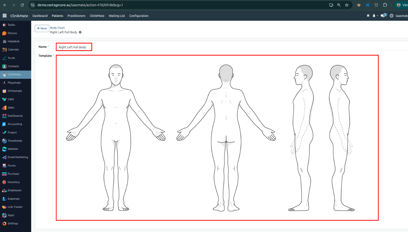
Treatment Notes
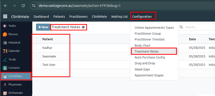
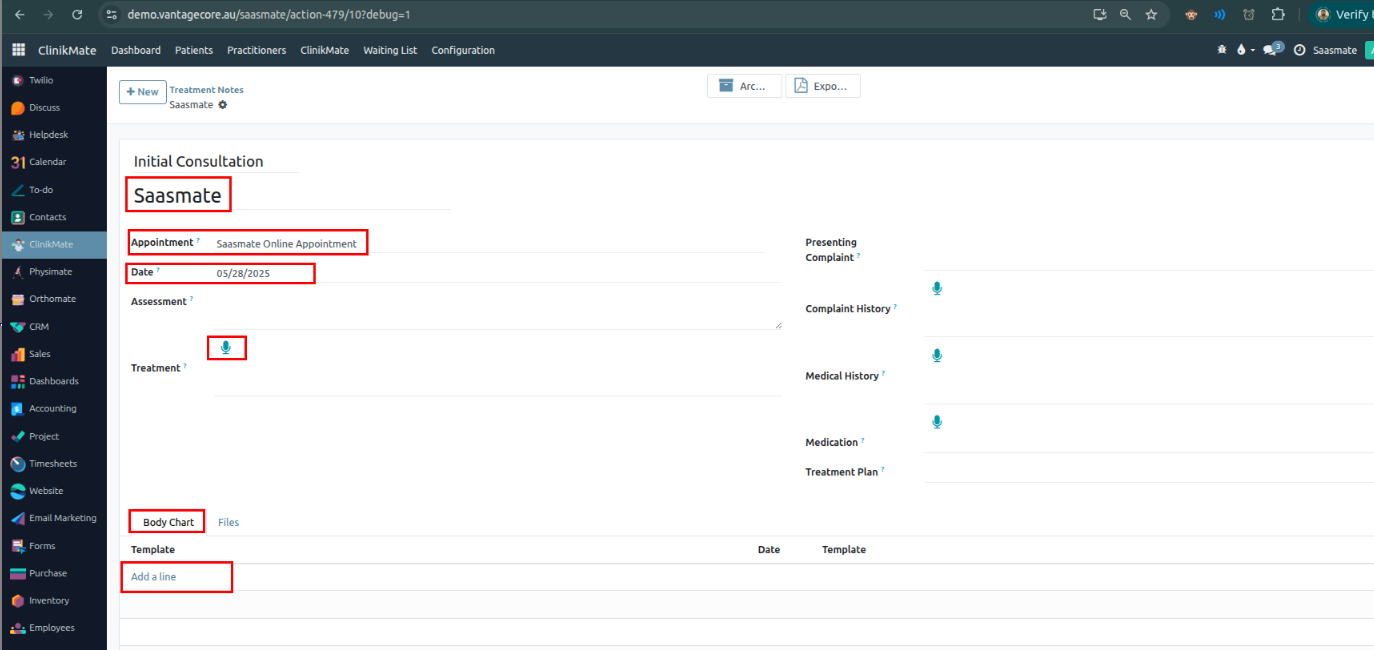
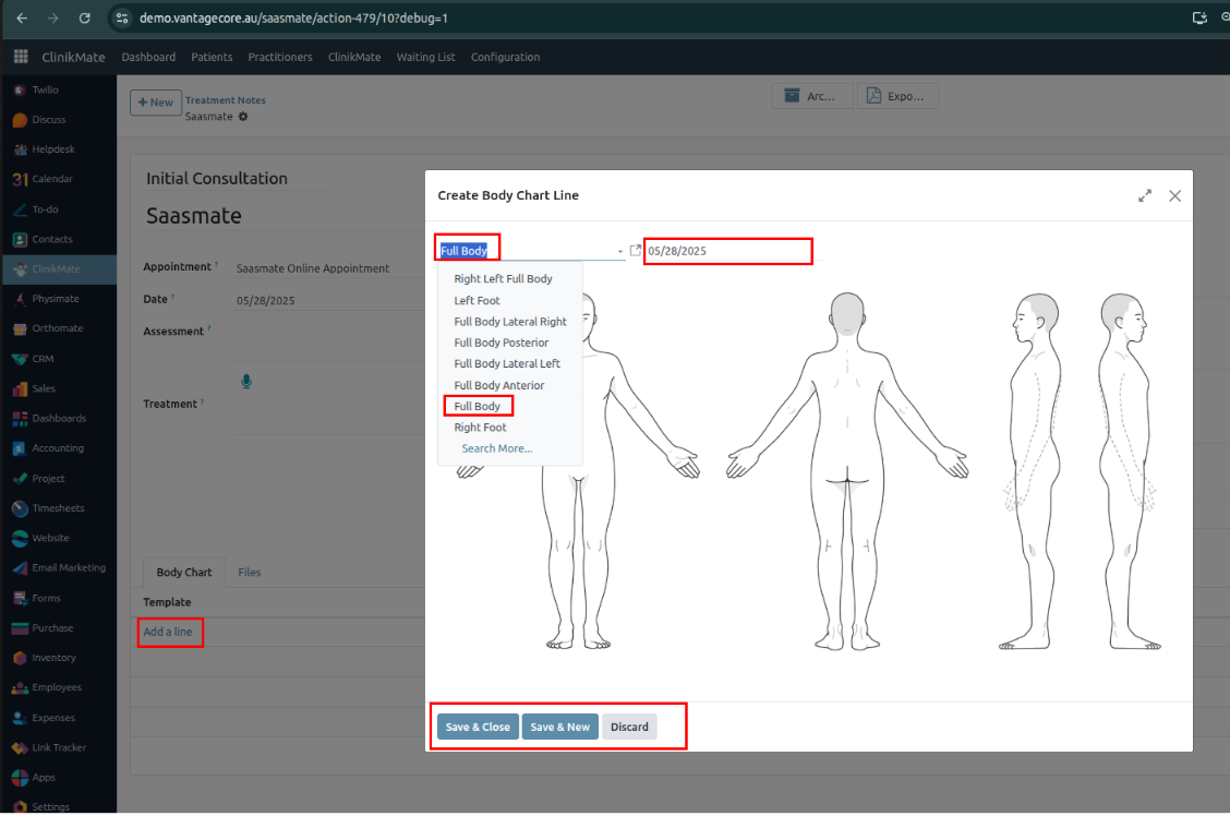
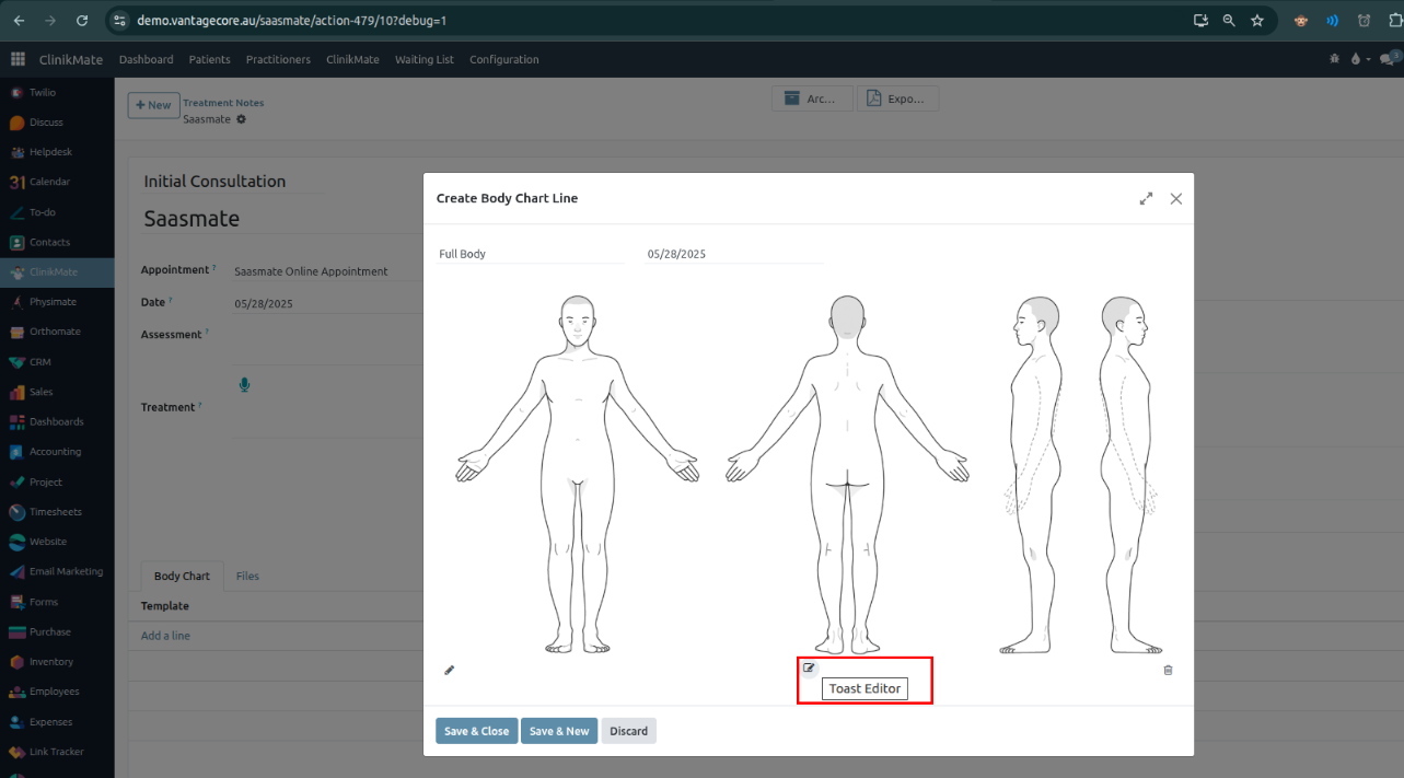
- Load: Allows you to load a new image.
- Download: Easily download the modified picture.
- Save: Saves the modified details. (Sometimes, the system may display messages. If you receive any, please reach out to us.)
- Close: Closes the Toast Editor window.
Note: Please remember to save the Treatment Note after modifying and saving the Body Chart template.
Appointment State
Note:- The stage will be reflected in the Online Appointment Types. If we modify any stage name in the Appointment Stage, it will also be reflected under the Online Appointment Types stage.
Clinikmate Dashboard
Path: Under ClinikMate → Dashboard
In the top-right corner, you will find the Select Period button. Here, you can choose among different period types:
Daily Report:
The daily report captures data from the start of the day at 00:00:01 to the end of the day at 23:59:59.
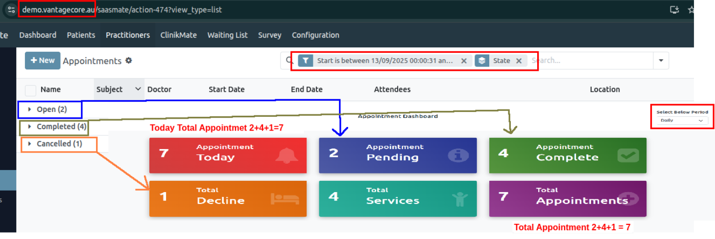
Weekly Report:
The Weekly report captures data from the start of the Sunday to the end of the Saturday.
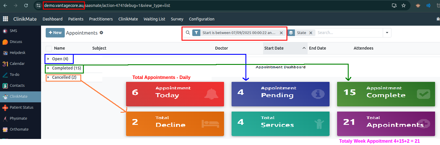
Monthly Report:
The Monthly report captures data from the Entire Month data.
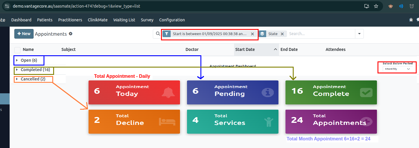
Weekly:
Monthly:
Daily:
Weekly Line Chart - All Appointments & Weekly Completed Appointments:
Line Chart showing all appointments for the week.
Displays all scheduled appointments for the current week.
The date period will be based on the start field.
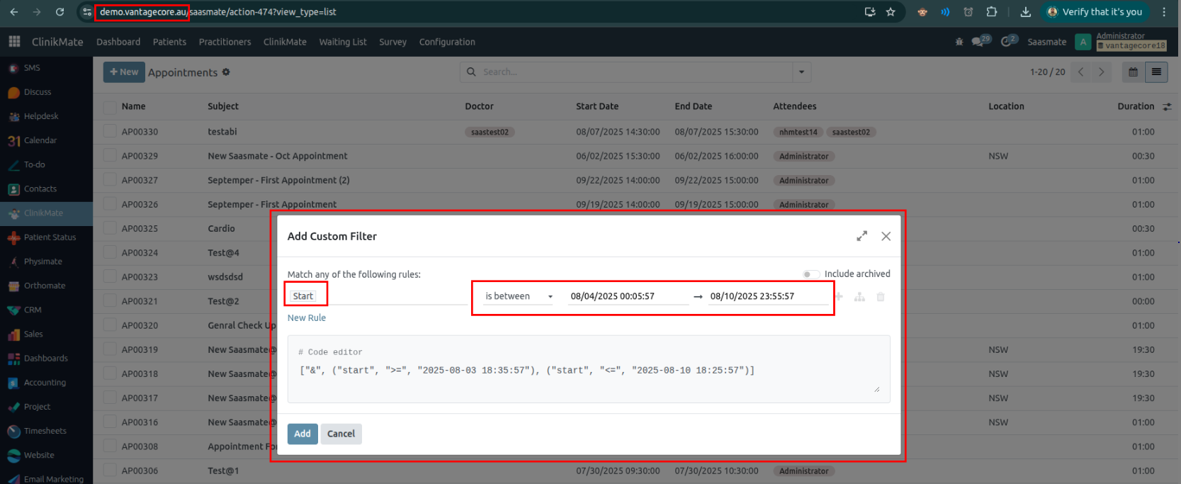
The line chart shows appointment data for one full week (Monday to Sunday).
The pie chart displays only the completed appointment data for the full week, Monday through Sunday.
The line chart below displays all appointment records:
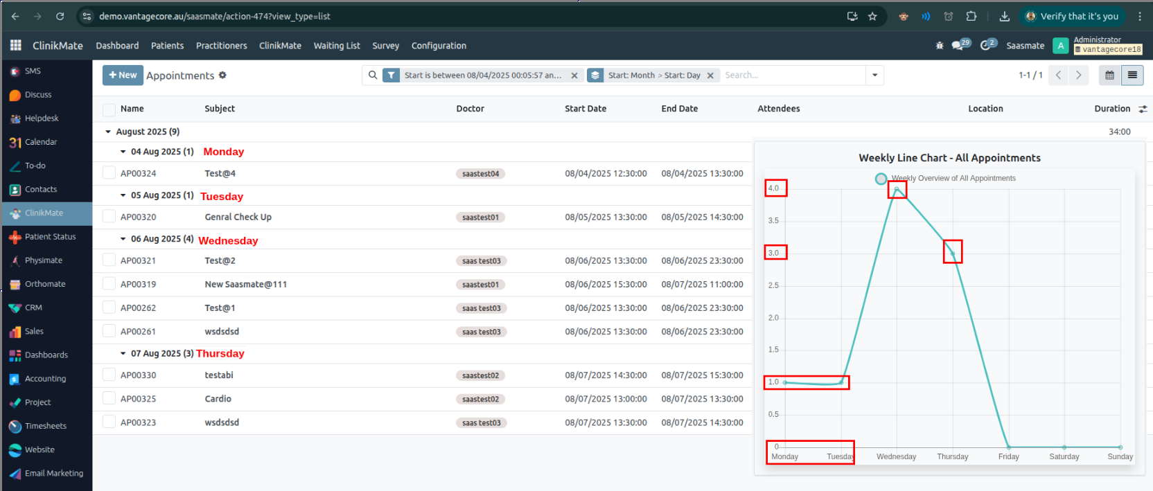
The pie chart below displays only the completed appointment records.
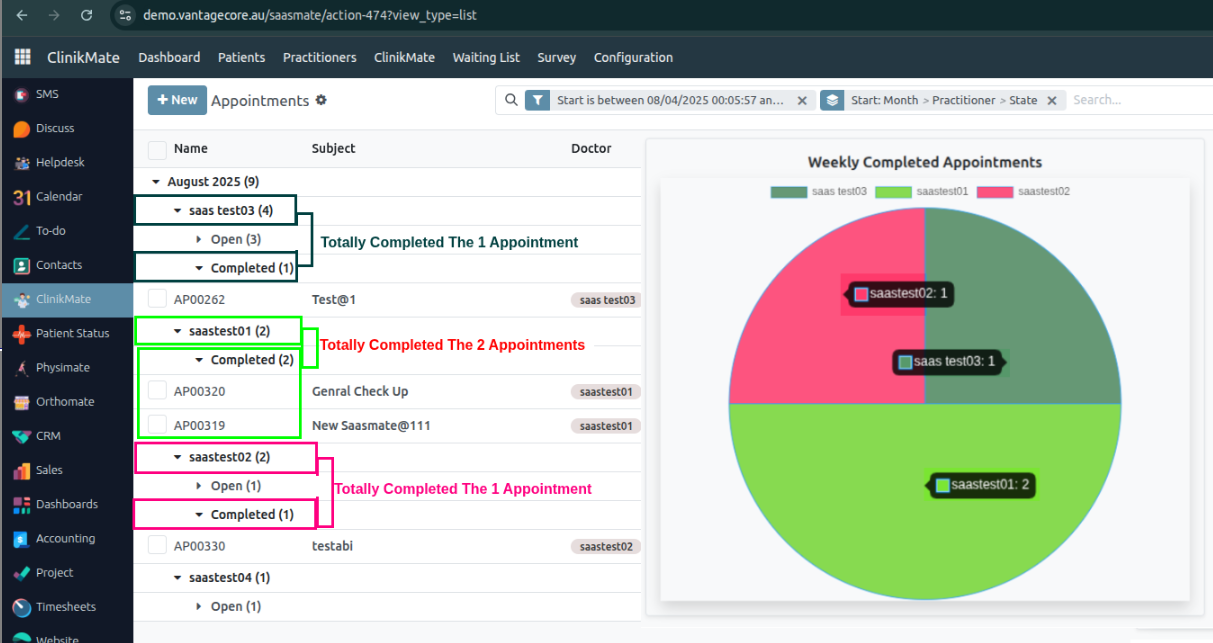
The overall view presents a weekly line chart displaying both all appointments and completed appointments for the current week. (Monday to Sunday).
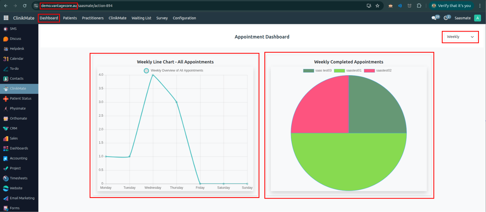
Monthly Line Chart - All Appointment & Monthly Completed Appointment:
The line chart shows all appointments for the year 2025–2026 (from July 1, 2025, to June 30, 2026). The appointment records are displayed month by month, showing the number of appointments for each month.
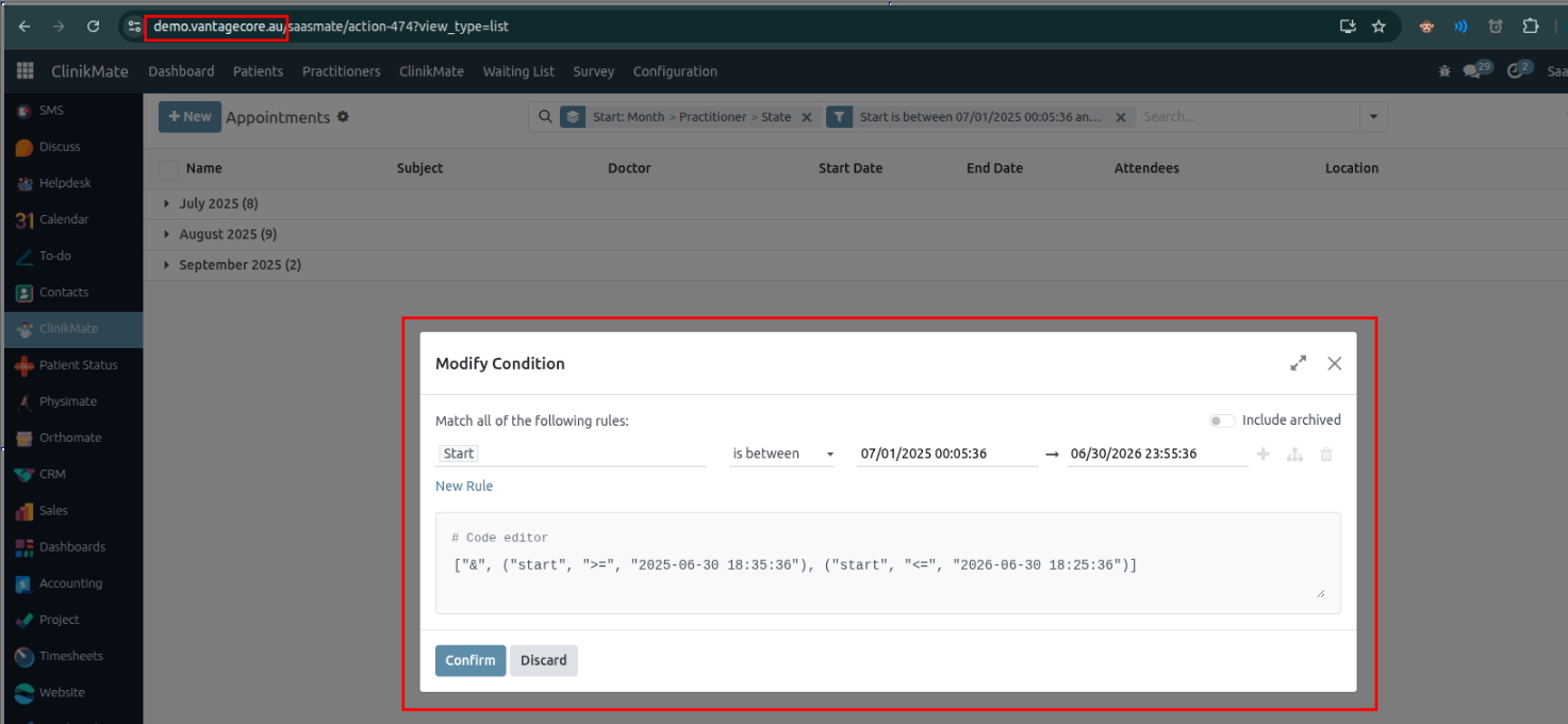
Displays all scheduled appointments for the current year, from July 1, 2025, to June 30, 2026, shown month by month.
Displays all scheduled appointments for the current month and Shows the number of appointments marked as completed during the month.
The date period will be based on the start field.
Line Chart showing all appointments for the month.
Summary of completed appointments each month.
The line chart below displays all appointment records (Months):
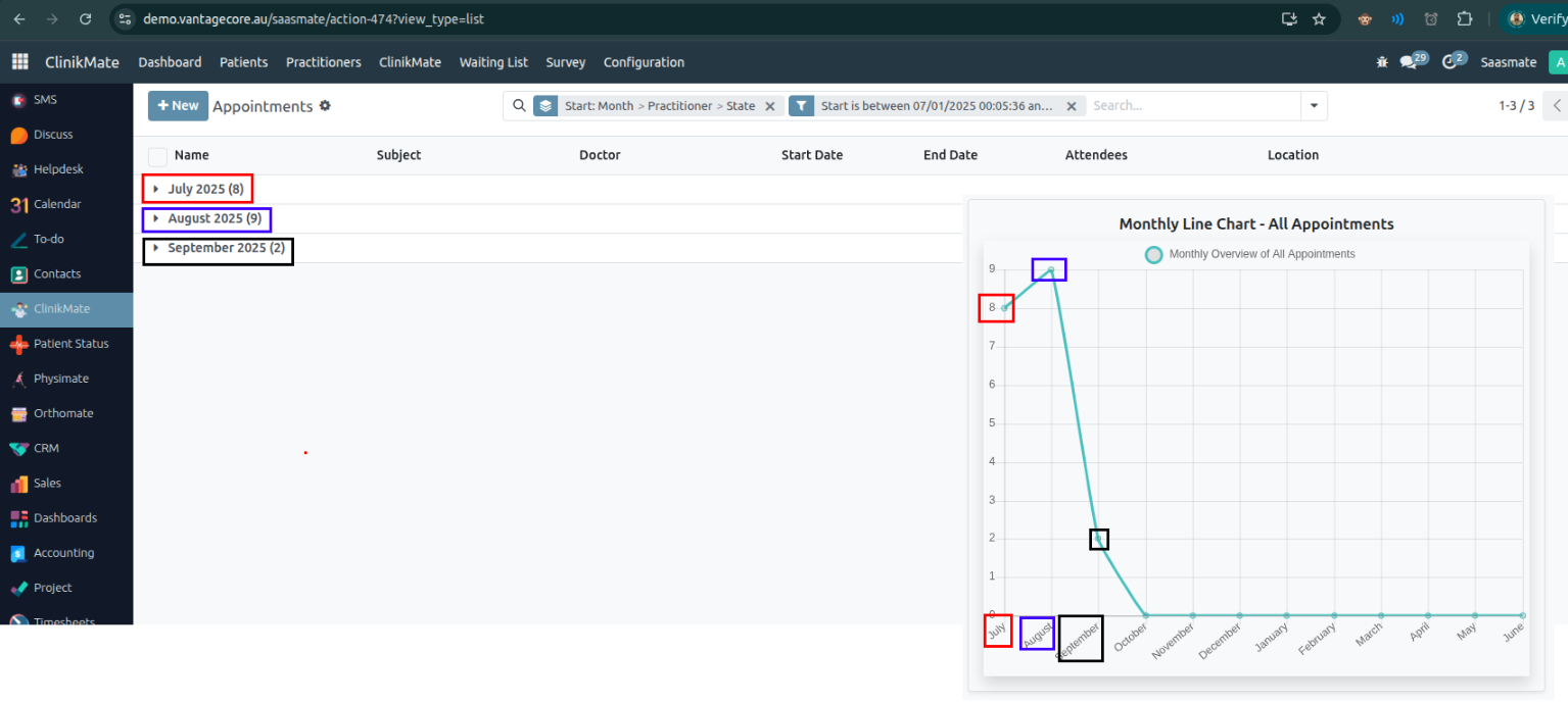
The pie chart shows only the completed appointments for the full current month:
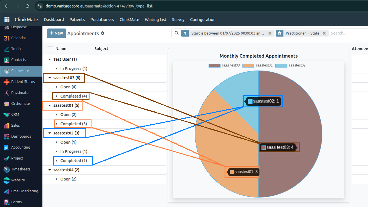
Daily Line Chart - All Appointments & Daily Completed Appointments:
The line chart shows all appointments for the Day. The appointment records are displayed Full Day.
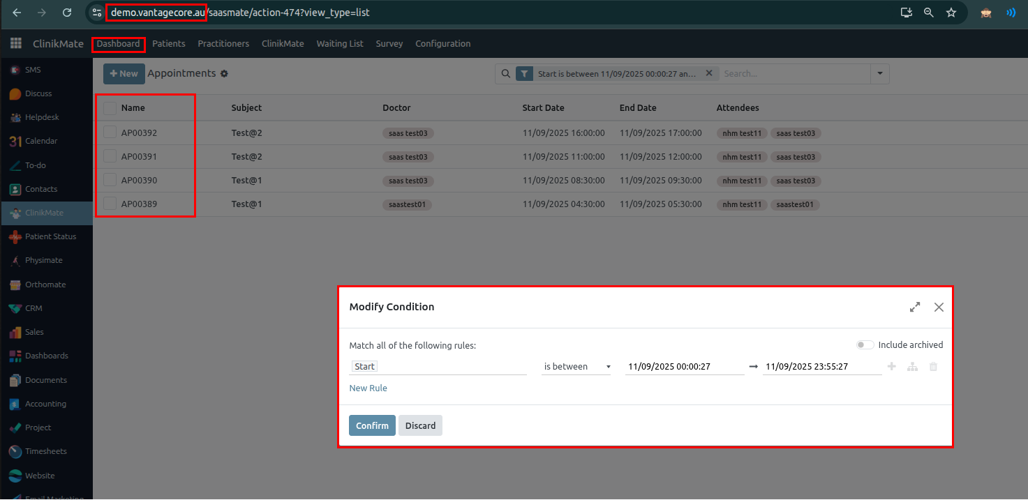
Displays all scheduled appointments for the Current Day.
Displays all scheduled appointments for the current day and Shows the number of appointments marked as completed during the day.
The date period will be based on the start field.
Line Chart showing all appointments for the day.
Summary of completed appointments each day.
The line chart below displays all appointment records (Day):
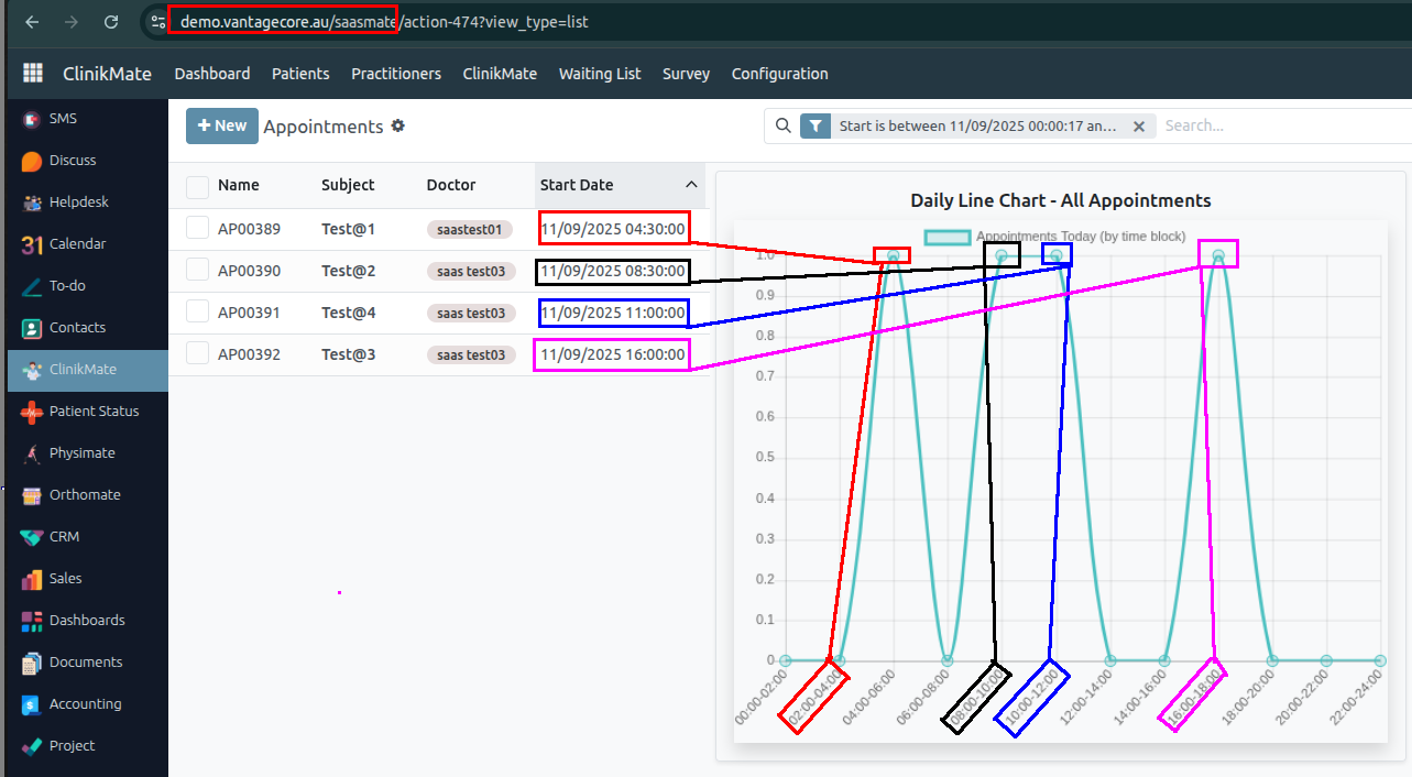
The pie chart shows only the completed appointments for the full current day:
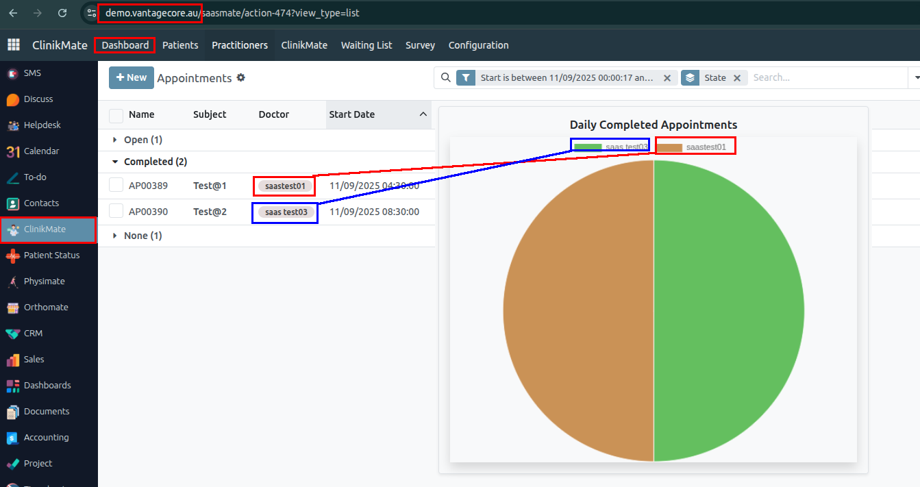
Appointment
1. Create a new appointment where the status will be Open.
• Patient: Shalman Patient
• Practitioner: saas test03
• Patient Status: Did Not Arrive
• Attendees: 2
• Start Time: 13/09/2025 11:30:00
• End Time: 13/09/2025 12:30:00
Once the patient attends the meeting, the appointment status will be changed to In Progress, and the patient's status will be marked as Arrived.
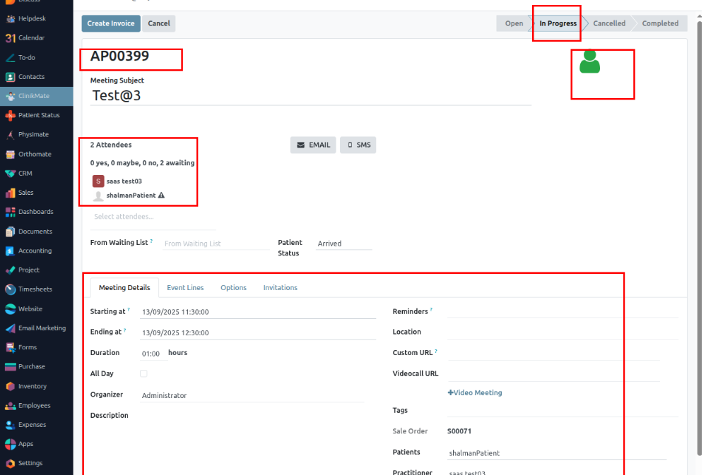
2. The event line should display the list of ordered products with the following details: Product Name, Quantity, Price, and Tax.
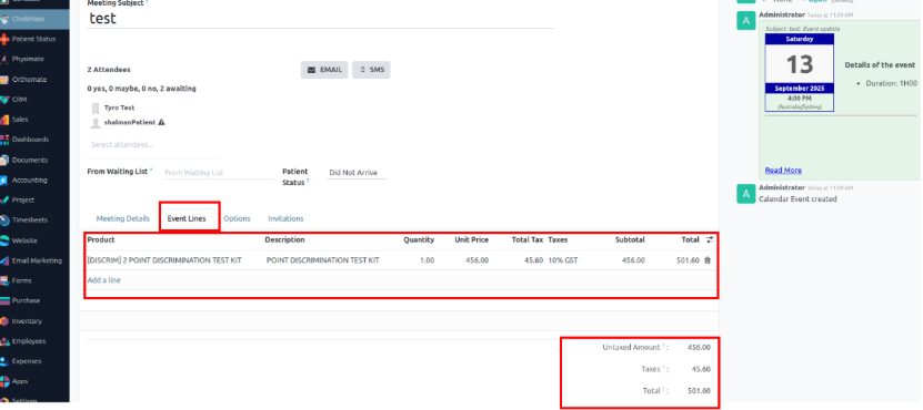
3. Once the Create Invoice button is clicked, the invoice will be created and the sales order number will be updated.
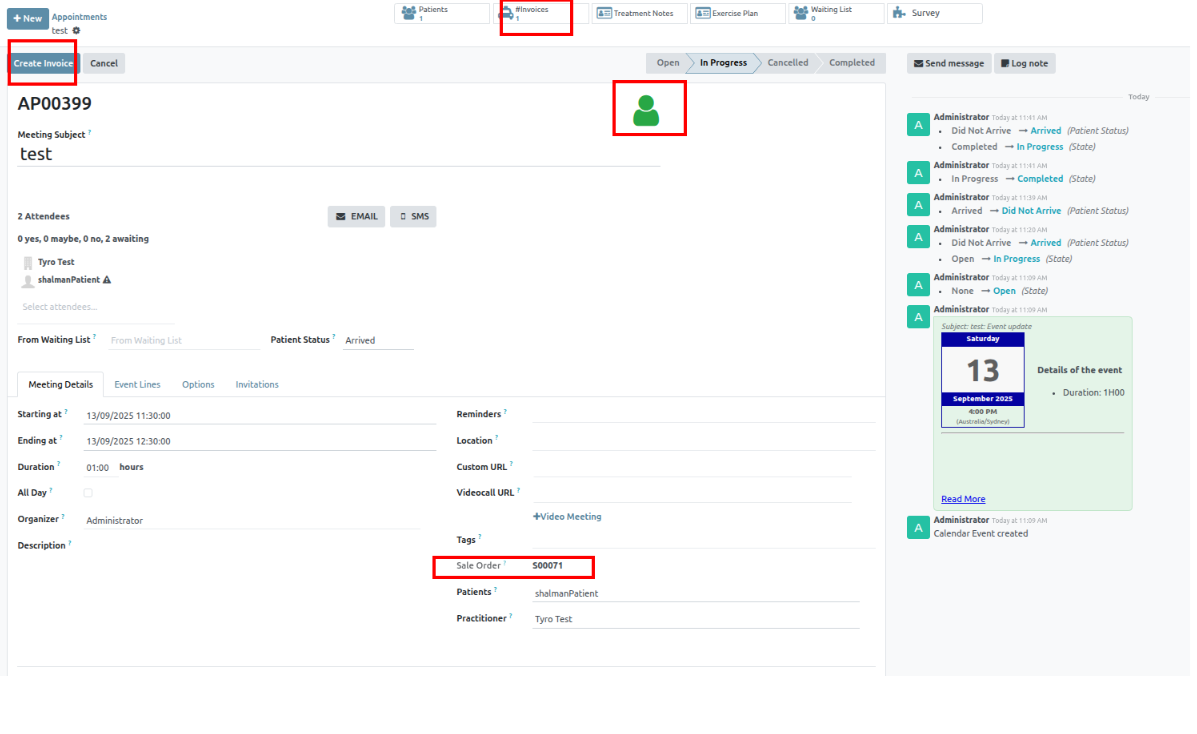
4. Customer Name: When the patient name is selected, their address will automatically populate. You can edit it if needed.
5. Invoice Date: The invoice date is automatically set to the date the invoice is created.
6. Payment Terms: Select the payment terms. For example, if you choose "21 days," the customer is expected to pay within 21 days.
7. Journal Selection: You can edit the selected journal by clicking the external link button. This will open the journal details in a new window.
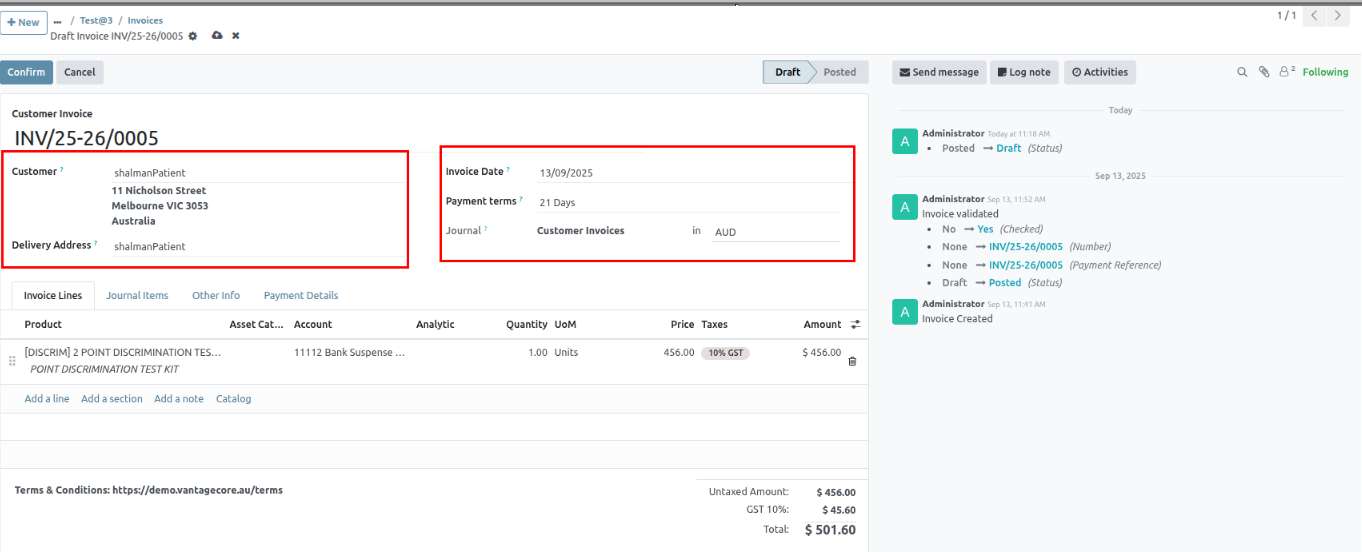
8. Invoice Journal Management.
9. You can create new journals for invoices based on your business type or invoicing strategy. These journals help organize and manage invoices efficiently.
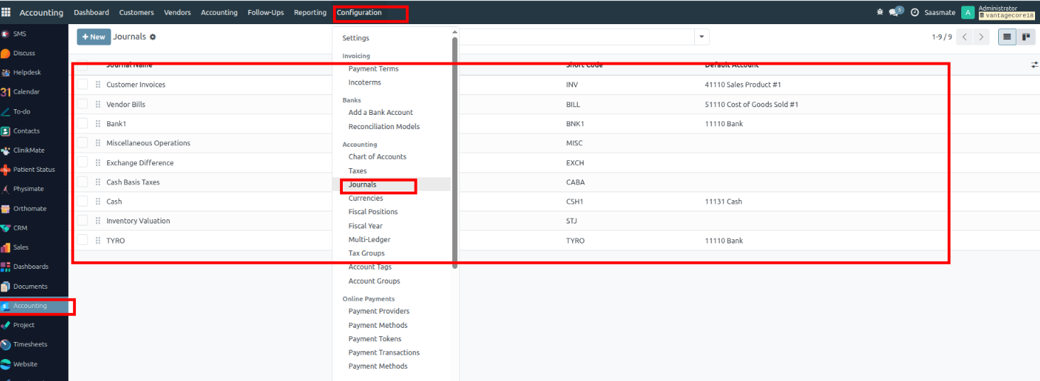
10. Click on the CREATE button to create the new Journal. Note that the created journals will be available to access from all of the modules.
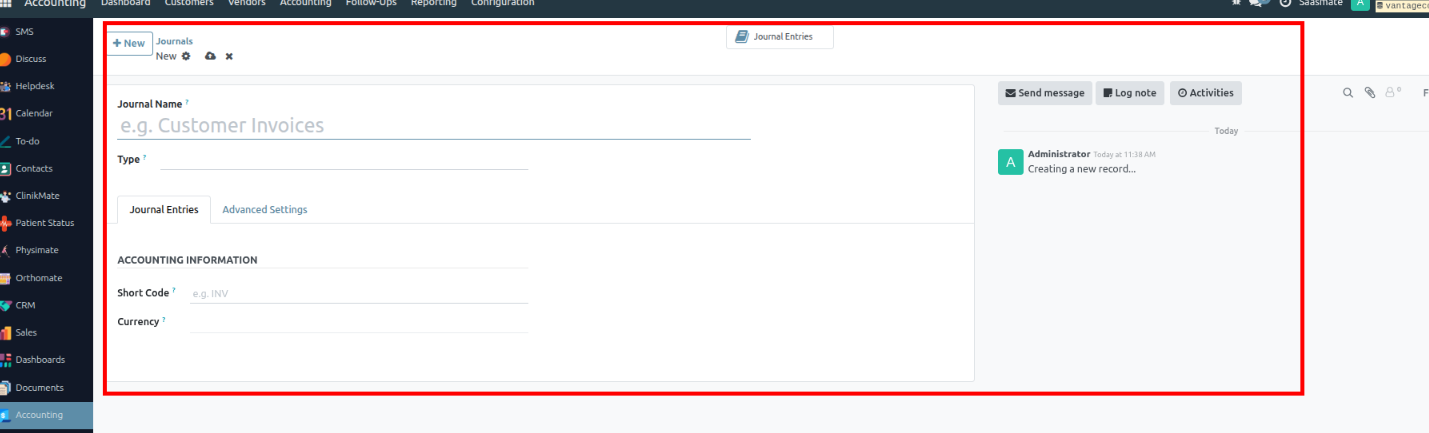
11. You can create the new Journal from this configuration page. Let us create a Journal for entering Customer invoices.
12. As an initial step, you have to start by naming the Journal and choosing the Journal type from the Type section of the configuration page.
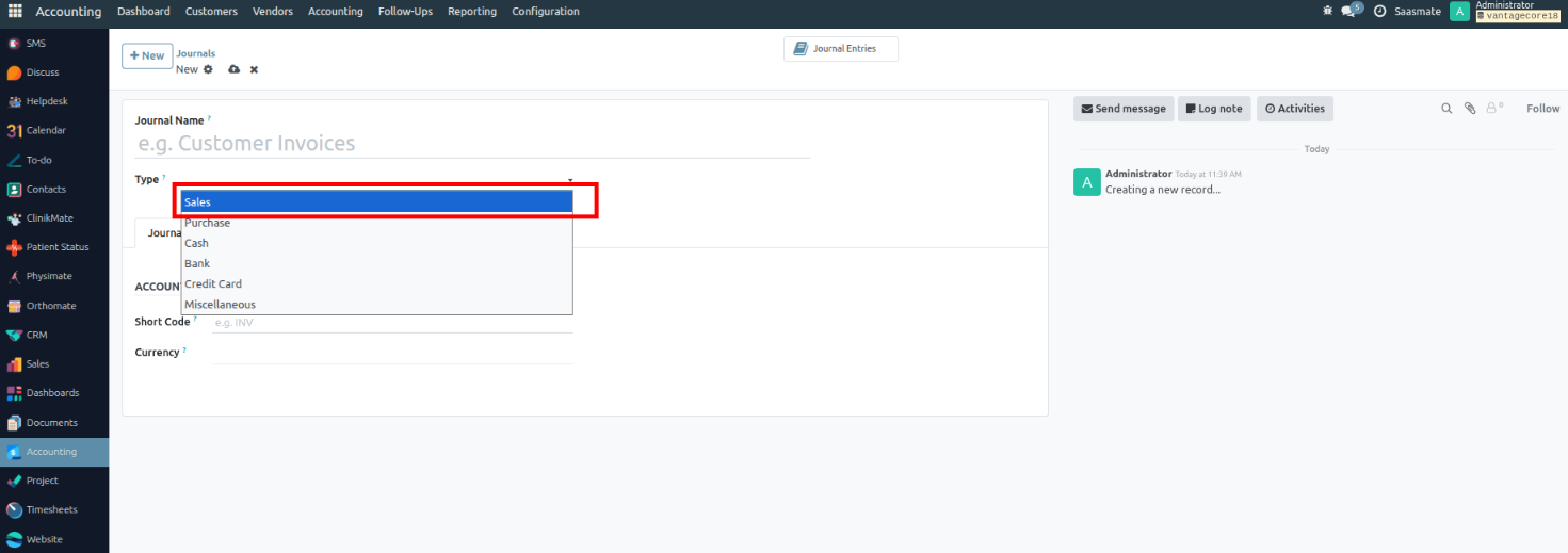
13. Dedicated Credit Note Sequence – Uses a separate numbering sequence for credit notes instead of sharing the same as invoices.
14. Short Code – Abbreviation of the journal name, shown in journal entries for quick reference.
15. Currency – Defines the currency in which transactions of this journal are recorded (default company currency if empty).
16. Default Income Account – Revenue account used when no income account is defined on the product or product category.
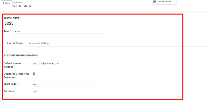
17. After the configurations on the Journal entries, you can go to the Advanced Settings section.
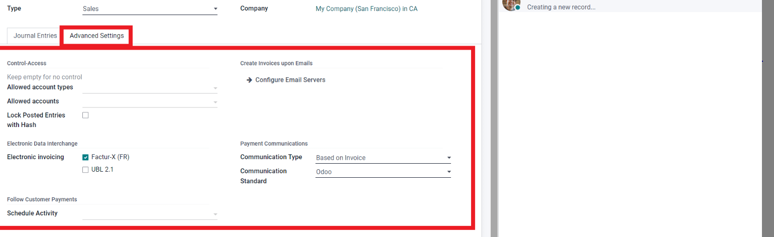
18. Each type has its own Allowed Account types that you can choose the account from.
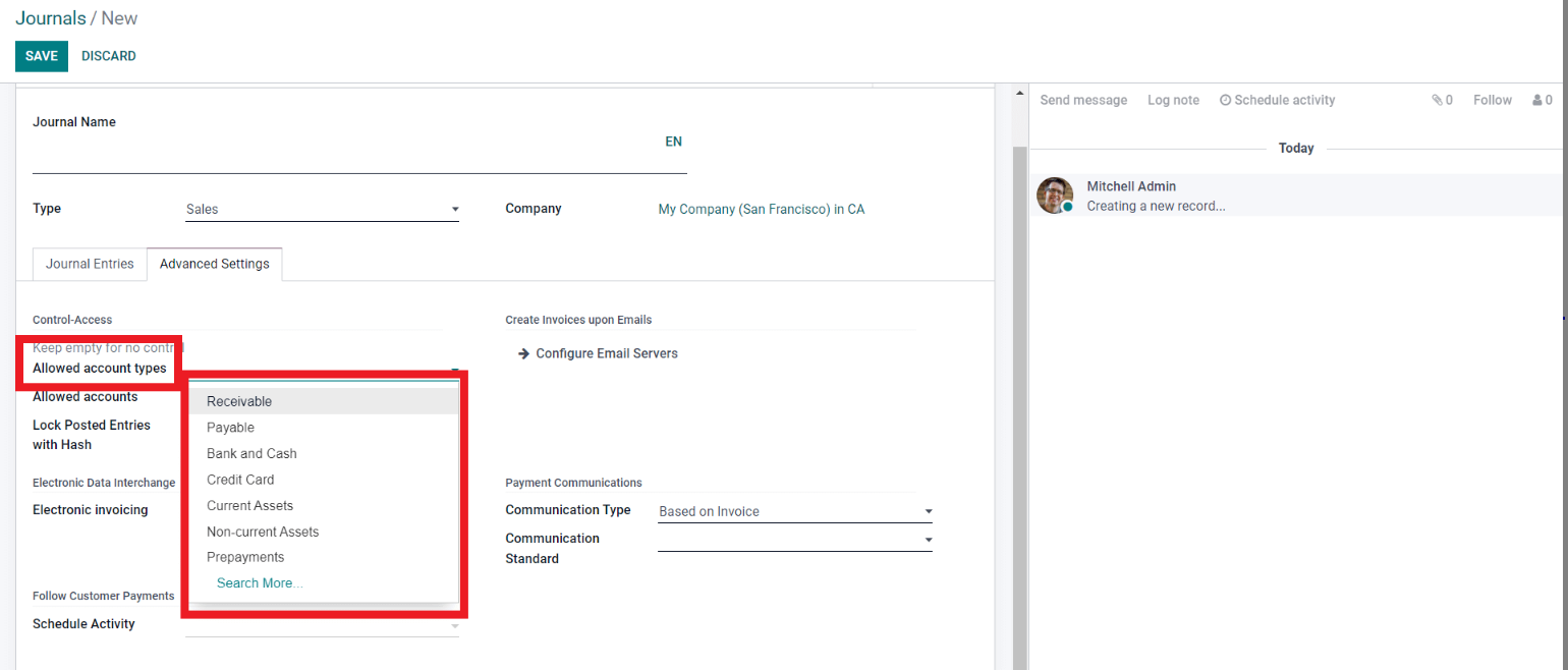
19. From the drop-down list of the Allowed Account types, choose one. Click on the Search for more options on the Account types.
20. Similar to the Allowed Account Types, you can choose the allowed accounts depending on the Journal Type that you have chosen. Click on the field Allowed Accounts, a set of options will drop down.
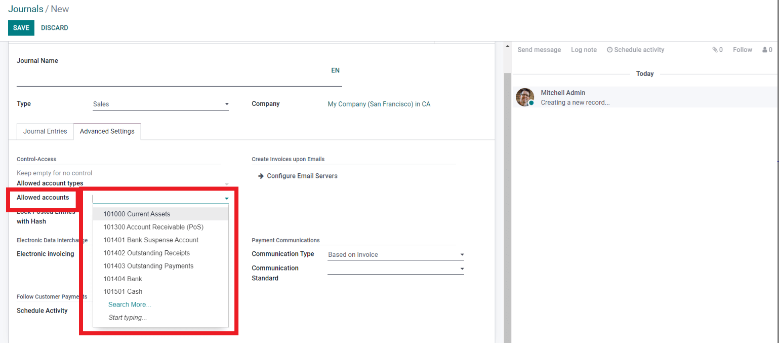
21. Click on Search More from the drop-down option. From the list, select the Allowed Account that can sync with the nature of your business.
22. You can use this configuration space to actively use follow-ups on your customers. To schedule, click on the field next to Schedule activity.
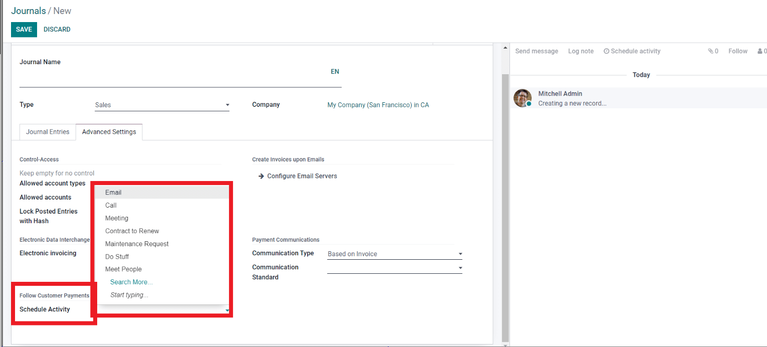
23. You can schedule the activity from here. A follow-up activity is something that automatically sends to the customers if they missed the payment date. If you set a Follow-up action here, two additional fields will appear with more configurations on the activity.
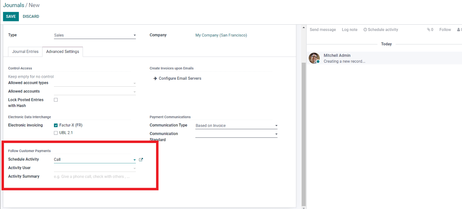
24. Payment Terms Management:
• This price list is by default set to the AUD price list.
• This default is set because the best-on-cost customer — in this case, Vantagecore — has the AUD price list assigned as default in the system.
• If you want to change the best-on-cost price or create a new price list, you can do so as needed.
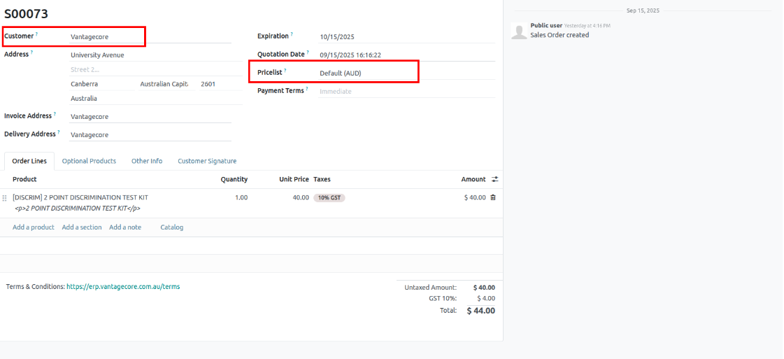
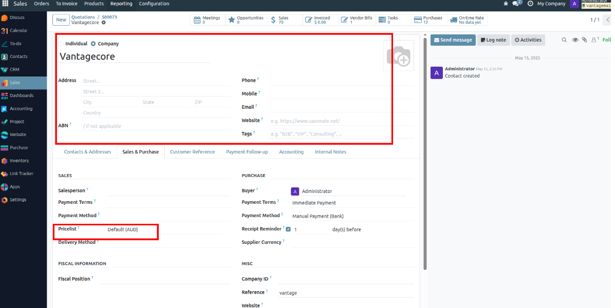
25. To ensure faster payments and help customers track their purchases, you can professionally invoice them using the Accounting module. Go to the Configuration tab, then under the Invoice section, click on Payment Terms. This opens the Payment Terms page, where you can view and manage all previously created terms.
26. From here, click on the Create button to configure and set up a new Payment Term.
• Set a Payment Terms Name – Define a name that identifies the payment terms (e.g., "Net 30", "50% Advance").
• Due Percent – Specify the percentage of the total amount that is due (e.g., 50%).
• After Due Date – Set the number of days after the invoice date when the payment is due (e.g., 15 days after invoice).
27. Invoice Lines – This section lists what you are being billed for (products or services, quantity, price, and tax). It is the bill view you see as a customer. You can edit the quantity, tax, and price if needed.
28. Journal Items – The accounting entries (debit/credit) created from the invoice, showing how the amounts are posted in accounts.
29. Once the Confirm button is clicked, the state will be marked as Posted, and an invoice number will be generated.
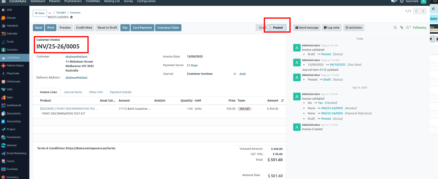
30. The Payment registration page will let you record the payment from the customer. Clicking on the SEND & PRINT button will let you send the invoices directly to the customer, assuming the payment registration is complete. A window with the info on printing and sending the invoice will open up.
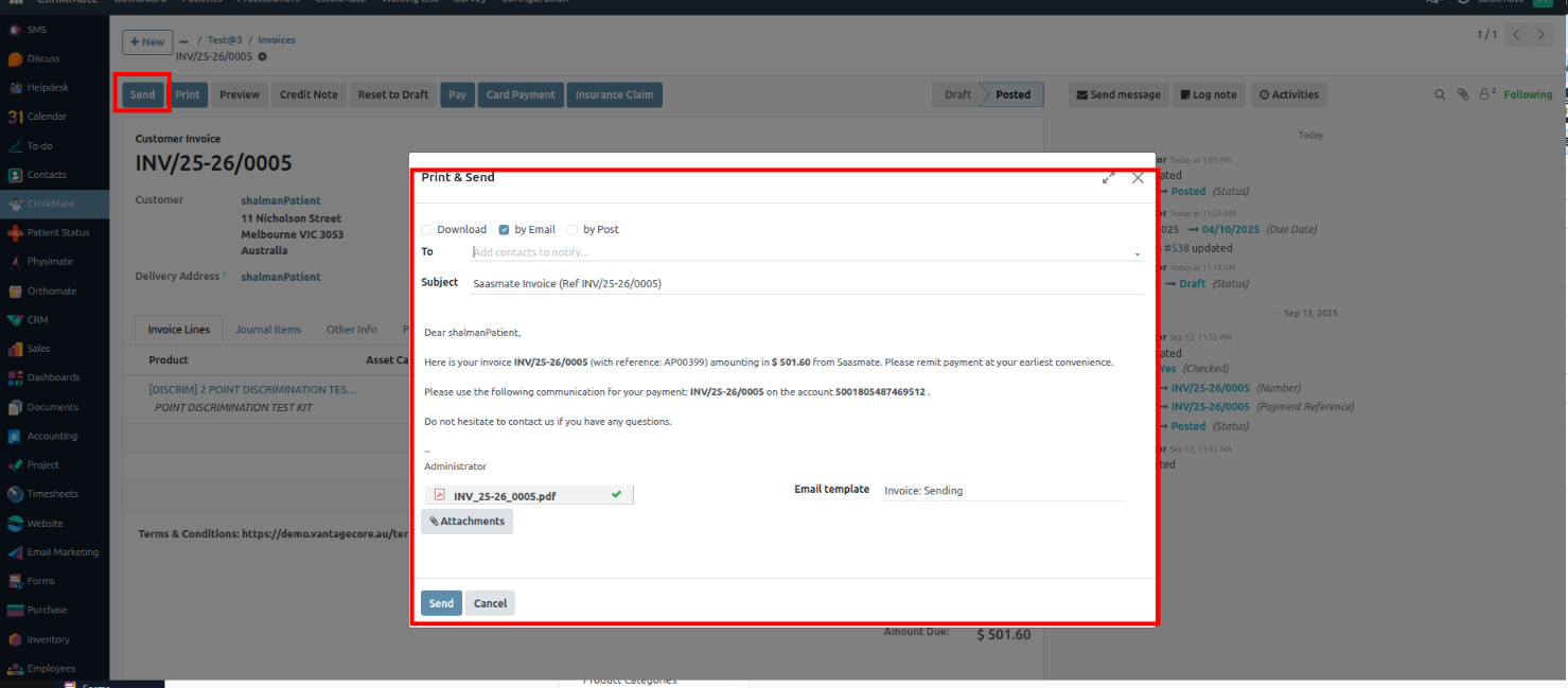
31. The Print button is used to print, download, or open the invoice.
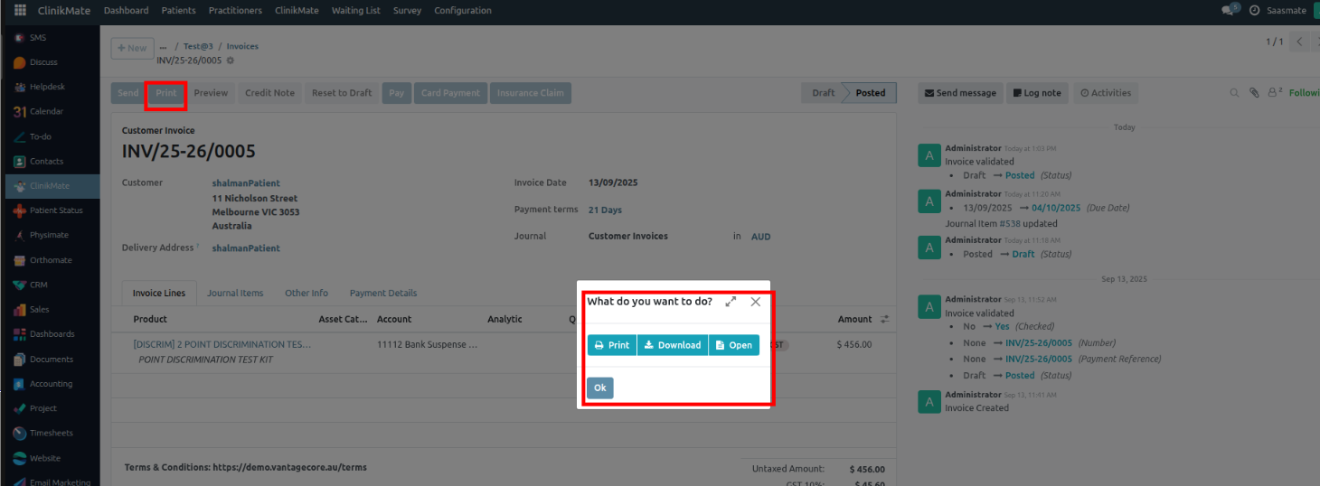
32. The REGISTER PAYMENT button from the Invoice register payment page will let you register the payment from the customer. A window or tab to register the payment will open up.
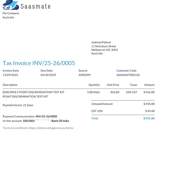
33. Journal Field – Choose the journal to enter the invoice.
• Module Integration – Invoicing, Sales, and Accounting modules are integrated for easy journal access.
• Amount & Currency – Enter in the Amount field.
• Payment Method – Select from the Payment Method field.
• Payment Date – Enter in the respective field.
• Recipient Bank Account – Choose the appropriate account.
• Memo Number – Add for better tracking.
• Create Payment – Click CREATE PAYMENT to register.
• In Payment Status – Invoice marked with IN PAYMENT once recorded.
34. The Journal field allows you to select the payment type, such as Bank, TYRO (card payment), or Cash. If the full amount is paid, the invoice status will automatically update to Paid.
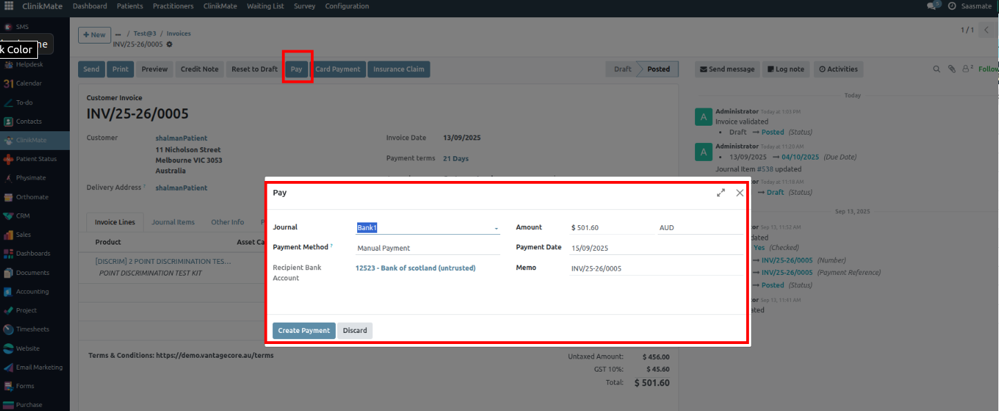
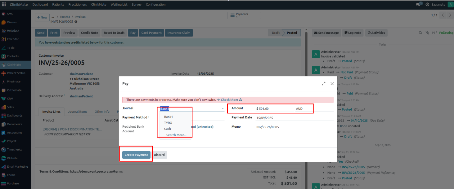
35. For partial payments, the system updates the invoice status accordingly. Example:
Total invoice amount: 501.60
First payment: 200 via Bank
Second payment: 200 via Cash
Status: Partial
Once the full amount is paid, the status will automatically change to Paid.
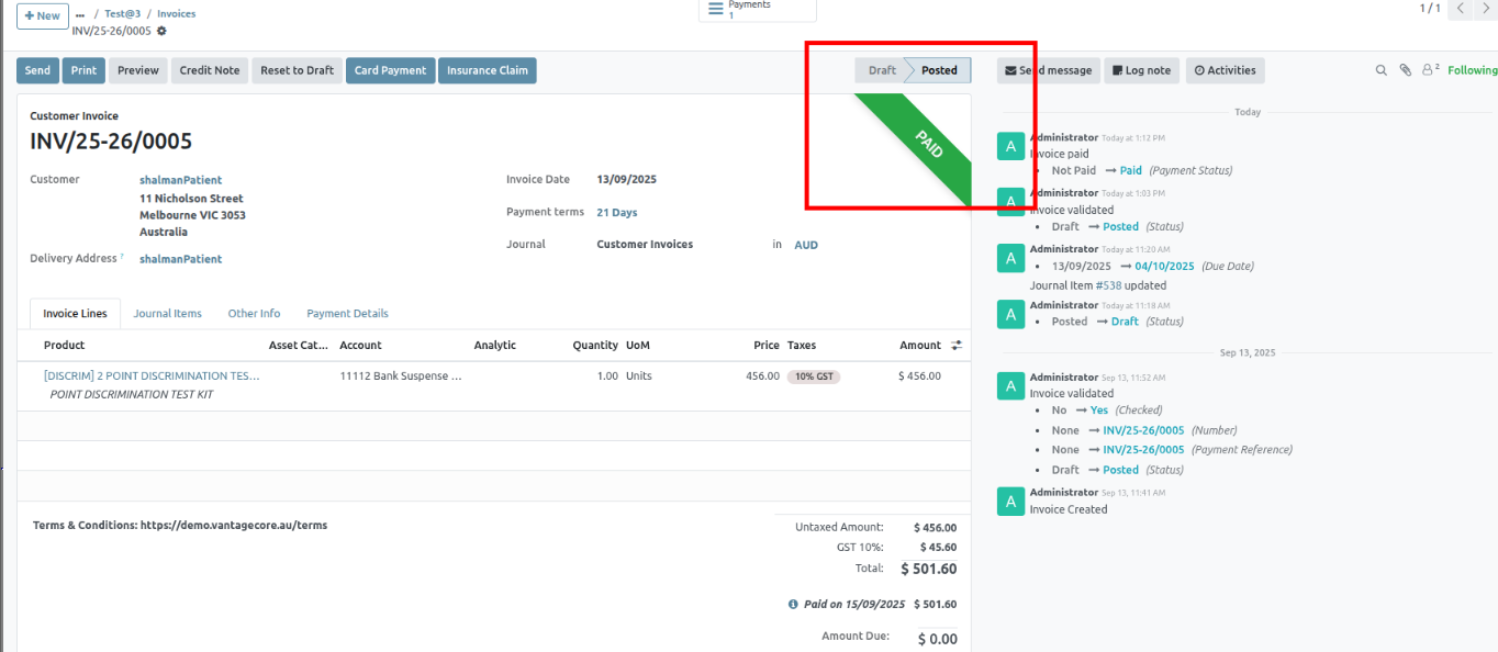
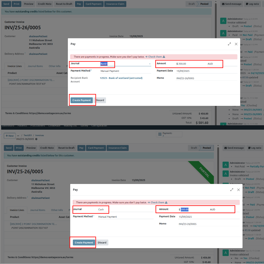
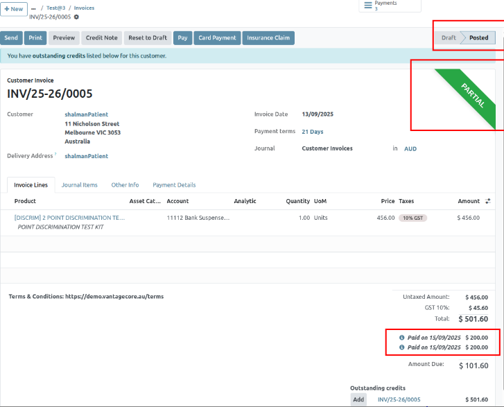
36. Now that the full amount is paid, the invoice status shows Paid.
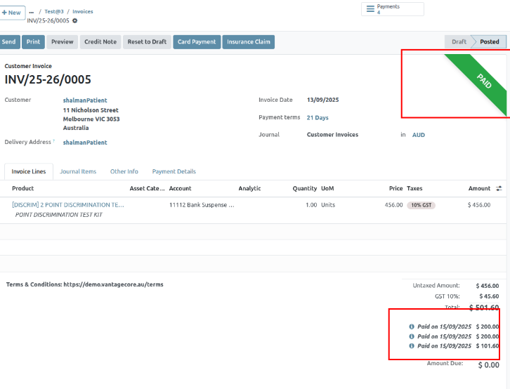
Calendar Sync
Calendar Sync keeps your appointments and schedules updated across multiple calendars (Google, Outlook, etc.). It ensures that bookings made in the system automatically reflect in your personal or work calendar. This prevents double-booking and helps you manage time more effectively.
Google Sync
1. To create Google calendar sync, select “Settings” menu under configuration,
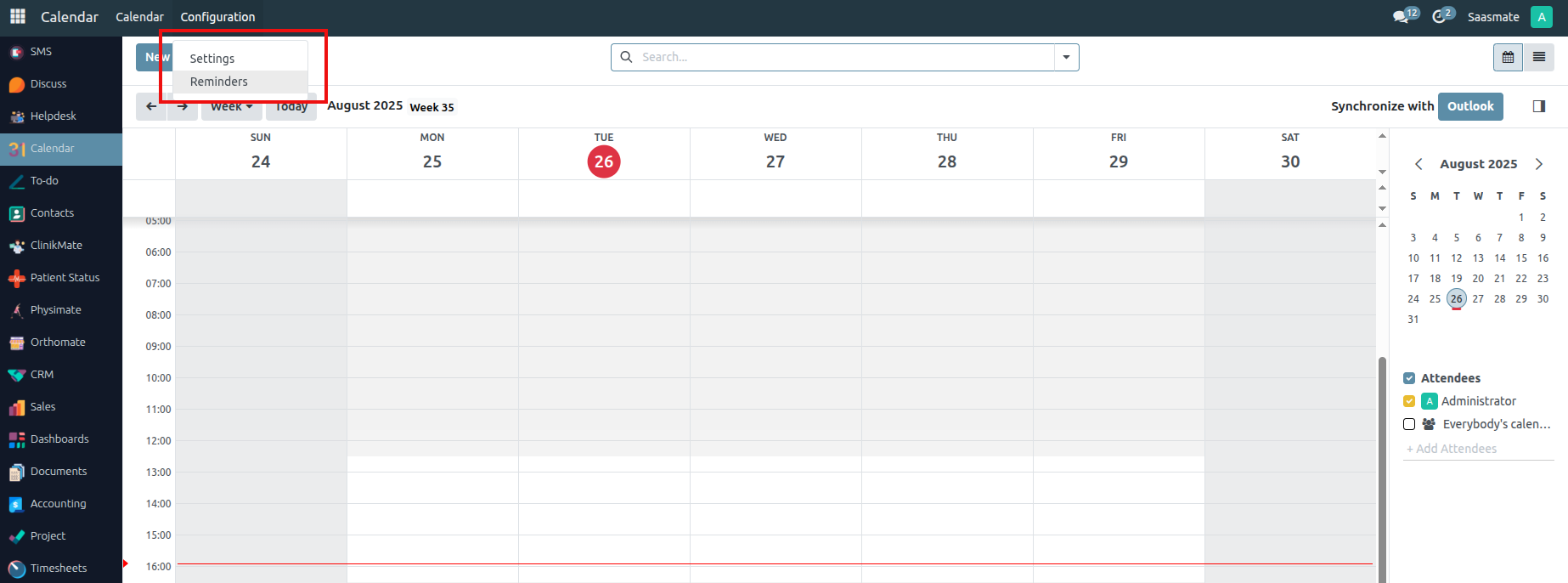
2. The Calendar settings will appear, Enable the “Google Calendar”,
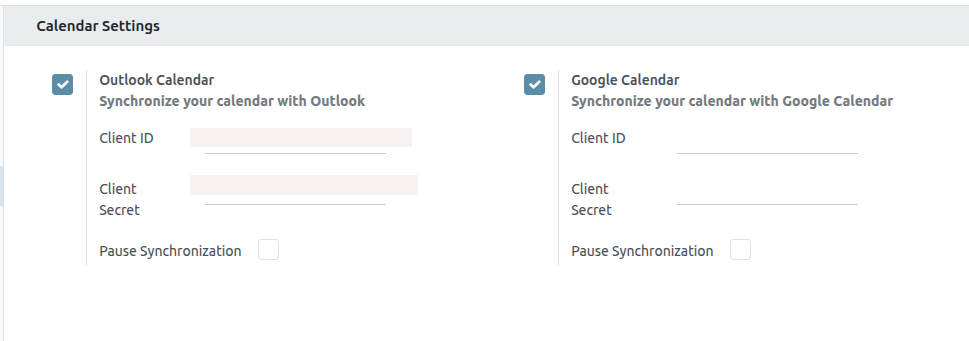
3. Using the below link, “Enable” the “Google Calender API”
“https://console.cloud.google.com/apis/library/calendar-json.googleapis.com?project=sasmate”
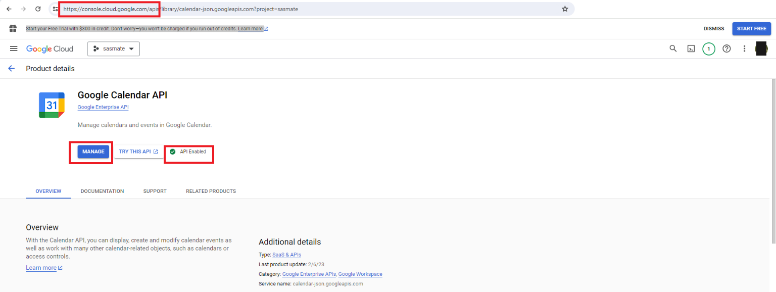
4. Select the “OAuth consent screen” from the left-hand side and change the User type to “MAKE EXTERNAL”,
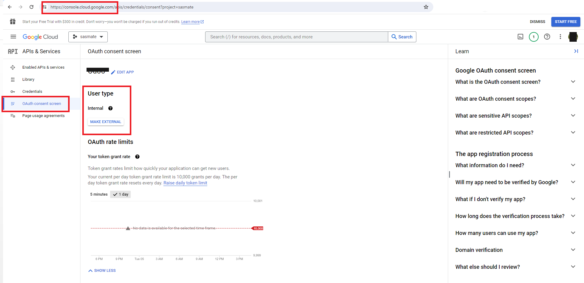
5. Select the “Credentials” from the left-hand side and select “CREATE CREDENTIALS”->“Oauth client ID”, as shown below,
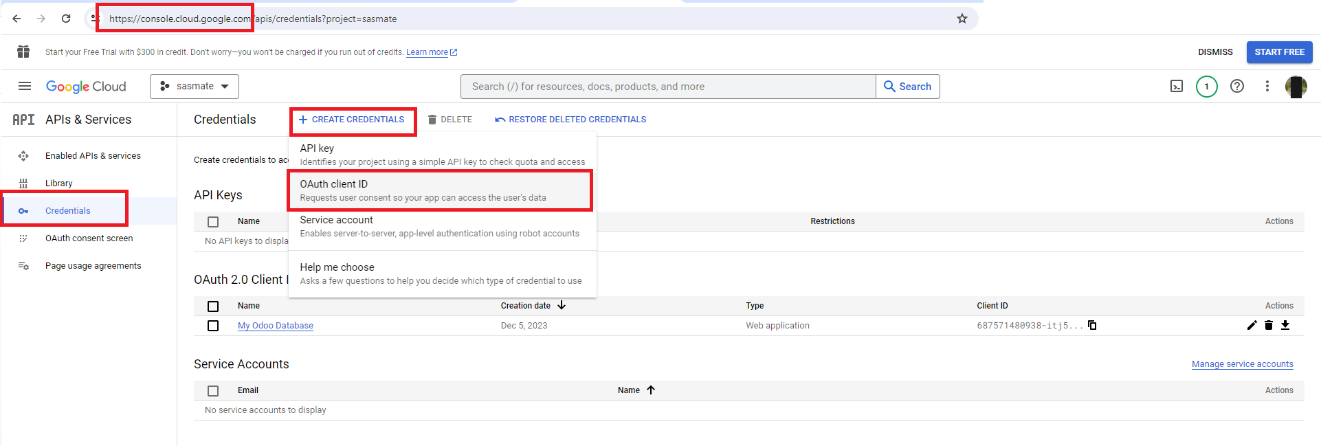
6. Create a “OAuth Client ID”
- Authorized JavaScript origins: Your URL →
http://localhost:1088 - Authorized redirect URI: Followed with your URL
/google_account/authentication - Example:
http://demo.vantagecore.au/google_account/authentication
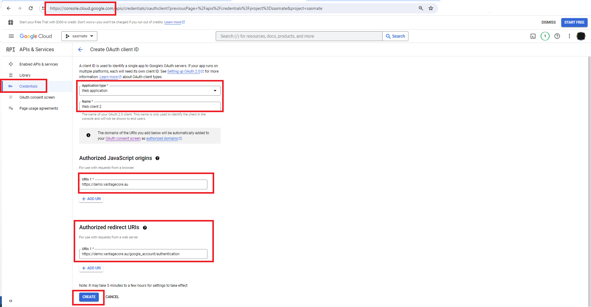
7. The (“Client_id” & “Client Secret”) will be generated,
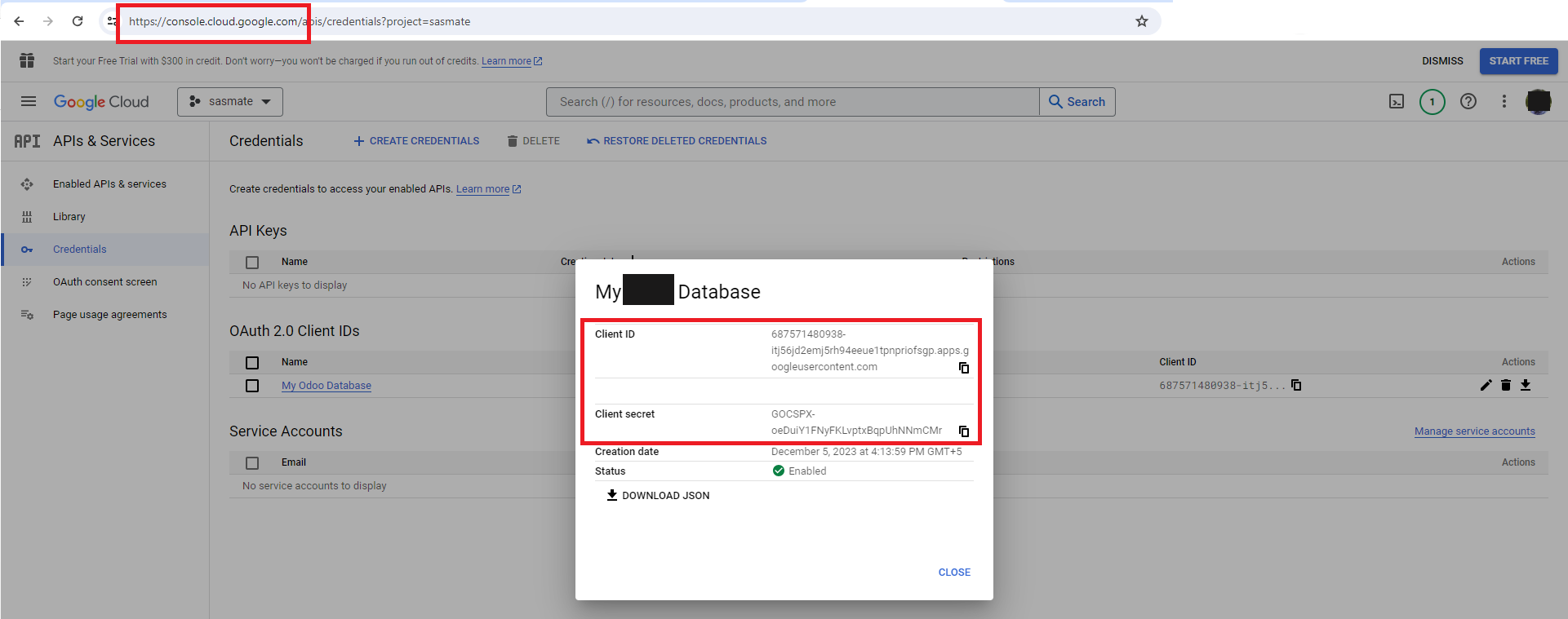
8. Map those (“Client ID” & “Client Secret”) to connect with calendar in Saasmate,
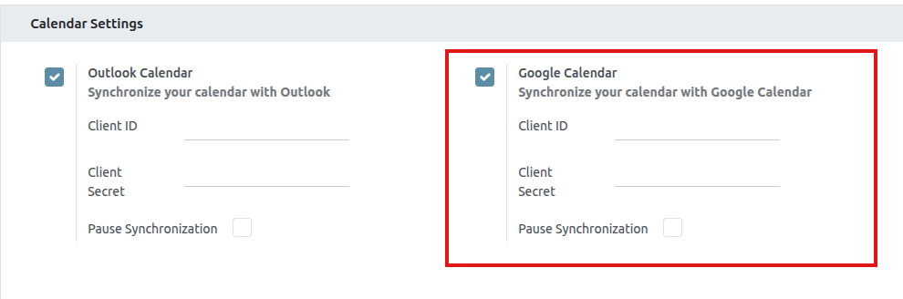
9. Output:
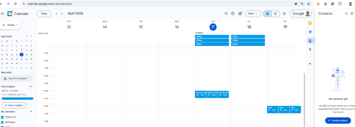
Outlook Sync
1. Sync the “Calendar” with “Outlook”
- Go to the calendar view after clicking Configuration under Settings.
- Enable Outlook under Configuration, then go to the calendar view.
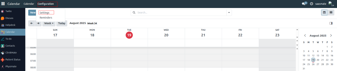
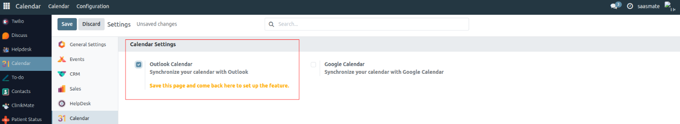
2. Outlook Configuration
- Go to https://portal.azure.com/#home.
- Log in to your Outlook, then search for App Registration and select it.
- Click on New Registration.
- Enter your Application Name.
- Set the Redirect URI to:
https://yourdbname.odoo.com/microsoft_account/authentication. - Click on Register.
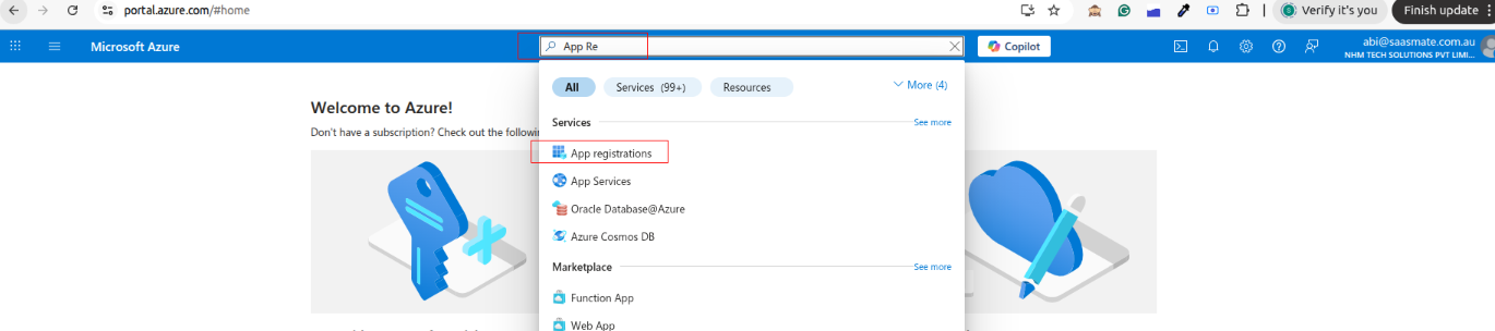
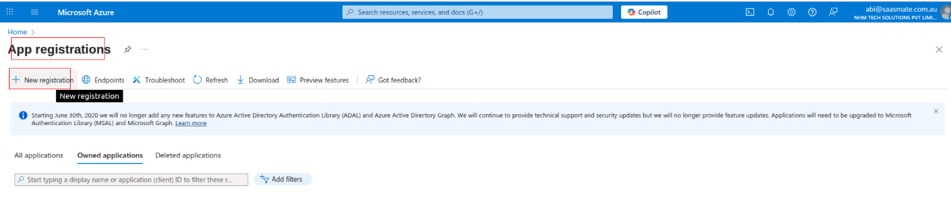
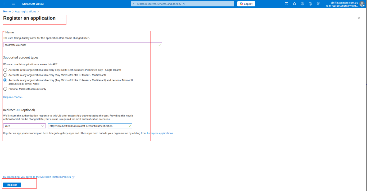
3. Once the app is registered, the 'Client ID' will be generated. Then, select 'Client Credentials'.
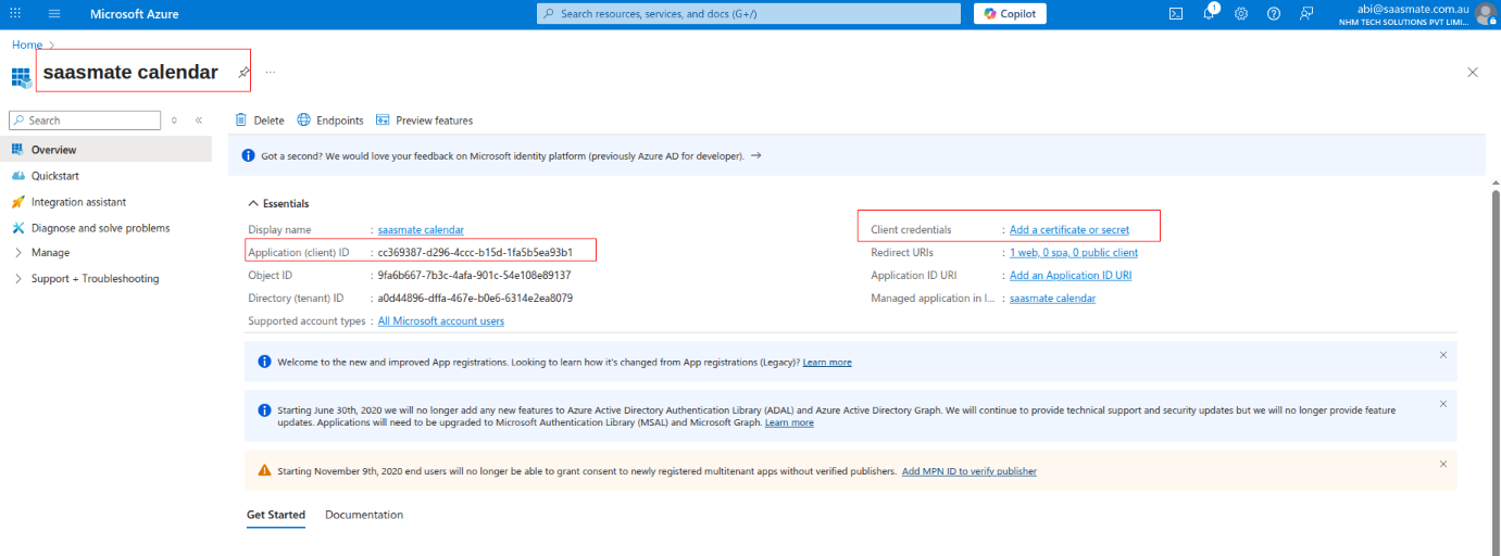
4. Now, you need to create client credentials. Click on 'Client Credentials' to proceed
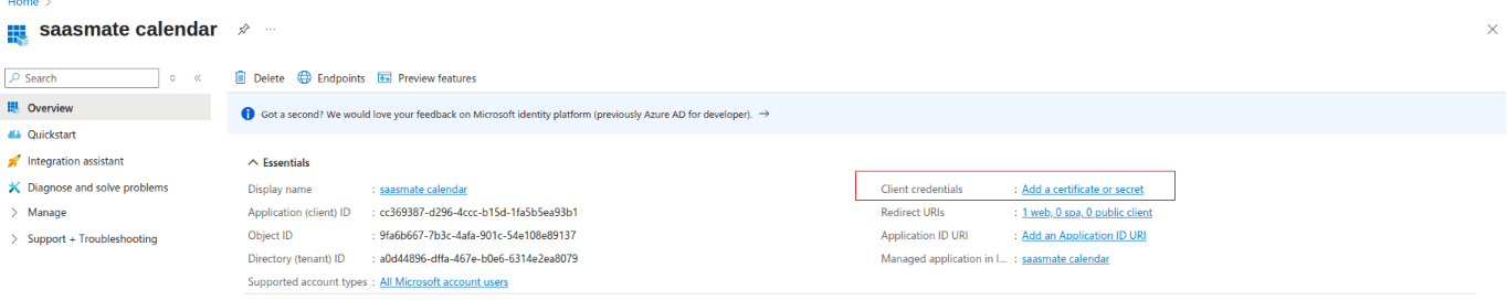
- Click on "Certificates Secrets" under Client Secrets.
- Add a description.
- Click the Add button to generate the secret.
- After generating, copy the value of your Client Secret and make sure to save it securely.
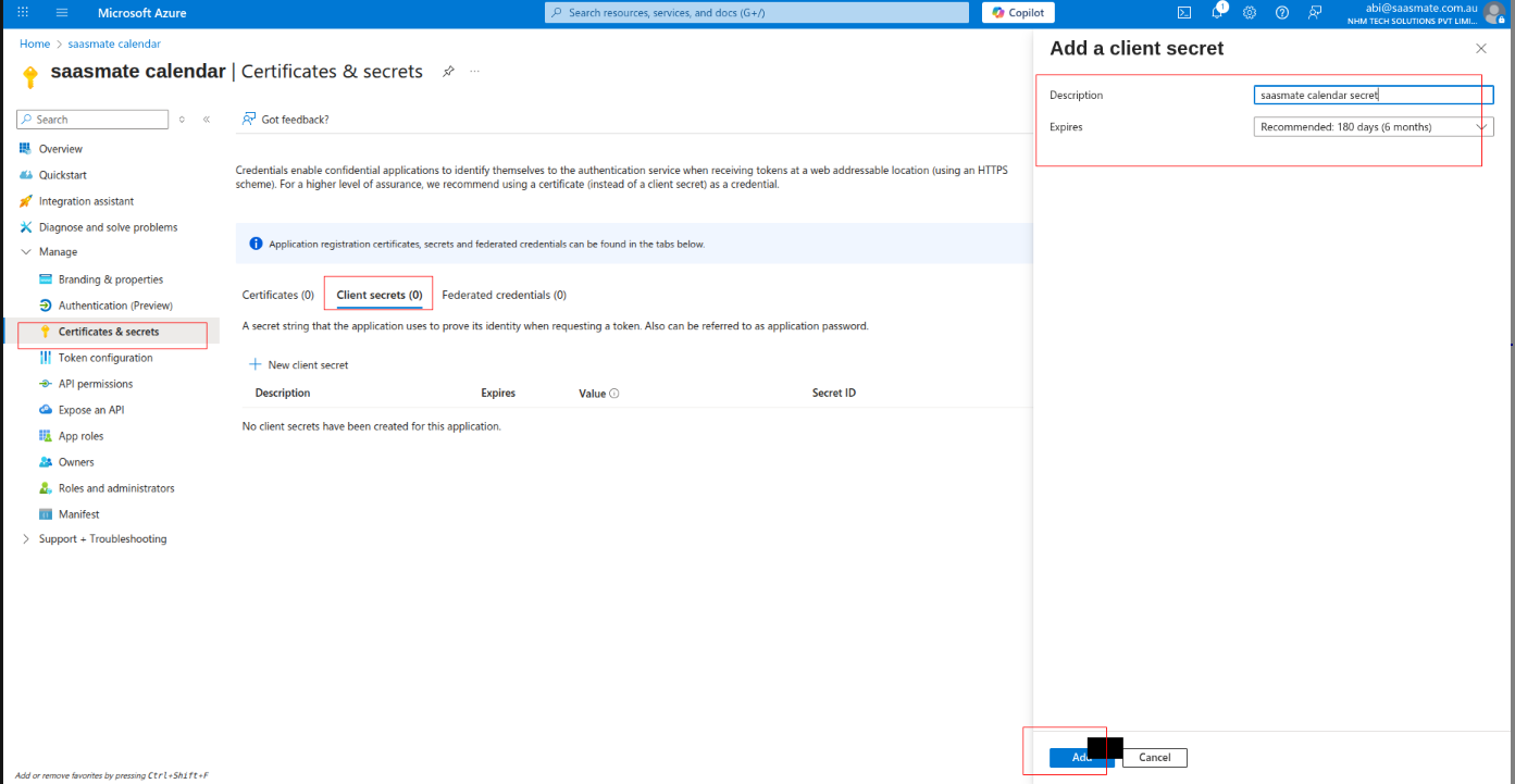
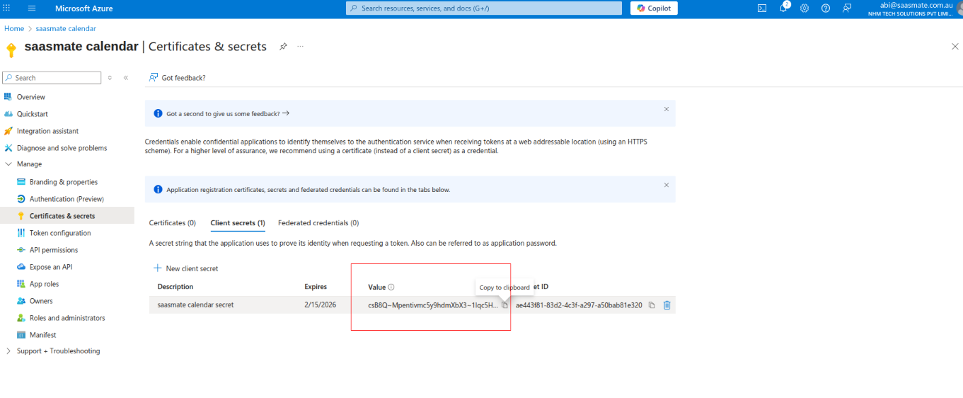
5. click on 'Api Permission' and click on 'Microsoft Graph'
6. Click on 'Delegated Permission' and scroll down it will show the permissions list.
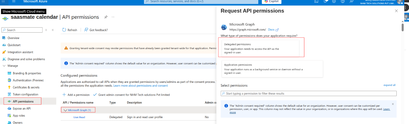
7. Click on Calendar for calendar applications permissions. And select full access to the user calendar. (That user can read, write, update and delete in calendar)
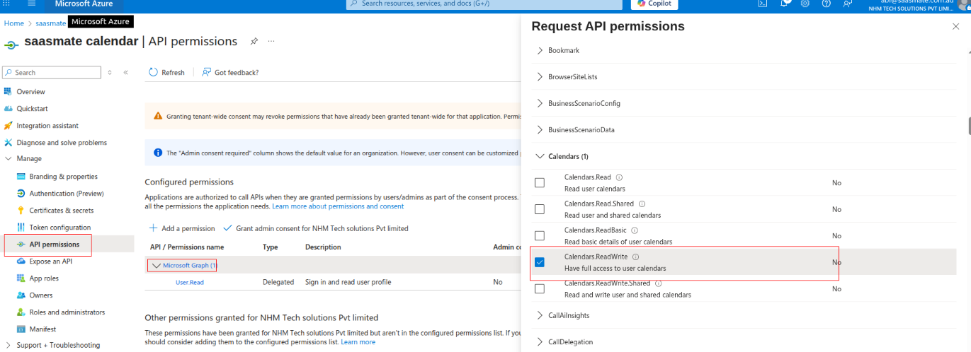
8. Click on Contacts for contacts applications permissions. And select full access to user contacts. (That user can read, write, update and delete in contacts)
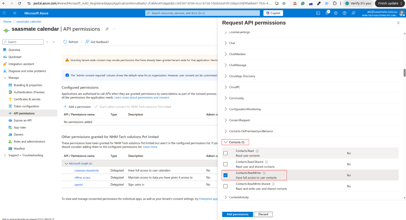
9. Click on Mail for mail applications permissions. And select full access to user mail. (That user can read, write, update and delete in mails)
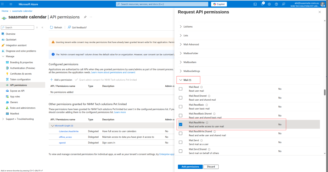
10. Click on Tasks for task applications permissions. And select full access to user tasks. (That user can read, write, update and delete in task)
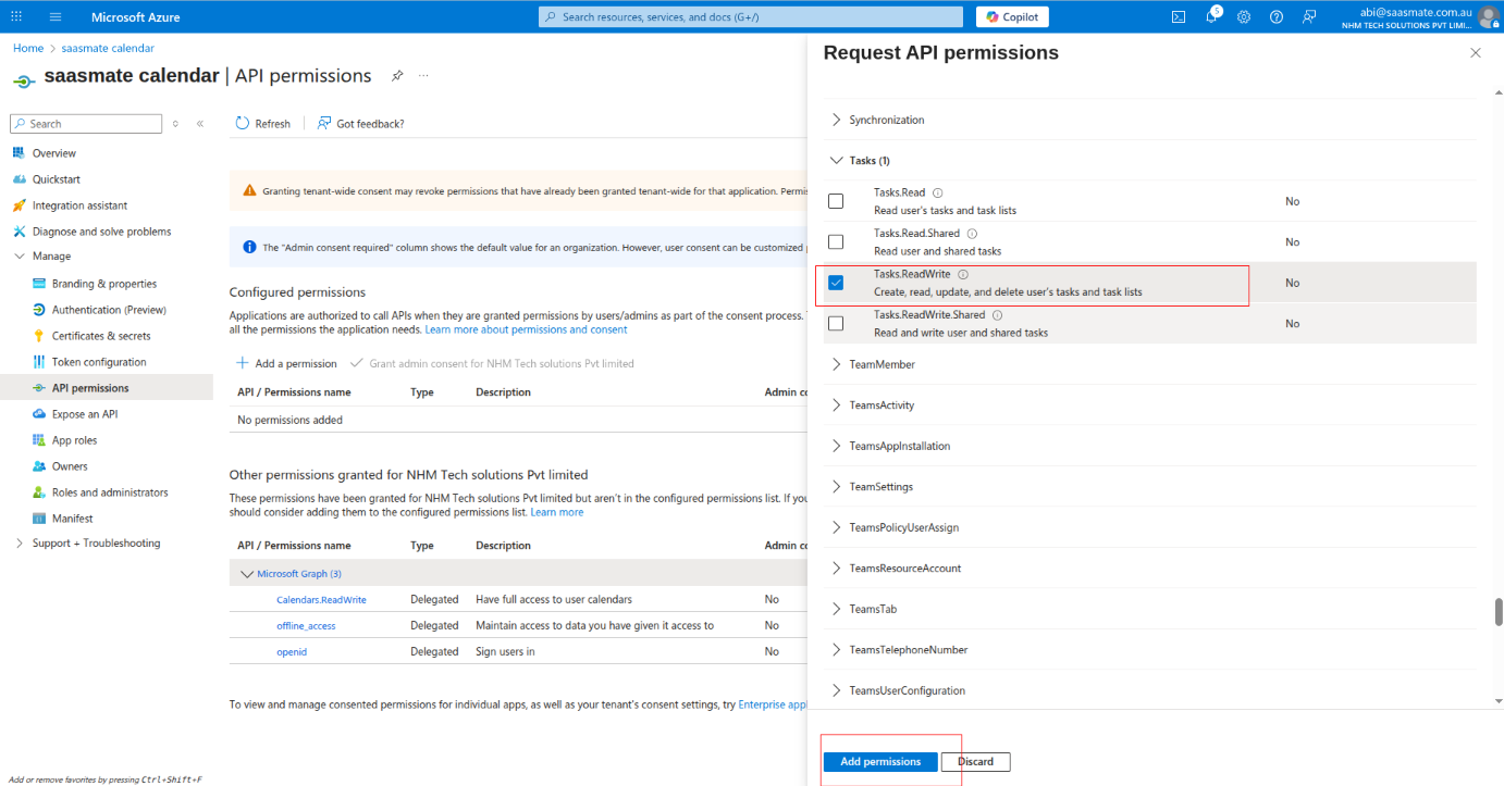
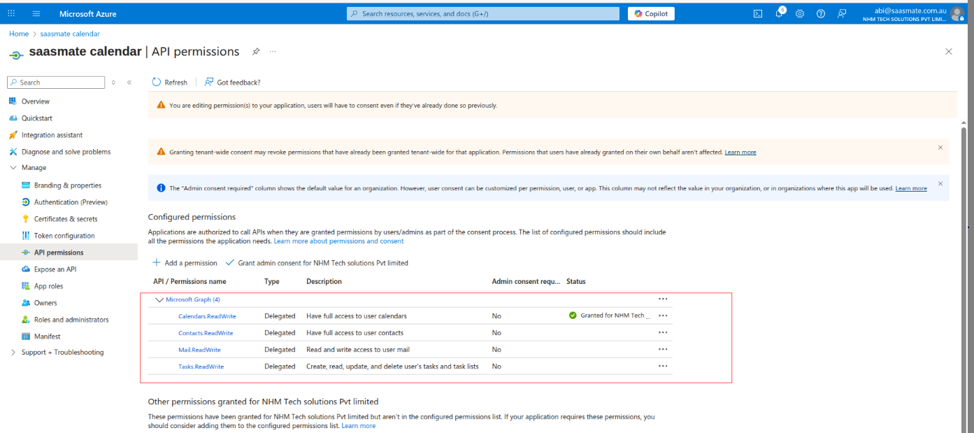
11. Map those (“Client_id” & “Client Secret”) to connect with calendar in Saasmate,
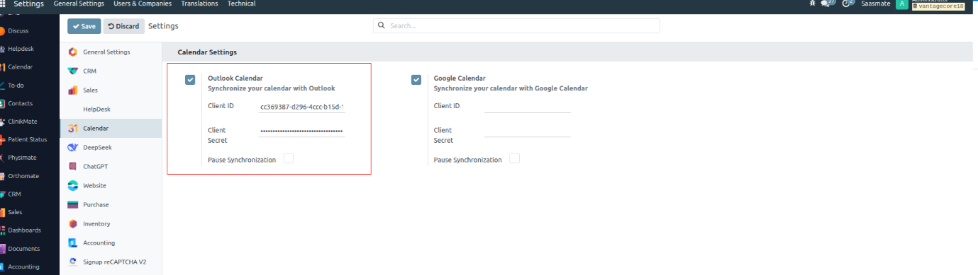
12. After clicking to activate the sync for Outlook.
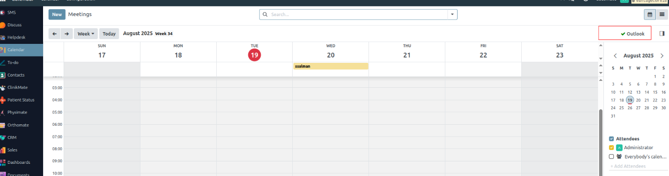
Video Calls
1. In the “Appointment” form view, a new field “Customer Videocall Meeting URL” has been added for storing customer-specific meeting links.
2. The customer meeting link generated for the appointment will be stored in this field for easy access and communication.
3. Practitioners can also generate a Videocall URL for the meeting, which will be stored in the “Videocall URL” field.
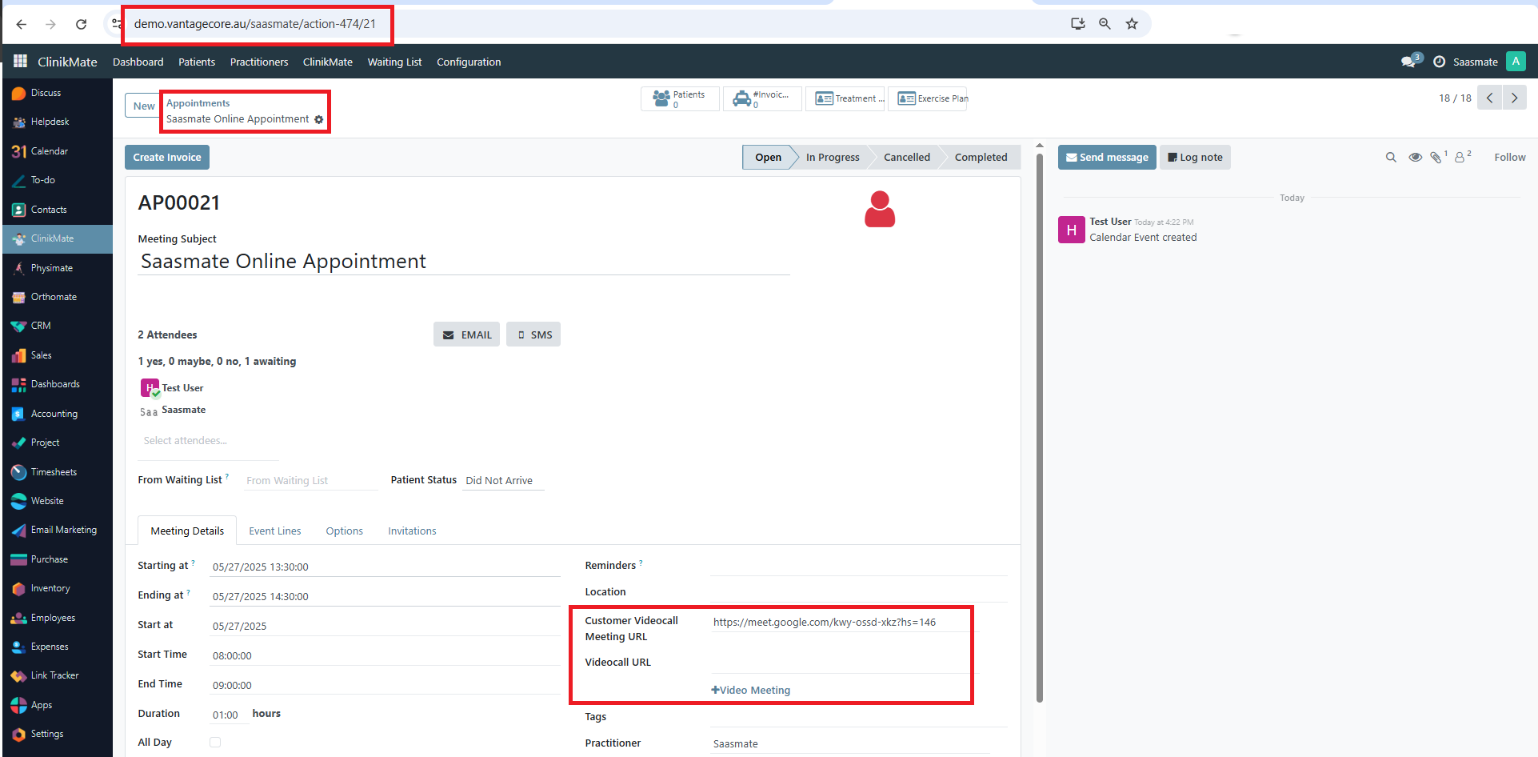
4. In the Email Templates, both fields (Customer Videocall Meeting URL & Videocall URL) are available to insert dynamic links into emails.
5. Logic for email link insertion:
- If both fields contain data, only the Customer Videocall Meeting URL will be passed to the email.
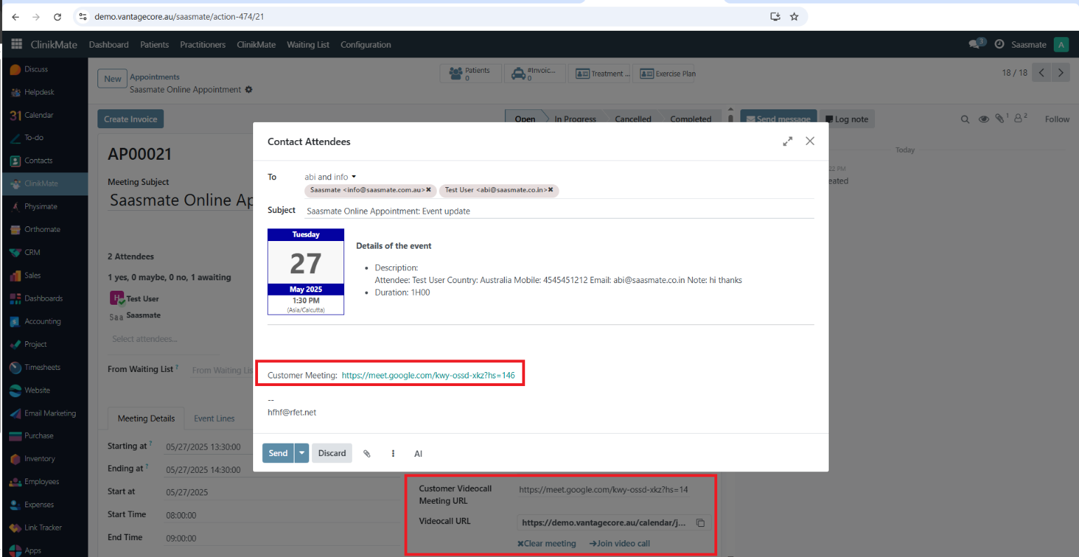
- If the Customer Videocall Meeting URL is empty but Videocall URL contains data, the Videocall URL will be used in the email.
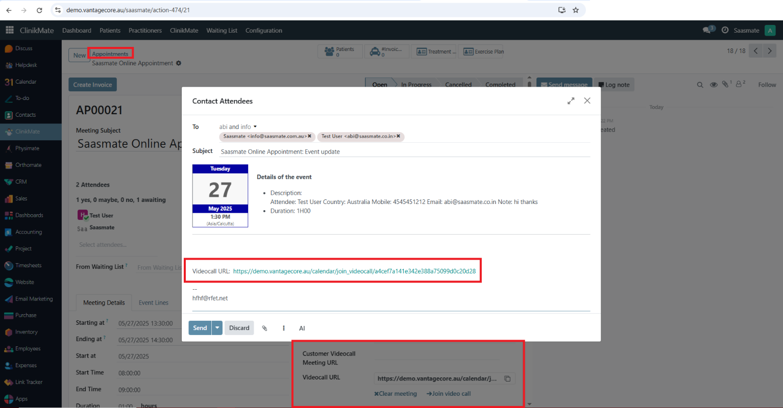
6. Emails containing the meeting link will be sent automatically to all attendees of the appointment.
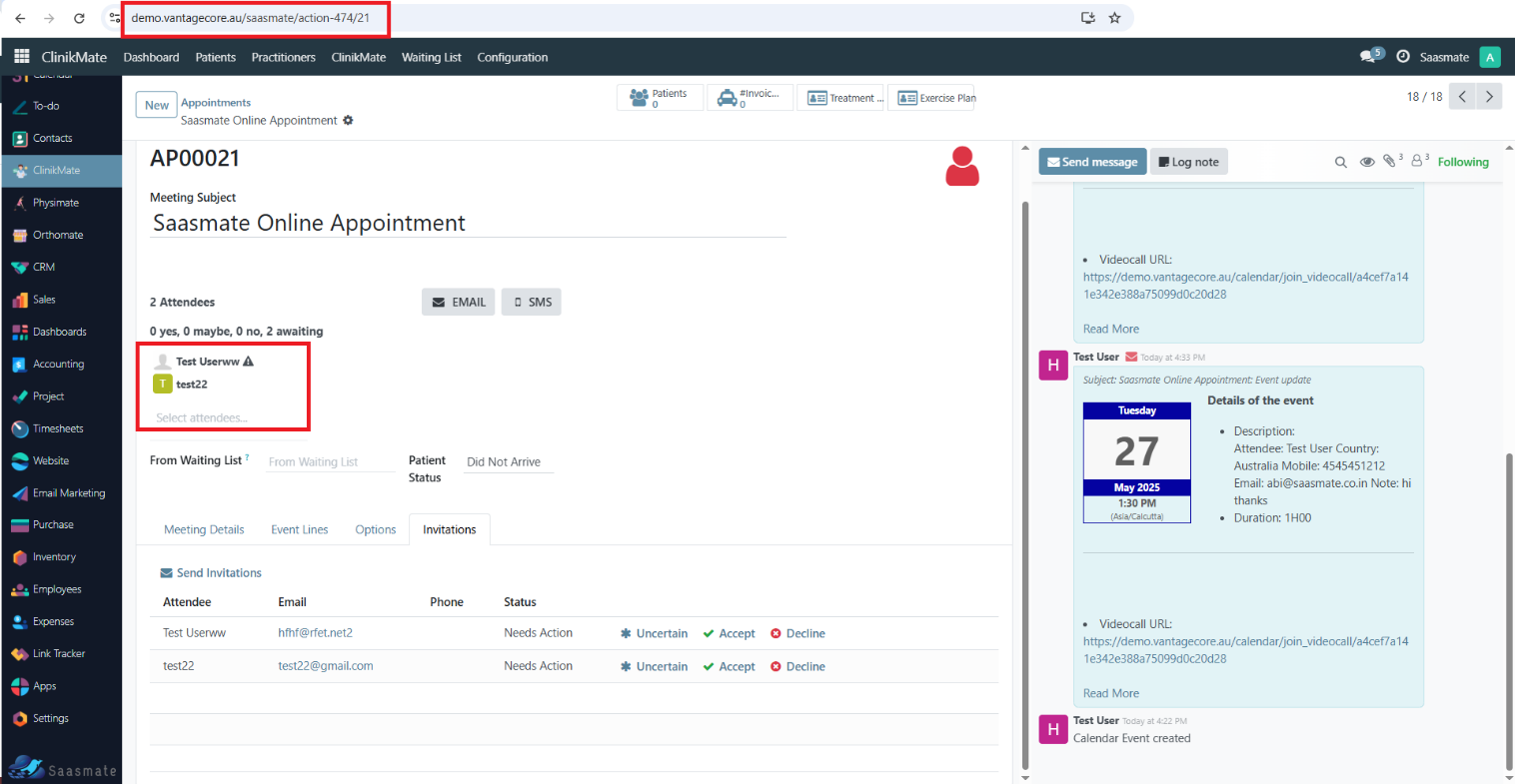
7. Each attendee receives a separate email containing their unique link for the video call, ensuring secure and direct access.
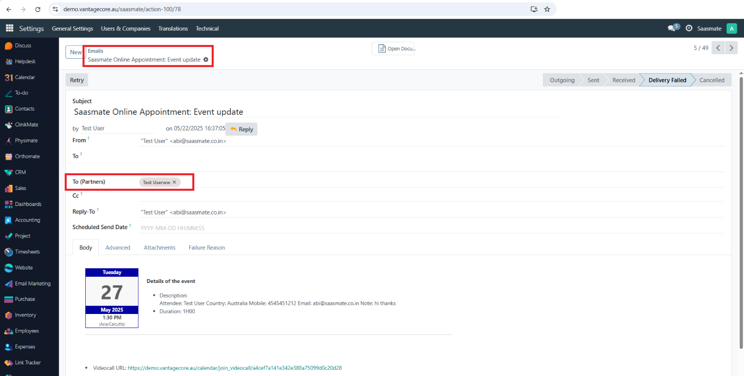
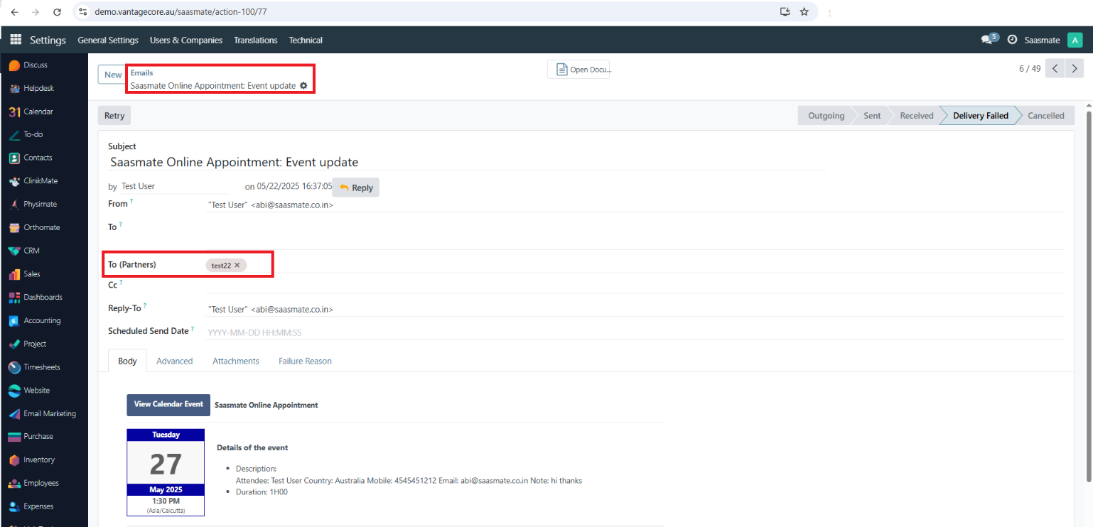
Map View
The Map View feature allows you to visualize patient, practitioner, or clinic locations directly on an interactive map. Instead of only seeing addresses in a list or form, users can quickly identify geographical locations for better planning.
1. Contact Record Geolocation
- Each contact can be assigned a Geo Location (Latitude & Longitude).
- The system can automatically compute these values based on the entered address using the “Compute based on address” button.
- Geolocation details (Lat/Long) are stored and can be refreshed whenever the address changes.
- (See Screenshot: Geolocation section in Contact record)
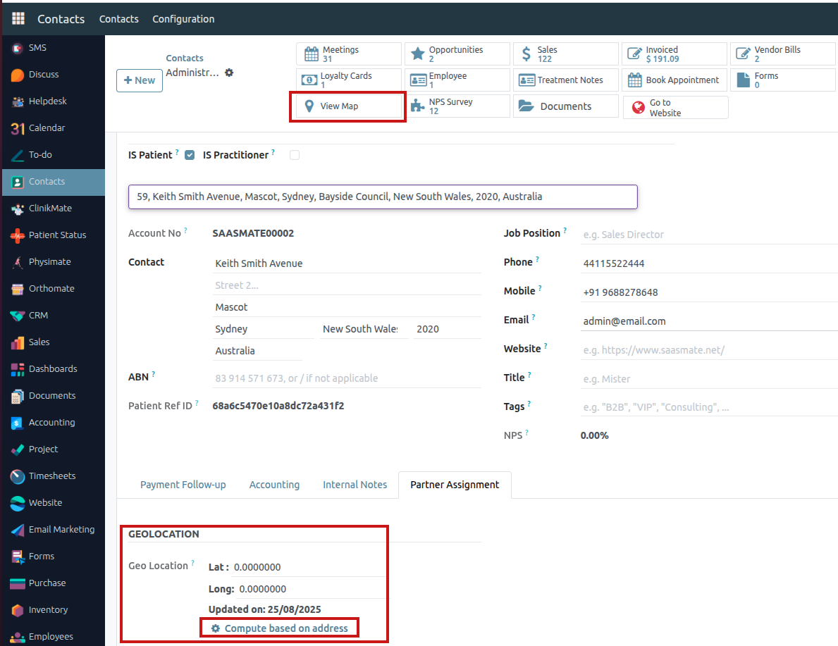
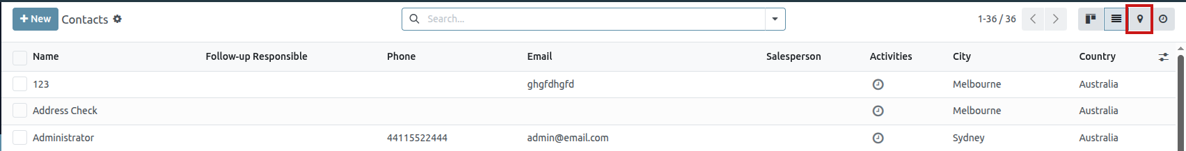
2. Accessing Map View
- From the Contacts list view, click the Map icon to switch from list mode to Map View.
- From an individual contact record, click the “View Map” button to directly view the selected contact on the map.
- (See Screenshot: Map icon in Contact list and View Map button in Contact details)
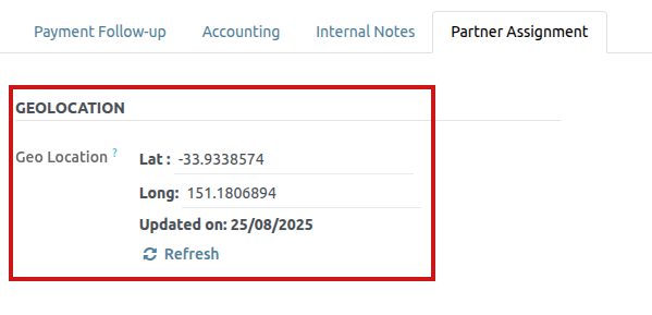
3. Map Display
- Contacts with valid geolocation appear as pins on the map.
- Clicking a pin displays key contact details such as Name, Address, and a “View Details” button for quick access to the full record.
- (See Screenshot: Map with contact pinned in Sydney, Australia)
Body Chart
Body Chart is a visual tool used to map and record patient pain points, injuries, or treatment areas. It helps practitioners document conditions accurately during consultations. This improves communication, diagnosis, and treatment planning.
1. The “Body Chart” master is located under Configuration in the Appointment module.
2. The multiple body chart images can be added in the tree view,
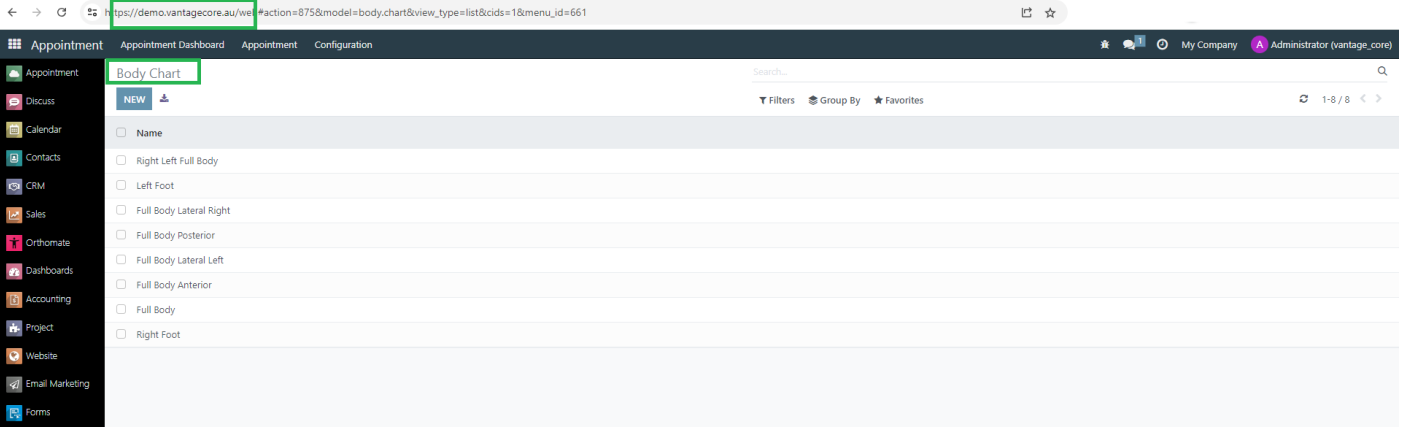
3. The “Treatment Notes” master is located under Configuration in the Appointment module.
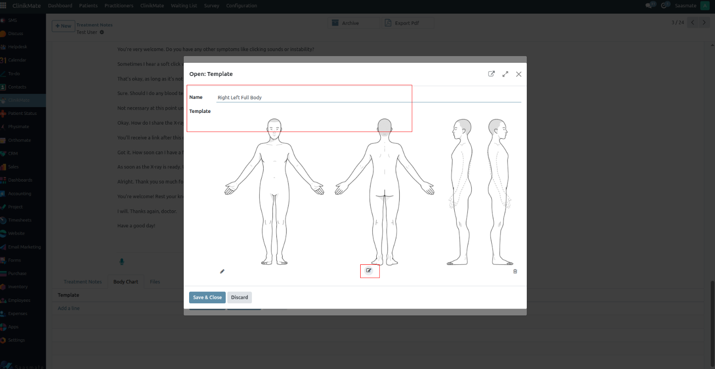
4. The image editor view, once the image is edited and it can be “Save”,
1.Resize
2. Crop
In that image editor, Crop lets you cut out unwanted parts of an image. You can usually do it in different ways:
3. Flip
4. Rotate
- Rotate lets you turn the image around its center.
- 30° → Rotate the image 30 degrees clockwise (or counterclockwise if negative).
- 60° → Rotate it 60 degrees.
- Range → Usually a slider from 0° to 360°, so you can rotate to any custom angle.
5. Draw
- Draw lets you add lines or markings directly on the image.
- Free → Draw freehand, like using a pencil, for curves or irregular shapes.
- Straight → Draws perfectly straight lines between two points.
- Colour → Lets you choose the drawing color (red, blue, black, etc.).
- Range → Controls the brush size or thickness of the line.
6. Shape
Shape lets you insert geometric figures onto the image.
- Rectangle → Draws a four-sided box shape.
- Circle → Draws a perfect circle or oval.
- Triangle → Draws a three-sided shape.
- Fill → Option to fill the inside of the shape with a solid color (or leave it transparent).
- Colour → Sets the color for the border and/or fill.
- Range → Controls the border thickness of the shape.
7. Icon
Shape lets you insert geometric figures onto the image.
- Rectangle → Draws a four-sided box shape.
- Circle → Draws a perfect circle or oval.
- Triangle → Draws a three-sided shape.
- Fill → Option to fill the inside of the shape with a solid color (or leave it transparent).
- Colour → Sets the color for the border and/or fill.
- Range → Controls the border thickness of the shape.
8. Text
Text lets you add and format words on the image.
- Bold → Makes the text thicker and stronger.
- Italic → Slants the text for emphasis.
- Underline → Adds a line beneath the text.
- Left / Right / Center → Aligns the text horizontally.
- Colour → Changes the text color.
- Text Size → Adjusts how big or small the text appears.
9. Mask
Load Mask Image → Lets you import another image to use as the mask.
- White / Visible Areas → Show the original image.
- Black / Hidden Areas → Hide parts of the image.
10. Filter
Basic Filters
- Grayscale → Turns the image into shades of grey (black & white).
- Invert → Flips all colors to their opposites (like a photo negative).
- Sepia → Gives a warm brownish tone, like old photographs.
- Sepia2 → A slightly different variation of sepia with more yellow tint.
- Blur → Softens details, making the image less sharp.
- Sharpen → Enhances edges and details to make them crisper.
- Emboss → Adds a 3D engraved effect to the image.
Adjustments
- Remove White → Makes white areas transparent (useful for overlays).
- Distance → Controls how much near-white is also removed.
- Brightness → Lightens or darkens the whole image.
- Noise → Adds grainy speckles for a textured look.
Special Effects
- Pixelate → Turns the image into large square pixels (mosaic effect).
- Color Filter → Applies a single-color overlay.
- Threshold → Controls how strongly the filter is applied.
Blend Modes
- Tint → Applies a soft color layer over the whole image.
- Multiply → Darkens the image by blending with a chosen color.
- Blend → Mixes the image with a color in a more balanced way.
11. Zoom In
- Zoom In → Magnifies the view so you can see details more clearly.
- Zoom Out → Reduces the view so you can see more of the image at once (usually shown as a minus (-) icon).
- Zoom Slider / Percentage → Lets you set the zoom level (e.g., 50%, 100%, 200%).
12. Zoom Out
- Zoom Out → Shrinks the view so you can see more of the image at once.
- Usually shown as a minus (+) icon for zoom out.
- Zoom Slider / Percentage → Lets you set the zoom level (e.g., 50%, 100%, 200%).
13. Hand tool
- Purpose → Lets you move the view around without accidentally drawing or editing.
- How it works → Click and drag the image to shift your view, especially useful when zoomed in.
14. History
In the image editor, History lets you step backward or forward through the changes you’ve made.
- Undo → Moves one step back, removing your most recent change.
- Redo → Moves one step forward, restoring a change you just undid.
- History Panel → Shows a full list of past actions so you can jump to any earlier point in your editing session.
15. Undo
- Undo → Cancels the last action you performed (like erasing a mistake).
16. Redo
- Redo → Restores the action you just undid.
17. Delete
- Delete → Removes the currently selected object (shape, text, image layer, etc.).
18. Delete All
- Clear All → Removes everything from the canvas, clearing it completely.
19. Load
- Load → Lets you import an image from your computer into the editor so you can start working on it.
20. Download
- Download → Exports the final edited image to your computer, usually in formats like PNG or JPG.
21. Close
- Close → Exits the editing session, and in many cases, it will ask whether you want to save your changes before leaving.
22. Save
- Save → Stores your current work, often in the editor’s native format, so you can continue editing later without losing layers or settings.
- After the image is saved, the configuration will be shown under Treatment Notes.
Treatment Notes
Treatment Notes allow practitioners to securely record important details about each patient’s consultation. These notes may include symptoms, clinical assessments, prescribed treatments, progress updates, and follow-up plans. This ensures continuity of care and provides a reliable medical history for future reference.
1. Before starting the consultation, the Practitioner must press the "Start Recording" button in the Appointment Conversation. This will record the session until the Practitioner presses "Stop Recording" at the end of the consultation.
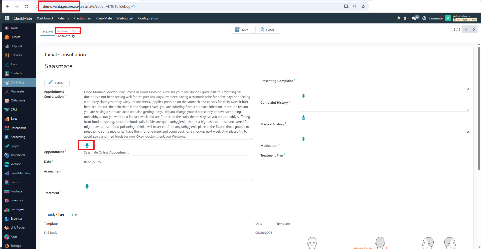
2. After the session is completed, the Practitioner can press the "Extra Medical Info" button. At this stage, the conversation data will be securely processed by ChatGPT, and key insights will be extracted and automatically stored into the relevant medical fields in the patient’s record.
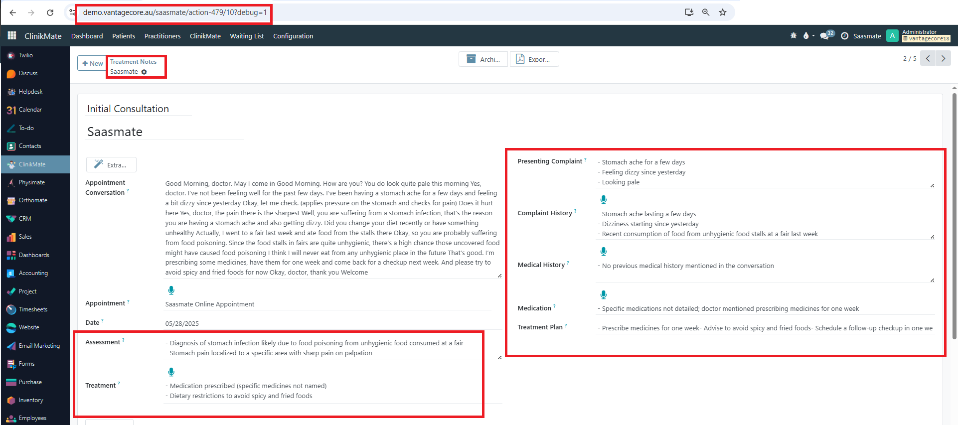
Benefits of Treatment Notes:
- Accurate Documentation: Automatically records consultation details without missing critical information.
- AI-Powered Insights: ChatGPT helps extract meaningful medical information from conversations.
- Continuity of Care: Provides quick reference for follow-ups and long-term treatment planning.
- Security: Notes are securely stored in the patient’s medical record.
- Time-Saving: Reduces manual entry, allowing practitioners to focus more on patient care.
Auto Purchase Order Config
Auto Purchase Order Config automates the creation of purchase orders based on stock levels and predefined rules. It helps maintain optimal inventory by triggering orders when products fall below minimum thresholds. This ensures timely replenishment and reduces manual effort.
1. If the "Appointment" is entered in the "https://demo.vantagecore.au/", The product added in the "Event Lines" tab. As shown in the below screenshot,
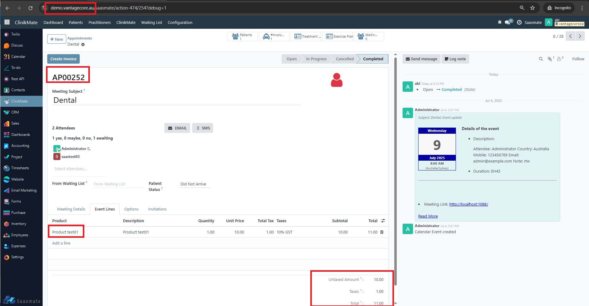
2. If the Invoice is created in the appointment "https://demo.vantagecore.au/", An automatic Quotation will be created in the "erp.vantagecore.com.au"
3. The customer address from "https://demo.vantagecore.au/" will be passed to the Quotation created in the "erp.vantagecore.com.au" which is custom delivery address field,
4. Supplier will be the supplier in main server. Currently the active supplier will be Vantagecore.
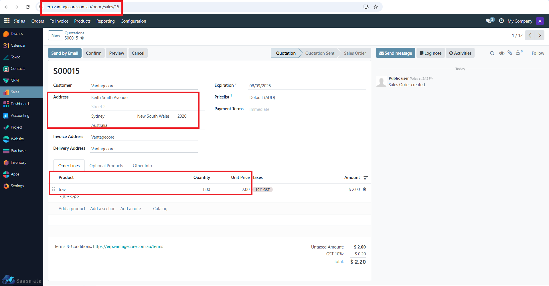
5. The SO reference number is added to the "Appointments",
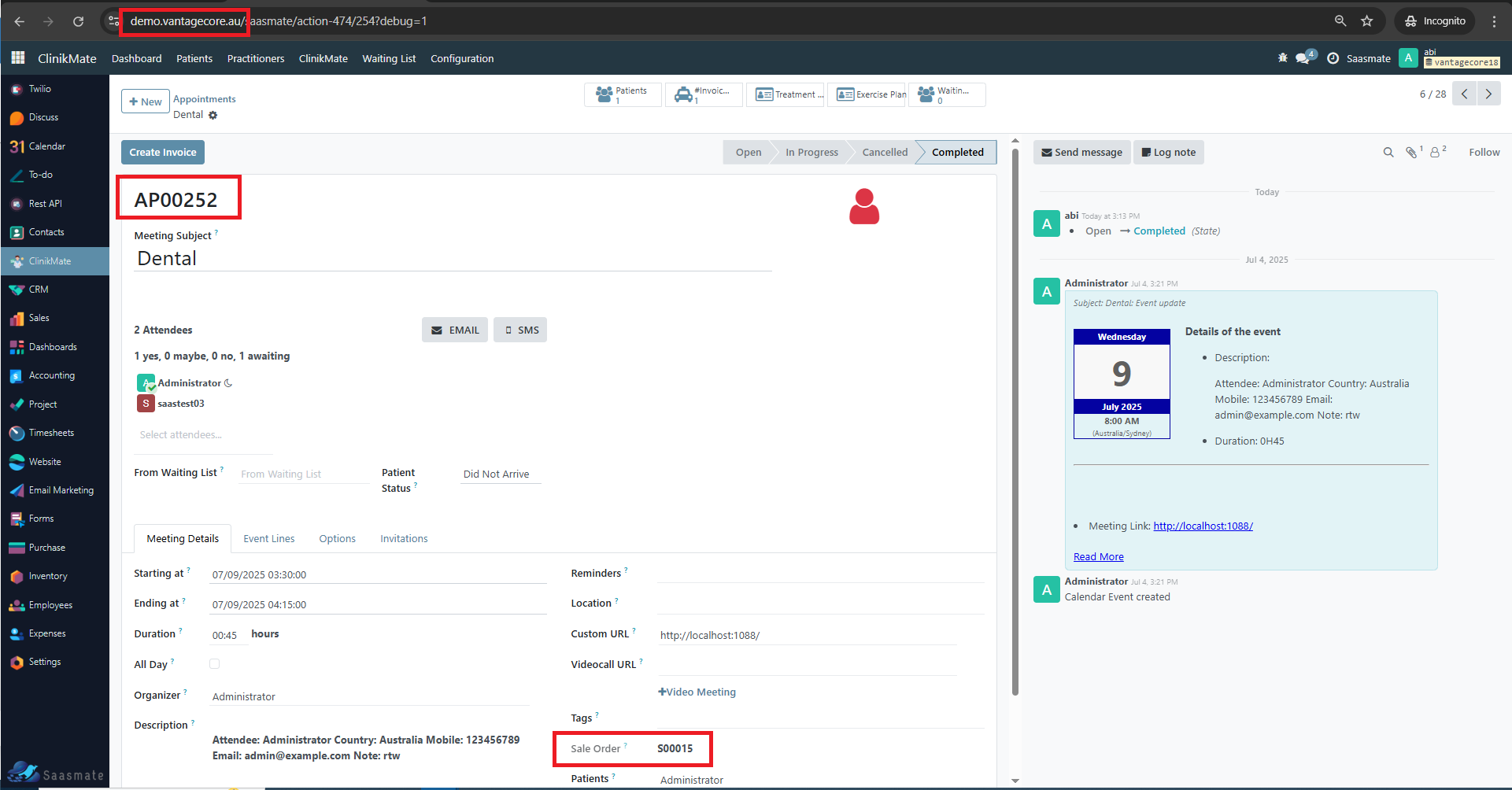
6. The product Cost price from the "https://demo.vantagecore.au/" will be passed to the SO lines in "erp.vantagecore.com.au",
Auto Sale Order Config
1. The sales order is automatically created from VantageCore. For example: S00067. The current state will be Quotation.
2. The customer is statically set as VantageCore.
3. The Invoice Address is statically set as VantageCore.
4. The Delivery Address is statically set as VantageCore.
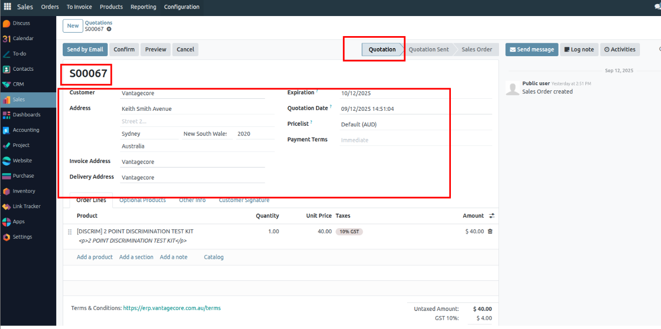
5. The address is taken from the patient when creating the appointment.
6. The order lines show the customer’s ordered product, quantity, and the unit price is taken from the product cost. The total amount is also displayed.
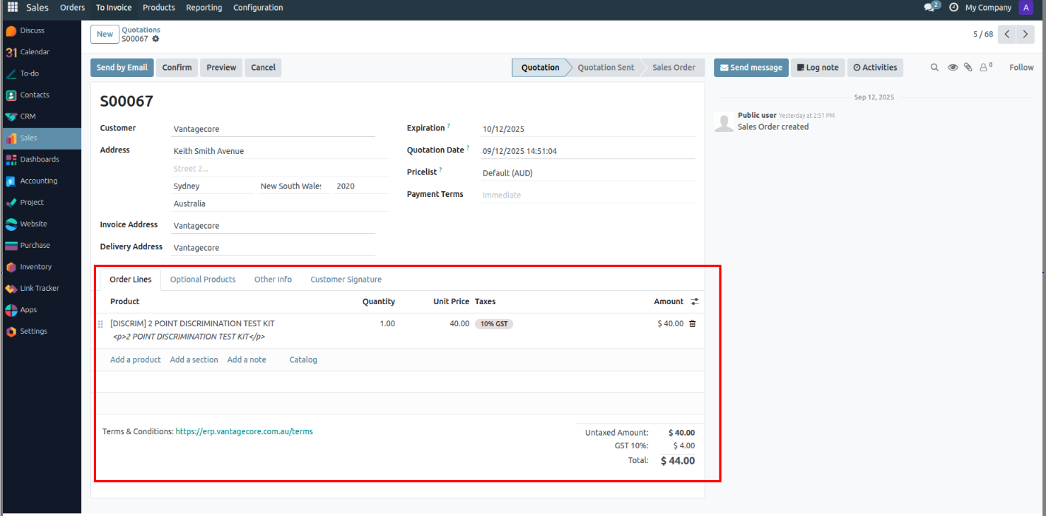
7. The product card takes the product values based on the cost value.
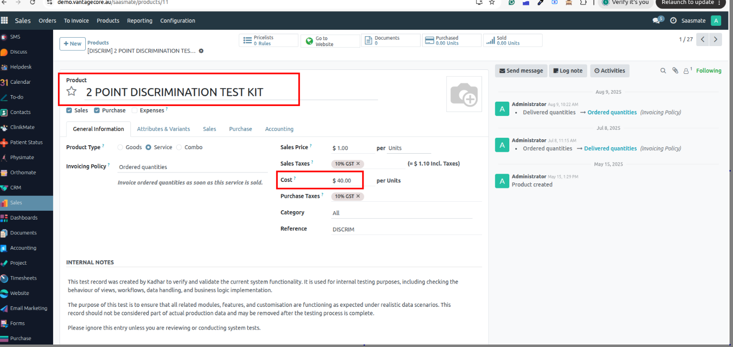
8. Once you click Send by Email, the quotation will open in a popup for review. After checking, click Confirm, and the quotation will be sent by email.
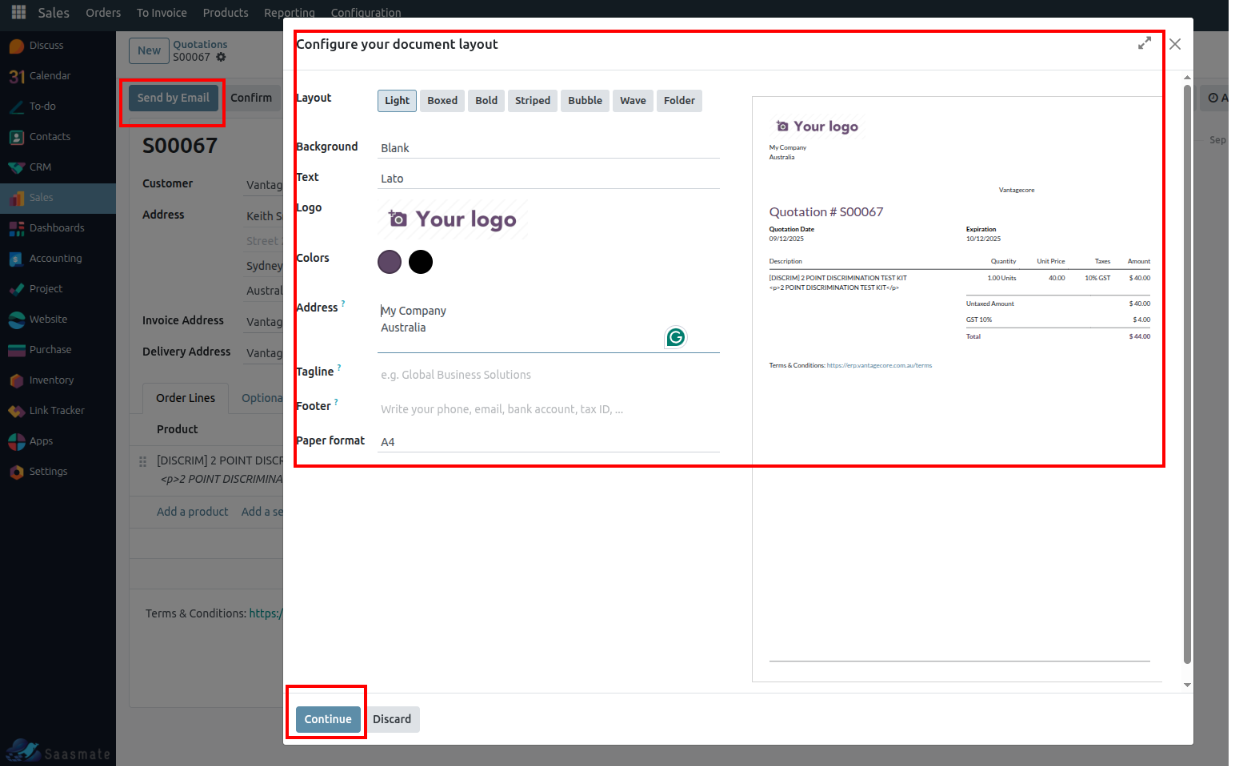
9. The quotation will be sent, and the status will change to Quotation Sent.
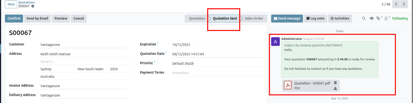
10. Click the Confirm button and the sale order will be created. The state will change on the sale order.
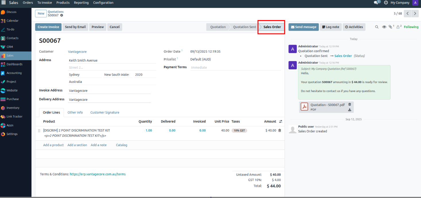
Letter Compose Configuration
1. In the "Customer" form view, a new tile "Letter Compose" has been added for easy access to letter management.
2. On selecting this tile, the "Letter Compose Wizard" opens. The letter body can now be edited in HTML format, allowing rich text formatting, images, and custom styles.
3. Users can click "SAVE AS NEW TEMPLATE" to store the letter as a reusable template for future communications.
4. The saved templates are automatically stored under "Email Templates" in the "Settings" menu for easy access and management.
5. The "Load Template" feature allows users to select any saved template and load it into the Letter Compose wizard, reducing repetitive work.
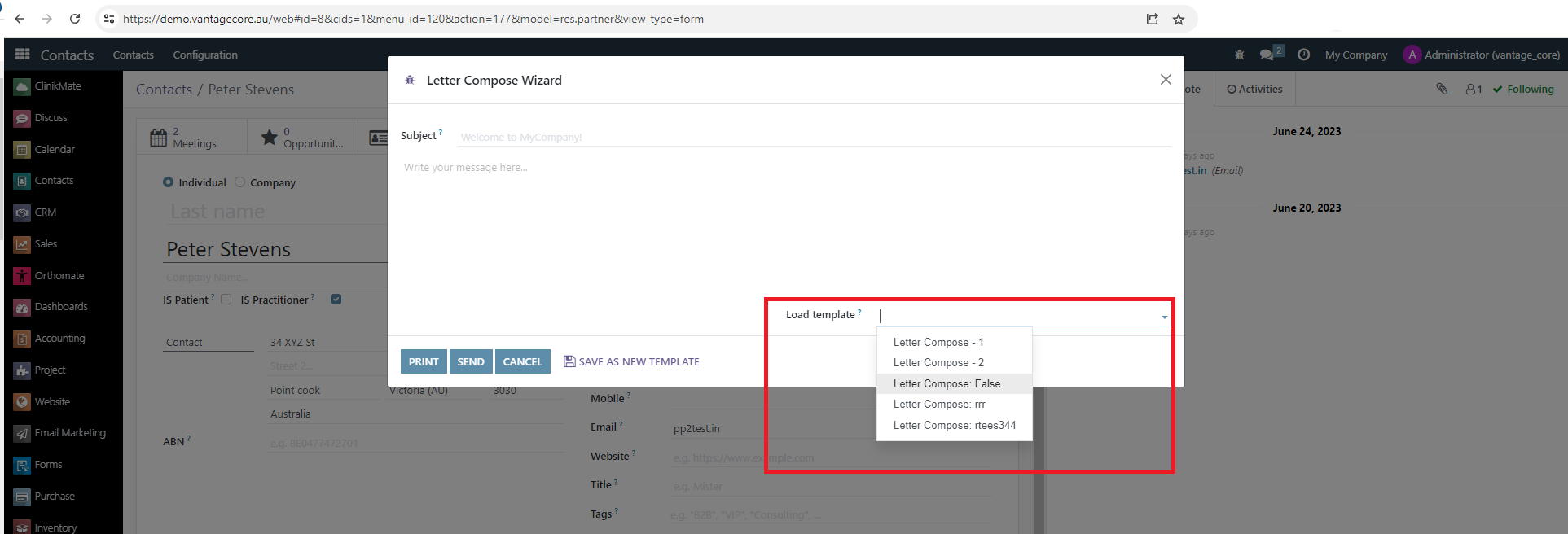
6. A preview of the letter template is available before sending or printing, ensuring the content appears as expected.
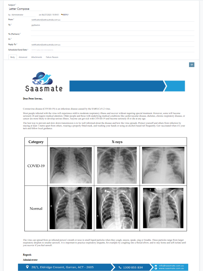
7. Once printed, the letter is automatically saved in the system, allowing future reference and tracking.
8. In the "Customer" form view, a new tile "Letters" has been added to view all letters related to that customer.
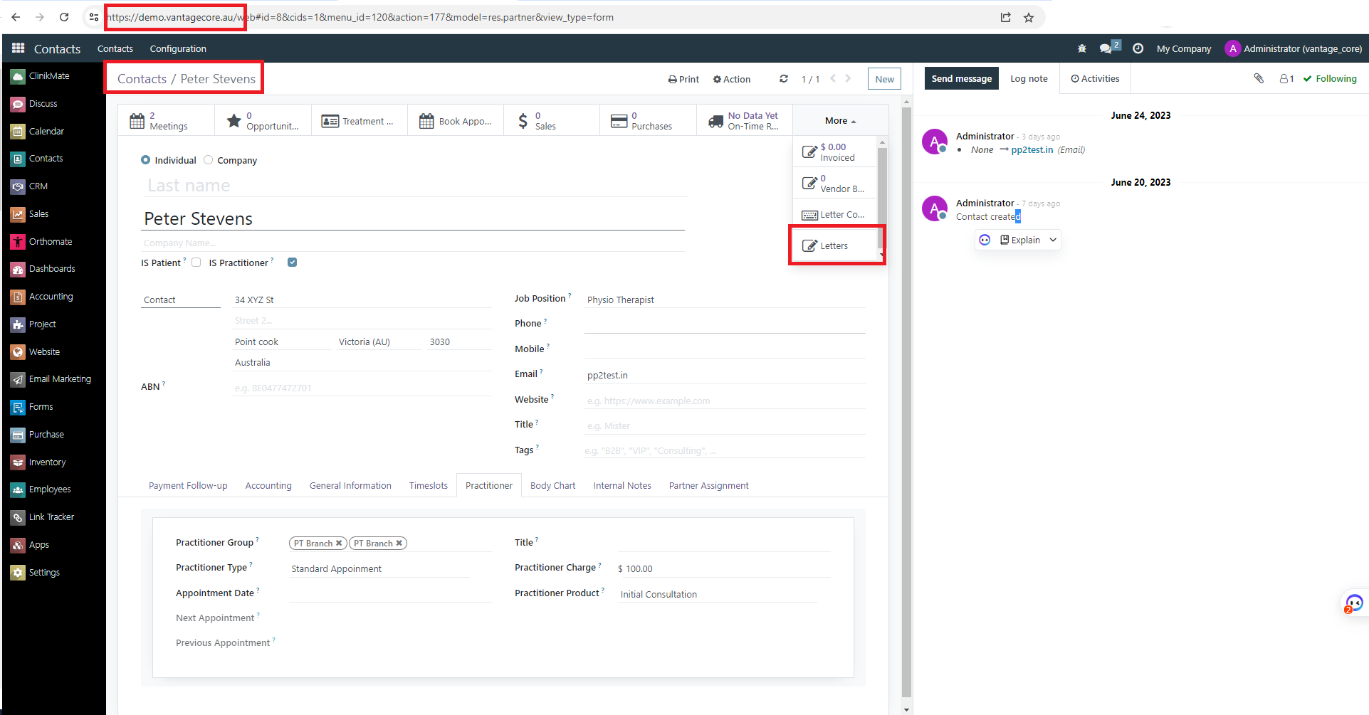
9. The individual customer's letters are displayed in a tree view. Users can click to view the letter in PDF format within the form view.
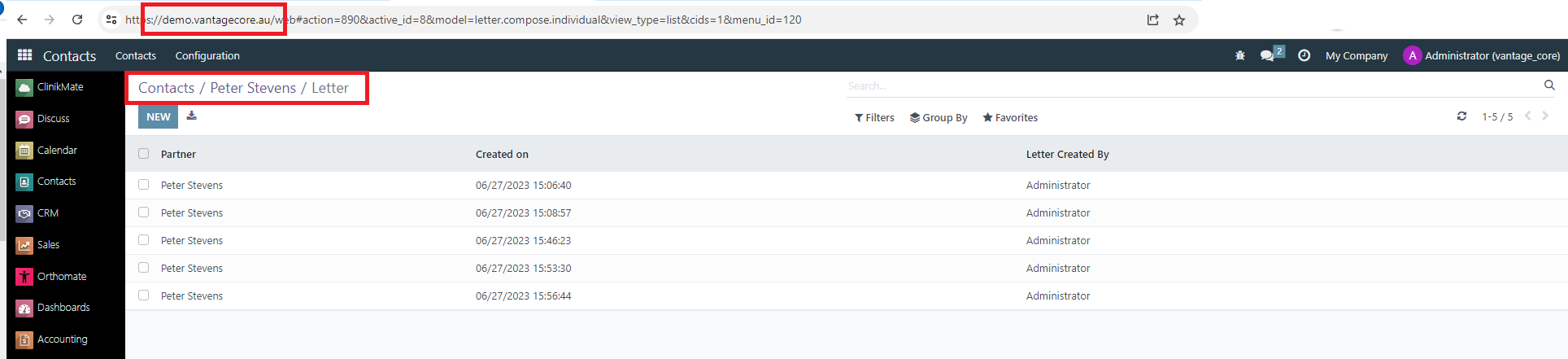
10. In the Clinikmate module → under the "Clinikmate" menu, a new section "Letters" has been added for centralized letter management.
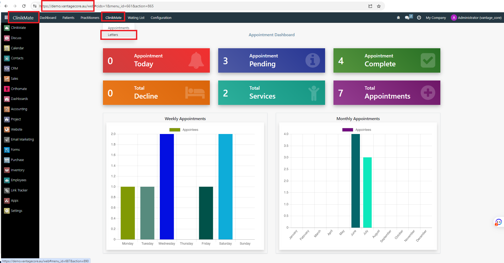
11. All letters for all customers can be viewed in this centralized tree view, allowing search, filter, and export options for better tracking and reporting.
Additional Features:
- Supports rich-text editing with HTML formatting.
- Save letters as reusable templates to standardize communication.
- Automatic saving of printed letters for audit and reference.
- Centralized view of letters per customer and system-wide in Clinikmate.
- Easy search, filter, and export options in the letters tree view.
- Preview option ensures letters appear correctly before sending.
Tyro Payments
Tyro Payments is a secure payment solution designed for businesses to process EFTPOS, online, and mobile transactions. It offers fast, reliable, and integrated payment services. Tyro helps streamline payments while enhancing customer convenience.
1. Added a custom "Payment" button in the Account Move (Invoice) form header.
2. When the button is clicked, the system will prepare payment data from the invoice and pass it to Tyro’s Javascript SDK.
Payment Data includes:
- Invoice Reference (invoiceReference) → Unique reference number for the invoice.
- Charge Amount (chargeAmount) → The amount to be charged.
- Patient/Customer Details (patient) →
In Saasmate, we have created a new field called Patient Ref ID in the customer form view.
- It stores the refId received from the first completed transaction.
- For subsequent transactions against the same patient, Saasmate will send only the stored refId instead of the full patient details.
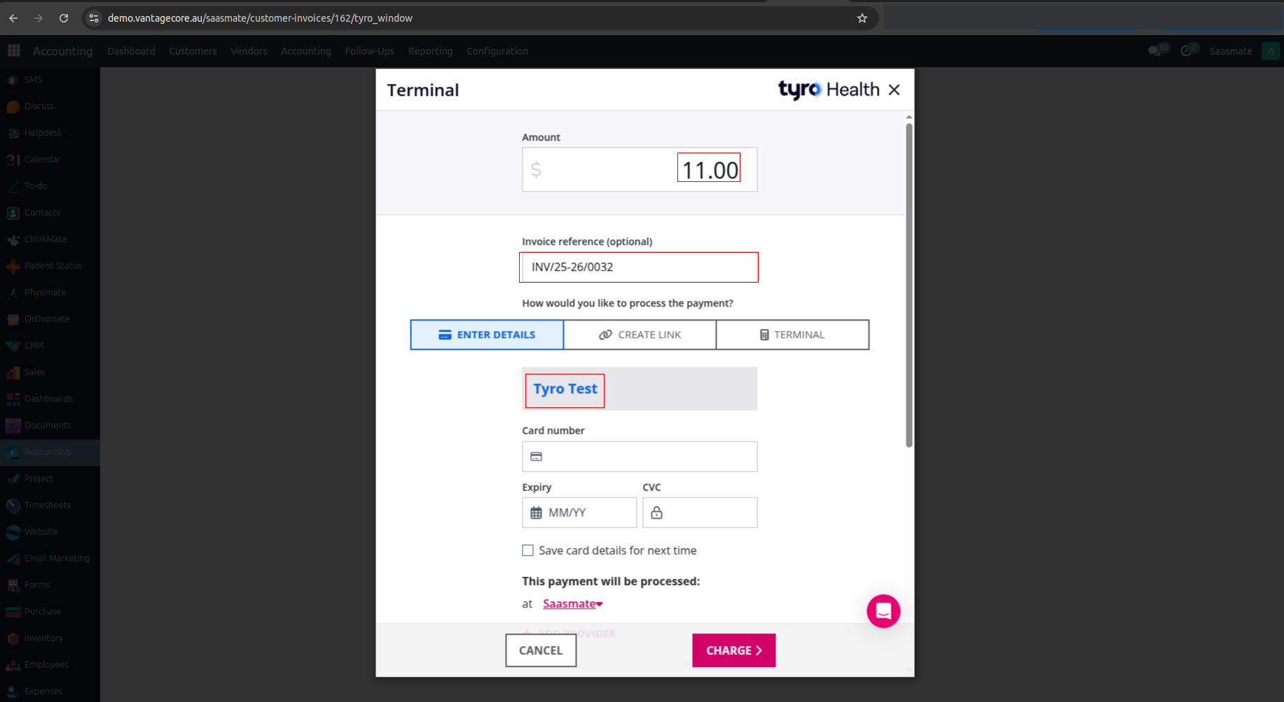
Payment Flow The customer chooses the payment method by entering card details and completes or cancels the payment. Possible outcomes:
- Success → Payment completed.
- Error → Transaction failed.
- Cancel → User closed the payment window.
3. In Saasmate, using the Tyro SDK, we can make partial payments for an invoice. Until the full amount is paid, the invoice remains in the Partial state.
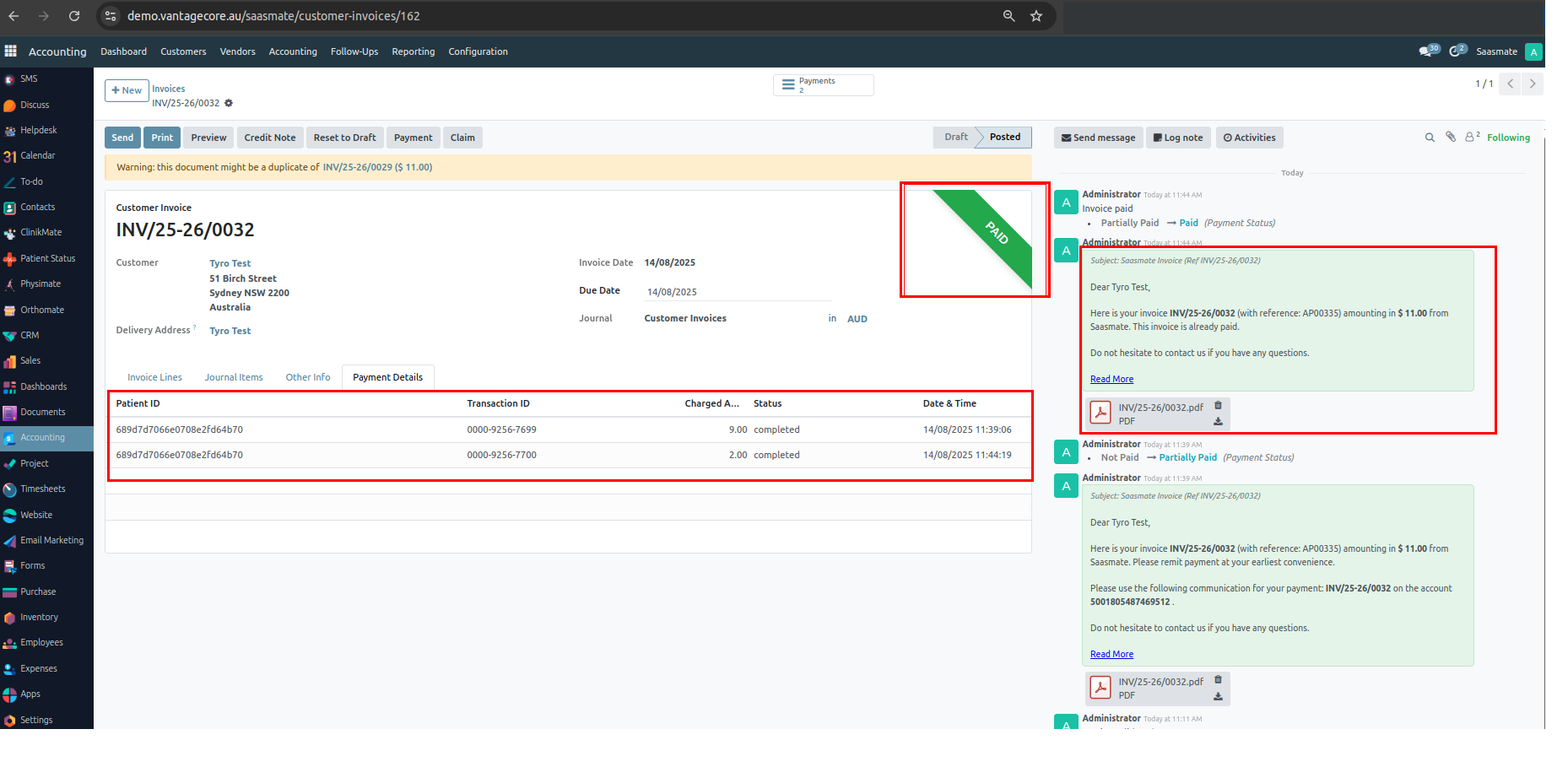
4. Once all payments are completed, the invoice moves to the Paid state, and Saasmate sends the invoice to the patient via email.

5. Saasmate stores all the responses received from the Tyro SDK payment process, including the Patient ID, Transaction ID, Charged Amount, Status, and Date & Time.
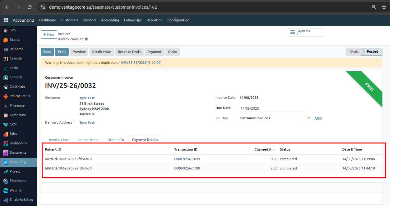
Week Days & Public Holidays
Week Days
This feature allows you to configure the days of the week (Monday to Sunday) for scheduling and availability purposes. It is mainly used to define practitioner working days, patient availability, and waiting list preferences. By selecting the applicable days, the system can better align appointments and manage clinic schedules efficiently.
Waiting List – Availability
In the Waiting List form, you can set patient availability by selecting specific weekdays (Monday–Sunday). This helps ensure that patients are only scheduled for appointments on the days they are available, improving accuracy and reducing scheduling conflicts.
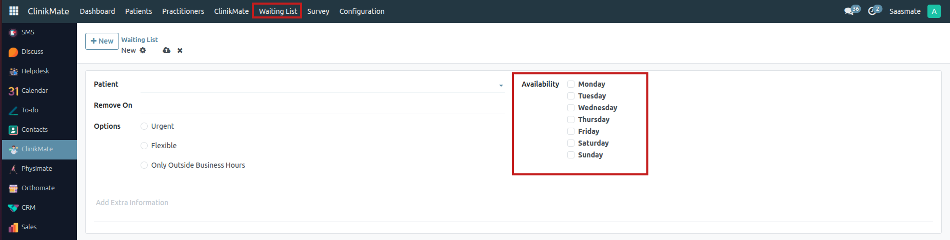
Public Holidays
The Public Holidays feature helps clinics manage appointments effectively by marking non-working days in advance. This ensures that no bookings are scheduled on official holidays and avoids confusion in clinic operations.
- Holiday Name → Name of the holiday (e.g., Christmas Day, Easter, ANZAC Day).
- Holiday Date → The date when the holiday occurs.
- Following Business Day → The first valid working day after the holiday (must not be Saturday or Sunday).
- Information → Optional notes or additional details about the holiday.
- Click the Export Sample Data button to download the sample data for your reference.
- After that, click the 'Import Records' button and upload your downloaded file.
- “Upload your file, then click the 'Test' button to validate it. If there are no errors, you’ll see the message 'Everything seems valid.' After that, click the 'Import' button to successfully import the records.
- These are the imported data.
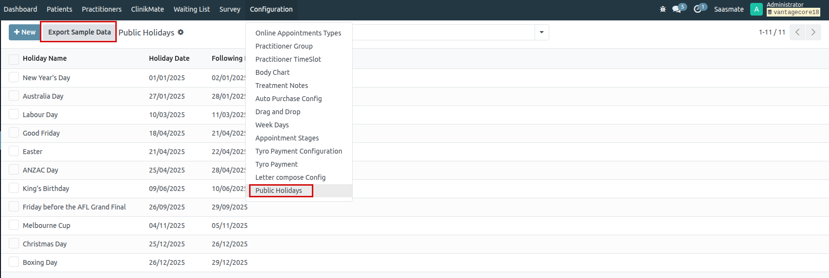
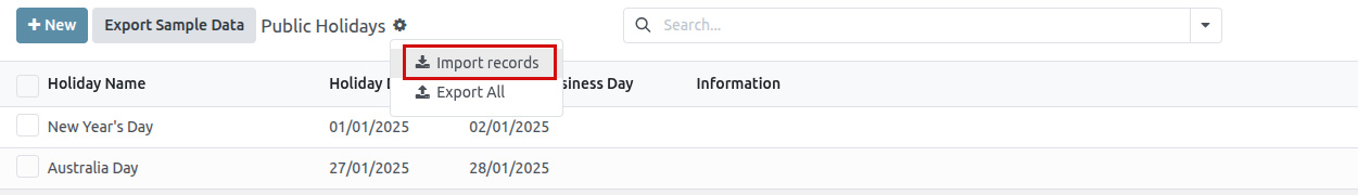
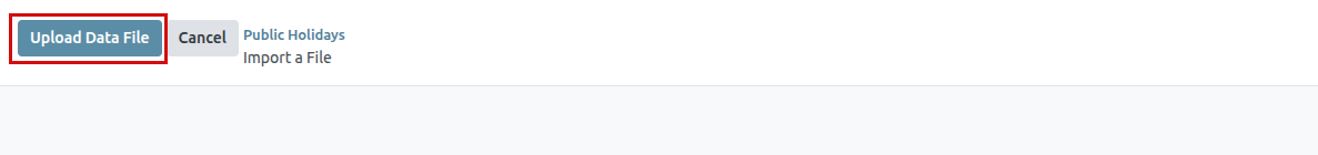
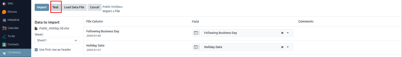
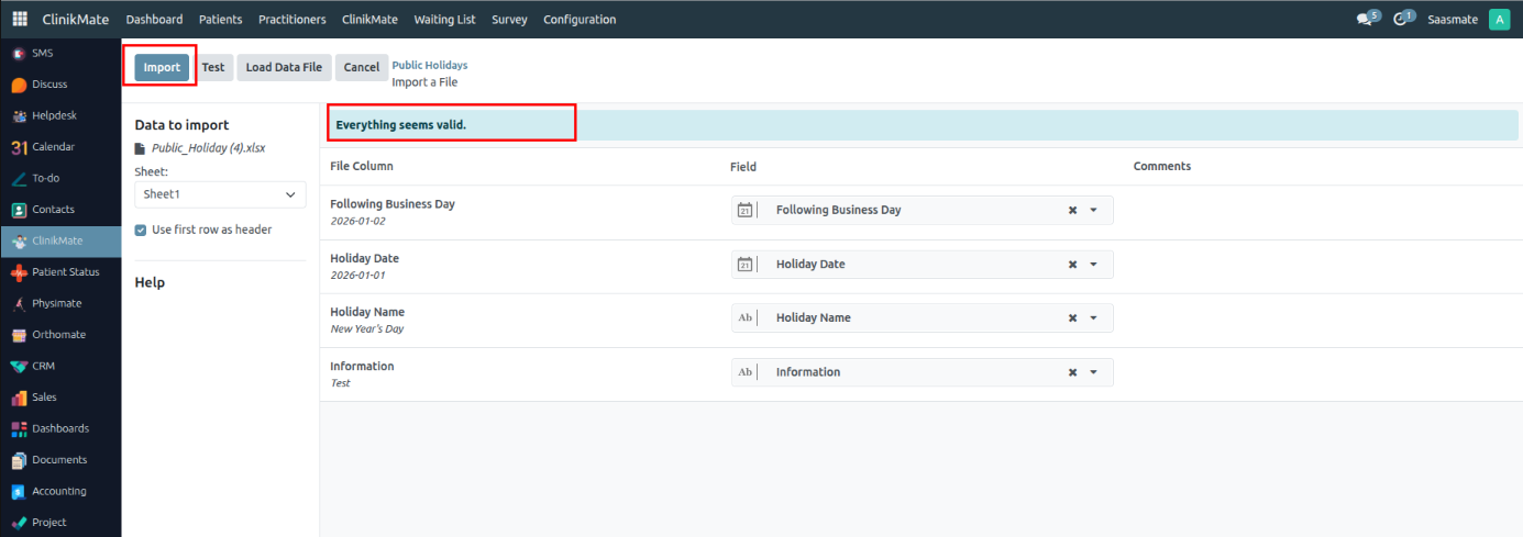
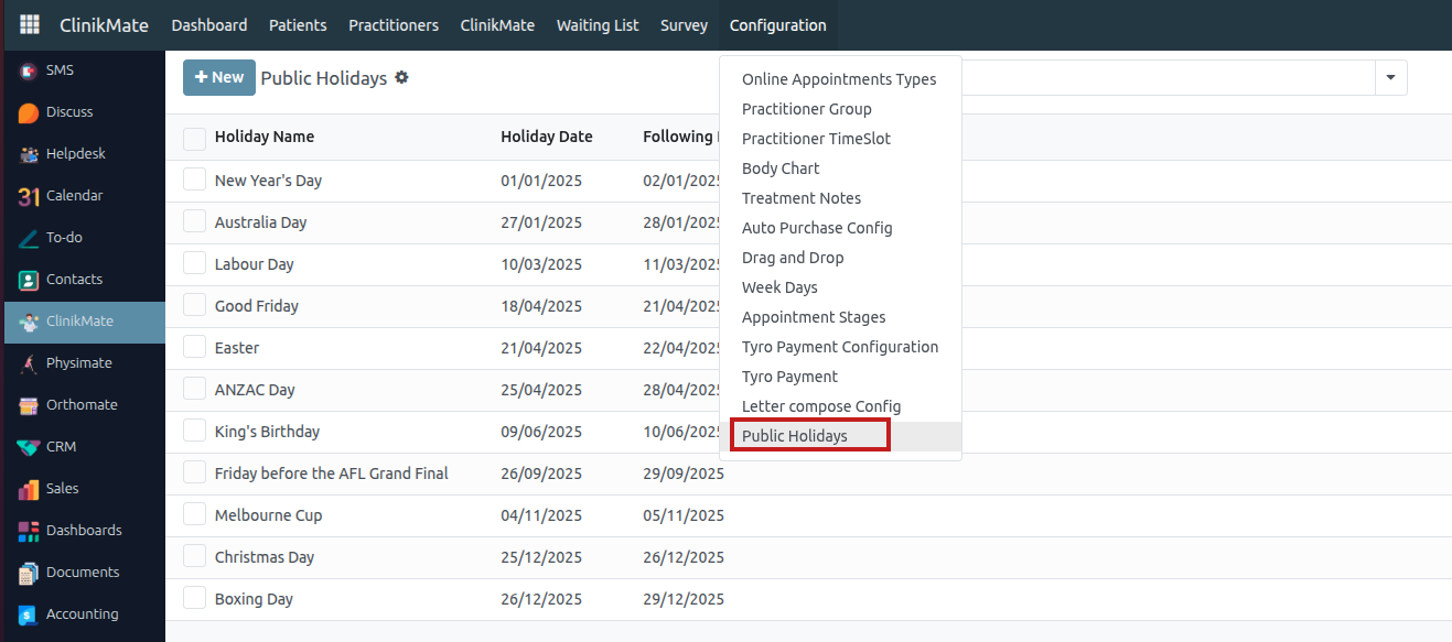
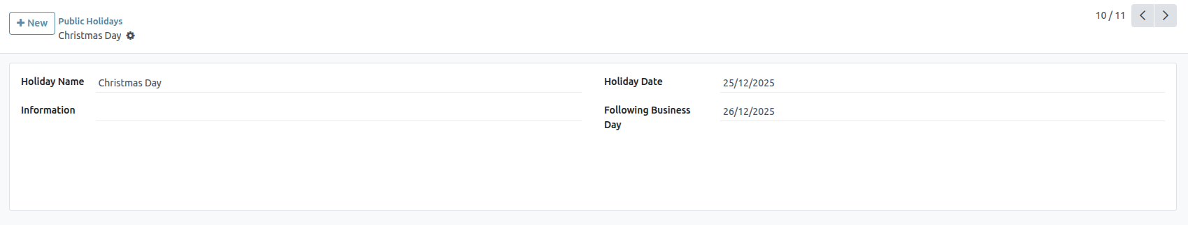
The Public Holidays To Mentioned Dates To Create Or Update The Appointments Means Raise Warning. This functionality ensures that no appointments are scheduled on official public holidays. If a user attempts to create or modify an appointment on a public holiday, the system will automatically display a warning message. This helps in preventing scheduling conflicts and maintaining accurate appointment management. Additionally, the system may suggest alternative working days or provide a calendar view highlighting public holidays for easier planning.
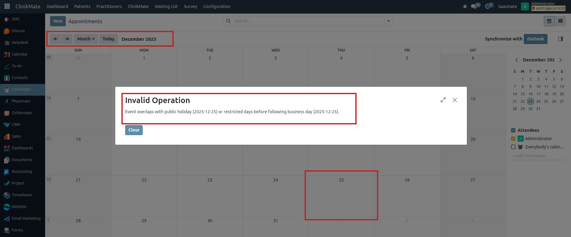
The system prevents creating or updating appointments on non-working days, including public holidays, Saturdays, and Sundays. If a user tries to schedule an appointment on any of these days, a warning message will be displayed. This ensures that appointments are only planned on valid working days.
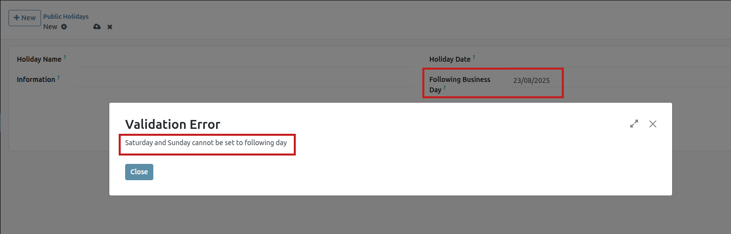
Patient Status
A specialized "Patient Status" portal has been created where patients can log in to view and manage their appointments. By entering their mobile number, they can search for and check into eligible appointments scheduled for the current day, while the system blocks attempts for past or future dates. The interface includes automatic data clearance and error handling for a streamlined patient self-service experience.
System Setup and User Access
1. A new user for “Patient Status” has been created with no access rights.
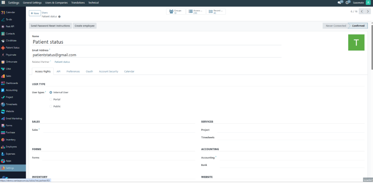
2. Two new groups were created:
- Patient Status Group – Users in this group can access the Patient Status module.
- Show All Module – If access to this group is false for a user, default apps (Contacts, Employees, Calendar, Website, Discuss) will be hidden.
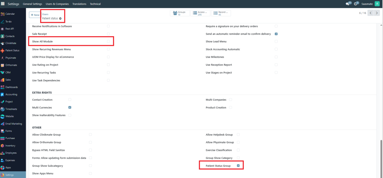
3. When the user logs in, only the “Patient Status” app will appear.
4. The “Mobile No” field will appear, where the user can type their mobile number and press Search.
5. We tested with the patient “nhmtest14”.
6. The patient name related to the mobile number will appear, and the patient's appointments will be listed.
7. If a patient attempts to check in for a future appointment, a warning message will notify them that early check-in is not allowed.
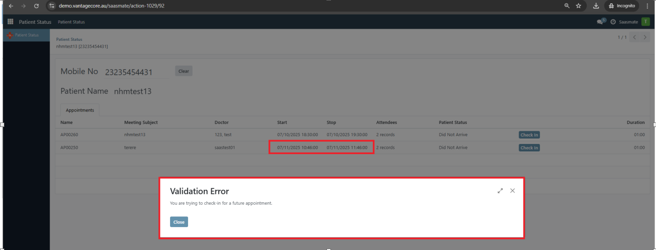
8. If a patient attempts to check in for a past appointment, a warning message will notify them that check-in for past appointments is not allowed.
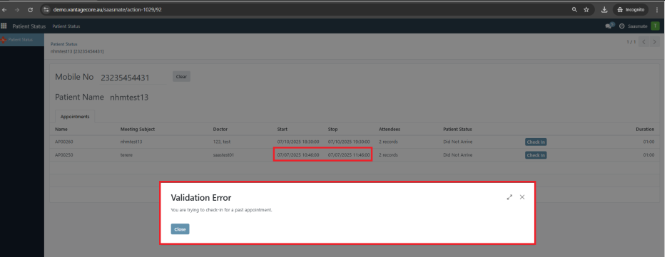
9. The patient can check in only for the current date appointment. Once checked in, a wizard will appear with a confirmation message.
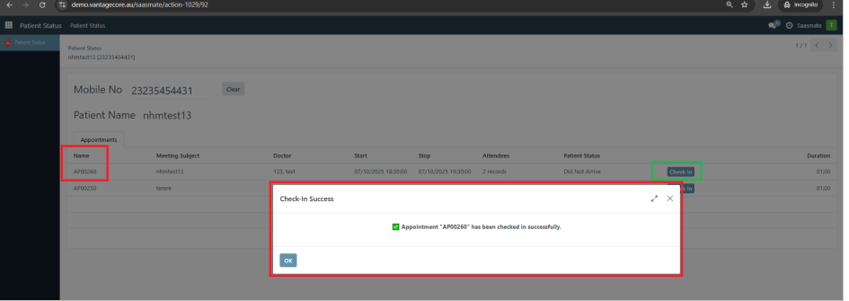
10. A timer will run for 30 seconds, after which the related appointment details will be cleared automatically.
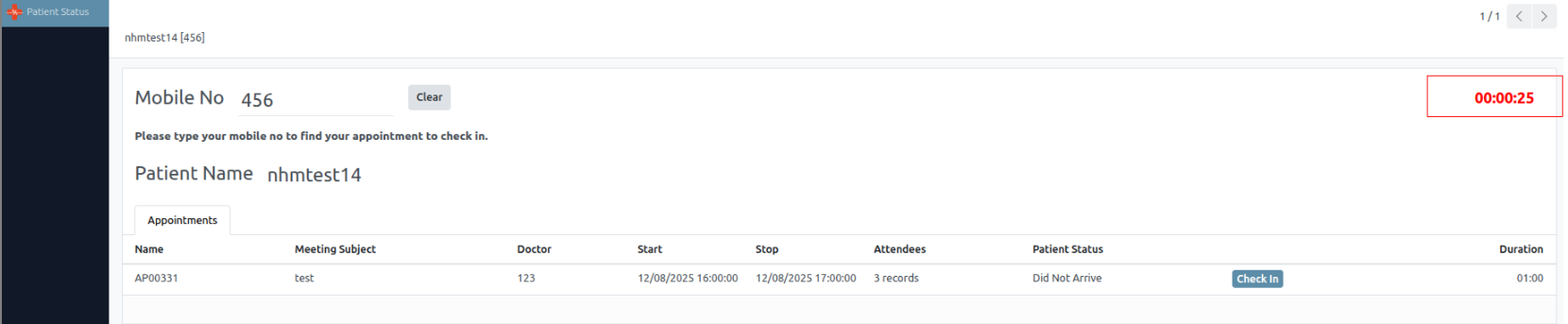
11. The Clear button can also be used to clear the related appointment details manually.
12. Appointments in Cancel or Completed state will not appear in the table.
13. Only patients can check their own appointments in this login.
14. If an incorrect mobile number is entered during the search, an error message will be displayed.
Exercise Plan
Exercise Plans allow patients to view all exercises assigned to them in the portal. Each plan shows its status Future, In Progress, or Completed—based on the start and end dates. Patients can track progress and generate PDF reports for exercise details or instructions.
1. Exercise Plans Overview
The "Exercise Plans" section has been added to the portal. It displays all exercise plans assigned to the user along with the total count of exercises in each plan.
2. Viewing Exercise Plans
Clicking on "Exercise Plans" displays a tree view of all plans. Both the tree view and the portal view show the status of each plan.
3. Exercise Plan Status
A status field has been added to the Exercise Plan with the following possible values:
- Future – Start date is in the future
- In Progress – Today's date falls between the start and end dates
- Completed – End date is in the past
4. Automated Status Update
A cron job named 'Exercise: Update Exercise Status' runs daily and updates the status of each exercise plan based on the following conditions:
- Future – If the start date is in the future, the status is set to Future
- In Progress – If today’s date is between the start and end dates, the status is set to In Progress
- Completed – If the end date is in the past, the status is set to Completed
5. Portal Display After Cron
Once the cron job runs, the Pyismate portal displays the updated status of all exercise plans.
6. Tracking Sheet Details
The tracking sheet details are taken from the Exercise Plan form view, showing all relevant exercise information.
7. PDF Report: Tracking Sheet
Clicking the 'Tracking Sheet' button in the website view generates a PDF report containing all details of the exercise plan.
8. PDF Report: Patient Instruction
Clicking the 'Instruction' button in the website view generates a PDF report containing all details of the patient instructions.
Orthomate
Orthomate is a specialized platform designed for managing orthopedic clinics and patient care. It streamlines appointment scheduling, treatment planning, product management, and progress tracking. The system helps improve efficiency, reduces manual effort, and ensures better patient outcomes.
1. A newly created “Orthomate Module” has been introduced to manage orthopedic-specific workflows.
2. A new “Catalogs” section has been added, with support for Kanban, Tree, and Pivot views for efficient catalog management.
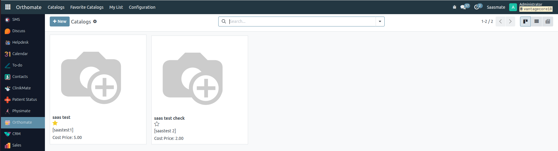
3. In the form view, custom fields have been created to capture orthopedic-specific catalog details.
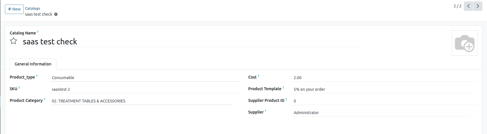
4. A dedicated “Favorite Catalogs” menu has been added, allowing practitioners to quickly access their most frequently used catalogs.
5. A personalized “My List” menu has been introduced, enabling users to maintain their own list of preferred items for quick reference.
6. In the form view, additional fields have been configured for recording product details, costs, and medical specifications.
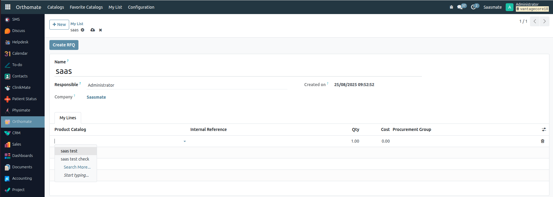
7. From the Catalogs Tree View, users can select one or more catalogs and then use the “Create Product Wizard” option under the Action menu.
8. The “Create Product Wizard” window will appear. Here, users can enter the desired Mark Up % value and then press the “CREATE” button to generate products directly from the catalog.
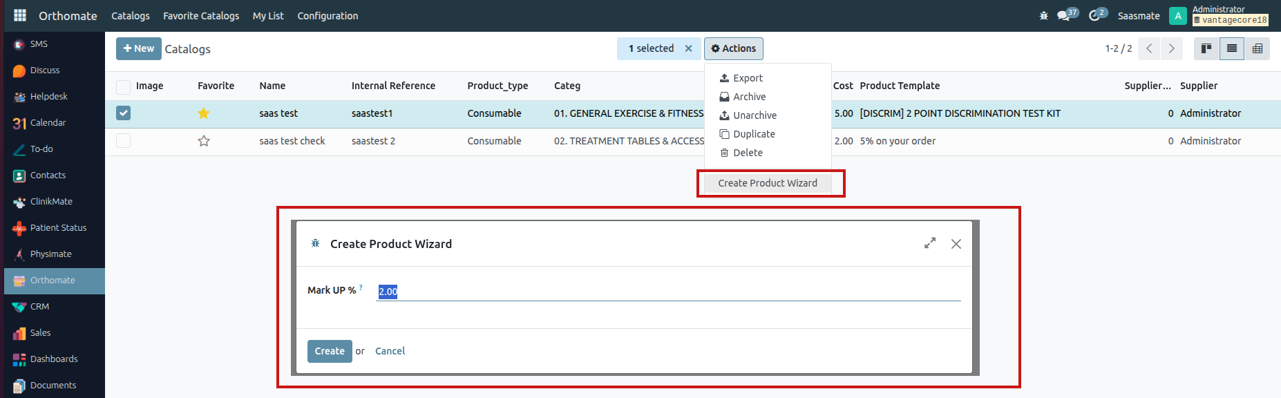
Documents
The Internal Documentation Master Menu is called Documentation.
Under the Master Menu, there is a sub-menu called Documents.
There are two types of views available: List View and Kanban View. In both views, documentation can be created by clicking the New button located at the top left corner.
List View
Kanban View
When we click on the "New" button, a new form view will be opened.
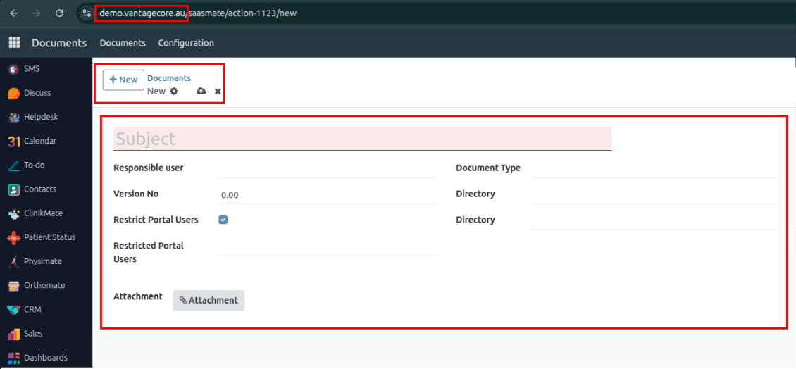
- Subject – We will add the subject related to the document.
- Responsible User – The user responsible for the document. This user will be shown in the "Users for Display" field.
- Version No – The version number of the document.
- Attachment – We will attach the relevant file(s).
- Restrict Portal User – When this boolean is set to True, an additional field called Restricted Portal User will be shown. If it is False, the document will not be visible to any portal user.
- Restricted Portal User – We will select the portal users who are restricted from viewing the selected document.
- When the Document Type is set to "URL", the Attachment field will be invisible.
- When the Document Type is not "URL", the Attachment field will be visible.
- Document Type – We will select the appropriate document type.
- Directory – We will select the directory where the document belongs.
Finally, the filled form view output will look like below.
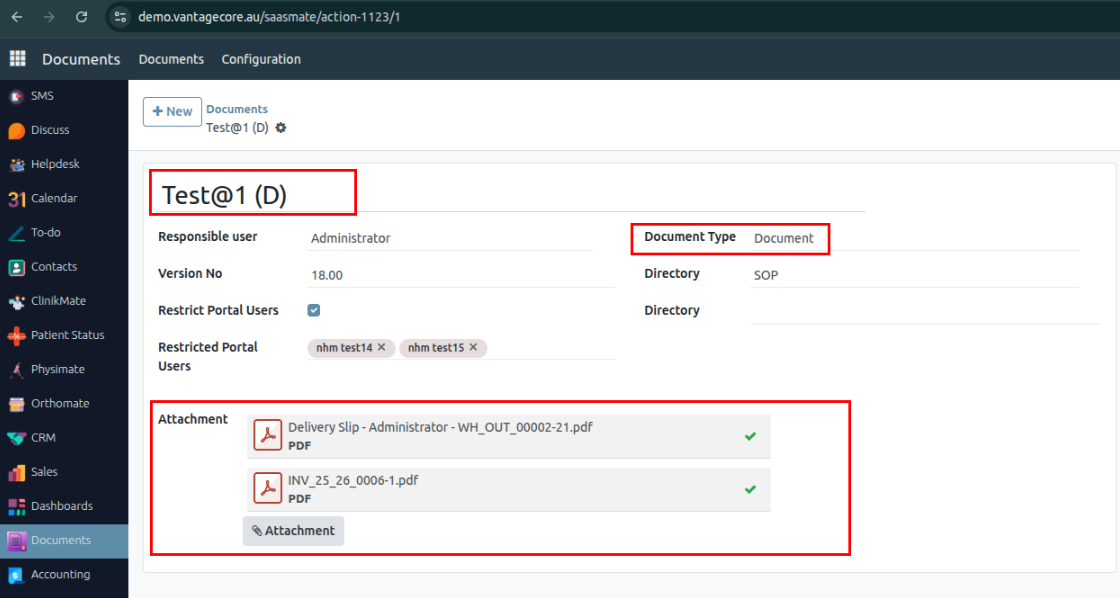
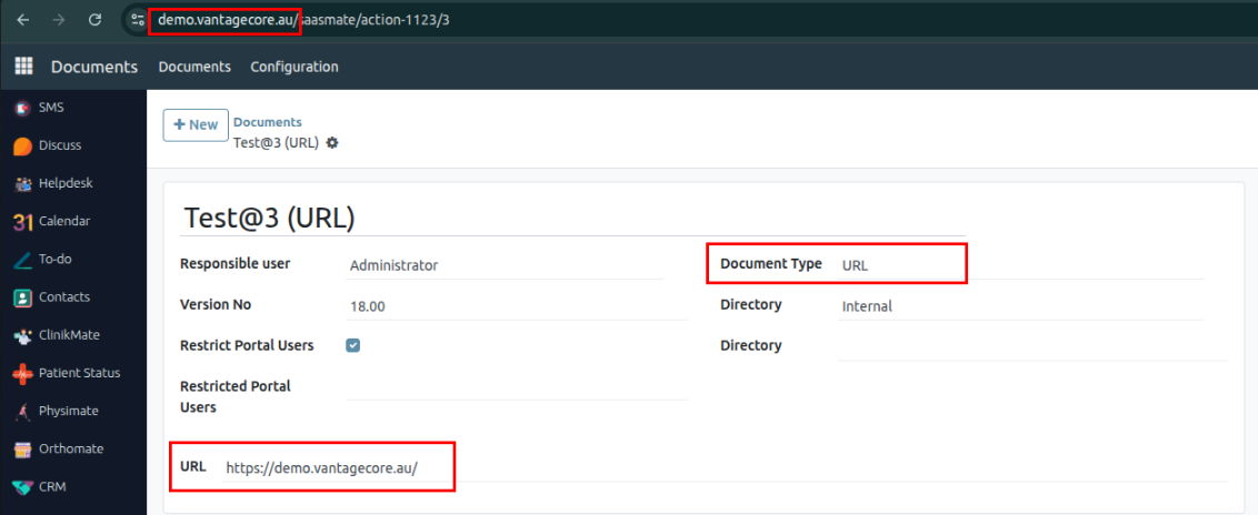
Under the Configuration menu, we will see the Document Type, Directory, and Classification options. Here, we can create new Document Types, Directories, and Classifications.
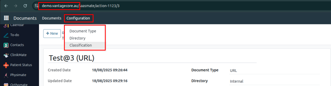
Another view will be available under My Account, so the Portal User must be logged in.
Path: My Account → Documents → Click on Open.
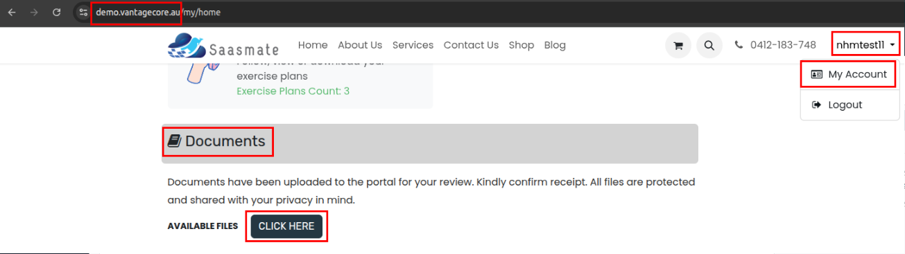
The view below works based on the Restricted Portal User field in the form view. We can choose which documents are visible to specific portal users.
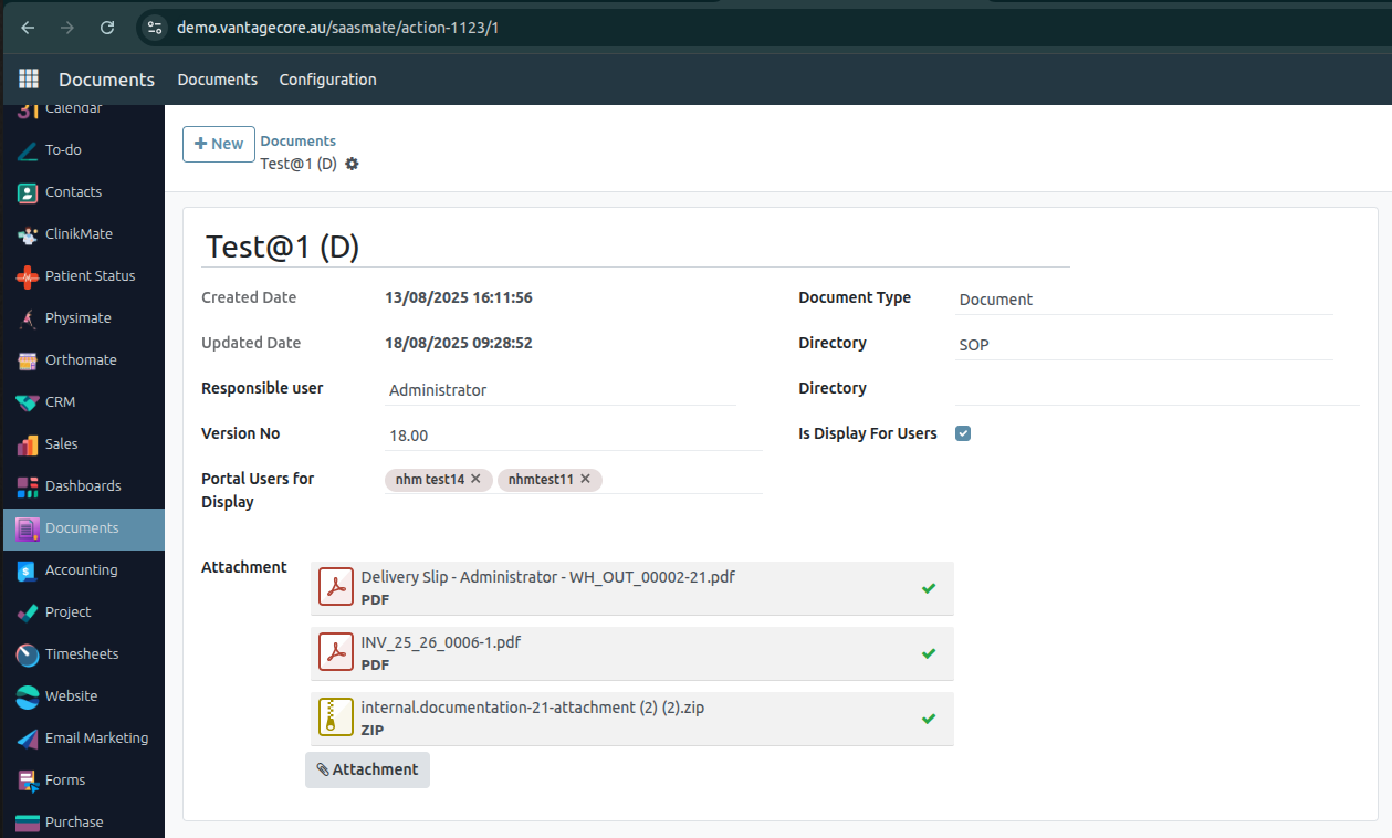
If we modify the Attachment (for example, remove a ZIP file), it will also be removed from the Portal View.
If we add any files or attachments, they will be visible to the portal user.
If we remove any files, the corresponding attachments will no longer appear in the portal.
Example – Adding Attachments:
We attached a total of 3 files for the users nhmtest14 and nhmtest11. These users will not be able to see those 3 specific files.
Additionally, added a ZIP file, so the portal users can’t also see the ZIP file in their view.
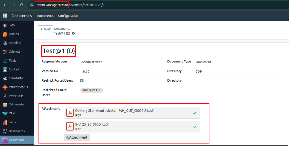
Portal Site:
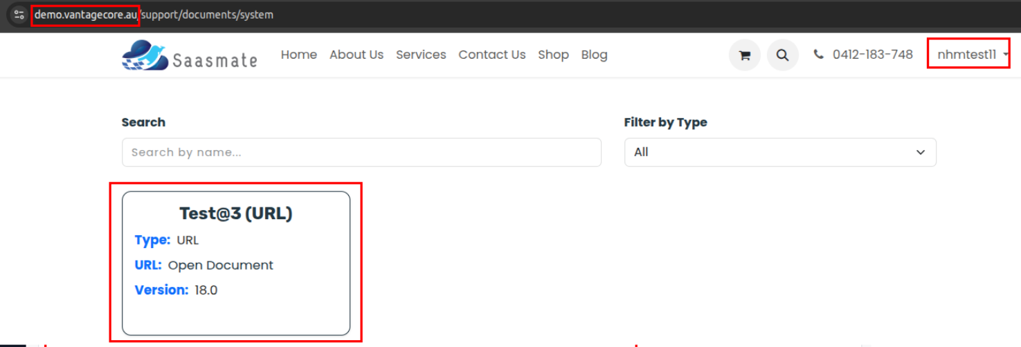
Example – Removing Attachments:
We removed 1 file for the users nhmtest14 and nhmtest11. These users will no longer be able to see that specific file.
Additionally, I removed a ZIP file, so the portal users will also no longer see the ZIP file in their view.
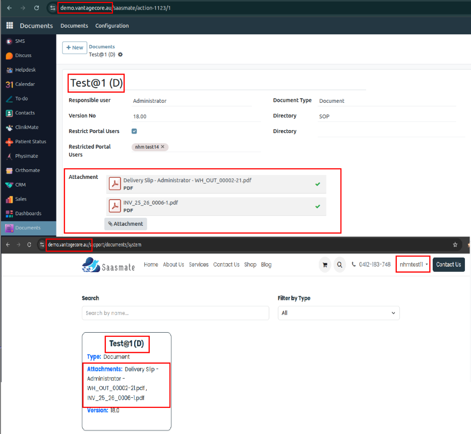
We have also added filters for Document, Video, URL, and Other formats.
Additionally, a search bar has been placed at the top of the view.
Some additional Groups have been created.
Path: Settings → Users & Companies → Groups → In the search panel, search for Internal Documentation.
Document Manager: Has access to Read, Write, Create, and Delete.
Document User: Has Read-only access.
Nps Survey
An NPS survey is created and sent to the Patient, When the Appointment reaches the Completed stage. Additionally, All required fields and Event Lines must be filled out.
The NPS survey can be found at the top right side of the Appointment page, Under the button labeled Survey.
When we click the Survey button, a page will open. The List view will be displayed first. Then, by clicking on the Survey, the Survey Form view will open automatically.
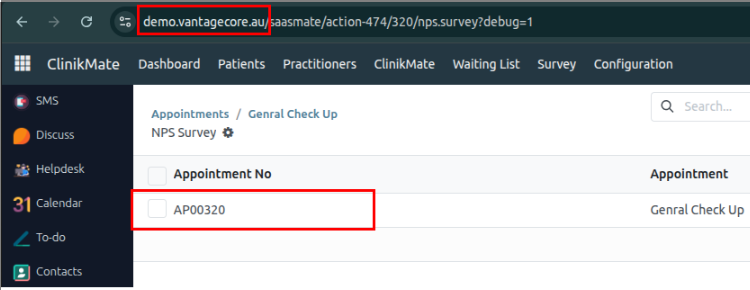
We are not able to modify the survey (such as creating, deleting, or editing it manually).
The Survey details will be fetched from the Appointment, When the survey is created.
The Pre-Filled form view is as shown below (Before Survey Submission):
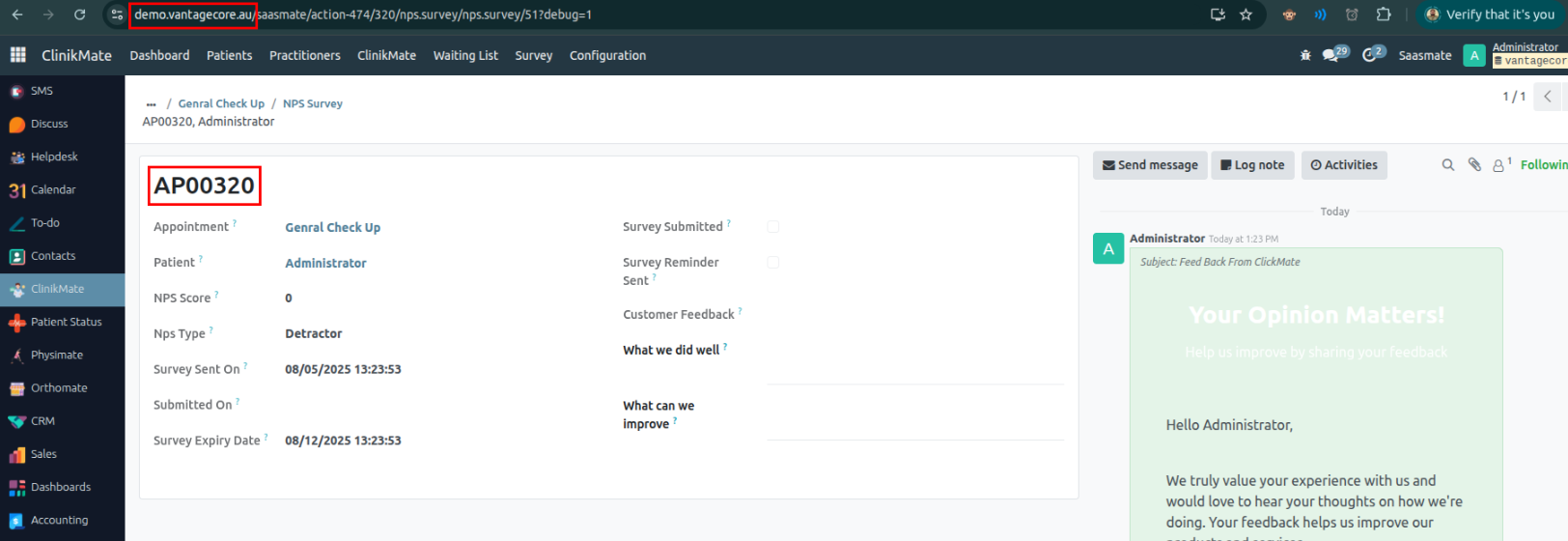
Note: The survey email will be sent automatically to the respective patient’s email address, When the appointment is moved to Completed State.
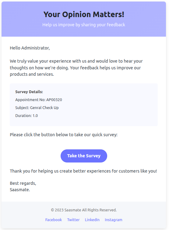
The Patient Email Survey is Below,
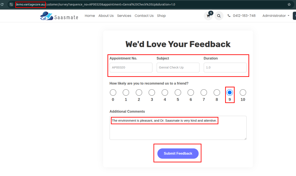
The following fields are read-only by default, so the patient cannot change them,
- Appointment No.
- Subject
- Duration
The Patient can give a rating from 1 to 10 by themselves and can also add Additional Comments.
The Patient can submit the feedback using the Submit Feedback button.
Once the feedback is submitted successfully, the patient cannot modify it.
Even if they refresh the page, use the back button, or try to revisit the feedback link, they will not be able to edit the submitted feedback.
The screenshot below is a reference for the survey feedback that was sent.
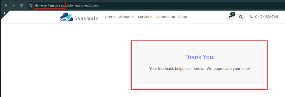
If feedback is submitted a second time for the same appointment, the following message will appear.
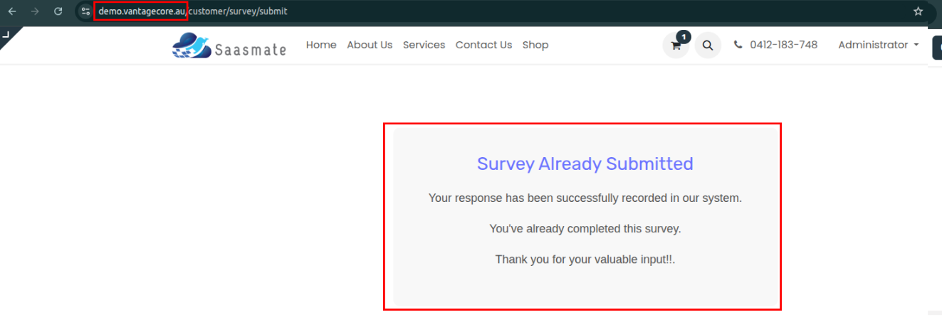
The patient appointment survey feedback can be viewed by following this path:
Under ClinikMate→Survey→NPS
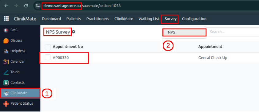
Below is the submitted survey form view.
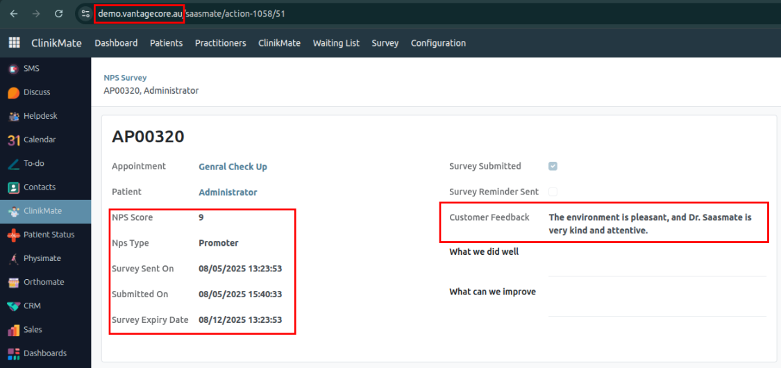
Appointment – The appointment type.
Patient – Patient name.
NPS Score – Patient rating.
NPS Type – Type of patient rating.
Survey Sent On – Date when the survey was sent to the patient.
Submitted On – Date when the survey was submitted.
Survey Expiry Date – The survey expires 7 days after it is sent. This is the last day for the patient to submit the survey. If not submitted by then, reminder emails will be sent via Cron until the expiry date.
Survey Submitted – Will be True when the patient has submitted the survey.
Survey Reminder Sent – Will be True when a reminder email has been sent to the patient before the survey expiry date. This status is updated by Cron, which toggles the Boolean from False to True accordingly.
Customer Feedback – Patient’s feedback comments (written in the survey).
What we did well – Positive feedback on what was done well for the patient.
What can we improve – Suggestions from the patient on areas for improvement.
NPS Type is calculated based on the NPS Score:
0 - 6: Detractor
7 - 8: Passive
9 - 10: Promoter
In the Customer Card, we have placed a field called NPS, the Method is below:
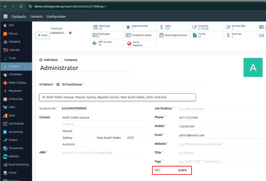
Methods:
• The method searches for all NPS surveys linked to the customer (partner_id) excluding passive responses.
• It calculates the percentage of promoters and detractors from the submitted surveys.
• The NPS score is computed as: % of Promoters − % of Detractors.
• The result is stored in nps_calculator as a formatted percentage.
• If no surveys are found or no surveys are submitted, it shows "N/A" or "0.00%" accordingly.
CRON Job: Survey Reminder - Cron
Schedule – Runs daily at 10:33 AM.
How It Works:
• The cron job checks the NPS Survey table to find surveys that have not yet been submitted by patients.
• For each unsubmitted survey, it verifies the Survey Expiry Date (7 days after the survey was sent).
• The cron job sends reminder emails to patients daily until the Survey Expiry Date is reached.
• Each time before sending a reminder email, the cron job sets the Survey Reminder Sent field to False (reset).
• After the email is sent, it updates this field to True to indicate a reminder was sent that day.
• This process repeats daily until the survey is either submitted or the expiry date passes.
Additional Info:
• The cron ensures that patients receive reminders about pending surveys to improve response rates.
• If the survey is submitted before expiry, no further reminder emails will be sent.
• If the expiry date passes without submission, reminders will stop automatically.
CRON:
Remainder Mail:
Tree View:
Filters: The filter appears in the screenshot below,
Filter:
• Submitted Survey – Displays only the surveys that have been submitted.
• Unsubmitted Survey – Displays only the surveys that have not been submitted.
Group By:
• Survey Reminder Sent – Groups surveys based on whether a reminder has been sent.
• NPS Type – Groups surveys by the submitted NPS type.
• Expiry Date – Groups surveys by their expiry date, shown as a dropdown.
Kanban View:
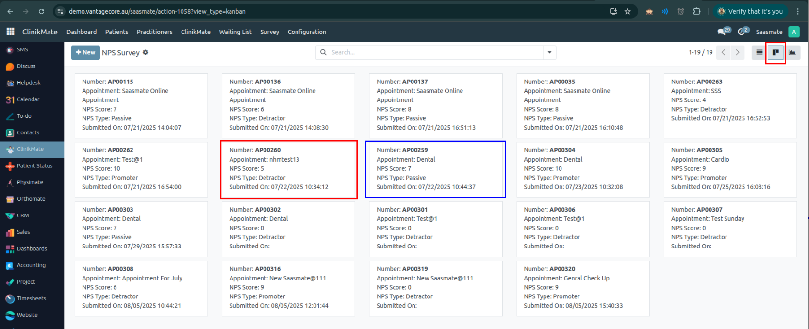
Each view contains the following fields:
• Appointment No. – Unique number for the appointment.
• Appointment Type – Type of the appointment.
• NPS Score and Its Type – Patient rating and whether it is a Promoter, Passive, or Detractor.
• Submitted On – Date when the survey was submitted.
Graph View:
Bar Chart VIew:
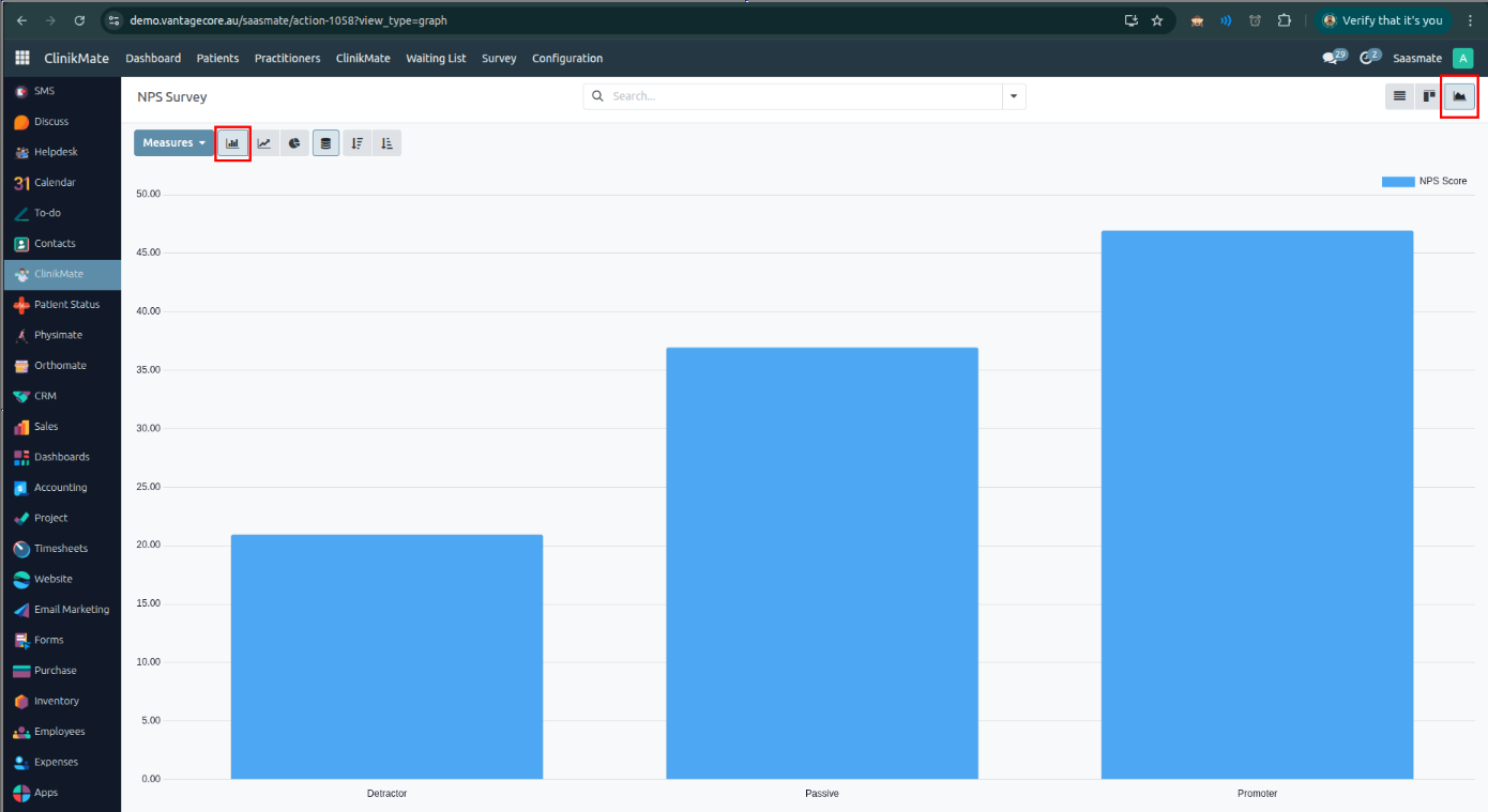
Line Chard View:
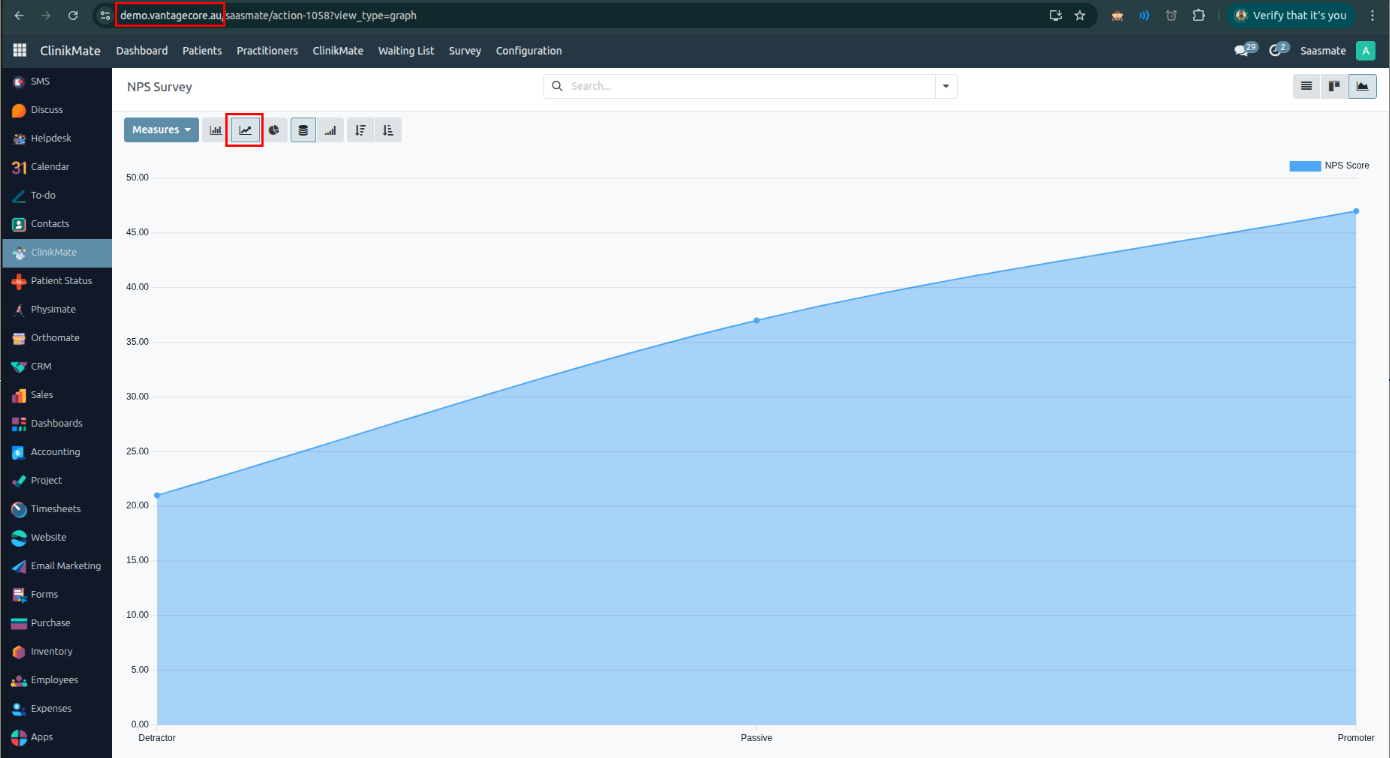
Pie Chart View: Only completed surveys are displayed here.
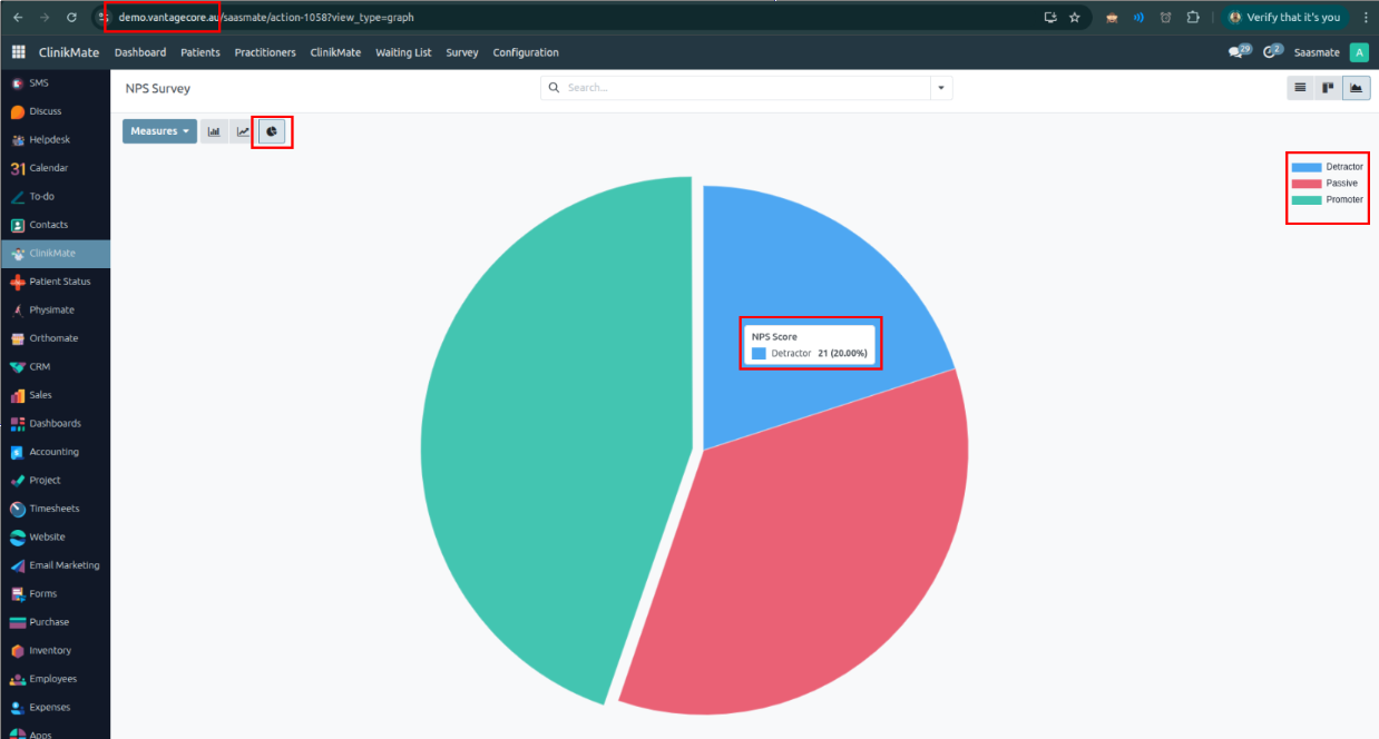
We have placed two new menu items under Clinikmate -> Survey:
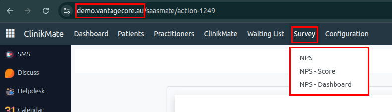
If we click the 'View' button in the last column, we can see the complete survey details of a particular customer.
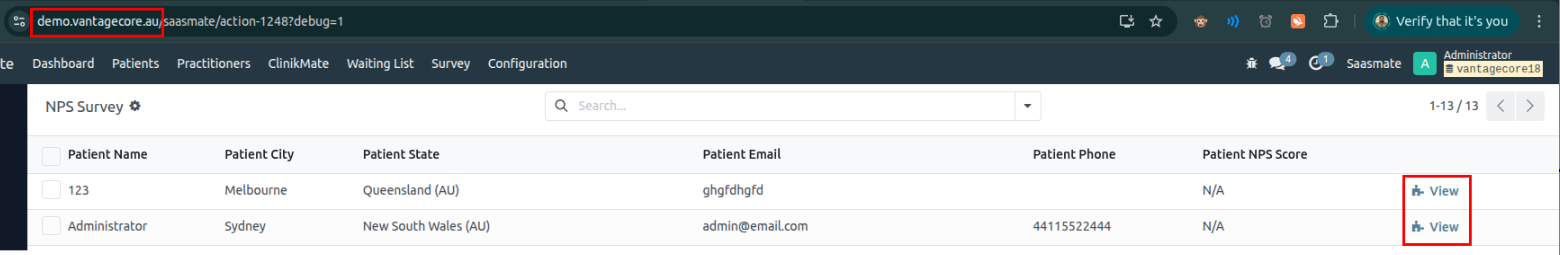
After Clicked,
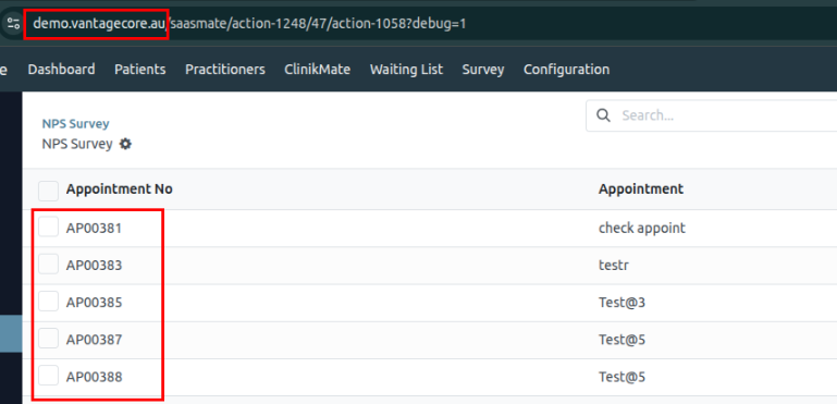
Nps Dashboard
We have placed two new menu items under Clinikmate -> Survey:

NPS - Dashboard: We have placed the 5 Dashboards in view.
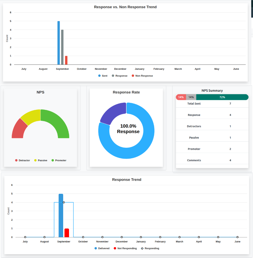
Dashboard I: Response vs. Non Response Trend
This Dashboard generates a monthly summary of survey activity between July of the current year and June of the next year. It focuses on three key metrics:
Surveys Sent Responses Received Non-Responses (surveys sent but not responded to)Date Range:
The reporting period spans from July 1st of the current year to June 30th of the next year. This is dynamically calculated based on the current date.Months Covered:
The method generates data for 12 months starting from July to June. Each month's name (e.g., "July", "August") is used as a label for the output data.Data Collection:
The method performs three separate database queries to count: The number of surveys sent in each month. The number of surveys that received a response. The number of surveys that were sent but not responded to.Filtering Conditions:
Only records that are active are considered. Dates are filtered within the July–June range. Boolean flags (is_mail_send, is_submitted) determine if a survey was sent and/or responded to.Data Structure Returned:
The result is a dictionary containing: A list of month names in order from July to June. A seriesData list with three series: Sent, Response, and Non Response. Each series includes the monthly data count and an associated color for charting or visualization.
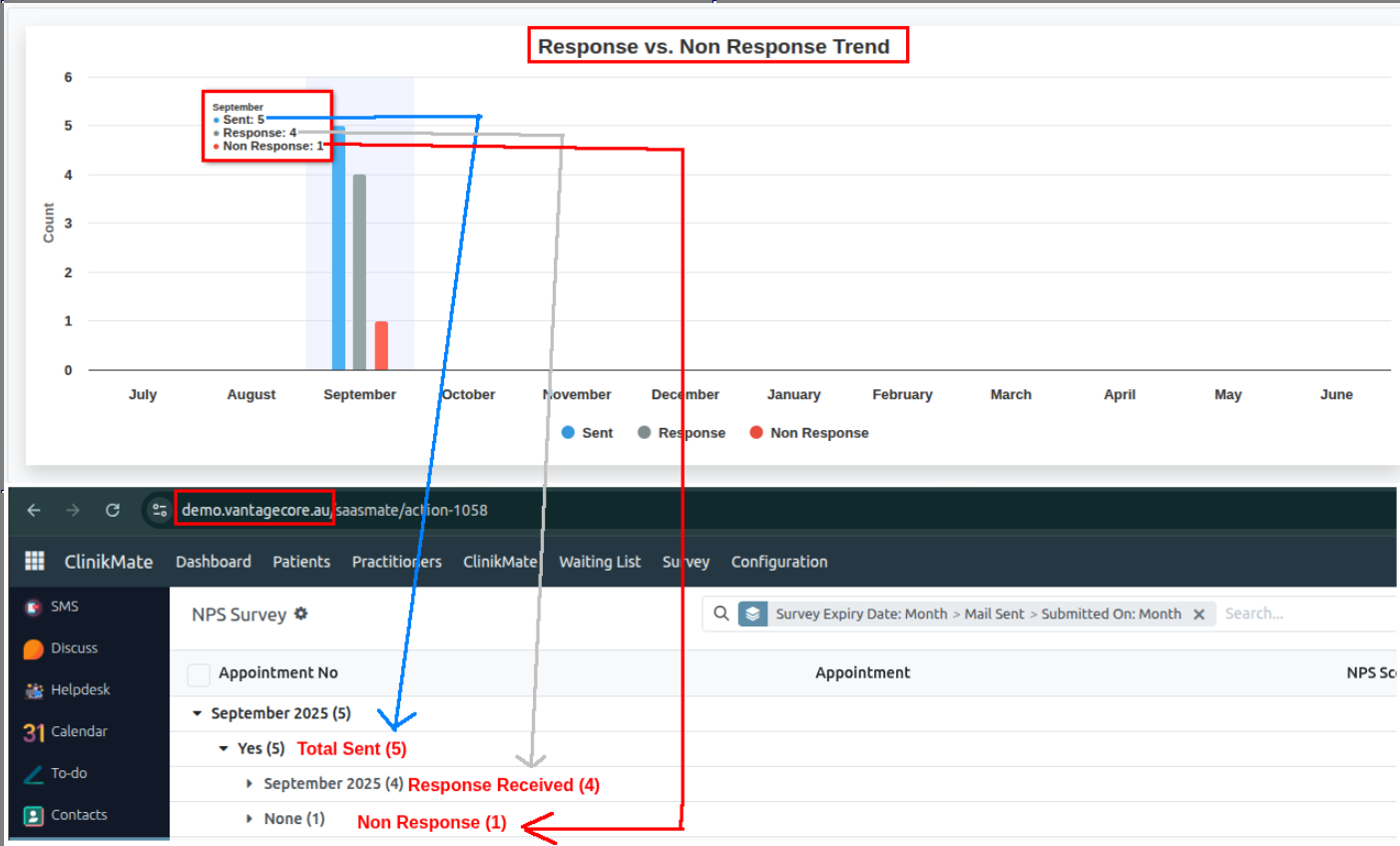
Dashboard II: NPS
This Dashboard is used to analyze customer feedback from NPS (Net Promoter Score) surveys. It helps us understand how many users fall into each satisfaction category — Promoter, Passive, or Detractor — within a specific time period (from July of the current year to June of the next year).
How It Works:
Time Period Covered:
Only surveys submitted between July of this year and June of next year are included in the analysis.
What It Tracks:
The method checks each survey response and classifies it into:
Promoters – happy and loyal customers Passives – neutral or indifferent customers Detractors – unhappy customersWhich Data Is Counted:
The survey must be: Active Sent Have a valid NPS type (Promoter, Passive, or Detractor) Submitted within the specified time periodWhat the Output Looks Like:
The result is a summary showing,
Number of Detractor responses Number of Passive responses Number of Promoter responses These numbers can be displayed on a dashboard to track customer satisfaction trends.
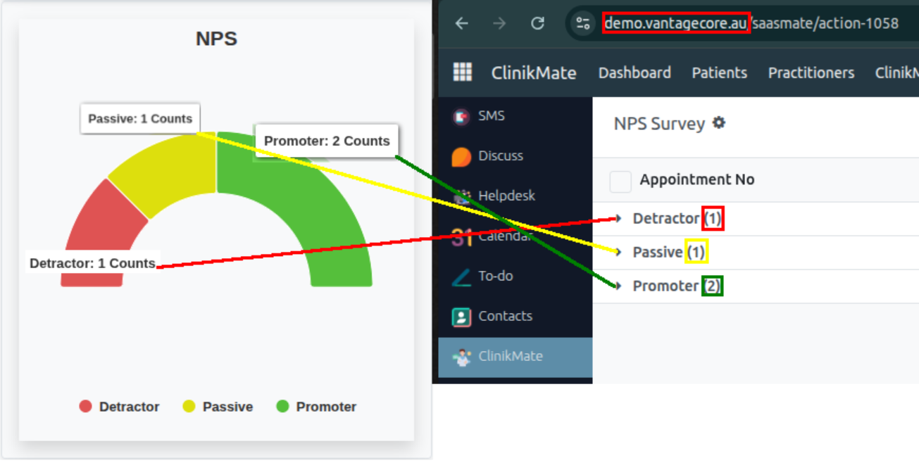
Dashboard III: Response Rate
This Dashboard provides a summary of how people responded to NPS (Net Promoter Score) survey emails — specifically breaking it down into:
Primary responses – people who responded without needing a reminder Reminder responses – people who responded only after receiving a reminder Non-responses – people who didn’t respond at allHow It Works:
Time Period Covered:
It looks at surveys sent between July of the current year and June of the next year.
What It Tracks:
- Primary Response:
- People who received the survey email and responded (without needing a reminder).
- Reminder Response:
- People who didn’t respond initially, but did respond after a reminder email was sent.
- Non-Response:
- People who received the survey, did not respond, and did not get a reminder.
Which Data Is Counted:
Only surveys that are:
- Active
- Sent within the July–June window
- For each category, it checks specific conditions like:
- If the survey was submitted
- If a reminder was sent
- If the submission date is missing (to detect non-responses)
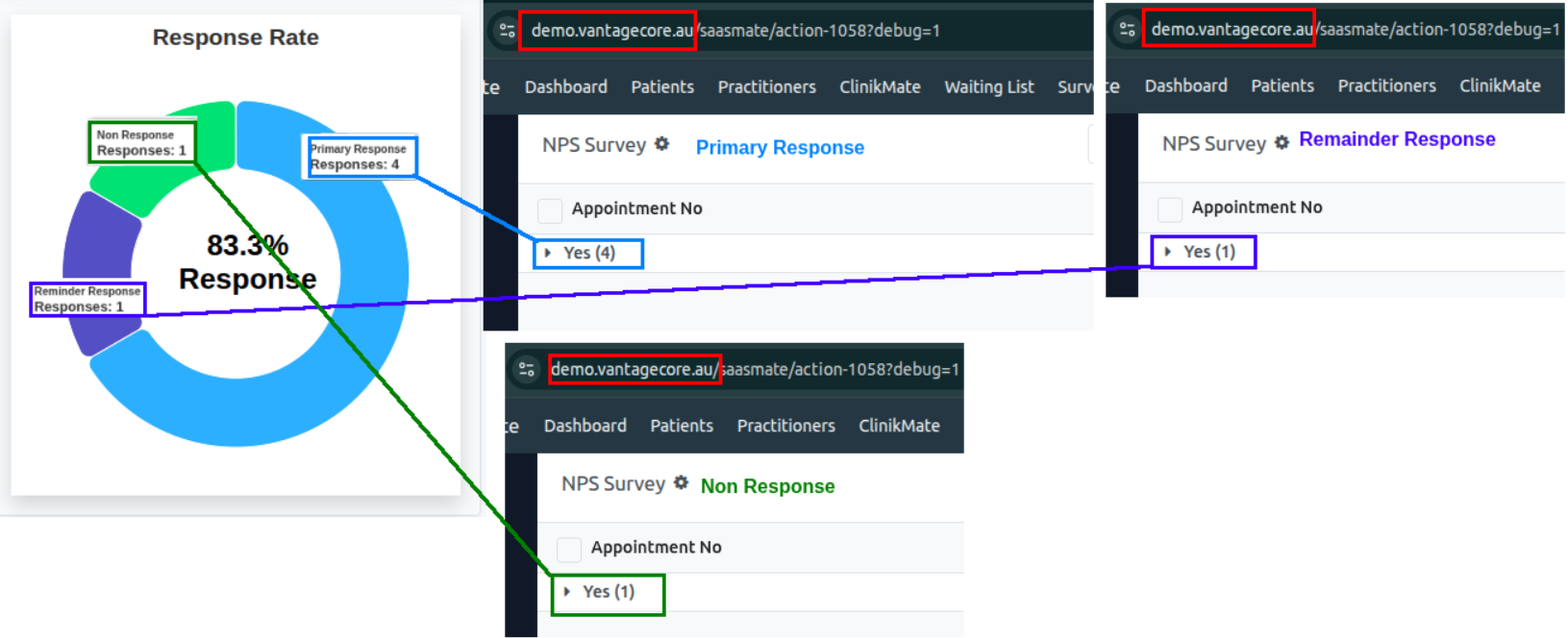
Dashboard IV: NPS Summary
This Dashboard gives a complete summary of NPS (Net Promoter Score) survey results for the current NPS cycle — from July of this year to June of next year. It shows both:
- The percentage breakdown of survey responses (Promoter, Passive, Detractor).
- The actual counts of each type.
- Extra insights, like:
- How many people submitted the survey.
- How many gave written feedback.
How It Works:
Time Period Covered:
The method looks at surveys submitted between July 1st of the current year and June 30th of the next year.
What It Tracks:
- Response Types:
- Promoters (happy customers)
- Passives (neutral)
- Detractors (unhappy customers)
- Percentages:
- It calculates what percentage of the total each response type represents.
- Example: If 100 responses are received and 60 are promoters, that’s 60%.
- Total Responses: The total number of valid NPS responses is counted.
- Submitted Surveys: It counts how many surveys were actually submitted, regardless of NPS type.
- Customer Feedback: It checks how many users left written feedback along with their response.
Which Data Is Counted:
- Only surveys that are:
- Active
- Sent
- Have a submitted date within the July–June window
- Have a valid NPS type (Promoter, Passive, Detractor)
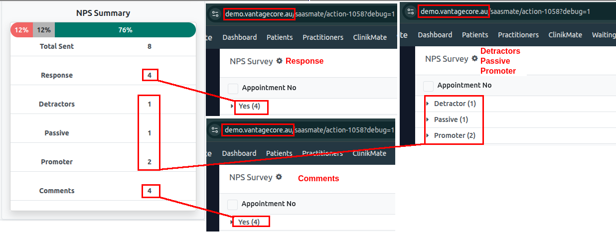
Dashboard V: NPS Summary
This Dashboard gives a month-by-month overview of how people interacted with NPS surveys during the current survey cycle (from July of this year to June of next year). It breaks down the data into three categories:
Survey Status Categories:
- Delivered – surveys that were successfully sent
- Responding – surveys that were submitted
- Not Responding – surveys that were sent but not submitted
How It Works:
Time Period Covered:
The report covers surveys sent between July 1st of the current year and June 30th of the next year. This matches the organization’s NPS tracking period (July–June).
Months Included:
- It shows data for each month in the cycle:
- July → August → ... → December → January → ... → June
- These months are used to organize the data on a chart.
What It Tracks:
- Delivered: How many surveys were sent
- Responding: How many people submitted the survey
- Not Responding: How many received the survey but did not respond
What Data Is Counted:
- Only surveys that are:
- Marked as active
- Were actually sent (
is_mail_send = TRUE) - Sent during the July–June reporting window
- For responses, it checks whether the survey was submitted (
is_submitted = TRUE)
What the Output Looks Like:
- The method returns:
- A list of the 12 months (from July to June)
- A list of data series for each category (Delivered, Responding, Not Responding)
- Each series includes:
- The count for each month
- A color code (used in charts)
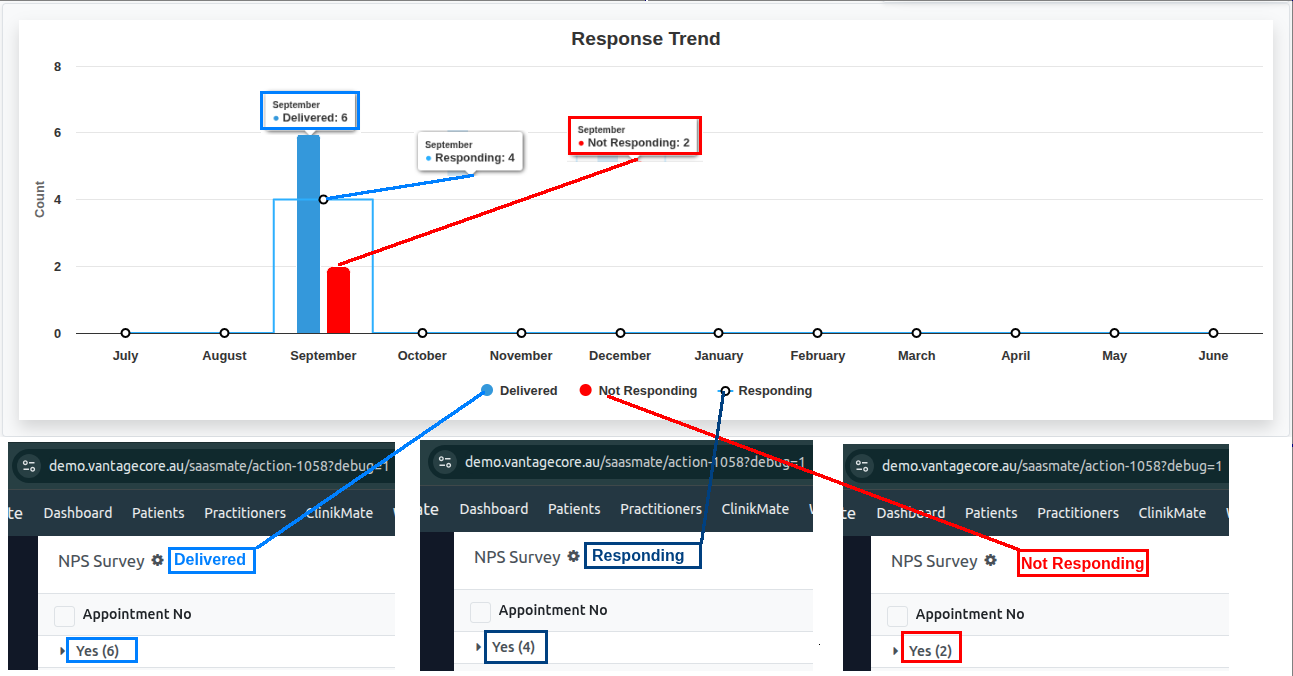
Forms
Forms provide structured layouts for entering and viewing patient or exercise information. They capture essential details such as dates, status, and related instructions. All data entered in forms is used to track, manage, and generate reports within the portal.
Create the new forms steps
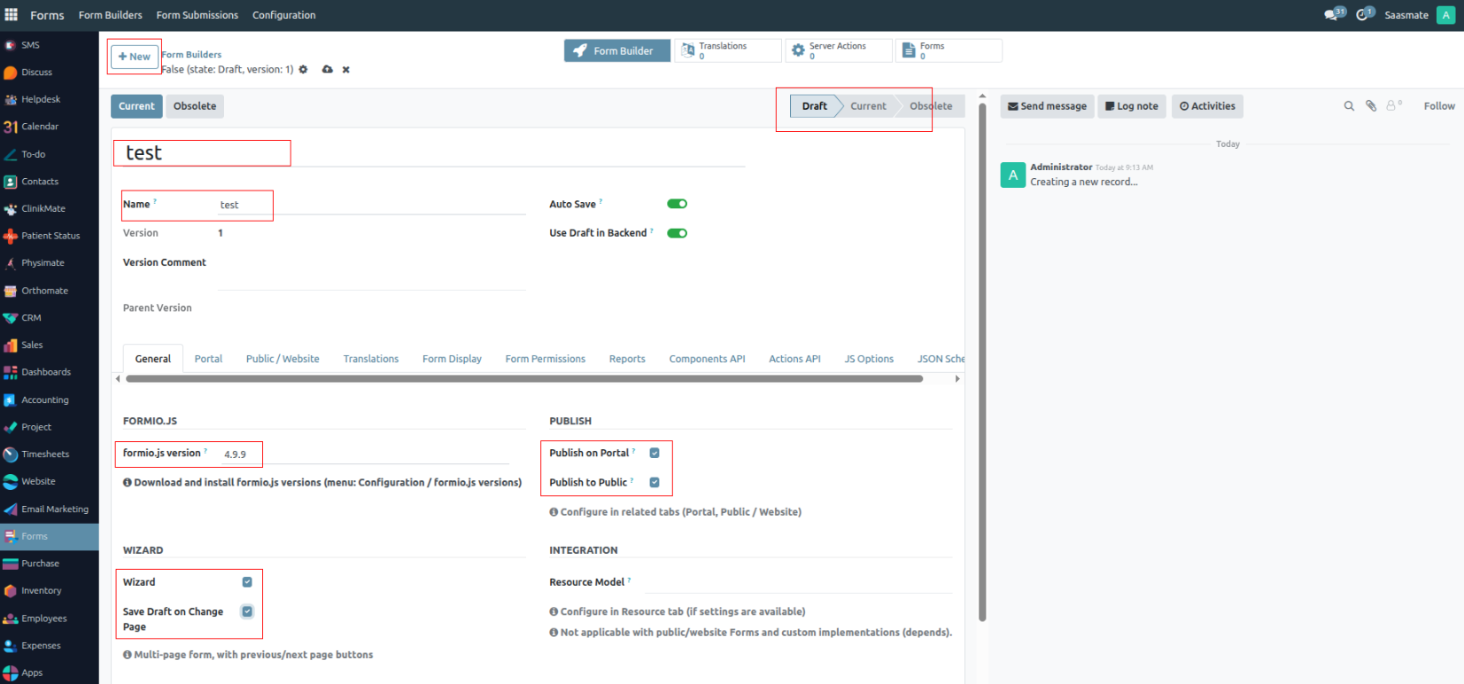
- New – Button to create a new form record.
- Name – Form title or identifier (e.g., Test).
- Formio.js version – Library version used (e.g., 4.9.9).
- Wizard – Enables multi-step (wizard) form display.
- Save Draft on Change Page – Saves progress when navigating between pages.
- Publish on Portal – Makes the form visible on the user portal.
- Publish to Public – Makes the form publicly accessible.
- Draft – Current form state/status.
- Portal Menu – Entry point for accessing forms from the user portal.
- Portal URL – Direct link to open the form on the portal: https://demo.vantagecore.au/my/formio/form/new/test
- Redirect After Save Draft – URL where the user is redirected after saving a draft: https://demo.vantagecore.au/
- Redirect After Submit – URL where the user is redirected after submitting a form: https://demo.vantagecore.au/
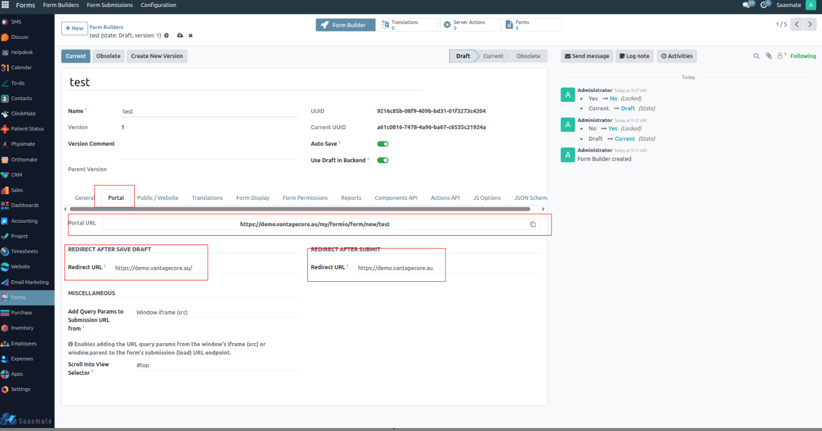
- Public / Website
- Public Current URL – Public link to the current form version: https://demo.vantagecore.au/formio/public/form/new/current/a61c0816-7478-4a96-ba67-c6535c21924a
- Public URL – Public link to the specific form builder version: https://demo.vantagecore.au/formio/public/form/new/9216c85b-08f9-409b-bd31-01f3273c4204
- Expire After – Time in minutes after which public access expires (30 Minutes).
- Redirect After Save Draft - Redirect URL – URL where the user is redirected after saving a draft: https://demo.vantagecore.au
- Redirect After Submit - Redirect URL – URL where the user is redirected after submitting the form: https://demo.vantagecore.au
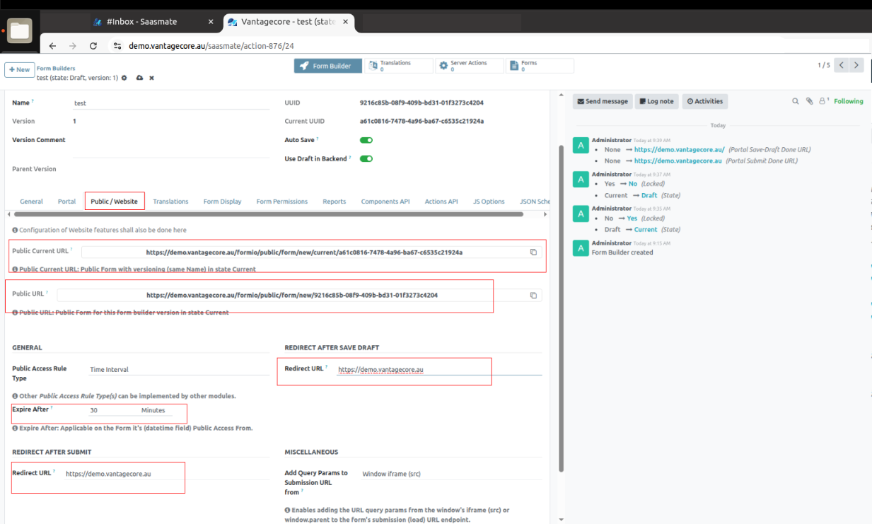
- Forms Display
- Full Width – Makes the form span the full width of the page.
- iFrame Embedding – Allows the form to be embedded in an iFrame.
- iFrame Resizer bodyMargin – Adjusts the body margin when using the iFrame resizer.
- Show Title – Displays the form title.
- Show State – Displays the current state of the form (e.g., Draft, Current).
- Show User Metadata – Shows metadata about the user who created or submitted the form.
- Show ID – Displays the form’s internal ID.
- Show UUID – Displays the form’s unique UUID.
- View as HTML – Renders submissions in an HTML view instead of JSON or raw data. (Always set to false unless explicitly needed).
- Translations menu, Form Permissions menu, Reports menu, Components API menu, Actions API menu, and JS Options menu — Nothing needs to be changed unless necessary.
- JSON Schema
- JSON Schema menu – When you build a form using the drag-and-drop builder, it automatically generates and stores the schema data for all the fields you added.
- Component Type – Defines the field type (e.g., text field, select box, checkbox).
- Label – The text displayed to the user for the field.
- Key – The internal name used for data storage.
- Validation Rules – Defines constraints such as required, min/max values, regex, etc.
- Layout Settings – Controls design aspects like width, rows, and custom CSS classes.
- Conditional Logic – Specifies when to show or hide the field based on conditions.
- Enable the “Current” button – Activates the form state.
- State Change – The form state will update to Current.
- Form Builder – Once the form is in the Current state, click the Form Builder button to start building.
- Enable Unlock Button – Allows editing and building forms when enabled.
Form Builder
- Form Builder button – Opens an interface with Basic and Advanced layout options. You can drag and drop fields to create the form structure.
- Basic – Common input fields for simple forms:
- Text Field – Single-line text input.
- Text Area – Multi-line text box.
- Number – Numeric input only.
- Password – Hidden text input for passwords.
- Checkbox – Single checkbox option.
- Select Boxes – Multiple checkbox options.
- Select – Dropdown list with single or multiple selection.
- Radio – Multiple-choice with radio buttons (single selection).
- Button – Action button (e.g., submit, reset).
Basic – Specialized input types:
- Text Field
- Component Settings – Applicable for all fields.

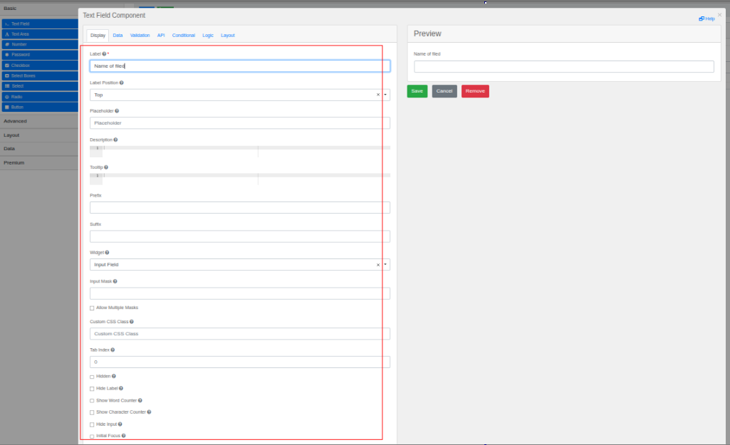
- Label – Name of the field shown to users.
- Label Position – Where the label appears (e.g., Right, Left).
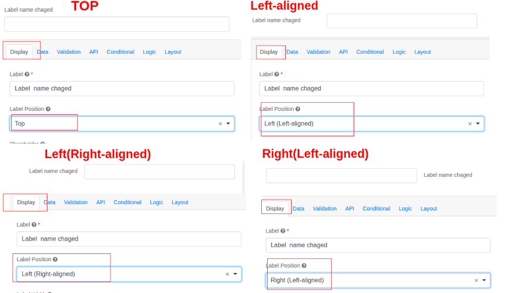
- Label width — defines how wide the label element is, controlling the amount of horizontal space it occupies.
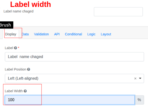
- Label margin — defines the outer space around the label element, controlling the distance between it and surrounding elements.
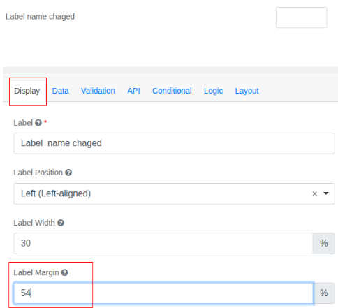
- Placeholder – Text shown inside the input until user types.
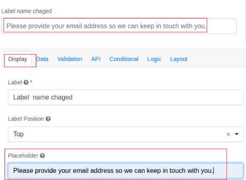
- Widget – Field type (input, textarea, etc.).
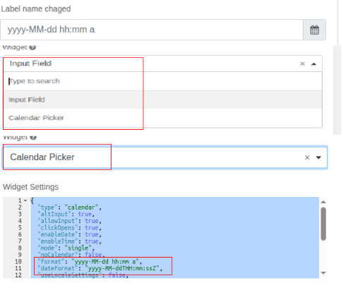
- Hide Label - The Label will be hide
- Disabled- Disable the form inputs

- Table View - show this value within the table view of the submissions. ( must enable)
Validation Tab Options
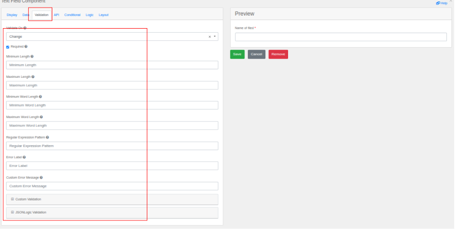
- Required – Makes the field mandatory.
- Number

Note:
- Data, API, Condition, Logic, and Layout do not need to be changed unless necessary.
- Text Area – Multi-line text box.
- Check Box
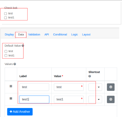
- Radio - this values is use to add many input put
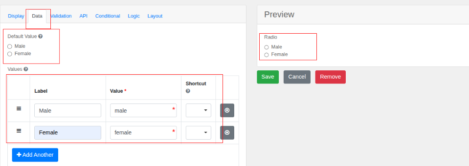
- Select how many valued need add to here
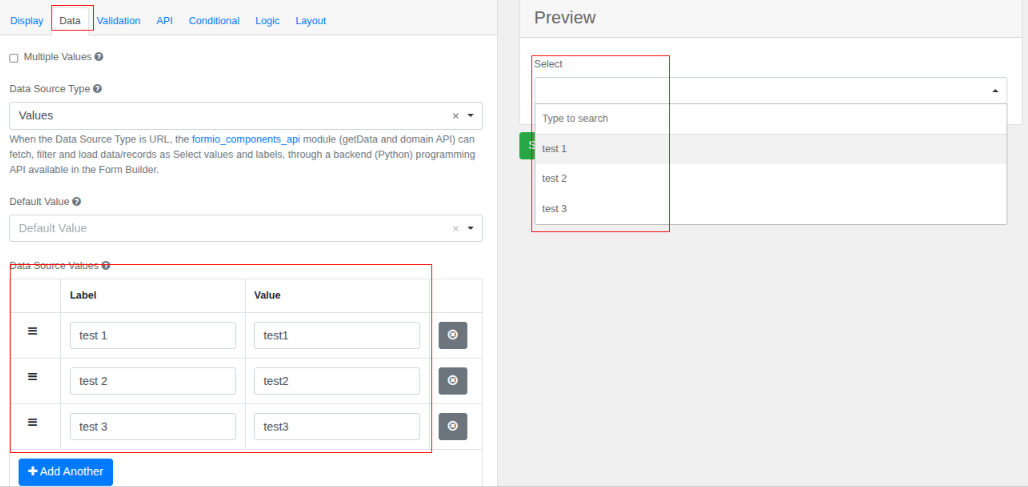
- Button Component

Advance – Specialised input types
- Phone No - set your country code base on input mask
- Address
- Date&Time - need to modify data&time formate
- Signature
- Drag to added the signature fields after need to set width and height best on your requirement
Layout – Specialised input types
- HTML Element Component
- Label – The internal name for the component. Here it’s set to HTML. This label helps identify the field in the form editor but is usually not shown to users.
- HTML Tag – Specifies the HTML tag to wrap your content in. Here it’s set to p (paragraph tag), but it could be div, h1, etc.
- CSS Class – Optional field for adding CSS classes to style the element. For example, you could add text-center to center content.
- Attributes – Lets you add custom HTML attributes (e.g., id, style, data-*). Each attribute has a name and value column.
- Content – This is where you write or paste your HTML code. In your case, it contains:
- Content fields
- This works like Microsoft Word. Type or write your content here.
- You can add descriptive text above/below the image in this same editor.
- If you set a Custom CSS Class, you could make this image responsive or styled differently.
- Columns

- Label — Use a clear, descriptive label for the column set so it’s easy to identify later (e.g., “Patient Details Columns”).
- Column Size & Width — Adjust the width (e.g., 6 means half-width) to control how much space each column occupies in the row.
- Offset, Push, Pull — Use these for spacing and repositioning columns without changing their size (e.g., offset: 1 adds a gap before the column).
- Add Column — Click + Add Column to increase the number of columns for placing different form elements side-by-side.
- Auto Adjust — Enable Auto adjust columns to automatically balance widths based on the number of columns added.
- Save it
- Panel Component
- Title – Sets the panel’s heading shown to users.
- Theme – Controls panel color/style (Default, Primary, Success, etc.).
- Breadcrumb Type – Chooses breadcrumb style for navigation between panels.
- Allow Click on Breadcrumb – Lets users jump between steps by clicking breadcrumbs.
- Panel Navigation Buttons – Shows/hides Previous, Cancel, and Next buttons inside the panel.
- Table
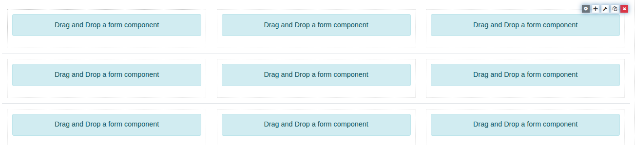
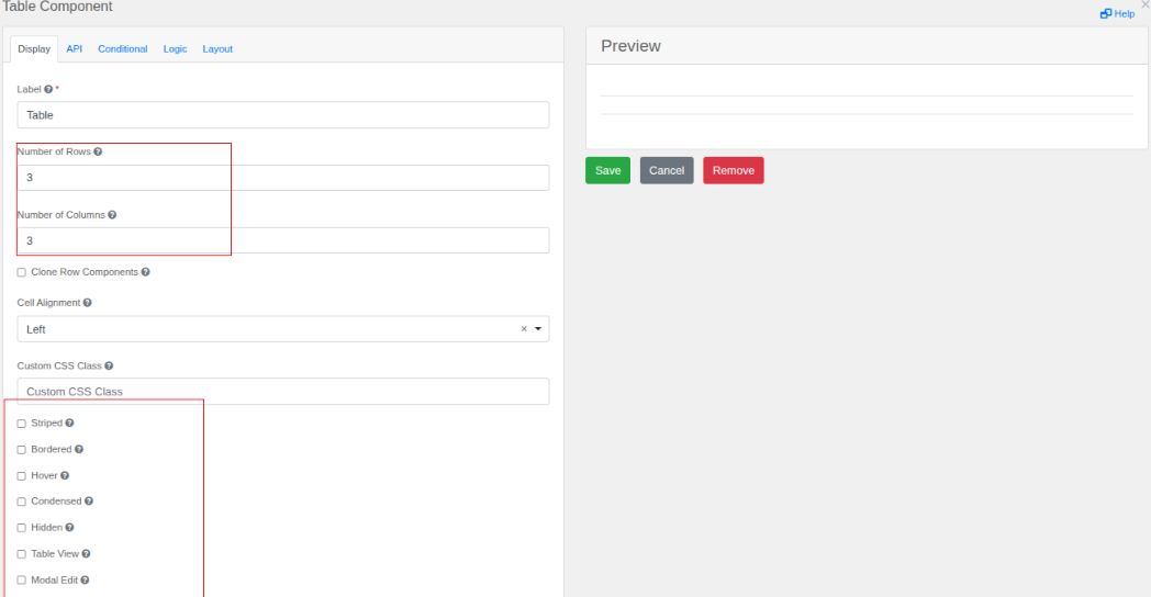
- Basic Table Structure
- Number of Rows (3) – Sets how many rows the table will have (e.g., 3 rows).
- Number of Columns (3) – Sets how many columns the table will have (e.g., 3 columns).
- Checkbox Options (Toggle On/Off):
- [ ] Clone Row Components – If checked, copying a row will also duplicate its components (like buttons or inputs inside cells).
- [ ] Signed – Adds a signature-style design (often used for approval tables).
- [ ] Bordered – Shows borders around cells for better visibility.
- [ ] Hover – Highlights rows when the mouse moves over them.
- [ ] Condensed – Reduces spacing between cells for a compact look.
- [ ] Hidden – Makes the table invisible (useful for conditional displays).
- [ ] Table View – Displays data in a standard table format.
- [ ] Modal Edit – Opens the table in a pop-up window for editing instead of inline.
- Alignment & Styling:
- Cell Alignment (Left) – Sets text alignment inside cells (left, center, or right).
- Custom CSS Class – Lets you add special styling (colors, fonts, etc.) using custom CSS.
- Action Buttons:
- Save – Confirms changes.
- Cancel – Discards changes.
- Remove – Deletes the table.
- Tabs
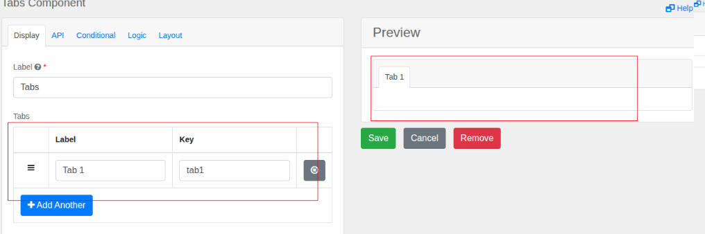
- Label – A name for the component (e.g., "Tabs").
- Tabs – A tabbed interface where each tab can hold a table or other content.
My forms
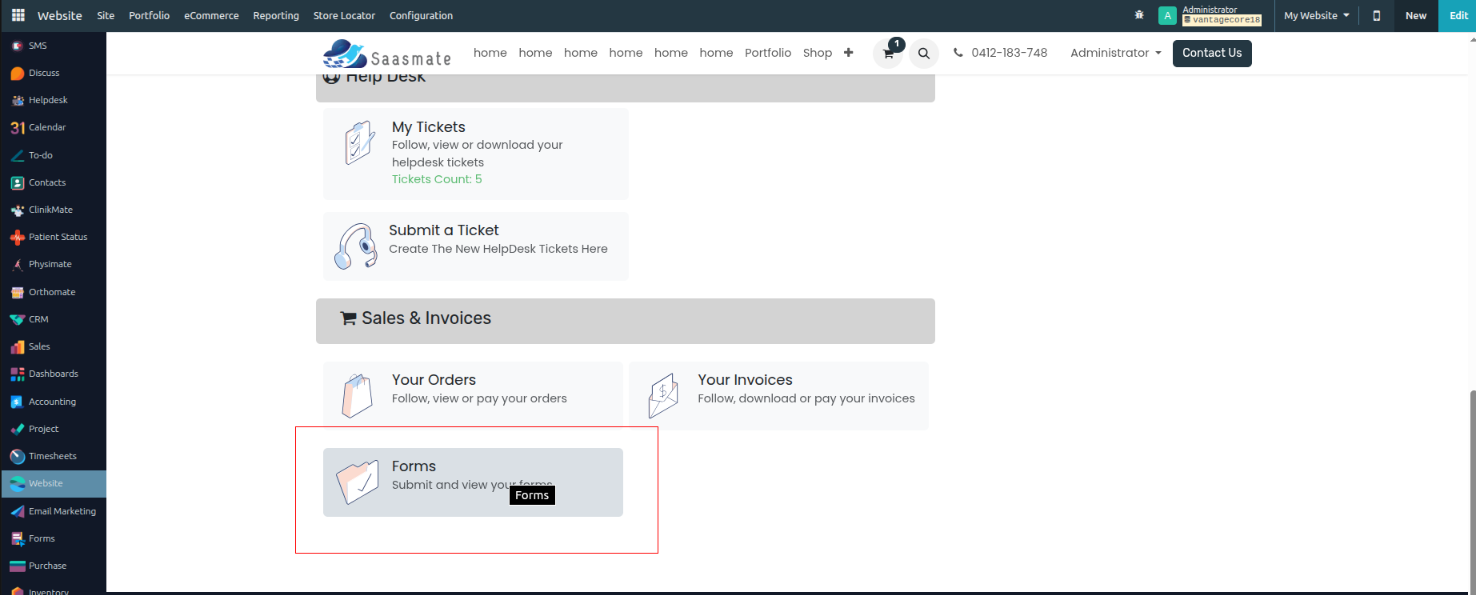
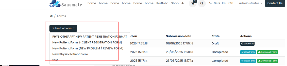
- All created forms will be stored under my account. Sales & Invoices menu under Forms.
- Once clicked, the form will open. After clicking the submit button, it will display the list of all forms. Clicking a form from the list will open it, where you can enter the date and save it.
- To download a submitted form, click the Download button.
- To view your form, click the View Form button.
- To edit your form, click the Edit button.
- The submission date of each form is also displayed here.
- The Created On date of each form is also displayed here.

- After Submission
- Once you submit the form, all entered data will be automatically saved and stored in the Forms module.
- Accessing Submitted Forms
- Go to your Project Dashboard.
- Look for the "Forms" button and click on it.
- Viewing Submitted Data
- The Forms section will display a list of all your submitted forms.
- You can view, search, and manage the collected data easily.

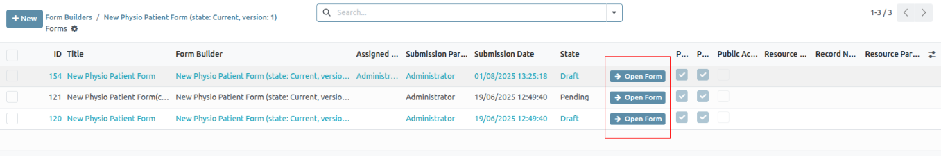
- Your submitted forms
- PDF Report Generation
- Available Report Options
- The system provides 3 types of PDF reports for your submitted forms:
- Summary Report – Key data overview
- Detailed Report – Full form entries
- Custom Report – Select specific fields
- The system provides 3 types of PDF reports for your submitted forms:
- How to Download Reports
- Go to the Forms module and select your submitted form.
- Click the "Generate PDF" button.
- Choose your preferred report type and click "Download".
- Available Report Options
Initial Setup
Overview
The SaaS Initial Setup module is an automation helper for new Saasmate databases. It ensures that selected legacy apps are pre-flagged as Vantage Apps automatically at database creation.
Key Features
- Auto installation: This module installs automatically whenever a new database is created (
auto_install=True). - Post-init hook: After installation, it runs the
set_vantage_flagfunction. - Pre-flags modules: The hook marks specific modules (declared in the hook) as Vantage Apps = True.
- Extendable: To add new legacy modules in the future, simply update the list inside the hook function.
Installation & Execution Flow
1. New Database Creation
- When a new database is created, Saasmate auto-installs this module.
2. Post-init Hook Execution
- The
set_vantage_flagfunction is triggered. - Inside the function, a list of modules is declared (e.g.,
sale_management,stock,purchase, etc.). - For each listed module, the field
vantage_apps = Trueis updated inir.module.module.
3. Admin Action
- Navigate to Apps in Saasmate.
- Filter by Vantage Apps.
- All the pre-flagged modules appear.
- Select them and activate in bulk.